As web design trends come and go, one factor remains constant; we are visual creatures. We absorb information, both explicit and implicit, much more rapidly through visuals than through bare text. In the digital age, when social media marketing thrives on visual storytelling, design choices are far from aesthetic preferences. On the contrary, they substantially affect visitors’ perceptions of a website’s professionalism, functionality, and more, in turn affecting Search Engine Optimization (SEO). With that in mind, let us explore the tenets of great web design that attract and retain customers under this lens.
The Power Of Design Overlapping With SEO
First, let us briefly substantiate the assertion that web design overlaps with SEO. Among other examples, consider the following benefits of impeccable design.
Reducing Bounce Rates
In many regards, attracting customers isn’t the primary challenge of digital marketing. Rather, it might be easier to attract visitors than to have them stick around. SEO practitioners like Thehotskills dub swift departures from a website as bounces, in turn, pinpointing the useful metric of bounce rates. Visitors may bounce for many reasons, and most of them either relate to or can be influenced by, web design. For examples, consider the following:
- Loading Speeds: web design simplicity improves loading speeds.
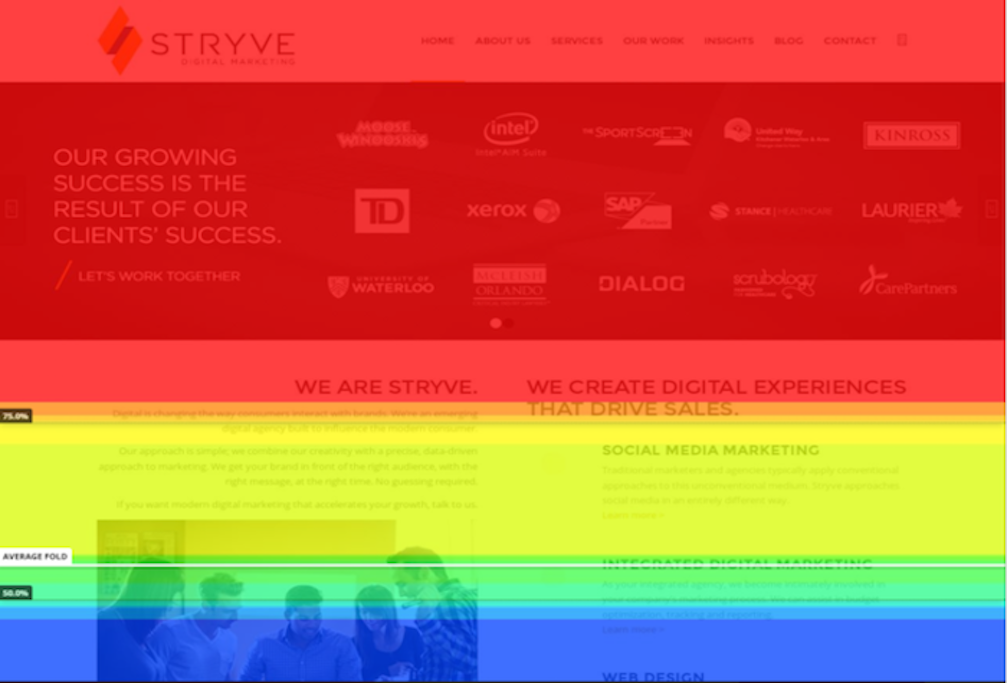
- Suboptimal Fold: visual elements within the fold area can sway visitors.
Poor Content Formatting: scannable content entice visitors to stay, which proper use of visuals and white space can facilitate.
Matching Search Intent
On the subject of optimal fold design, matching a visitor’s search intent directly informs their retention. Consider how much the average internet user values relevant Google results, and how much Google strives to provide them.
Now, matching search intent does heavily hinge on your overall content strategy. However, the place where your visitors determine your pages’ value is the fold, as any scroll heatmap will frequently show.

It follows, then, that it’s your fold’s design that attracts customers and retains them.
Enhancing UX
Finally, great web design will, of course, enhance your visitors’ User Experience (UX). Consider sitemaps, responsive pages, visible Calls to Action (CTAs), breadcrumbs, and more.
However, what’s arguably even more interesting is that great web design can actually mask UX shortcomings. UserTesting dubs this the “aesthetic-usability effect”; “[y]our visitors are more likely to ignore small glitches on your site if your website looks good”. That’s not to say you should rely on this psychological effect, of course, but it is equally noteworthy.
Implementing Great Web Design That Attracts Customers
Now, the above should help contextualize that SEO and web design overlap significantly. It’s not simply that design attracts customers; the design also retains customers, whose engagement metrics affect your SEO score. In turn, this enhances your website’s online visibility, attracting new customers and continuing the circle.
But broad theory can only illustrate this so well, so let us delve into specifics.
#1 Simplicity Ensures Fast Loading Speeds
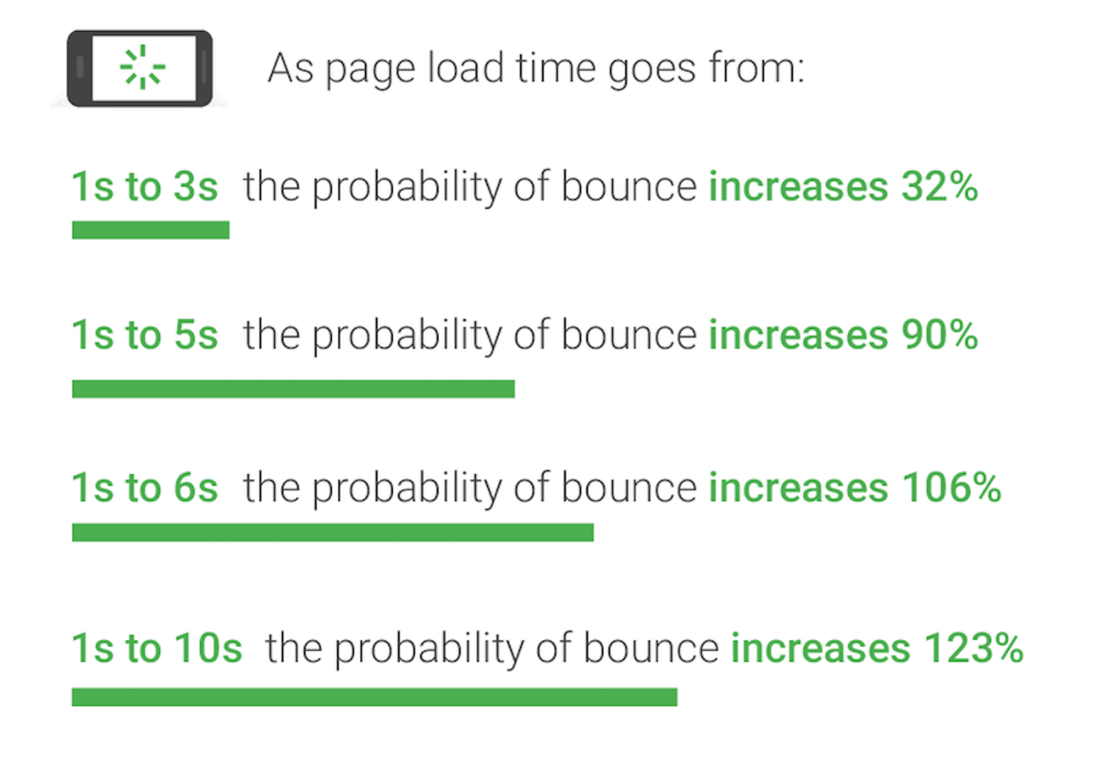
First and foremost, design simplicity directly affects loading speeds. That’s a crucial factor to consider, as bounce rates directly correlate to loading speeds, according to Google/SOASTA research:

What this means is twofold; bloated loading speeds will both discourage new visitors and hamper SEO, undermining further lead acquisition. Thus, the core tenet of great web design that attracts customers is simplicity. Here, you may consider such factors as the following:
- Plugins And Themes: examine your plugins’ and themes’ impact on loading speeds.
- Visual Elements: only use as many visual elements as you need to enrich your content.
- Image Compression: <100kB file sizes are typically ideal, as long as compression and format don’t compromise quality.
#2 Mobile-First Designs Boost SEO And Mobile UX
Still, on the subject of SEO, mobile-friendliness is among the most fundamental SEO practices. There are many reasons for this, but the primary ones in this context are two:
- Google indexes mobile versions of websites first, and
- Mobile traffic accounts for nearly half of all web traffic, according to Statista.
Understandably, then, it is often a great mobile-first web design that attracts customers on mobile devices. But what exactly is a mobile-first design? Adobe explains:
“Mobile-first design is a design philosophy that aims to create better user experiences by beginning the design process with mobile devices in mind first, often prioritizing the smallest of screens.”
With this in mind, adopting a mobile-first design philosophy can also yield many holistic design benefits, such as:
- Simplicity: mobile-centric designs necessitate simplicity, especially given the smaller screen real estate.
- Hierarchy: proper, logical content hierarchy is even more crucial to mobile users than desktop ones.
- Responsiveness: Core Web Vitals champion responsiveness, a strong priority of mobile-first designs.
#3 Clean Designs Enhance Readability
Having discussed simplicity, we may now discuss content readability. As highlighted above, readable, scannable content incites engagement, which in turn boosts your SEO score. Design-wise, you may ensure your design and layout frame your content as well as possible through such practices as:
- Selective Use Of Visuals. As highlighted above, visuals can undoubtedly enrich your content. Invest in quality aesthetic photos that resonate with your audience. Excess, however, can have adverse effects and drive customers away. Examine visitor behavior through heat maps to deduce optimal visual placement across your pages.
- Using White Space. Similarly, white space lets your content breathe – and thus allure visitors more easily. Don’t be afraid to let your visitors’ eyes rest on white space, as that directly enhances readability.
- Color Choices. Finally, your color choices can motivate or discourage visitors. View your pages in monochrome to ensure visual fidelity and readability for visitors with visual impairments. At the same time, examine how colors contrast, bleed into each other and otherwise interact to inform visual appeal.
#4 Ample Valuable Visuals Incite Engagement
Now, we’ve warned against excessive use of visuals manifold throughout this article. However, that’s not to say you should steer clear of using visuals altogether. On the contrary, ample visuals make up a web design that attracts customers – with proper implementation.
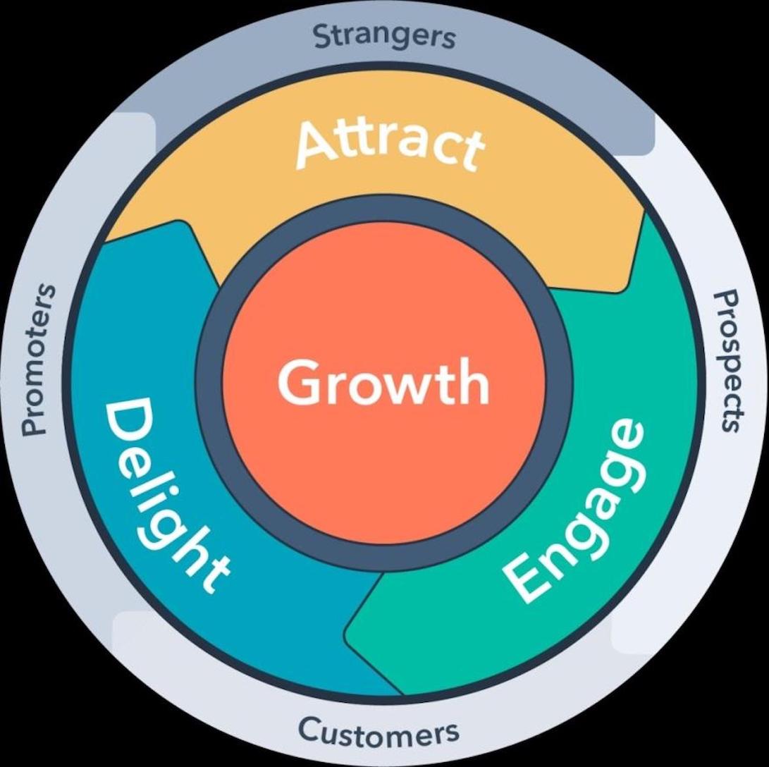
Engagement is a crucial SEO metric, for a plethora of reasons. In fact, it’s so valuable – as it directly informs customer retention – that it spearheads HubSpot’s flywheel model.

That said, what really constitutes “ample”? The answer varies, but it ultimately depends on your pages and analytics. Consider your distribution of visuals on a page-by-page basis, and under such scopes as:
- Image/Word Ratios: marketers will sometimes argue for concrete image/word ratios, like 1 image per 250 words. That’s a solid concept, but it should still depend on your own analytics. Use heat maps and other tools to determine the optimal ratio for your own unique audiences.
- Page-Appropriate Visuals: moreover, not all pages have equal visual needs. Your landing pages don’t require the same number or type of visuals as your conversion pages and product pages do. Again, use your analytics tools to use visuals that match your customers’ journeys across your pages.
- Valuable Visuals: finally, examine how valuable your visuals are. Stock images will certainly work for some landing pages, but other pages will require how-to videos, deep infographics, and so forth.
#5 Selective Visual Elements Pronounce CTAs
Finally, Conversion Rate Optimization (CRO) hinges on proper, efficient CTAs. Having attracted potential customers, it now falls on your CTAs to finalize the conversion. Here, too, your design plays a very substantive role. Examine how it frames your CTAs in such ways as:
- Visual Clarity: first, you may examine how visible your CTAs are. Are background colors obscuring them? Do they appear clickable? Are they positioned high enough for most visitors to see them?
- Distractions: then, you may examine surrounding visual elements. It is extremely common that a nearby visual element may steal your visitors’ attention – especially pictures of people. Here, a move/hover heat map may help you identify such issues.
- Copy, Font, And Color: finally, is your CTA’s copy readable, or is it bleeding into the background color? For that matter, are you using the right color? For example, HubSpot found that red CTAs outperform green ones, and that has remained true from 2011 to today.
Conclusion
To summarize, a plethora of factors come into play when attracting, retaining, and of course converting, visitors. From your initial loading speed to your page’s fold, first impressions can immediately allure or discourage you. As mobile-first designs and customer-centric marketing rightfully take hold, your mobile friendliness, content readability, and careful use of page-appropriate visuals become equally crucial. In all cases, one thing is certain; it is a great web design that attracts customers, whether it’s fueling SEO for better online visibility or enhancing CRO to ensure conversions.

