
Facebook is more than a social network. These days, it’s one of the platforms that a portion of our digital lives revolve around. In fact, around a fifth of the world’s population uses Facebook every single day. Knowing how to create landing pages for a Facebook Ad Campaign is extremely important.
This makes Facebook ads incredibly powerful.
The Power Of Facebook Advertising
No matter where you are in the world, the average person spends about an hour a day on Facebook. That’s a whopping 7% of a person’s waking hours spent on the platform. So how do these figures translate into revenues for Facebook?
Before we get started be sure to check out this free logo maker.
Check out this graph from Statista:
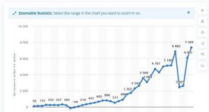
There’s a little slump in net earnings at the start of 2019, because of legal costs incurred for GDPR breaches. Besides that, it’s essentially non-stop growth. Facebook’s most recent annual net income amounted to $22 billion.
When you put all of this together, Facebook ads are basically non-optional.
You know advertising on social media has its benefits, and Facebook is by far the most significant player. Besides the sheer size of your potential audience, Facebook is also one of the cheapest advertising platforms around.
You can reach thousands of people for only a few dollars, which makes it great for affiliate marketers, eCommerce store owners, etc.
Additionally, with all that data Facebook users generate, it’s also one of the most accessible platforms to target your ideal users. In just a few clicks, you can take advantage of both demographic and behavioral targeting.
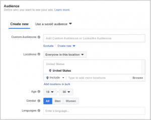
Unfortunately though, getting your message in front of the right people is only a small part of your PPC strategy. When it comes to creating high converting Facebook ads, the real challenge begins once users have clicked through.
The key to this is creating the perfect landing page.
Today, we’ll look at how to do precisely that. In particular, we’ll explore the four main steps for creating landing pages that are optimized for Facebook ads. We’ll also check out some real-life examples at each stage.
Creating The Perfect Landing Page
Step 1: State Your Goal Clearly
As in any other campaign, the goal is fundamental. After all, this determines the direction of your campaign, including how your Facebook landing page will look. With any PPC campaign, there are only two potential goals:
- Selling immediately.
- Gathering email addresses to sell later.
Obviously, we’d all like to make as many sales as we can, as quickly as possible. Sadly though, this isn’t realistic.
Unless you’re selling low-value retail goods, the goal of your Facebook ad landing page should be to gather leads. You do this by making a value offer in exchange for email sign-ups. You can then warm those leads through email marketing to make sales.
Once you’ve determined your goal, it will inform the rest of your marketing strategy.
At the level of your initial ad, it pays to be upfront about this. That is, your value proposition should be the main focus of your ad.
This is important because Facebook only allows advertisers to use 20% of an ad’s visual real estate for text. Therefore, you don’t have much text to display when directing users to your landing page.
Here’s an excellent example from diib, a data management platform that provides predictive and actionable analytics about websites.
With its Facebook ad, diib entices viewers to scan their websites for free using the platform. They also emphasize that it will only take 60 seconds.
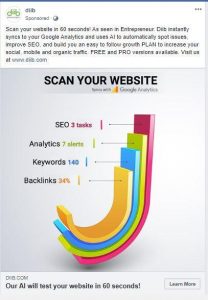
Users are then directed to a landing page where they can enter their details to scan their site. As we’ll see later, this has all the ingredients for an effective landing page. For now, check out how diib uses social proof through reviews and testimonials to add credibility.

2) Employ The Structure Of A Winning Landing Page
Now that you’ve set the goal for your campaign, you have to determine the appearance of the landing page. Luckily, this is fairly straightforward.
These Are The Essential Elements You Should Include:
- Headline: Your headline should emphasize benefits.
- Short copy: This can further explain your headline, but you should also include testimonials, reviews, and customer success stories.
- Calls-to-action (CTAs): The best landing pages offer multiple CTAs to give users plenty of chances to convert.
- Logo: This is your company logo.
- Images: These are usually pictures of your product or the services being offered.
Similarly, The Best Landing Pages Are Also The Simplest, So Don’t Include The Following:
- A navigation menu: Focus only on your offer.
- Irrelevant images:We don’t want to confuse people.
- Complicated forms: You want people to sign-up, not give up.
You have to make sure to provide enough information to foster conversion. Here’s an example of a good Facebook ad landing page from Simply Cook:
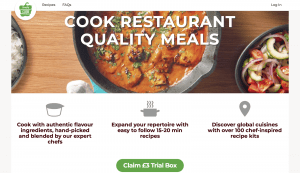
This is the top of the page. Notice that most of the screen is taken up by the headline and hero image. Then there’s some benefit-orientated copy and a high-contrast CTA. As you scroll down, you’ll see each claim is accompanied by a new CTA.

The final CTA on the page makes use of social proof through testimonials and Simply Cook’s high Trust Pilot rating. This is one last-ditch effort to gain a sign-up.
In total, there are four calls-to-action on this landing page alone. Having multiple calls to action is good practice as it maximizes your chances of gaining a sign-up. This is the basic formula you should use in your landing pages.
3) Ensure Visual Continuity
When you create your landing page for a Facebook ad, it’s critical to ensure brand continuity. Specifically, the visuals in your initial ad should match those on the landing page.
The idea is to create a smooth sense of progression from the Facebook ad to the landing page. In short, when people click on the ad, they should not feel like they are transported to another universe. This jarring and feels unnatural.
The easiest way to do this is by making sure that your business logo and brand colors are present in both. The visual style should also be consistent.
Here’s a look at an excellent example from WP Engine, a WordPress hosting site:
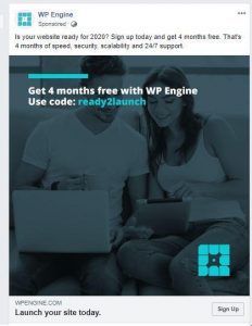
The Facebook ad and the landing page of WP Engine basically have the same elements: the logo, the colors, and the style. This makes it feel less like an ad per se, and more like smooth user experience.
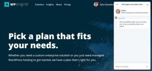
Achieving this effect is important, as customers are normally turned off by a jarring experience.
4) Optimize For Mobile
It’s also important to consider how your users view and access your landing page.
Many people access Facebook, but they don’t all access it on a desktop. In fact, Hootsuite/We Are Social reports that as of 2019 that 96% of users access the social media platform on a smartphone or a tablet.
In short, mobile devices were the most utilized devices for accessing the social media platform:
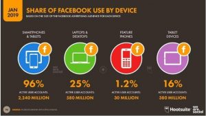
For businesses, this means that failing to optimize your landing pages for mobile will definitely impact conversions for your campaign.
Then you’re effectively burning money.
But how do you optimize the landing pages in the first place? Here is Facebook’s short but sweet answer – Less is more.
In short, those that are optimized for a mobile screen should have the following characteristics:
- They have compelling visuals.
- They have a brief and straightforward copy that urges the audience to take action.
This may not seem too different from a desktop landing page but pay careful attention.
According to Facebook, the key is to “think about where you want your customers to look and the action you’d like them to take.” You should then adjust your visual design accordingly.
In practice, this involves optimizing for mobile users’ thumbs, with bigger copy, shorter forms, and larger CTAs.
When optimizing for mobile, it’s also crucial to make sure your landing pages display properly across a range of devices. This means two things:
- Testing on as many different screen sizes as possible.
- Using accelerated mobile pages to ensure quick load times on poor mobile connections.
This landing page from Elementor, a WordPress site builder, is the perfect example.
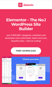
After clicking on the Elementor Facebook ad, the first thing the mobile user sees is the description of Elementor as the No. 1 WordPress Site Builder. Those who are converted won’t have a hard time availing of Elementor’s services.
There’s a large CTA in the form of a free download button, front, and center.
The most important thing is all these elements can be easily seen on a mobile screen.
How To Create Landing Pages For A Facebook Ad Campaign
In this article, we’ve seen that Facebook continues to dominate social media. Businesses should, therefore, harness their power to gather leads and generate revenue. The hardest part of this is creating the perfect landing page.
To that end, we explored how PPC goals should be defined first and foremost. After all, the goal of your campaign will inform every other decision you take.
The next stage is understanding the winning formula for landing pages. You should also ensure visual continuity between the Facebook ad page and the Facebook landing page, and ensure everything displays properly on all devices.
If you follow these tips, there’s no reason you can’t come up with that great Facebook landing page that can help drive conversions. Complement them with other online marketing strategies and see how your ROI skyrockets.
About The Guest Post Author:
Owen Jones is the Senior Content Marketer at Zoomshift, an online schedule maker app. He is an experienced SaaS marketer, specializing in content marketing, CRO, and FB advertising.

