Paramount Outdoors Website Rebuild
A New Tool for The Outdoor Apparel Industry.
Paramount Outdoors was made for people who take their sport seriously. It was born from the idea that while there were many players within the outdoor apparel space, there’s always room to make the gear better for the people to whom it matters most. Paramount’s attention to detail, fabric selections, and construction process sets them apart in the industry and are backed by one of the largest screen printers and apparel embroiderers in the nation.
We wanted to make sure their site met the same standard as the gear, leveraging WordPress and WooCommerce to do so. We designed the site with an optimal buyer journey in mind making sure that the product pages were clean and easily navigable. We also put a huge focus on the mobile shopping experience. We also wanted to make sure that their site, just like Paramount Outdoors’ gear, was built to perform. We will tell you more in this website redesign case study.
Industry
eCommerce
Colors & Typography
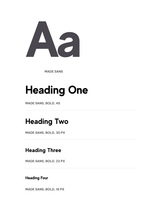
Our team was instrumental in not only creating their website, but also many elements of the brand itself. We did our research into the market, comparable brands, similar websites and influencers in the industry. This research helped us to shape many of the visual elements used on the site today. We chose colors that are saturated, deep and jewel toned to evoke an “elevated” feel. We also chose fonts that are clear, sharp and bold to grab the user’s attention.
What made this process even more enjoyable and rewarding was the fact that a few of our team members are outdoor enthusiasts themselves. We were especially excited to help bring something new to the table based on things that we’d want to see. This passion fueled our efforts and gave us a deeper connection to the product itself.
Brand Colors
Typography
A Large Focus On Lifestyle
When creating an eCommerce website, it’s important to include lifestyle photography. This can be presented in a multitude of ways but the main goal is to showcase actual people in your images. This helps to create a human connection with the user and better allows them to visualize themself using your product or service.
Bold Statements & Imagery
On the homepage you’ll find high contrast photography and powerful headlines that command your attention and lead you deeper into the site. We also made sure to include images of outdoor enthusiasts wearing Paramount’s gear so that the user could better connect to the product.
Clever Animations
These lightweight and quick zoom animations on rollover enhance the desktop experience. While designing these elements, our team drew inspiration from the logo to help reinforce the brand and catch the users attention while navigating the homepage.
Mobile Magic
The key to an effective eCommerce website is to build a great mobile experience. Our team worked to build this experience by adding clear CTA’s and simple in-page navigation features to help guide the user effortlessly through the site.
Outdoor Influencers
When establishing a brand against long established competitors, it’s important to differentiate and help your audience understand your experience and legitimacy in the industry. The Paramount Outdoors team partnered early on with key players in the outdoors space to help get the right talent in the gear. Our job was to feature these prominently and let the images tell the story.
Photography
We worked closely with the Paramount team, providing input on the types of photos that we thought would resonate well with their audience and bring the site to life. We wanted a new user coming to the site to immediately understand that Paramout’s goal is not to showcase a bunch of pretty pictures but rather to visually represent the durability and performance level of their gear.
Shopping Experience
All the eCommerce goodies were leveraged in order to help this site perform, especially WordPress and WooCommerce. WordPress is our go-to platform for website creation due to it’s customizability and user-friendly CMS. We also leverage WooCommerce for showcasing products due to its ease of use, integration options and SEO benefits. Both of these tools combined makes for a seamless buying experience for website users.
Contact Matchbox Design Group Today!
If your website could use a refresh or you’re looking to drive more traffic to your site, fill out the form below and we’ll contact you to learn more about your digital needs.