Mapping A New Identity
Taxography, based in St. Louis, MO, specializes in property tax compliance solutions, providing businesses with comprehensive jurisdiction data, mapping tools, and address standardization services. This case study is for Taxography Branding.
When they approached us, they were ready to update their brand to better reflect their expertise and modernize their digital presence. Our work focused on updating their logo, color palette, fonts, and imagery to create a modern, cohesive brand identity that reflects their service offerings and expertise.
Starting From Scratch
The original Taxography logo, created in the company’s early days, no longer aligned with their identity as a well-established and growing business. Ready for a fresh start, the Taxography team sought an entirely new direction, open to innovative ideas and eager to leave the old design behind.
In our brand exploration, we focused on creating a visual identity that reflected Taxography’s new identity while maintaining a sense of trust. We explored modern typography, fresh color palettes, and imagery inspired by data, mapping, and infrastructure. This process allowed us to present multiple directions that emphasized their core values: accuracy, efficiency, and reliability.
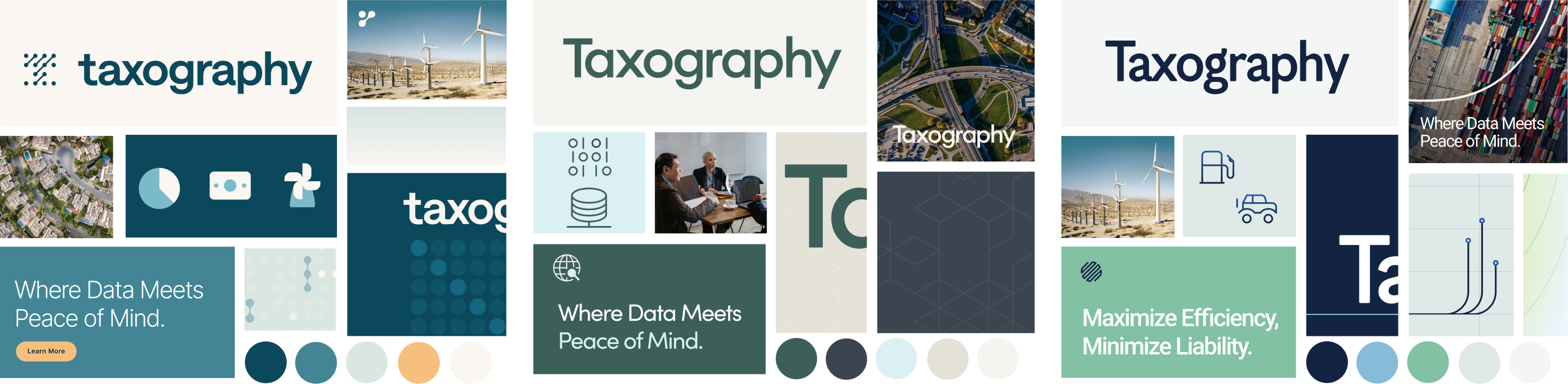
SOME OF OUR INITIAL BRAND EXPLORATION
Fostering Stronger Connections
We began by analyzing competitors to identify opportunities for Taxography to stand out in the market. Through an extensive exploration of fonts and color palettes, distinct design directions began to take shape. Building on these insights, we created a new logo, color palette, typography and image styles.

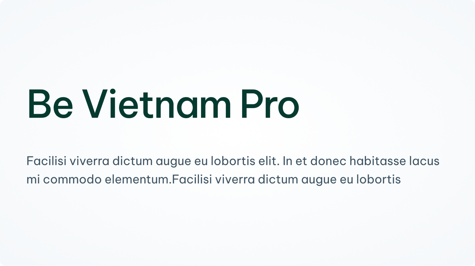
We chose Be Vietnam Pro as the brand font, because of
it’s curved geometric shapes and friendly appearance.
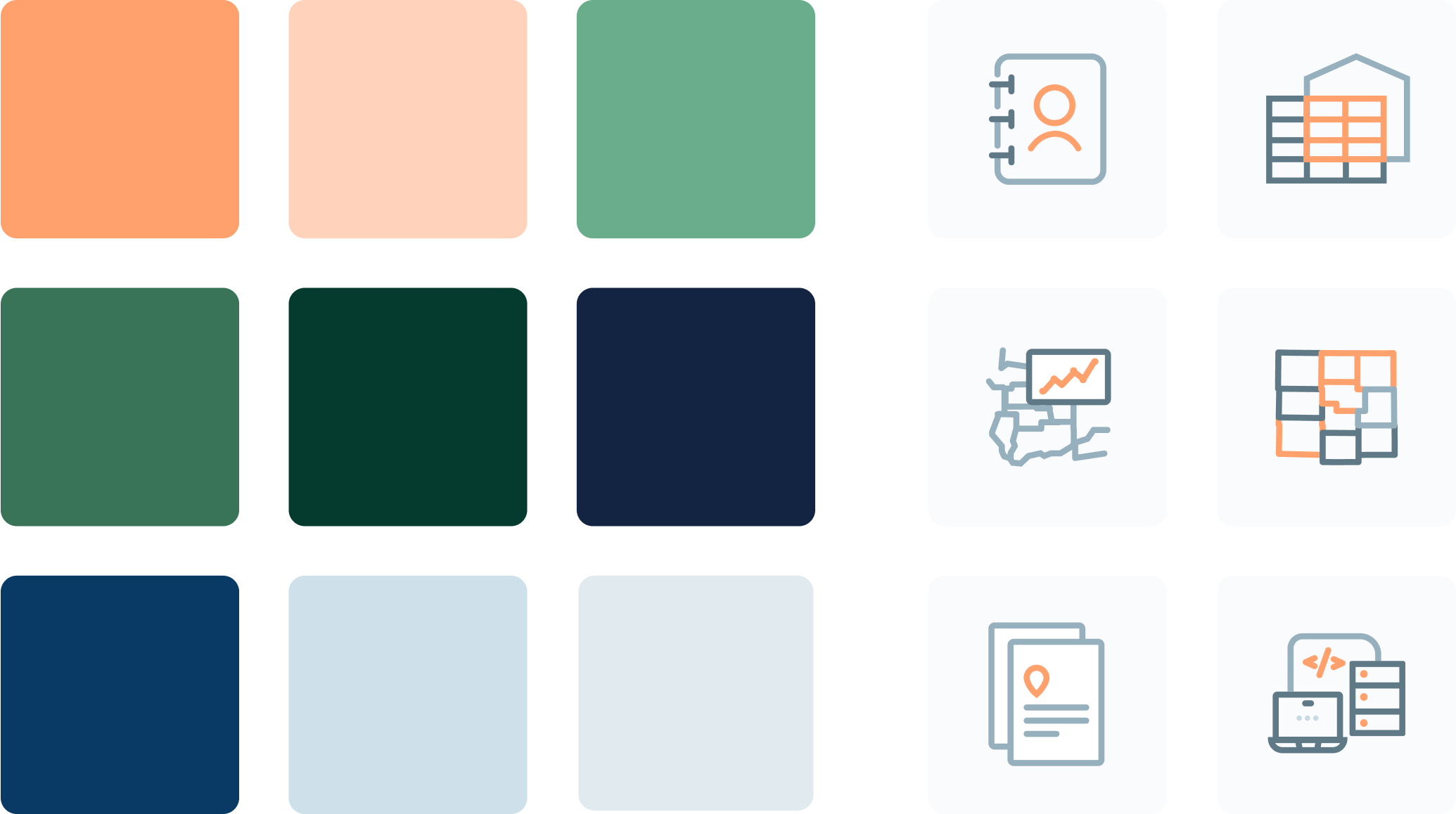
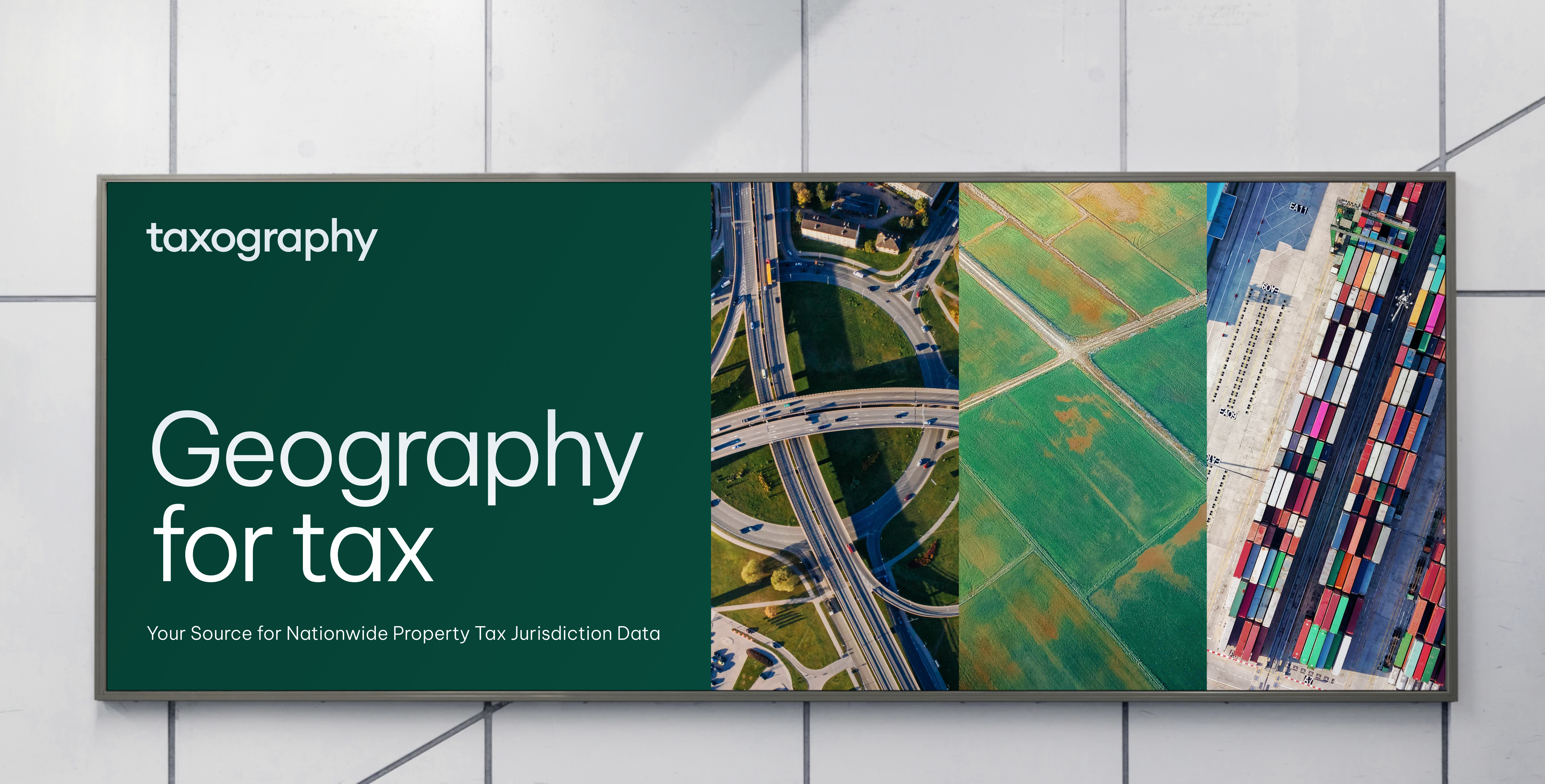
The blues and greens in the color palette align with colors commonly associated with geography, and the bright pop of orange lends some contrast. We also created custom icons to represent their tax solutions.
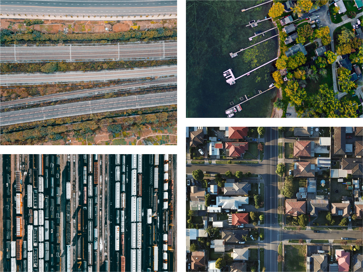
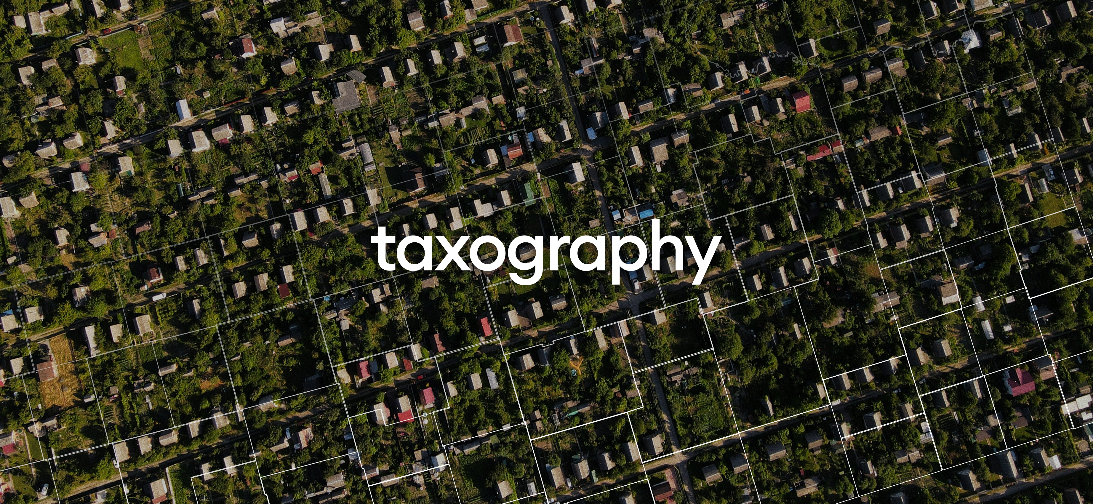
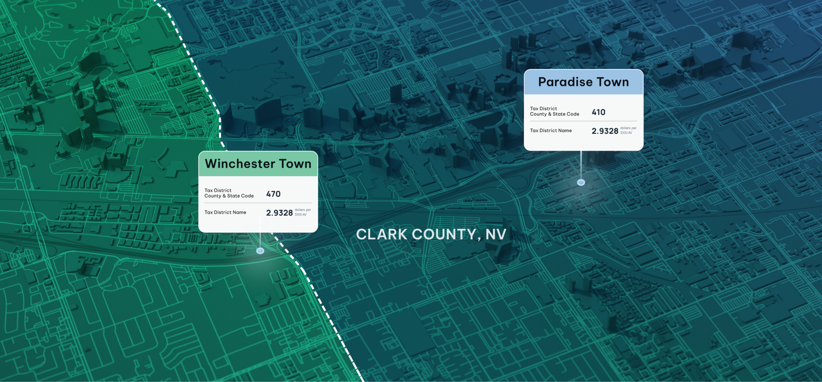
We chose aerial imagery of geography to represent Taxography’s focus on jurisdictional data and mapping. These visuals highlight naturally occurring geometric patterns found in roads, neighborhoods, waterways, and rail systems, creating a sense of order and precision that aligns with Taxography’s services.
The elevated perspective reinforces their role in providing clarity and structure to complex property tax data, while the balance of natural and built environments reflects their expertise in mapping across diverse landscapes.

The Technology
The final portion of the visual identity was designing the website: How was the Taxography team going to convey the product itself? Using screenshots of the UI itself was too obvious and lacking the quick-read it needed.
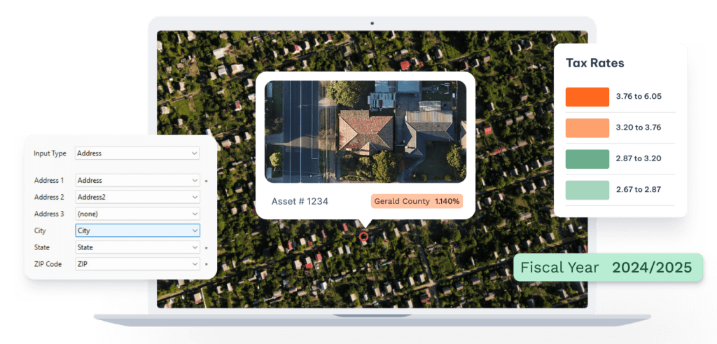
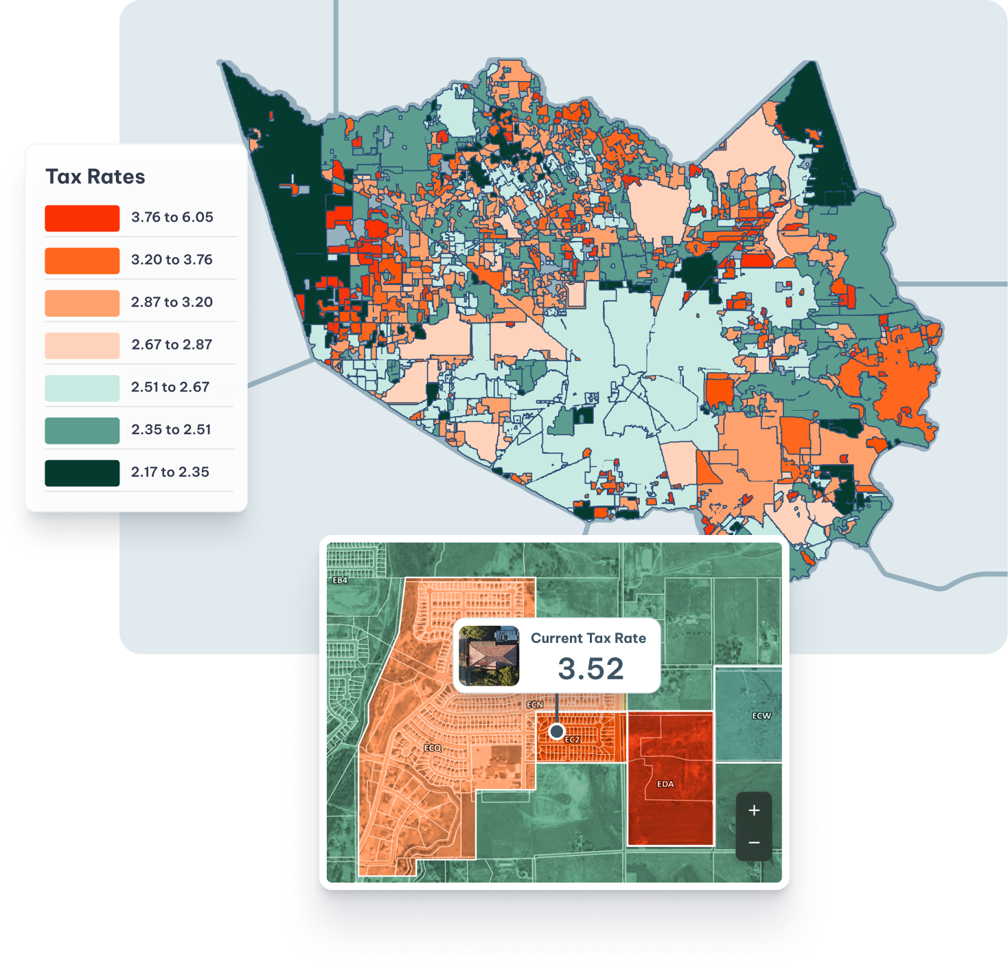
Taxography helps companies, particularly in sectors like utilities and telecom, assign assets to the correct tax jurisdictions and rates efficiently. Since this is such a large undertaking for a company, it was important to show that using their tools would improve workflow and data integrity, while reducing costs and risk. We started by pulling out vignettes of the UI to help explain the many different functions of the software in one image. The result was a compact layered view of the functions, using an example asset.
Contact Matchbox Design Group Today!
If your website could use a refresh, if you’re looking to drive more traffic to your site, or you would like to submit a guest post, fill out the form below and we’ll contact you to learn more about your digital needs.