The past month has seen a spike in eCommerce popularity. In fact, 36% of consumers shop online every week since COVID-19 happened. This is why eCommerce Checkout page optimization is so important to sales.
Nonetheless, buyers would opt to abandon their cart for various reasons. Luckily, there is something you can do to salvage those abandoned carts.
One of them is checkout page optimization.
What Makes An Excellent Checkout Page?

There is no denying that designing a checkout page is meant to reduce cart abandonment. After all, its purpose is to provide a streamlined transaction for your customers.
What makes a checkout page excellent?
Uses Minimal Steps
As mentioned earlier, a checkout page is designed to provide a streamlined transaction. And you can achieve that by requiring as few steps as possible.
One way to do that is by letting buyers checkout as guests.
Fewer Form Fields
In line with having fewer steps, an excellent checkout page also uses fewer form fields.
This means you should only ask for the necessary information. For instance, complete name, contact details, and delivery address.
Too many form fields will not only turn off your buyers. It can also creep them out if you ask irrelevant questions.
Mobile-Friendly
In the United States alone, 82% of Internet users used their mobile devices to shop online. Hence, it is essential to ensure that your checkout page is mobile-friendly.
However, being mobile-friendly is more than just having a responsive website. It also means that your form fields and buttons should adjust with the screen accordingly.
Encourage Various Payment Options

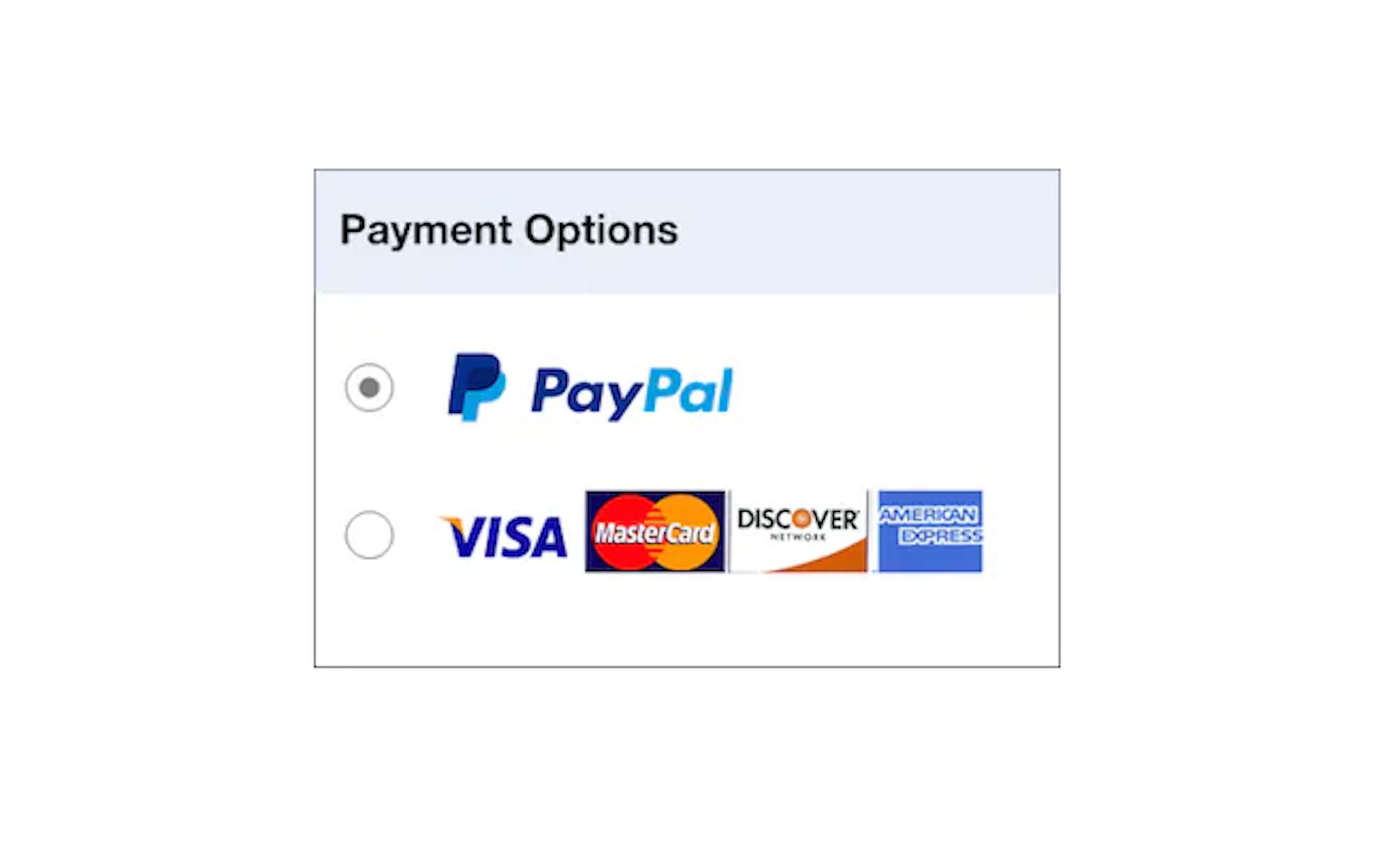
Here’s the thing: Not everyone has a credit card, but anyone can shop online. That’s why you must offer various payment options, especially if you cater to global consumers.
Mind you, in some parts of Asia, the preferred mode of payment is through mobile payment channels and online banking.
Implements Upselling And Cross-selling
Just because your customer is ready to pay does not mean you can no longer promote your products. Upselling and cross-selling during checkout is a great way to jump on your customers’ impulsiveness. So, you might as well leverage the checkout page to boost your average order value.
How To Optimize Your Checkout Page
Now that you know what an excellent checkout page looks like, it is time to discover ways to optimize it.
Offer A One-Page Checkout
This might be one of the most crucial checkout optimization tips that you need to know. That’s because a one-page checkout could mean that it has all the characteristics stated above.
- Minimal steps.
- Fewer form fields.
- Mobile-friendliness.
- Allows various payment options.
- Promotes upselling and cross-selling.
Regardless, a one-page checkout is designed for simplicity. And simplifying things is the first step to optimizing a page.
For one, it makes the payment process straightforward. And because a customer does not need to undergo multiple steps, it helps reduce your cart abandonment rate.
Add A Progress Bar
If you cannot opt for a one-page checkout, at the very least, consider having a progress bar.
The role of this element is straightforward: It lets customers know where they are in the process. And this gives them a sense of excitement when they know how many stages are left for them to complete.
But just because you have a progress bar does not mean you will need a 10-page checkout. It will turn off your customers when you do that.
A 5-page checkout would be plenty. So, do your best to have a straightforward process.
Don’t Surprise Users
Do you know the number one reason buyers abandon their online cart? It’s because of expensive extra costs, like shipping fees and taxes.
If you want to optimize your checkout page, it would be best to provide as much information as possible. This means you should indicate the added costs early in the checkout process.
That way, customers can manage their expectations and budget.
Add Customer Reviews

Your product description and UX design can only do so much. Hence, you will need something more to push sales.
One way to do that is to add at least one customer review on the product.
Mind you; Bright Local revealed that 91% of people read online reviews. Moreover, 84% of them trust online reviews as much as personal recommendations.
Hence, displaying customer reviews can give your buyer a boost of confidence before proceeding. And this might be the last thing they need to click the buy button.
Enable Checkout Buttons
It is understandable to think that showing the checkout buttons once everything is done makes sense. But have you ever thought of enabling the buttons every step of the way?
This can help expedite the checkout process, especially if the customer intends to purchase a single item. You can even level up your game by adding a specific CTA button.
So, instead of having a single button that says “Checkout,” you can add another two. One for “PayPal Checkout” and another for “VISA Checkout,” for example.
Moreover, enable this feature for existing members of your eCommerce site. Doing so allows them to save time when buying something.
Add An Auto-Save Feature
Cart abandonment does not always mean that your customers were turned off with your checkout page. It is possible that someone or something interrupted their online shopping.
In this case, it would be best if your checkout page has an auto-save feature. Doing so could come in handy when trying to recover those cart abandonments.
Plus, you will be surprised at how customers who opted to save their shopping list are willing to return and proceed with the purchase.
Test, Measure, Adjust
Just because your online store is up and running does not mean it is the end of it. You need to keep on measuring and making adjustments.
That way, you will know how you can maximize every site visit and turn them into sales.
But what do you need to test, measure, and adjust? There are various elements on the checkout page that you can work on.
This includes the call-to-action buttons and form fields.
Checkout Optimization Means Better Sales
Here’s the thing: There is no one-size-fits-all approach when it comes to eCommerce fulfillment. That’s because your experience will depend on two things:
- The nature of your business.
- Your customers’ consumer behavior.
Regardless, eCommerce checkout page optimization is integral in boosting your revenue. Plus, it can help reduce your cart abandonment rate.
About The Author
Jake Rheude is the Director of Marketing for Red Stag Fulfillment, an eCommerce fulfillment warehouse that was born out of eCommerce. He has years of experience in eCommerce and business development. In his free time, Jake enjoys reading about business and sharing his own experience with others.
Share at:ChatGPTPerplexityGrokGoogle AI
