We’re all visual creatures, affecting our daily lives no less than our purchasing decisions. As 2022 draws to a close, web design ideas continue to steer in that direction; first impressions matter. Customers are looking for visually captivating, sleek designs no less than user-friendly pages and convenient simplicity. A good product page design can help with
Perhaps unsurprisingly, the same applies to product pages specifically. If anything, inherent eCommerce challenges like high cart abandonment rates necessitate even more attention to detail.
To help inform your decisions, let us discuss some of the biggest Dos and Don’ts of product page design.
The Biggest Dos Of Product Page Design
When we start discussing the biggest Dos and Don’ts of product page design, first, come to the Dos. Those fundamental qualities and best practices inspire confidence, build trust, and help drive conversions.
Bonus Tip: A product photo shoot is one of the most important parts of a product page.
In no particular order, consider the following four.
#1 Add And Display Product Reviews
First, the importance of online reviews for your business cannot be overstated. Reviews serve as excellent social proof that, in the case of products, reassure potential buyers of their choices. Choosing to display them also denotes professionalism and confidence, helping foster further trust. Even negative reviews can present opportunities to enhance your image, as most review readers read them too:
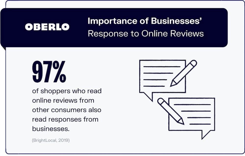
As such, choosing to display customer feedback can only be a net positive. Thankfully, that’s relatively easy to do on WordPress sites. Its plugin library offers a handful of product review plugins for WP you can consider, including
- WP Review
- WP Customer Reviews
- All In One SEO (AIO SEO)
#2 Add Multiple High-Quality Product Pictures
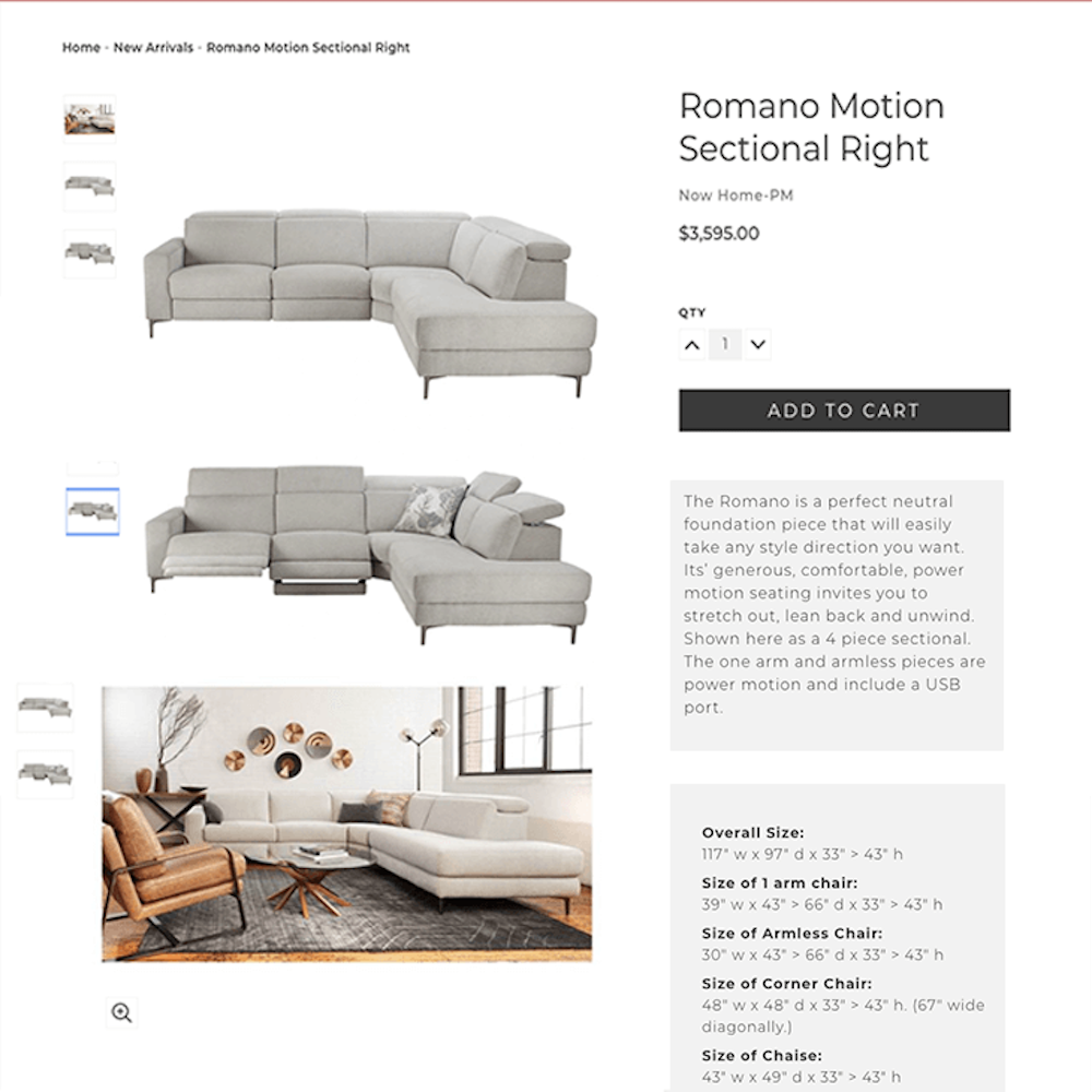
Second, the value of high-quality product pictures should be self-evident too. Customers will likely focus there first unless they are somehow distracted by other page elements. For instance, how the product looks will immediately shape their first impression and deeply inform their final decision. As such, your pages should leverage pictures to best highlight your products’ value and build trust.
On Picture Variety, Consider Covering The Following:
- Different angles for better visualization
- The various product uses, if applicable
- Color choices, if applicable
As you do, however, remember to balance quality with page performance. That’s one of the biggest Dos of product page design, as we’ll cover in the next section.
#3 Feature Your CTAs Prominently And Keep Them Clear
Third, your Call To Action buttons (CTAs) are your literal calls to action. To convert, they must be immediately visible and alluring – which you can achieve with proper CTA design and placement.
In Regards To CTA Design, Consider The Following Qualities:
- Immediate visibility; examine your CTAs in color, shape, and more. They should always be visible, contrasting with background colors and appearing clickable.
- Readability; ensure your color choices leave your copy readable and clear. Your choice of fonts is equally essential in ensuring this quality.
- Simplicity; keep your CTA copy simple and to the point. For product pages, you’ll often only need traditional “add to cart” and “buy now” types.
As regards placement, it’s generally advisable to keep your CTAs above the fold; the quicker customers see them, the better. However, you can also consider Joshua Turk’s suggestion on offer complexity, having it inform the final placement:
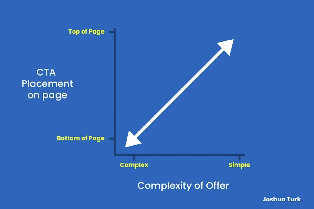
In both cases, A/B tests should best inform your decisions. These are not clear-cut matters with simple, universal solutions, after all.
Take A Look At Our Home Services Marketing
#4 Keep Your Pages Clean – And Your Checkout Process Short
Fourth, as highlighted above, your product pages must always remain clean, leading to equally clean checkout pages. That is among the biggest Dos of product page design, as customers increasingly seek quick, clear shopping experiences with as little friction.
On-Page Cleanliness, Consider Such Elements As:
- Visual clutter; any visuals that don’t directly relate to your product or the purchasing process can distract more than help. Avoid these web design mistakes at all costs, from ads to unrelated images.
- An abundance of product options; product options are by all means practical but remember not to overwhelm your customers. Choice fatigue is a genuine phenomenon, after all.
- Multiple CTAs; the mantra of “one page, one CTA” helps ensure your customers know where to focus their attention. You may make case-by-case exceptions, but minimizing CTAs typically helps.
As you simplify your product pages, you may also consider simplifying your checkout process. How you do so will strictly depend on your process and store, but there are many reasons for this practice. If you do so, consider the following:
- Presenting final costs as early as possible
- Allowing for purchases without an account
- Minimizing the steps to checkout
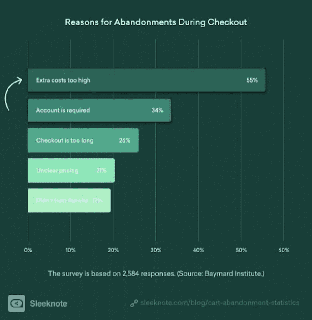
In order these are the three main reasons for cart abandonment:
The Biggest Don’ts Of Product Page Design
Next, outlined more briefly, are the Don’ts. Those pitfalls you may best avoid and not hamper your website or discourage customers from converting.
In no particular order but in equal measure, note and avoid the four that follow.
#1 Don’t Slow Down Your Page
First, remember that page speed matters immensely. Before converting your visitors, your pages must entice them to stay – and loading speeds are a determining factor. Google/SOASTA research confirms this in no uncertain terms:

As such, prioritize usability before all else. Remove all visual clutter, as outlined above, and cull heavy themes and plugins that might slow your pages down. Examine your product pictures, and consider what acceptable compromises in the quality you can make to enable faster loading.
For a detailed guide on this step, you can also consult our article on page speed optimization.
#2 Don’t Duplicate Product Descriptions – Or Use The Manufacturers’
Second, pay due attention to product descriptions. As regards Search Engine Optimization (SEO), duplicate product descriptions may hurt your pages’ rankings. And as regards your customers, they will notice and have their trust diminish in turn.
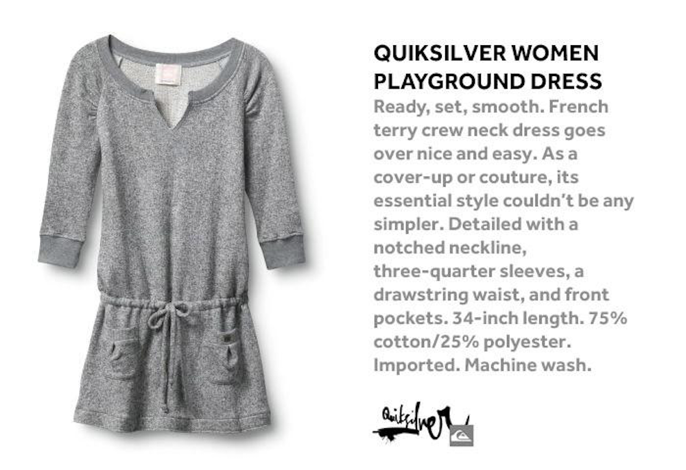
That may not be one of the biggest Don’ts of product page design in terms of impact, but it is widespread and often overlooked. To please search engines and customers alike, steer clear of copy-pasted descriptions or ones provided by manufacturers. Instead, use unique, vivid, and descriptive product descriptions, like the following:
You may read our guide to writing better product descriptions for more information.
#3 Don’t Use Social Sharing Buttons On Product Pages
Third, you mustn’t let negative social proof sabotage your product pages. It’s often a common practice to add social media sharing buttons to product pages, but this can easily backfire. VWO provides a fitting example where removing such buttons yielded an 11.9% increase in CTA click-throughs for Taloon:
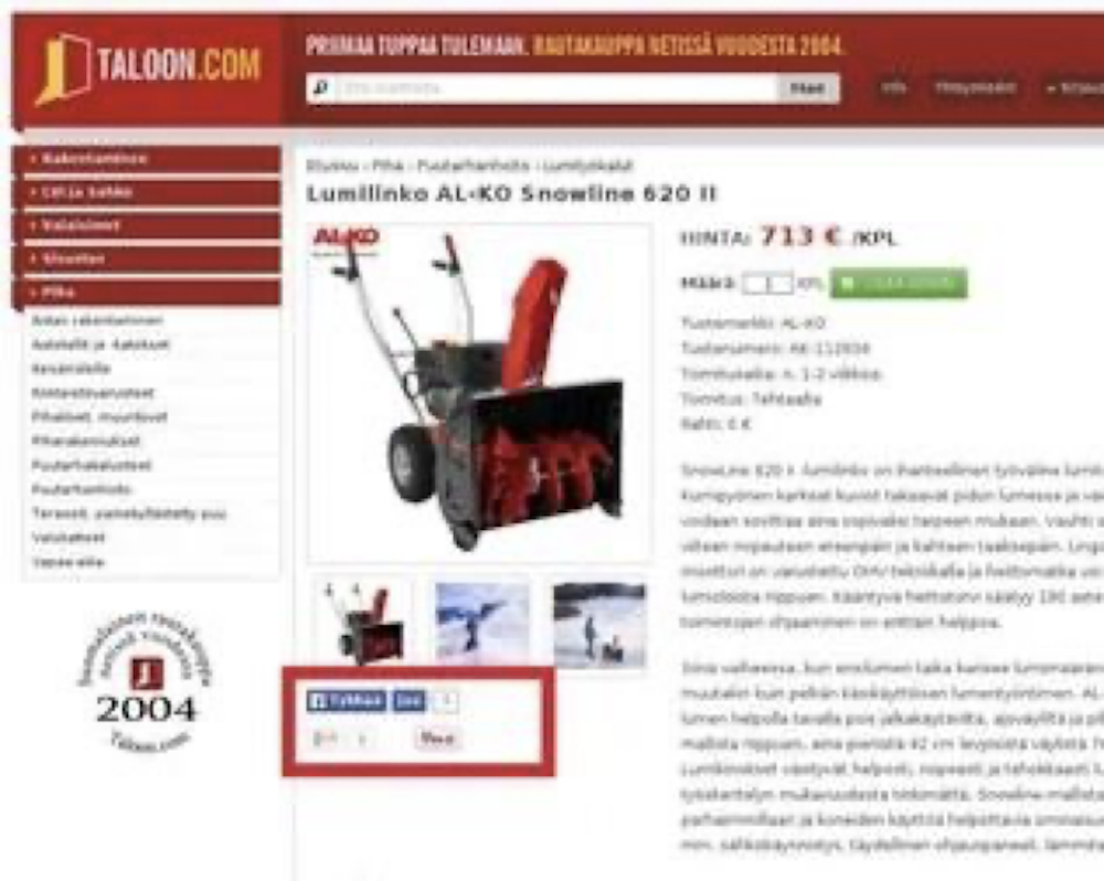
That was due to negative social proof, as “the number of shares on most of Taloon’s product pages was zero.” In addition, they note, “those share buttons were just extra clutter” that distracted customers from the pages’ CTAs.
Of course, you’re A/B testing may suggest otherwise. But typically, this is a practice best avoided.
#4 Don’t Suggest Unrelated Products
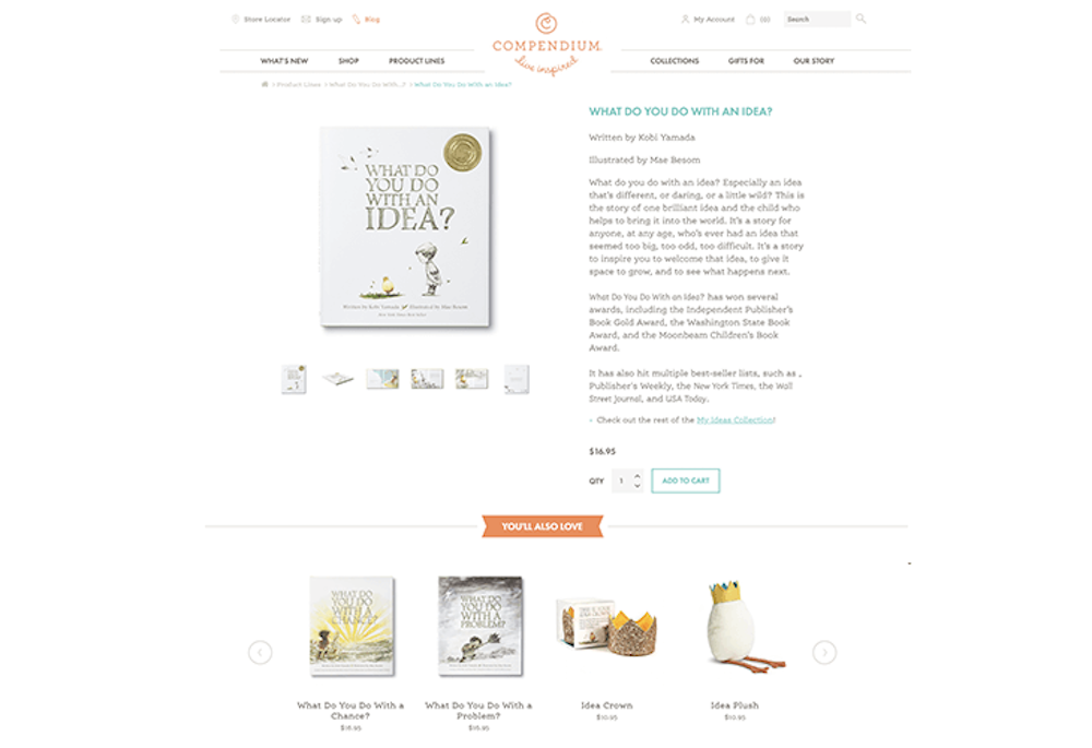
Finally, remember that each product page is a step along the customer journey. As we’ve covered before, building a customized sales funnel is key to success. Therefore, it is vital that your product recommendations remain relevant to your customers’ needs and purchasing goals. One of the biggest Don’ts of product page design is neglecting this and suggesting unrelated products.
How you design product recommendations is somewhat subjective but should typically boil down to historical customer data. Examine which products generally are bought together and which products individual repeat customers care most for, and adjust recommendations accordingly.
In Closing
To summarize, the biggest Dos and Don’ts of product page design can be consolidated into two categories.
The Dos consist of practices that enhance transparency, build trust, reduce friction, and keep pages user-friendly and search engine-friendly. Beyond visual appeal and style, they focus on encouraging conversions and creating a pleasant User Experience (UX).
The don’ts consist of errors toward these same goals; reducing trust, cluttering and slowing down pages, and failing to facilitate better customer journeys. These pitfalls can reduce lead generation by lowering SEO scores, diminishing customer trust, and conversion rates, or lowering the final possible revenue.
While brief, we hope this article helped you embrace and avoid the latter, letting your pages thrive.
Image Citations
- https://www.pexels.com/photo/brown-cardboard-box-on-stainless-steel-shopping-cart-6214474/
- https://www.oberlo.com/media/1628072939-online-review-
- statistics8.png?fm=webp&w=1824&fit=max
- https://www.seattlewebdesign.com/uploads/images/kasalablog1.png
- https://joshuaturk.com/wp-content/uploads/2019/07/cta-placement.jpg
- https://n7nqziuw1z4b1r6k2adhav10-wpengine.netdna-ssl.com/wp-content/uploads/2021/03/Reasons-
- for-Abandonments-During-Checkout.jpg
- https://storage.googleapis.com/twg-content/images/mobile-page-speed-new-industry-benchmarks-01-
- 2.width-800.png
- https://d2hhgs6eoqpuyl.cloudfront.net/uploads/blog_image/file/124/how-to-write-product-
- descriptions-for-your-store-5.jpg
- https://static.wingify.com/gcp/tr:h-0.5,w-0.5,c-at_max/uploads/2019/01/1Original1.jpg
- https://www.seattlewebdesign.com/uploads/images/compendiumblog.png
Contact Matchbox Design Group Today!
If your website could use a refresh, if you’re looking to drive more traffic to your site, or you would like to submit a guest post, fill out the form below and we’ll contact you to learn more about your digital needs.


