Closing loans for 66 years and counting
Gershman Mortgage has been an ongoing client with us for many years so when they reached out wanting to finally rebuild their main website we were excited to not only design a better user experience but also make updates to the backend of Word Press in order for them to easily update content in the future.
First Impressions Are Everything
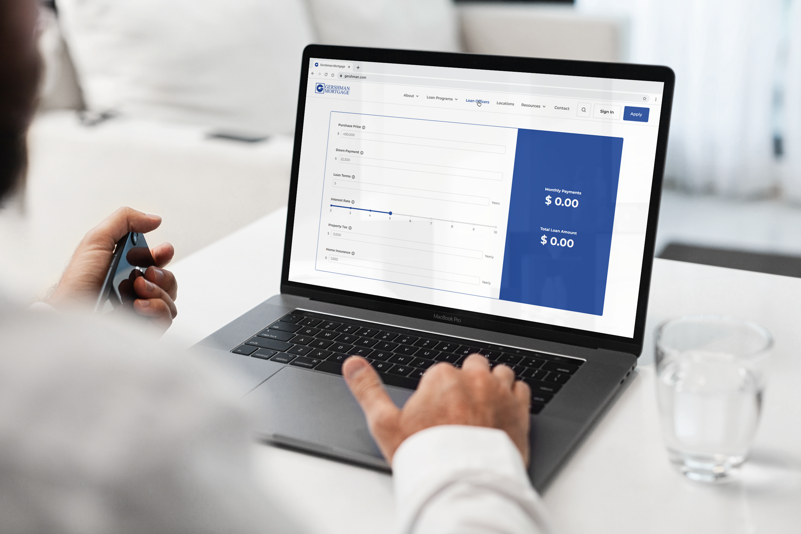
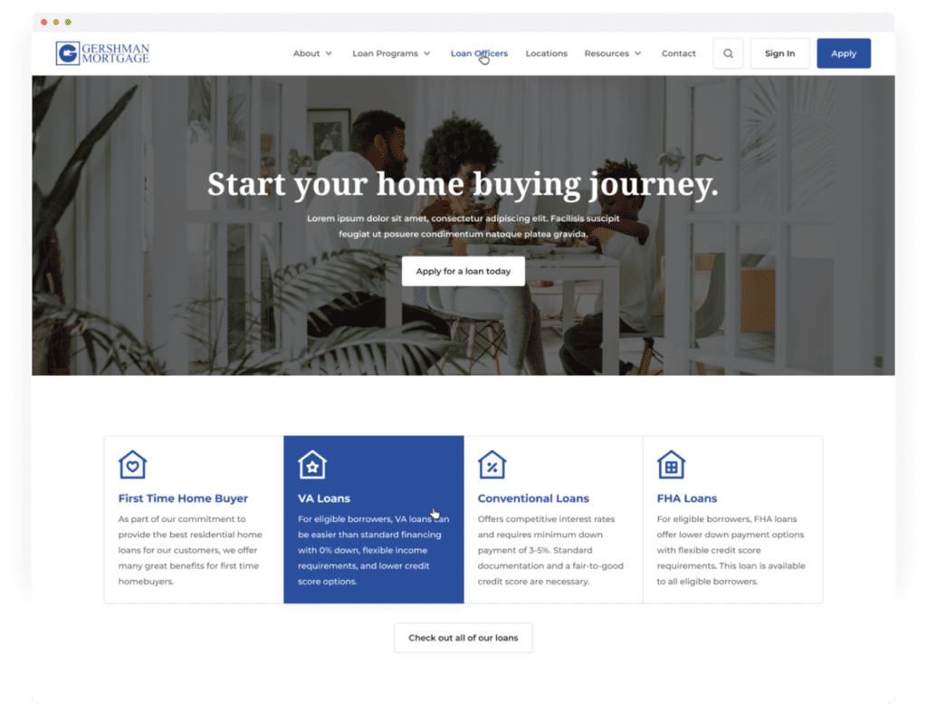
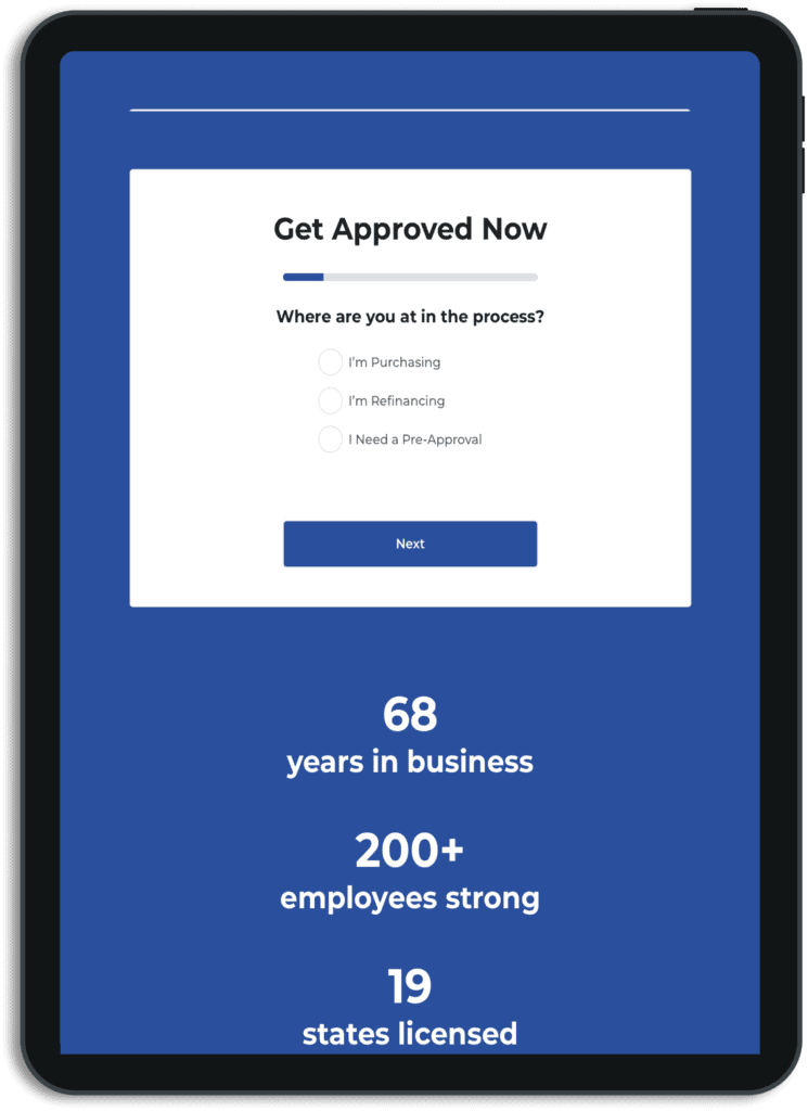
After looking at analytics and talking to the Gershman team, the main goal was to send potential customers to apply for the loan. This was reinforced by not only adding a call to action button under the page headline, but adding a more prominent apply button in the navigation bar.
The secondary goal was to drive users to loan pages so they can quickly find the loan perfect for them, leading to more potential applications. When the user lands on the homepage, even above the fold, they are given a glimpse of Gershman’s popular loans. They can click on the button below the featured loans to see all loans that are offered.
Randomized Loan Officers
Once a person decides what loan they would like to apply for, they are able to choose a loan officer to work with. The problem on the previous website was that loan officers were categorized by alphabetical order. This meant that those with an “A” as the first letter in their first name would always be shown at the top of the page. This led to some of the other loan officers having fewer clients than those who would appear at the top.
To solve this, any first time users coming to the site would have a randomized list of the loan officers presented to them. This gave more opportunity to those who were usually at the bottom of the page, the chance to take on more clients.

Mobile Friendly
Before we started the redesign, the Gershman team had mentioned that on mobile devices, they had issues with image sizing, spacing issues and an overall bad experience. On all projects we follow guidelines for responsive design so whether a user was using a computer, a tablet or a phone, their experience would be optimized for that device.
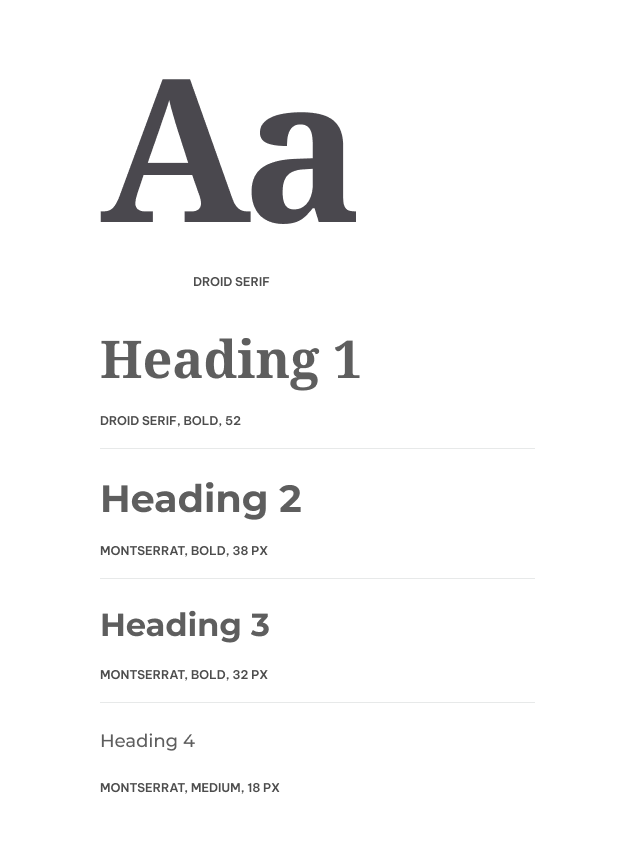
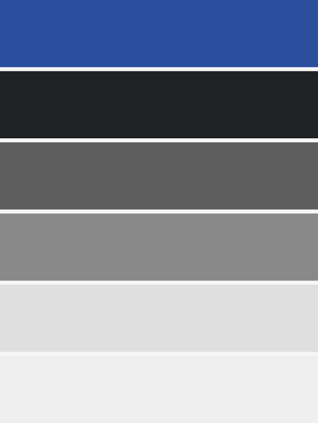
Colors & Typography
The Gershman Blue is iconic for their brand so we wanted to make it the stand out even more by complimenting it with Grayscale colors. Their team had made comments that their current font made the brand feel outdated so we chose Montserrat as their main font and Droid Serif as their page heading to bring the professionalism of Gershman Mortgage into the site.
Let’s Start the Conversation
Want to get more out of your marketing or just talk through some ideas? We’d love to hear from you. Fill out the form and we’ll be in touch soon.