
Estimated reading time: 16 minutes
Almost every website we build has motion in it and very little of it is there to look impressive. A button that shifts color when you hover it, a menu that slides instead of snapping, a confirmation that fades in after you submit a form; those are website animations, and most people never consciously notice them. Hint: that’s usually a sign that they’re working!
The animations people do notice are the ones causing problems. The hero slider that changes on its own before you finish reading it, the scrolling logo ticker that never stops, or the page where six cards fade up one after another and you sit there waiting for the content to arrive. And for a meaningful slice of your audience, the issue goes past annoyance into a physical reaction. Motion on a screen can trigger nausea, dizziness, and migraines the same way a car ride can.
Related Links
So let’s talk about the line between the two. In this blog we’ll dive into what separates an animation that helps someone use your site from one that gets in their way, which accessibility guidelines should you be following, and how this all plays out on a WordPress site.
TL;DR: Animation earns its place when it does a job: orienting the user, confirming an action, or connecting one state to the next. It becomes a problem when it is purely decorative, can’t be skipped, or ignores that some users get physically ill from on-screen motion. WCAG has hard requirements here, and most of the gap closes with one CSS media query plus a few decisions made before a designer ever opens Figma. Good motion is short, purposeful, and optional.
Website Animation Basics
Under the hood, motion gets onto a web page in one of three ways. You don’t need to write any of this code to make good decisions about it, but knowing which is which explains a lot about why some animated sites feel smooth and others feel broken.
- CSS transitions. You define a start state and an end state, and the browser fills in the middle. A button that goes from dark blue to light blue over 200 milliseconds when you hover it. This is the cheapest and most common kind of animation on the web.
- CSS keyframe animations. You define the frames yourself and the browser plays them, often on a loop. Scrolling logo marquees, loading spinners, and pulsing badges are keyframe animations.
- JavaScript-driven animation. Either a library like GSAP or Motion, or the browser’s Intersection Observer API, which watches for an element scrolling into view and then triggers the effect. Nearly every “fade up as you scroll” effect on the internet works this way.
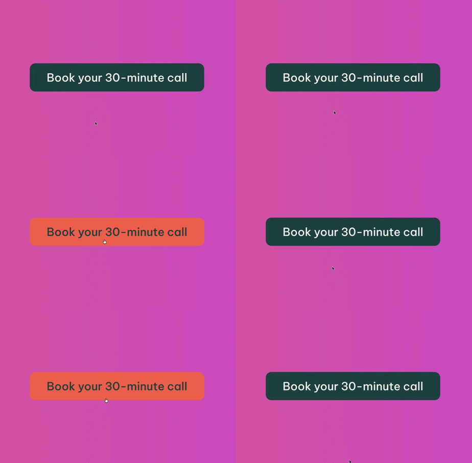
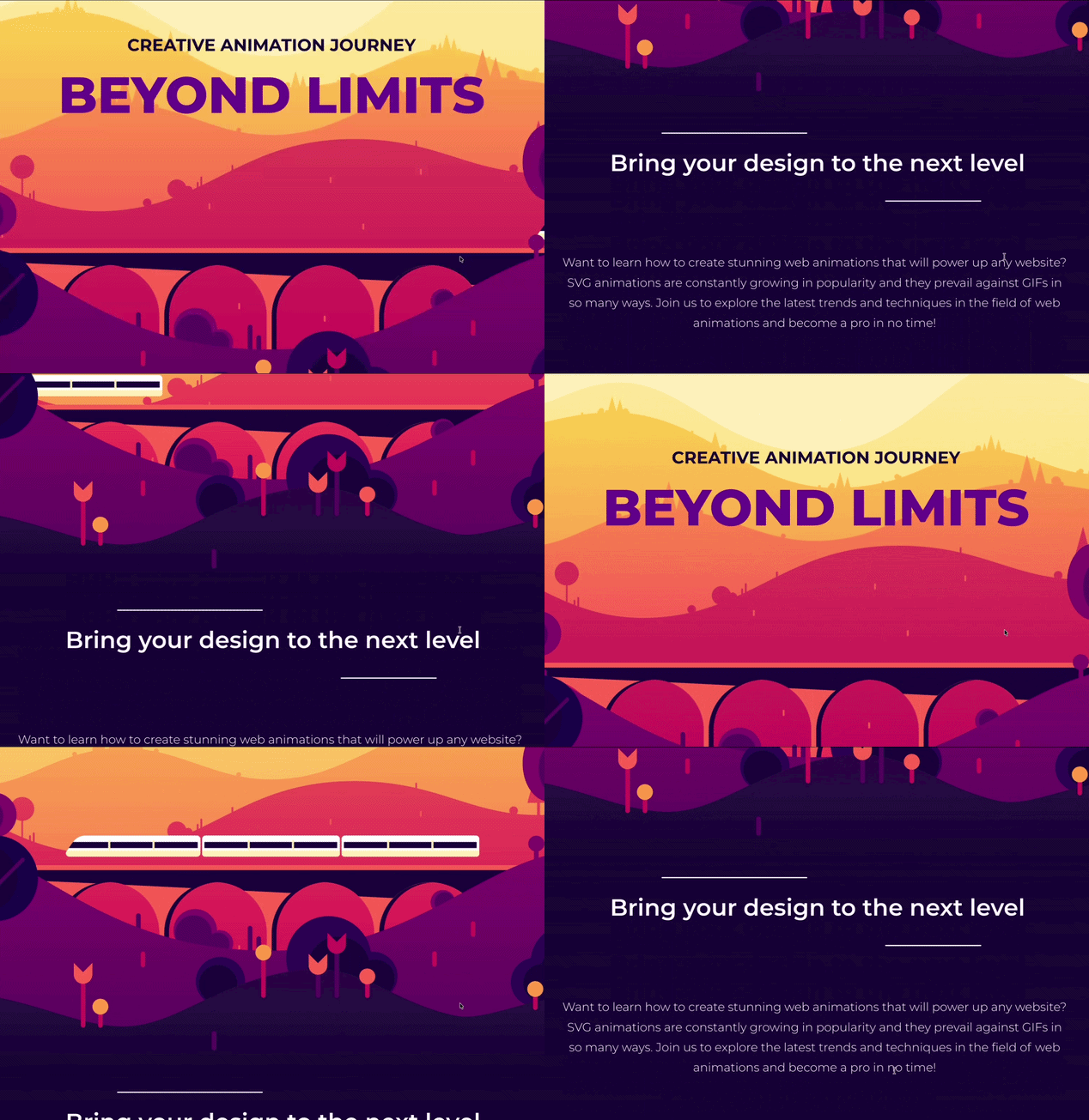
There is a performance flaw worth noting, because it is the single most common cause of animation that looks cheap. Browsers can animate two properties, transform and opacity, on the GPU without recalculating the page layout.
Animating anything else, height, width, top, margin, forces the browser to recompute the layout on every single frame. On a fast desktop you may never see the difference, but on a mid-range Android phone it visibly stutters. So when someone says an animation feels “janky,” this is usually the reason why.
Four Jobs Good Animation Does Well
The most useful filter we apply is simple: what job is this motion doing? There are basically four good answers.
- Orientation. Showing where something came from and where it went. A modal that scales up from the button you clicked tells you the two are related. A menu that slides in from the right tells you it is still there, just off-screen.
- Feedback. Confirming that something happened. The button state on press, the field that validates as you type, the cart icon that ticks up. Without this, users click twice because they aren’t sure the first one registered.
- Hierarchy. Directing attention deliberately, once. One animated element in the viewport can guide the eye to the primary action. Five animated elements cancel each other out.
- Continuity. Keeping context across a state change, so a filtered product grid feels like the same grid rearranging rather than a completely new page.
If an animation isn’t doing one of those four things, it is decoration. Decoration isn’t automatically bad, brand personality is a common business goal, but it has to pay rent. Decorative motion that costs load time, delays content, or makes someone feel sick is not worth the cost.
Timing Is Where Most Animations Go Wrong
Most animations that feel wrong are the right idea running at the wrong speed.
- Under 100ms reads as instantaneous. Fine for small state changes.
- 200 to 300ms is the sweet spot for most interface motion: hovers, dropdowns, button states, tooltips.
- 300 to 500ms suits larger elements traveling further, like a full-width panel sliding in.
- Over 500ms starts to feel sluggish. Past a second, people assume something is broken and click again.
The bigger culprit is delay. Staggered scroll reveals are the classic example: six cards, each set to appear 200ms after the last, means the final card shows up 1.2 seconds after you scroll to it. The designer saw it once in a mockup and it looked elegant, but the user is just waiting for the final option to show up. Every second your users wait is an opportunity for you to lose a customer, so the goal is to to keep these wait times as low as possible.
Where Animation Can Turn Into an Accessibility Barrier
Motion is not a neutral design choice; for some users it is a barrier, and for some organizations it is a compliance requirement. The DOJ’s ADA Title II rule sets WCAG 2.1 Level AA as the standard for state and local government sites, and in April 2026 the compliance deadlines were pushed out one year, to April 26, 2027 for entities serving populations over 50,000 and April 26, 2028 for smaller ones. If you serve a public-sector client, a school district, or a healthcare organization, motion is now on an audit checklist.
Here is what actually causes problems.
1. Motion Sensitivity Is a Medical Condition, Not a Preference
People with vestibular disorders, and a broader group prone to migraine or motion sickness, can experience real nausea, dizziness, and disorientation from on-screen movement. Parallax scrolling is the worst offender because it moves multiple layers at different speeds, which is exactly the visual signal that triggers the response. Large zooms and full-viewport movement do it too. This is not someone being fussy about your homepage; it is a physiological reaction to a design decision.
2. Anything That Moves on Its Own for More Than Five Seconds Needs a Control
This is WCAG Success Criterion 2.2.2, Pause, Stop, Hide, and it is Level A, the most basic tier of compliance. The text is claer: “For any moving, blinking or scrolling information that (1) starts automatically, (2) lasts more than five seconds, and (3) is presented in parallel with other content, there is a mechanism for the user to pause, stop, or hide it.” [W3C – Pause, Stop, Hide]
Auto-advancing hero sliders, scrolling logo marquees, animated stat tickers, and news crawls all land squarely in this criterion. A trap I have seen in a lot of component libraries is pausing on hover, which does not satisfy it. Hover doesn’t exist for keyboard-only users or on touch devices. If the only way to stop the motion is to put a mouse on it, a large group of people simply cannot stop it. You need a real control or a visible button that is reachable by keyboard.
3. Flashing Content Is a Seizure Risk
WCAG 2.3.1, Three Flashes or Below Threshold, also Level A, exists because rapidly flashing content can induce seizures in people with photosensitive epilepsy. The rule: nothing on your site should flash more than three times per second. This rarely comes up in polished design work, but it does show up in an autoplaying background video and in third-party ad or promotional embeds you didn’t build.
4. Users Should Have the Option to Disable Interaction-Triggered Motion
WCAG 2.3.3, Animation from Interactions, states that “motion animation triggered by interaction can be disabled, unless the animation is essential to the functionality or the information being conveyed.” [W3C – Animation from Interactions] This one is Level AAA, so it is not required for standard AA conformance, but it is worth honoring anyway; as you will see in a moment, you get most of it for free.
5. Scroll Reveals Can Hide Content Permanently
This is the failure mode that surprises people. A scroll-triggered fade-in works by setting the element to invisible and then making it visible when it enters the viewport. Which means the default state of your content is invisible. If the JavaScript fails to load, if a script error stops execution earlier on the page, or if the trigger never fires for any reason, that content is gone.
Also, an element set to zero opacity is still in the accessibility tree and can cause problems. A keyboard user can tab to a link they cannot see, and a screen reader will still announce content that is not visually present. Whatever you use to hide content before it animates in has to be handled deliberately.
6. Motion That Moves Layout Costs You in Core Web Vitals
Animations that push other elements around contribute to Cumulative Layout Shift, one of Google’s Core Web Vitals. It is the same underlying issue as the performance point earlier, and it is measurable in your analytics rather than a matter of taste. If you want to go deeper on that side, we covered it in optimizing website Core Web Vitals.
One Setting That Does Most of the Work
Every major operating system has a reduce-motion setting. It is Reduce Motion in macOS and iOS accessibility settings, Show animations in Windows under Windows ease of access, and Remove animations on Android. When someone turns it on, they are telling every app on their device that motion causes them problems.
Browsers pass that signal straight through to your CSS as a media query called prefers-reduced-motion. The hope is that a site can read it and respond, but most sites don’t, which means a user who has explicitly told their computer “motion makes me ill” gets your parallax hero anyway.
A blunt global safety net looks like this:
@media (prefers-reduced-motion: reduce) {
  *,
  *::before,
  *::after {
    animation-duration: 0.01ms !important;
    animation-iteration-count: 1 !important;
    transition-duration: 0.01ms !important;
    scroll-behavior: auto !important;
  }
}
This is a good start, but there are two things to understand before you mark the task as done.
First, the goal is reduced motion, not zero motion.
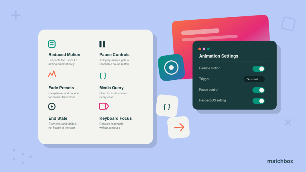
The better approach is to swap movement for something calmer rather than deleting the transition entirely. Keep the fade, drop the travel. Keep the state change, remove the bounce. Users still get the feedback that tells them the interface responded; they just don’t get thrown around to receive it.
Second, avoid the scroll reveal trap.
if your scroll reveal starts at zero opacity and you kill the animation that reveals it, the content never becomes visible. You have turned an animation problem into a blank-page problem for the users who needed the accommodation. Reduced motion has to land elements in their visible end state immediately, not freeze them at the start. Any reduced-motion rule you add has to be tested with the setting turned on. Every time.
If the animation is driven by JavaScript rather than CSS, the same signal is readable in code with window.matchMedia('(prefers-reduced-motion: reduce)'), so a library like GSAP can be told to skip straight to the end state.
Delightful vs. Distracting: A Side-By-Side
| Element | Delightful | Distracting |
|---|---|---|
| Buttons & links | Color or subtle lift over 150–250ms, with a matching focus state | Scaling up 20%, rotating, or bouncing on hover |
| Scroll reveals | One subtle fade per section, no stagger past 300ms total | Every card, heading, and icon fading up with cascading delays |
| Carousels | Manual advance, visible arrows and dots, keyboard operable | Auto-rotating hero with no way to stop it |
| Loading | A skeleton or spinner that appears only after ~400ms of actual wait | A branded full-screen preloader on every page view |
| Backgrounds | Static, or very slow and small in amplitude | Multi-layer parallax tied to scroll position |
| Marquees & tickers | A real pause control that works by keyboard | Infinite loop that pauses on hover only |
| Video | Click to play, or muted with visible controls | Autoplaying full-bleed video behind your headline |
| Attention | One animated element in the viewport at a time | Three things competing for the same glance |
Good motion is short, purposeful, and optional.
How This Plays Out on a WordPress Site
On a modern WordPress build, developers don’t usually handwrite CSS for every element. Motion is typically added in three main ways:
- The theme. Hover states, focus styles, menu transitions, and button behavior are baked into the theme’s stylesheet and apply site wide.
- Blocks and block libraries. Custom blocks frequently ship with motion built in; sliders, carousels, and scrolling marquees are all animated components, and many expose entrance effects as a per-block setting.
- Plugins. Animation plugins and page builder motion modules add effects that editors can apply to anything, usually as a dropdown labeled something like “Entrance animation: Fade In, Duration 800ms, Delay 200ms.”
That third option is where animations can start get away from you. When animations are being set block-per-block, that usually means that nobody is looking at the whole page at once. Lets say a homepage gets built over three months by two designers and a content editor where everyone is in charge of a certain section. One designer adds a smooth fade up, the other designer ops for a dissolve in and the content editor adds a tasteful fade. Since each person has a different style and animation preference, that can lead to a homepage with inconsistent animations, making it feel very disjointed and chaotic. On their own, each animation decision looks good, but they don’t work together as a whole.
The fix is simply a clear process. Define a small motion set as part of the design system: two or three approved animations, fixed durations stored as CSS custom properties, and a rule for when each one applies. Then the reduced-motion override is one block of code touching three variables, instead of thirty individual block settings that someone has to find and audit one at a time.
Check your slider plugin’s defaults.
Most sliders come with autoplay switched on by default. Check the settings, and make sure the pause button actually works — not just for someone clicking with a mouse, but for anyone navigating with a keyboard too.
One more thing worth noting: if you’re using an accessibility widget (one of those overlay tools that adds accessibility controls to your site), understand what it actually does. It’s a helpful extra for the users who know to look for it, but should not be treated as a replacement for building your site correctly in the first place.
A Pre-Launch Motion Checklist
- Turn on Reduce Motion in your OS settings and load the site. Everything should still be readable, present, and usable. If any content is missing or not legible you have work to do.
- Tab through every page with the keyboard only. Focus should always be visible, order should make sense, and you should never land on something you cannot see.
- Find everything that moves on its own for more than five seconds. Each one needs a pause control that works without a mouse.
- Disable JavaScript and reload. Content behind scroll reveals should still be there.
- Test on a mid-range Android phone on a real connection, not a desktop simulator. The janky parts always show up there first.
- Count the animated elements in a single viewport. If it is more than two, make some cuts.
- For every remaining animation, answer out loud: orientation, feedback, hierarchy, or continuity? Remember “it looks nice,” is not a complete answer, each animation needs a stronger justification than that.
The Bottom Line
Good animation is invisible in the same way good typography is invisible. It makes an interface feel responsive and coherent without ever asking to be admired. Bad animation demands attention, delays content, and in the worst cases makes a site practically unusable.
The encouraging part is that fixing this is cheap. You don’t need a redesign or a separate accessible version of your site, you just need a media query, a handful of pause buttons, and the discipline to ask what each animation is actually for (usually the hardest part of the three). Get those right and you keep all the polish, while making sure people who need motion turned down can actually use what you built.
Want a second set of eyes on how your site handles motion and accessibility? Learn more about our UI/UX design work or contact Matchbox Design Group to talk through an audit.
Key Takeaways: Website Animations
- Motion Needs A Job: Orientation, feedback, hierarchy, or continuity. Anything else is decoration that has to justify it’s cost.
- Duration Is The Difference: 200–300ms covers most interface motion. Staggered delays are what make users wait on content.
- Five Seconds Is The Legal Line: WCAG 2.2.2 (Level A) requires a pause control on anything moving automatically for longer than that. Hover-to-pause doesn’t count.
- Reduced Motion Is Nearly Free: One CSS media query respects an OS-level setting your users already turned on. Just verify content is visible.
- WordPress Makes Motion Easy To Accumulate: Per-block animation settings mean nobody audits the whole page. Define an approved motion set in the design system instead.
- Test With The Setting On: Reduce Motion enabled, keyboard only, JavaScript off. Three tests that catch nearly everything.
FAQs
Any movement or visual change over time on a web page. That includes obvious things like sliders and scrolling tickers, and subtle things like a button changing color when you hover it or a menu sliding open. Most animation on a well-built site falls into the second category.
They can, in two ways. JavaScript animation libraries add file weight that has to download before the page is interactive. And animating the wrong CSS properties forces the browser to recalculate the page layout on every frame, which causes visible stuttering on mid-range phones. CSS animations that only change transform and opacity are dramatically cheaper.
They can be. People with vestibular disorders can experience nausea and dizziness from parallax and large scale motion. Similarly, rapidly flashing content is a seizure risk for people with photosensitive epilepsy. WCAG also requires a pause control for anything that moves automatically for more than five seconds. Animation is not inherently inaccessible, but it has to be built with these users in mind.
Most interface motion belongs in the 200 to 300 millisecond range. Larger elements traveling further can justify 300 to 500ms. Beyond half a second an animation starts to feel slow. Once it passes a full second users often assume the interface is broken. Watch stacked delays especially. Six elements each delayed 200ms means over a second before the last one appears.
The theme’s stylesheet handles site wide behavior like hover and focus states. Individual blocks, especially sliders, carousels, and marquees, ship with motion built in. And animation plugins or page builder motion modules let editors apply effects to any element from a dropdown. That last one is why pages accumulate animation nobody planned.