
A great website experience begins with understanding how users think, what they need, and how they move through a site. By putting ourselves in the visitor’s shoes, we can identify their goals, anticipate the steps they’ll take, and determine the best path for them to find the information they need. User flows help us turn these insights into a website experience that feels natural and easy to navigate.
TL;DR: A user flow maps out the exact path someone takes to complete a goal on your website, from where they land to how the site responds to every click along the way. Mapping this journey before design begins helps teams spot friction points early, keep the experience intuitive, and make sure every step (and every possible detour) leads users where they’re trying to go.
What Is a User Flow and How Does it Work?
A user flow is a visual map of the steps someone takes to complete a goal on a website, from the moment they land on a page to the moment they convert. Rather than looking at a single page in isolation, a user flow zooms out to show the full path: every click, decision, and screen a visitor moves through along the way.
Its purpose is to help design and development teams spot friction points before they become a problem. By mapping out where users enter, what they do next, and how the site responds at each step, teams can catch issues early on when they’re still cheap and easy to fix. A well-built user flow also keeps stakeholders aligned, giving designers, developers, and clients a shared reference for how a feature or page is supposed to work before a single line of code is written.
Identifying Where Users Enter The Site
Every user flow starts with an entry point. A visitor might land on the homepage after searching your brand name, click through from a paid ad targeting a specific service, follow a link shared on social media, or arrive at a blog post via organic search. Each of these entry points carries different context and intent.
Someone clicking a “20% Off” ad is ready to shop, while someone reading a blog post is likely still researching. Identifying where users enter helps teams design a flow that meets each visitor where they are.
Related Links
A Series of Actions That Leads to a Destination
Once a user lands on the site, the flow tracks the sequence of actions they take to move toward their goal:
- Clicking a menu item
- Filling out a form
- Adding a product to a cart
- Scrolling to find more information
Mapping this sequence makes it easy to see the critical path, which is the shortest, clearest route to conversion. It also outlines decision points, moments where the user has to choose between options, which is often where drop-off happens if the choice isn’t obvious or the next step isn’t clear.
How the Website Responds to User Decisions
Unlike a river or stream, a user flow does not flow in one direction. The path a user takes depends on where they enter and where they’re headed, which makes it more like a highway. To help users arrive at their destination successfully, you need to make sure you have proper signals along the way leading them in the right direction.
If a user takes a wrong turn or runs into a roadblock, there needs to be clear signs like error messages, validation prompts or redirects, to get them back on track.
Then, once their destination has been reached, there should be some sort of indication that their journey is complete. For example, this could be a confirmation page after checkout or a success message after a form submission.
Understanding User Goals
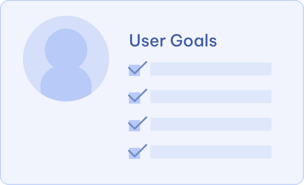
Every effective user flow starts with a clear understanding of the people using the website. We partner with our clients to identify their key audiences, understand what each user is trying to accomplish, and define the goals they need to achieve. These insights become the foundation for mapping journeys that guide users through a website in a way that feels natural and intentional.
While every website has its own unique set of goals, most fall into a few common categories:
Completing a Purchase
For ecommerce sites, this is often the primary goal. When the end goal is for the user to make a purchase, you’ll want to guide your users from browsing products to checking out with as little friction as possible. This flow needs to account for product discovery, comparison, cart management, and a checkout process that feels quick and trustworthy.
Filling Out a Form
Whether it’s a contact form, a quote request, or a newsletter signup, this goal is about converting users into leads. The flow should make it clear what information is needed, why it’s being collected, and what happens after the form is submitted.
Gathering Information
Not every visitor is ready to buy or convert. Many are researching, comparing options, or trying to learn more before making a decision. For these users, the flow should make key information easy to find and encourage next steps, like reading a related article or exploring a service page. The key here is to not be too salsey or pushy, you want to meet the user where they are.
Creating an Account or Logging In
For sites with member portals, subscriptions, or personalized experiences, account creation and login are critical touch-points. This flow needs to balance security with simplicity so users can get into your portal and easily access the information they need.
Scheduling or Booking
For service-based businesses, the goal is often booking an appointment, consultation, or reservation. This flow should minimize back-and-forth by clearly presenting availability and confirming details in as few steps as possible.

Mapping Out The Journey
Once we understand who the users are and what they need to accomplish, we can now begin mapping out their journey through the website. We identify the key steps they may take, the information they need at each stage, and the actions that will move them closer to their goal. By visualizing this path before design begins, we can create an experience that feels intuitive, removes unnecessary friction, and helps users confidently find what they’re looking for.
Figma
Figma is a tool we use here at Matchbox and is where we often start, especially when journey mapping is closely tied to the design process. Since our design team is already working in Figma for wireframes and UI, mapping user flows in the same tool keeps everything connected.
We can use FigJam, Figma’s whiteboarding tool, to sketch out flows with sticky notes and connectors, or build more polished flow diagrams directly alongside design mockups so stakeholders can see how the journey and the interface work together.
Lucidchart
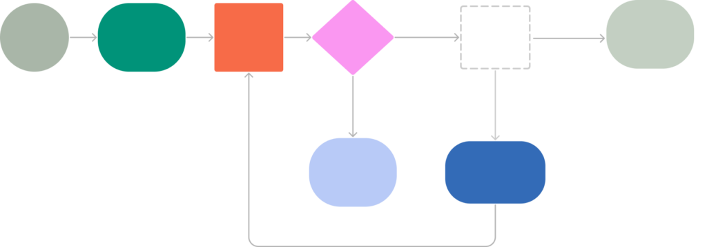
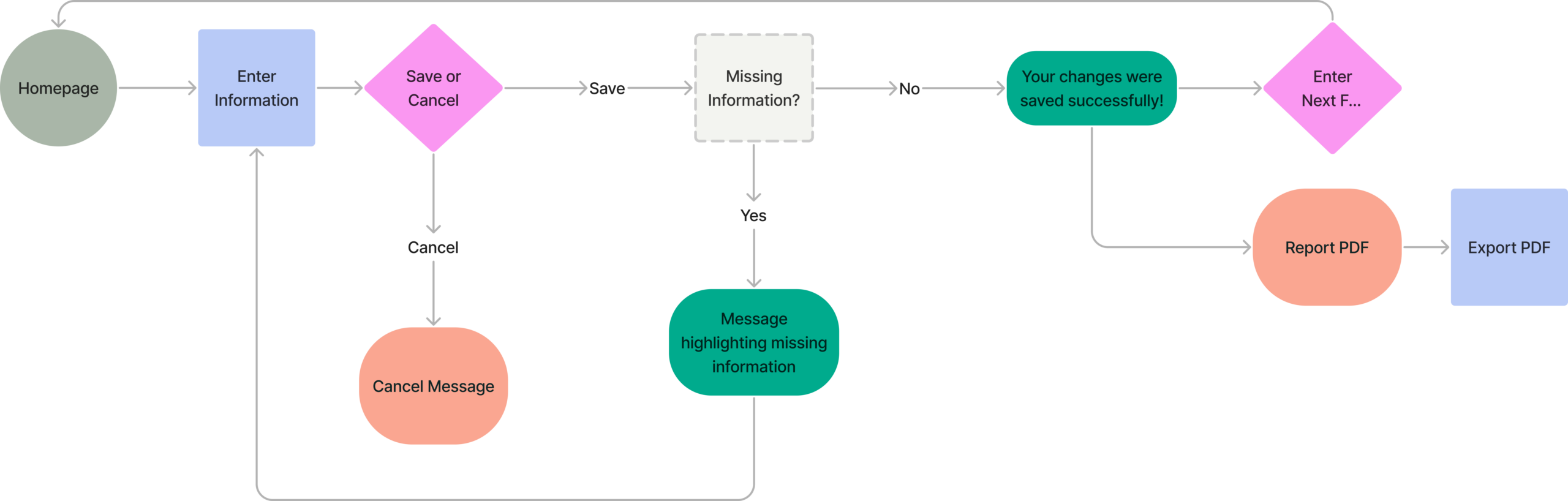
For more complex flows with lots of branching logic, like the save, cancel, and validation paths shown above, Lucidchart gives us more flexibility for detailed flowcharting. Its shape library makes it easy to represent decision points, conditional branches, and system responses clearly, which is especially useful when a flow needs to be shared with developers or clients who need to understand the full logic at a glance, not just the visual design.
Where Good Design Begins
At the end of the day, a successful website is one that works for both the people using it and the organization behind it. User flows give us the insight needed to create experiences that are thoughtful, purposeful, and easy to navigate. By planning the journey before we begin designing, we can build websites that connect users with the information they need as smoothly as possible.
If your website isn’t guiding users where they need to go, it might be time to take a closer look at their journey. Our team can help you map out your user flows, identify where visitors are getting stuck, and design a path that turns more visitors into customers. Fill out the form below for a free consultation.
Key Takeaways
- A user flow visually maps the steps a user takes to reach a goal, covering their entry point, the actions they take, and how the site responds to their decisions.
- Understanding user goals first, whether that’s completing a purchase, filling out a form, gathering information, creating an account, or booking an appointment, is the foundation every flow is built on.
- User flows move in more than one direction. Like a highway, they need clear signals to guide users forward and get them back on track if they hit a snag.
- Tools like Figma and Lucidchart help map out these journeys, letting teams visualize branching logic and decision points before a single line of code is written.
- Planning the journey before designing it leads to websites that feel intuitive, reduce friction, and connect users with what they need more smoothly.
User Flow FAQs
It depends on the complexity of the site and the number of goals being mapped, but a single flow can typically be sketched out in a few hours to a couple of days. More complex flows, like ones with multiple decision points and error states, take longer to map thoroughly. We usually build this into the early discovery phase of a project, before any design work begins.
You don’t need one for every page, just the ones tied to a specific goal, like checkout, lead forms, or account creation. Informational pages that don’t involve a multi-step process usually don’t need their own flow.
A sitemap shows the overall structure of a website, every page and how they’re organized in a hierarchy. A user flow shows the specific path a user takes through some of those pages to complete a goal. Think of a sitemap as the map of the whole city, and a user flow as the directions for one specific trip.
They’re just as valuable for existing sites, if not more so. If a site already has traffic and conversion data, that information can highlight exactly where users are dropping off, making it easier to map a more effective flow during a redesign.