The primary objective behind every product page is to convert visitors into customers in the most cost-effective and timely manner. What separates a great product page from a bad one is not only its ability to convert but its ability to do so look easy and seamless. Today we will discuss ways to boost product page conversion rates.
Are your product pages repelling customers or drawing them in?
Your product pages are most likely the most important pages in your store. These are the real money makers; the ones that clearly and concisely display to your customer, this is how my product will help solve your problem or provide you with the experience and feelings you desire. Let’s do business.
You only have seconds to capture and retain the interest of a prospective buyer. The need to get your product pages right is a fundamental aspect of your success as an eCommerce store. Once you’ve nailed down the perfect website design, it’s time to focus on the nitty-gritty of optimizing your product pages.
What Is Conversion Rate Optimization?
Conversion rate optimization on product pages involves taking a strategic approach to all aspects of a product page, including getting the right blend of layout, colors, images, and words. It’s a fine art with big payoffs and involves a lot of testing.
After all the energy you spend attracting visitors to your store through an effective paid ads campaign, a social media post, or great SEO, it’d be a shame to lose them when they land on your product page. For this reason, it’s vital to use conversion optimization to fully capitalize on all potential sales opportunities.
Here are five quick tips you can apply to your product pages to build trust, reduce page friction, and increase conversions.
Tip 1 – High-Quality Media Showing The Product Being Used
Unique product photos can be expensive and time-consuming to shoot which leaves many store owners simply making do with the manufacturer’s photography. This is doing nothing to set yourself apart from the crowd and nor is it good SEO practice.
It’s crucial you invest in good product photography, videography, or other supporting media.
Even the most dazzling product can appear dull when the stock photos don’t make it pop. On the other hand, a run-of-the-mill product can seem compelling to shoppers when your product pictures paint it in the best light.
Making the extra effort to produce excellent images is not only worthwhile for the overall aesthetic look of your product page, it’s a must. According to a study by Shotfarm, 26 percent of shoppers said poor or misleading product photos were the reason for cart abandonment.
You can even take it up a level by also using GIFs on product pages showing the item being used.
GIFs help to give a product context and assist shoppers in the following ways:
- Help overcome objections.
- Increase social sharing.
- Make you stand out from the competition.
Supportive media like videos and GIFs help your product to stand out. They provide a more personal and compelling than ones offered by most retailers.
Note: Favour using the mp4 file type over the GIF format. Some GIFs can cause page load time problems due to their potentially large file sizes. The modern equivalent is the mp4 format which offers excellent image quality for a smaller overall file size.
Most cameras and some smartphones can record directly in mp4, or you can convert your GIFs and other video formats into mp4 using a service like Cloud Convert.
Tip 2 – Don’t Make Your Shoppers Think
Humans prefer to think easy thoughts, or so the theory of cognitive fluency suggests. CXL argues that you should apply the theory of cognitive fluency to your shopping website too.
CXL claims that shoppers see websites that conform to expected norms as more beautiful than those that try to be different.
The primary aim of your product pages is for visitors to click the add-to-cart button. To reduce friction by using layouts that conform to shopper’s expectations. Your aim should be to reduce the amount of thinking and clicking your customer needs to do in order to make a purchase.
Use a clean, clutter-free layout, with a CTA button shoppers, can’t miss. And test your site with friends and family to see if they instinctively understand how to use it. See whether your Grandma can navigate her way to the checkout!
The text used on your CTA button is important too. Don’t make the customer think about what they have to do to buy the product. “Add To Cart” or “Buy Now” are perfectly fine to get the job done.
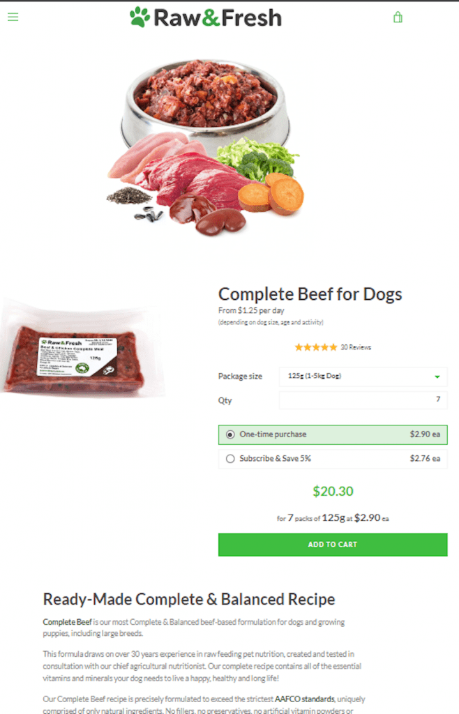
Raw and Fresh, an Australian raw pet food supplier, makes sure shoppers don’t have to overthink when buying. Their site has a crisp, clean layout, which conforms to expected norms, and has a prominent CTA button. Their product pages address all the main benefits of their product offering, state clearly why they are the superior option, and make it easy for a customer to decide then and there.

Tip 3 – Trust Badges For Reassurance
Despite the accelerating switch from bricks and mortar to online shopping, many people are still nervous about buying online. Compounded when your store doesn’t have the established trust of eCommerce giants like Amazon or Asos.
It helps when you communicate to your visitors that shopping with you is safe and secure, by adding appropriate trust badges to your product pages.
A trust badge can be used to convey trustworthiness in several different ways. You can use them to promise data security, highlight safe payment methods, and convey reassurance on customer service standards. If you’re in a regulated industry like food and health, which has certifications or governing bodies, show how you’re certified. Naturally, you should back up any claims you make with a secure and trustworthy site.
It’s common to use a combination of trust badges, often placed in prominent locations near the add to cart button and shown on checkout pages.
A study by Optimeria demonstrated a 32 percent increase in conversions when a trust badge was displayed on an e-commerce page.
You will need to choose the right types of trust badges for your geographical location and audience. Experiment with popular ones for your market and A/B test them to find the ones that give the most significant boost to your conversion rates.
Popular trust badges include a secure payment method, free returns, 100% satisfaction guaranteed, and all-important customer reviews. Naturally, you need to be able to back any of these promises. Here is a selection of trust badges Herb Cottage uses to convey confidence.

Tip 4 – Proactive FAQs
Average stores only sell products to consumers. Great stores help them solve their problems too. They achieve this by understanding the process of the buyer’s journey and providing the information customers need to move along the path.
The buyer’s journey is the term given to the well-developed model of the steps a shopper undergoes when they purchase a product. Each step could take a moment or weeks – depending on the product cost and the problem a would-be buyer is trying to solve.
The problem could be specific, such as the need to buy a washer to fix a leaking tap. Or more esoteric, such as wanting to look good for a job interview, so the shopper wants a new outfit.

Whatever the problem, the shopper needs different information at each stage. Be proactive and provide the details a shopper might require to move along the buyer’s journey clearly linked from product pages on your site.
From necessary information on shipping and returns to more in-depth product-related details; your job is to provide the knowledge to visitors in a well-structured FAQ section.
It can help you stand apart from your competition, and also has the benefit of helping to reduce the number of customer support inquiries.
Initially creating your FAQ pages using questions you think your customers might want answers to is OK to get you up and running. But to have a genuinely beneficial resource, keep a note of common real-life inquiries you receive.
You can also use a service like Hotjar to survey your visitors. Ask them questions about your product pages, especially about what information they feel is missing from the content.
Over time, you can build up real-life customer information needs and incorporate these into your FAQs.
Gymshark has a well-organized FAQ page that covers much of the information a shopper might need.

Tip 5 – Display Peer Product Reviews
When was the last time you made a sizeable purchase without doing your own ‘research’ and reading other customer reviews?
We live in a peer-to-peer world. With social media, review apps, YouTube, and word-of-mouth, we rely on the opinion of our peers to help in our buying decisions. It’s more important than ever to showcase to the world all the positive feedback and reviews your products attract. If someone gives you a raving review, shout it out loud and proud on your product pages!
Do not underestimate the power of one positive review to speak to a customer in exactly the way they need to hear. You could write the perfect sales pitch on your product page but sometimes it’s the personal experience of another customer that’s really what makes the sale.
If you don’t have any reviews, then it’s a matter of asking for them. There are a plethora of review apps available for every eCommerce platform to automate the asking process for you. When a customer makes a purchase, it will trigger an email to send after a set period requesting a review.
Conclusion
Your product pages generate revenue for your business. They are your chance to convince shoppers that they have found the right item and they should buy it from you, now.
But online shoppers are fickle. A missing piece of information, an inability to trust your site, or even problems in navigating or reading your content can be enough to lose a sale.
Work on optimizing your product pages using the tips above. Make one change at a time and track conversion rates, and, over time, you should start to see improvements.
Bio: Emily Amor is SEO Manager at Digital Darts; a leading Shopify Partner and Google Premier Partner, and we’ve been growing online businesses for over 10 years through Google, Facebook, and Instagram Ads, SEO, and email marketing. When she’s not helping to make clients more money, she’s outdoors hiking, mountain biking, gardening, or on a rainy, rugged up in bed with a great fantasy novel.
Contact Matchbox Design Group Today!
If your website could use a refresh, if you’re looking to drive more traffic to your site, or you would like to submit a guest post, fill out the form below and we’ll contact you to learn more about your digital needs.


