In some organizations, SEO and design are often at odds. SEO people seem to want ugly, long pages filled with dense text, and designers want user-friendly, image-heavy pages. Today we will discuss some SEO Website Design Tips.
But I’m here to tell you that this conflict doesn’t have to be so. In fact, Google incorporated user-interaction signals into their ranking algorithm to reward websites with great visuals.
So, like ol’ Aunt Eller sang in the old musical Oklahoma, “The Farmer and the Cowman Should Be Friends”. (Or, in this case, the SEO and the designer should be friends.)
Today we are going to discuss 3 SEO website design tips for 2021.
1. Embrace Visual Media
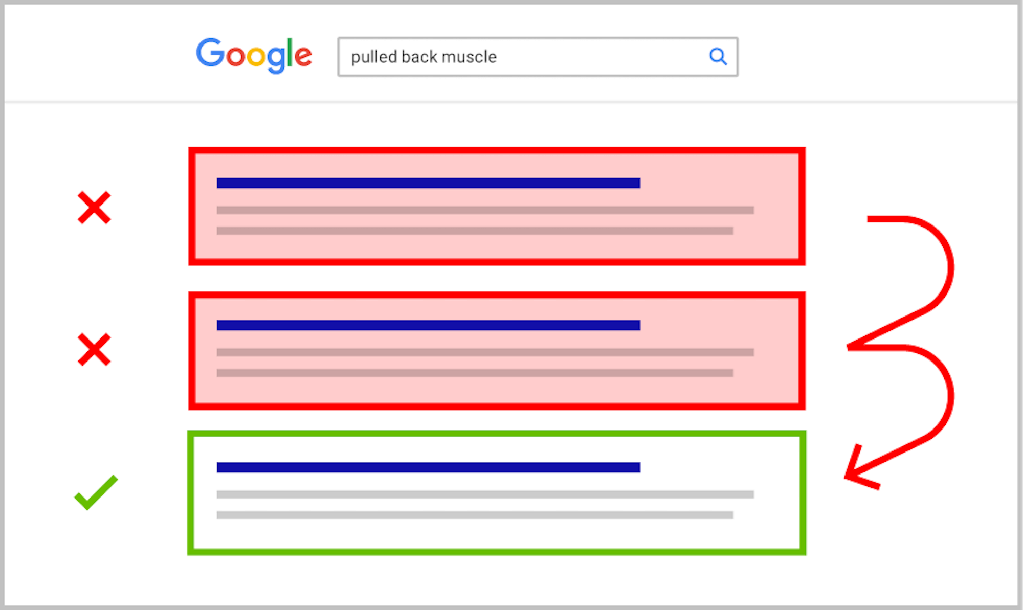
Google measures the click-thru rate, dwell time, and bounce rates. The main thing that you want your website to avoid is pogo-sticking.

“Pogo sticking” is when you bounce back and forth between Google and the actual websites they list in their search results. Have you ever clicked on a search result, and then bounced back to Google because you didn’t like what you saw?
That’s the kind of signal that tells Google, “this website wasn’t a good fit for this search query”.
How do you keep people from bouncing off of your page?
Here’s a simple list:
- Make sure that your page is in good working order (ie not receiving a 500 “server error” or 404 “broken link” error).
- Make your webpage load speed fast.
- Make your content scannable.
- Design beautiful pages.
That last note is where visual media comes in.
No, Google still doesn’t read or weight images or videos well in their ranking algorithm. BUT they do measure dwell time and bounce rates, so if your awesome design engages the user, you’ll win the SEO game.
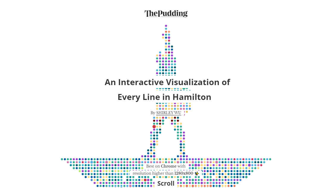
One great example of this is the website Pudding cool. I have a “work crush” on these guys. Every page on their site is data-centric, highly-interactive, and beautifully designed.
According to the SEO tool Ahrefs, their site gets over 23,000 visits every month from organic search traffic.
Consider their piece about the Broadway musical, Hamilton. “An Interactive Visualization of Every Line in Hamilton” is a) a mobile-first design, b) super fun and engaging, and c) showcases interesting data.

Now, you don’t have to create interactive tools to achieve a great visual experience. Hopefully, this serves as an inspiration for how great you can make your own content.
For most of us, good design simply involves appealing imagery, a minimalist approach, and focused branding.
My own website prioritizes design with simple javascript animations, fast load speeds, and a minimalist approach. Many SEO companies, including Matchbox, integrate good SEO and good design without sacrificing either.
Make your product pages pleasing. Let your content sing. And watch your conversions rise.
2. Make It Scannable
Even if you don’t have a single image on your page (which I really hope isn’t true), please, please, please make your page scannable.
Use short paragraphs. Use short sentences. And break up the page with headers, bullet points, tables, and quote blocks.
In today’s internet world, most people are reading your article on their phone. According to data from Statista, just over 60% of Google’s search traffic is mobile.
Even if you have a desktop-heavy traffic distribution on a B2B website, optimizing your content for mobile won’t make for a wonky desktop experience.
While browsing on your phone, have you ever clicked onto an article that is a huge wall of text? I’d bet good money that bounced quickly, in probably under 5 seconds.
If you have good customer journey analytics tools, you can narrow down which pages have the highest bounce rates and lowest on-page dwell times. This data tells you how your customers are reacting to your site.
Like you, your users don’t want to see that huge wall of text. They don’t want to read those huge, dense paragraphs.
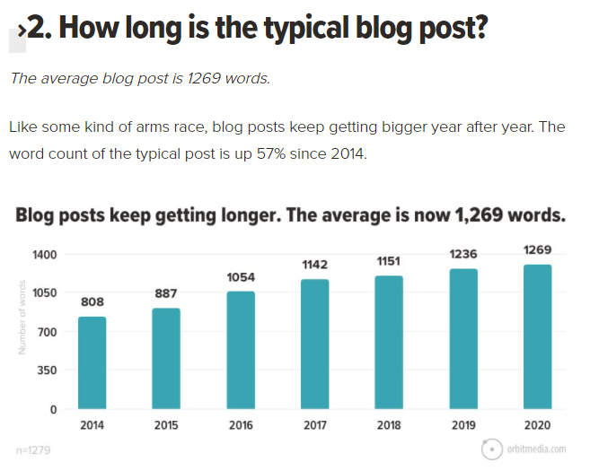
The team members at Orbit Media do a great job with content structuring on their blog. You’d be hard-pressed to find an article on their website that isn’t highly scannable and engaging.

Look at this blogging statistics page. Statistics are boring, right? Not the way they’ve done here! You have a headline followed by a one-sentence paragraph. Then a two-sentence paragraph. Then an image that illustrates the point.
I belabor this point because some writers don’t seem to get it.
For example, I have one client in the legal technology space. Their intern does a lot of our blog writing, and bless her heart, she’s in law school. Those exciting law school textbooks must have rubbed off on her writing style because it took me months to get her to keep her paragraphs short.
The rule of thumb is:
- Keep your paragraphs to 3 lines (on desktop).
- Don’t be afraid of one-sentence paragraphs.
- Use a new headline or image every desktop page scroll.
I used desktop rules because almost all writers write on their computers.
Pro tip: Try writing an article on your phone.
I have a Quora account where I’ve written on and off for the past few years. At a certain point, I started writing the articles on my phone, and it really helped me keep my writing scannable.
The net result?
A few of my articles actually went viral, getting hundreds of thousands of views. But only the ones that were written in a highly scannable, short-paragraph style.
3. Optimize For Snippets
All of us in the SEO world are obsessed with getting two different types of what Google calls “snippets”. The main ones have featured snippets and rich snippets.
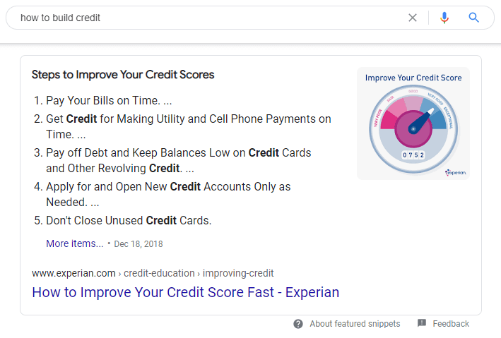
The featured snippet is what we call “position 0”. For example, when you search, “how to build credit”, you’ll get this answer:

This answer box appears below the paid ads, but above even the #1 normal organic search listing, hence the nickname.
You can’t 100% control if you get it, but you can significantly increase your chances of getting it by structuring your on-page content in a certain way.
If the current featured snippet is a numbered or bulleted list, then you need to structure your content that way. Put your keyword in an h2 or h3 HTML header, then follow it immediately with 4-8 bullet points or numbers. Experian.com did a good job of this above.
If the current featured snippet is a paragraph, then that’s just as easy to structure for. Include the keyword in the header, immediately followed by a paragraph that is 40-60 words long. This paragraph should answer the keyword question or answer the keyword search intent as directly as possible.
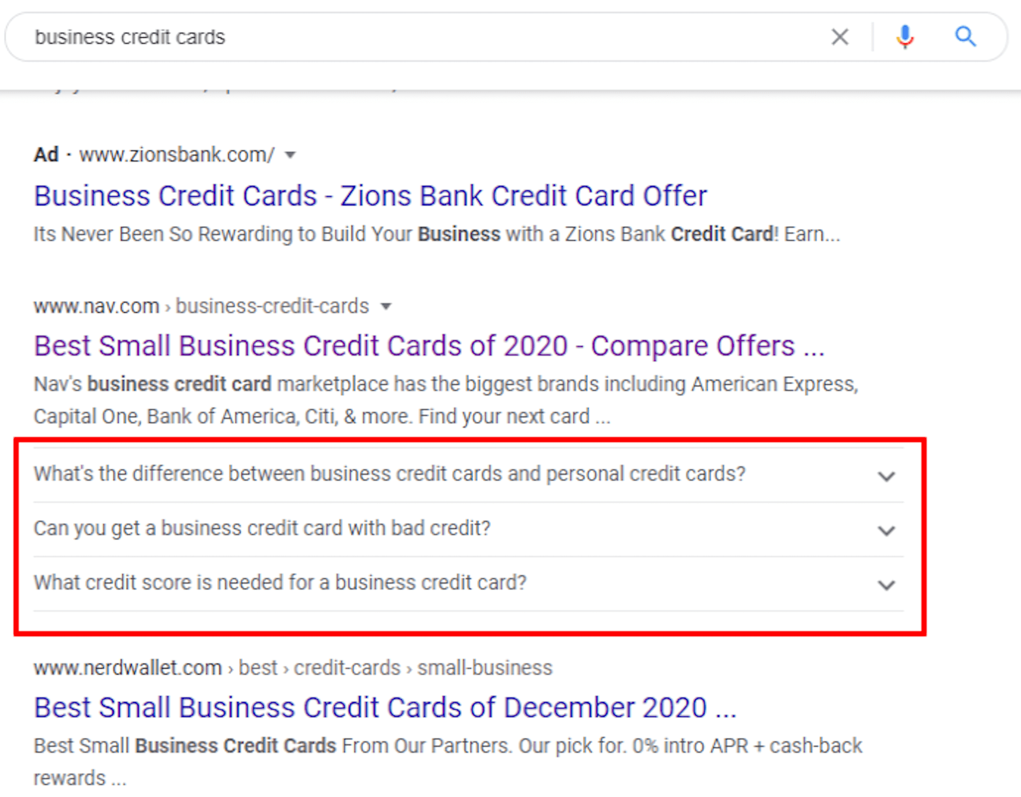
The other on-page factor to remember is for rich snippets. Rich snippets are any enhanced search list feature, just as additional site links, product feature callouts, or frequently asked questions.
That last one is my favorite. The frequently asked questions rich snippet doubles the size of your search listing and makes it more engaging.
They look like this:

This is a rich snippet for a site that I worked on earlier this year. You can see how big the questions make that page.
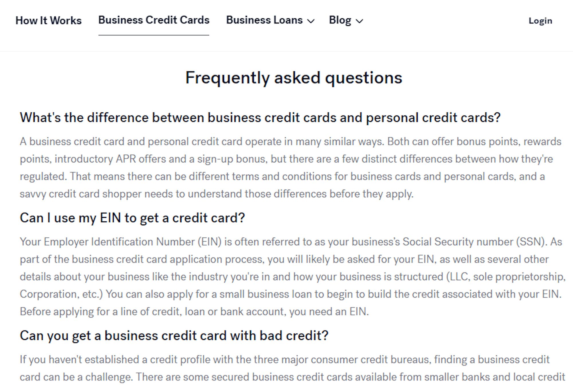
To get this snippet, you have to structure the content on your page like this:

Put your “Frequently asked questions” headline in an h2, and put the subsequent questions immediately after in h3s. Each h3 question must be immediately followed by the answer to that question.
After correct content structuring, get your developer or SEO professional to implement FAQ schema markup on that section, which is basically SEO code.
The great thing about FAQ structuring is that it always works, and it works quickly. If your webpage is on the first page of Google for that keyword, and you do all of this correctly, you should be able to get the FAQ rich snippet to appear within 24 hours.
Final Thoughts
My main guiding principle is to provide value. If your website content and design provide value to the user, to the search engines, and to your industry peers, your marketing will never miss. Hopefully, these SEO website design tips will help you out in the years to come.
Share at:ChatGPTPerplexityGrokGoogle AI
