Web Design Matters
And for those who think that good web designs are expensive, let me tell you bad web designs are even costlier!!
With an increasingly large number of businesses moving online, your website represents the face of your company on the digital platform. It’s an electronic portfolio of your business. Hence, if you want your digital marketing efforts to pay off and make your business successful in the modern marketplace, a good website is an absolute must.
So from small start-ups to large enterprises, one of the most common purpose a (good) website serve is to generate sales. And while you’re busy optimizing website content to fulfill this objective, it is super easy to relegate its design elements to a low-priority position.
But Read This!
Webfx points out that while website users’ first impression plays a pivotal role in keeping them interested and getting them back to your website, 94% of the first impressions are made by your site’s web design.
So precisely how can web design help you boost sales?
In a short time, you will learn the detailed specifics when I give some simple tricks and tips to make an appealing website and bring in sales. But in general, quality web design makes your website appear more credible and offers customers comfortable browsing or shopping experience. As a result, they are more likely to make a purchase.
To ensure that we are on the same page, let’s first have a glance at the key elements of web designs to lay the groundwork for the main topic.
What Is Web Design?
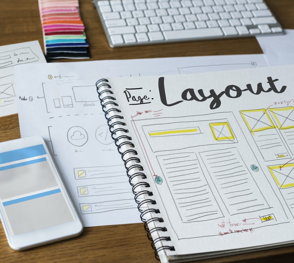
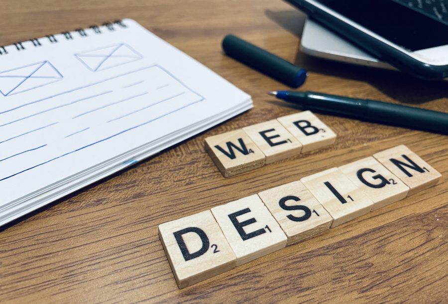
Web design is the way content on a website is planned and arranged. It determines the look of the website.
Here, let us take a moment to clarify that although closely related, web design is different from website development. Website development deals with building and maintaining website structure and involves an intricate coding system.
What Are The Key Elements Of Web Design?
A combination of aesthetic and functional aspects of a website make-up web design elements and can be categorized as-
Visual Elements
These elements ensure that your website looks aesthetically pleasing. So it would be best if you looked out for the following:
Web Copy
Excellently written content or copy conveys valuable information about your products and services to your customers and makes them want to stick to the website.
Website Fonts
Typographical features like font style, font size, font pairing, spacing between words and phrases, etc., emphasize the significance of ease of reading and understanding for the visitors. After all, the content won’t be persuasive without typographic clarity.
Color Schemes
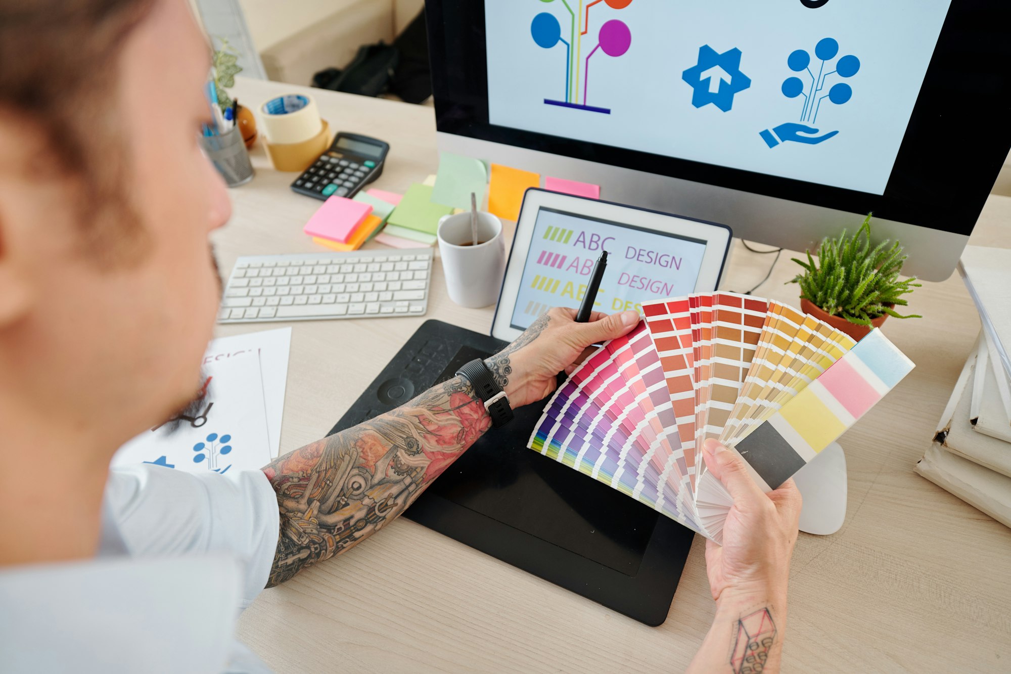
Color selection during web design boils down to more than just aesthetics. Since colors evoke emotions, you can create a palate that aligns with the brand concept by understanding color theory, psychology, and harmony.
Page Layout
The way you bring about the strategic positioning of visual elements can dramatically impact the website user. Plus, an optimized layout is equally essential for navigation and speed optimization.
Icons And Images
When used effectively, icons and images are worth a thousand words. They strengthen content representation, enhance readability, and optimize navigation. For example, zoom icons provide a visual cue for visitors to know what action they should take–it’s important that these icons be consistent with your brand and easy for users to understand.
Videos
Videos can take your content marketing strategy to the next level. They improve SEO, increase conversion rate, and demonstrate products in a way that text never will.
Functional Elements
These elements refer to how your website works. Thus, it is crucial to consider the following aspects while designing your web pages.
Navigation
Smooth navigation is what allows website visitors to find the web pages and sections they want to discover after landing on your website.
Speed
It signifies how quickly a website fully loads after a visitor enters it. Have a slow website and be ready to lose customers to your competitors. There are many proven practices to accelerate the loading speed of the pages.
Responsiveness
Responsive design ensures a dynamic appearance so that the users can view your website from multiple devices with different screen sizes and orientations without altering its user experience.
User experience (UX)
The right UX is all about leveraging usability, design, navigation, and impression for anticipating users’ needs to move through the website towards their ultimate goal.
Animation
Quickly becoming a popular web design trend, web animations breathe life into static website layouts and offer a more intuitive user experience.
After understanding essential web design elements, it’s now time to learn how improving web design helps increase sales.
1. Make It Responsive

Most commonly faced web-associated sales challenges such as low conversion rate, high bounce rate, and poor UX can be, to a certain extent, addressed by a responsive design. That means it is essential to optimize your web design for smartphones, tablets, and desktops alike.
Learn more about necessary changes to your web design to make a responsive website.
2. Need For Speed
A website that hosts data-intensive graphics and photos exhibits a slower load speed than the one with minimal graphics. Quite often, users don’t have time and patience to wait for painfully slow websites, which if you have, there are the highest chances that the users will bounce.
So is the takeaway to eliminate graphics from your web design? No. The mantra is to make strategic use of graphic elements for more impact and faster load speed. Actionable tweaks like minimizing photo file size as much as possible while still preserving the quality, utilizing a page speed plugin, or upgrading a web hosting package can go a long way in improvising your website’s load speed.
3. Offer A Frictionless Navigation
Organized navigation, just like a map, makes it easier for customers to find the product or relevant information quickly. One way to do this is to provide clear-cut and self-explanatory navigation bars like header, sidebar, and footer so that users can access information on products, services, pricing, etc., without much struggle. Logical categorization, hierarchical arrangement, interlinking, and sub-navigation will also offer users an easy time moving around your website and help you increase the website’s conversion rate. Before launching, you can consider representing this design through laptop mockups.
4. Judicious Use Of Images
Stock images are fine for blog posts, but when used for web designs, they cause your website to blend in with thousands of other websites that have also used the same photos and eventually bring down your credibility as a business.
On the other hand, professional photography and custom images have the capability to speak directly to your users and convey your brand message clearly. Hence, use actual photos and place them strategically to leverage their power to increase engagement.
5. Simple Is Beautiful
Complicated content is the last thing you would want on your website. Instead, keep the content simple and easy to scroll through such that the users can understand it at a glance and find their way around without wasting their time. Also, cramming too much of elements, images, colors, and text is something you will want to avoid at any cost. Remember, you want your web design to be fancy but not tacky.
6. Avoid Excessive Visual Distraction
Too many design elements in a small space, loud autoplay audio, excessive pop-ups, gaudy background images, and jarring colors are annoying and take away visitors’ focus even before they can engage with the content. Hence, the best way to use media in web design is to embed them seamlessly with other elements such that it doesn’t cause users to lose focus and leave the website without converting.
7. Well-Formatted Content
They don’t. Users rarely read web pages word by word; instead, they scan and navigate the page by looking at the images and links until they find what they are looking for. In fact, chunky paragraphs tend to get in the way of scanning for visitors and putting them off. Thus, segment your web content for a significantly effortless reading experience using well-written and designed headings, sub-headings, bullet points, numbered lists, short sentences, etc.
Last but not least, do not overlook white spaces between elements of the web pages. It gives your website a minimalist look, helps direct the content flow, and simplifies navigation.
8. Favicon For Improved Web Usability
This small but powerful element can significantly impact your potential buyer’s website browsing experience. Basically, the “favorite icon” or “favicon” comes into play when website users use a lot of tabs while browsing. Some users leave the tab open to review later.
Favicons offer visually legible tags enabling them to find what they are looking for and return to your website in split seconds. Thus, favicon is a must-have web design element for modern users that saves their precious time.
9. Attention-Grabbing CTAs
Clearly marked action words and attractive visual cues make for the ideal call to action tabs to enable visitors to navigate your site and excite them to do something easily. So a great way to prompt users in the desired direction is to create CTA buttons by making use of bold, action-oriented, and time-sensitive words.
10. Make links identifiable
Links are an integral part of any web page content. When you are placing a link on any page, you’re prompting the user to click there. Underlined and differently colored links let the users know that the links are to be clicked on. Hence, it only makes sense to differentiate the links from the other text using visual cues or hyperlink differentiation.
In a nutshell
It is totally possible to dramatically increase the sales you get from your website if you focus on creating customer-oriented web design. Keeping in mind the above tips will help you revamp your web design, pull more traffic, and build a profitable website.
