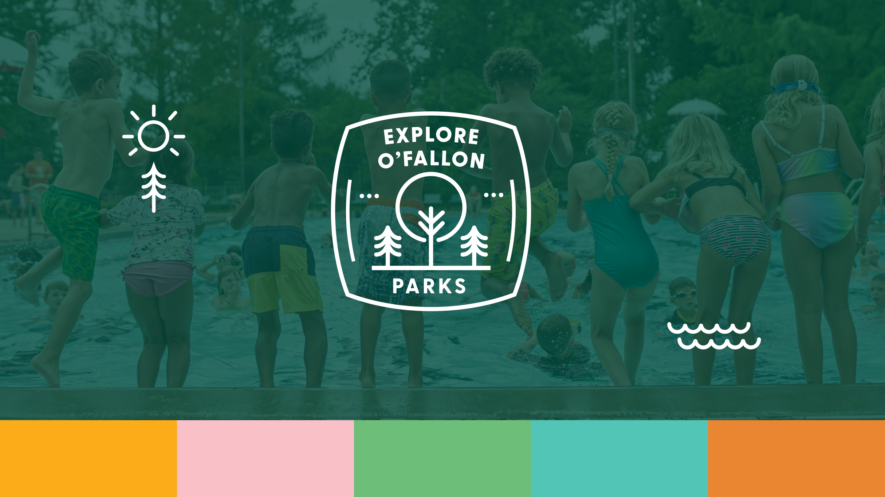
A Lot To explore!
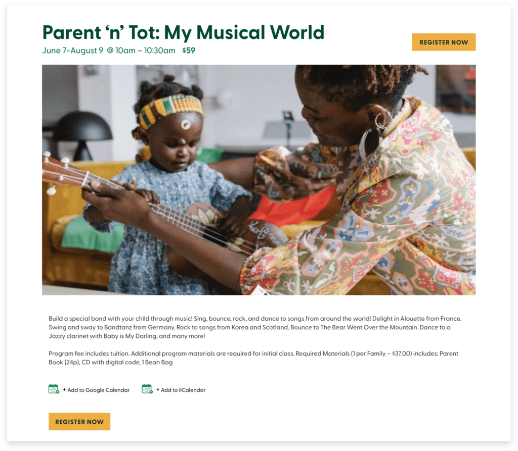
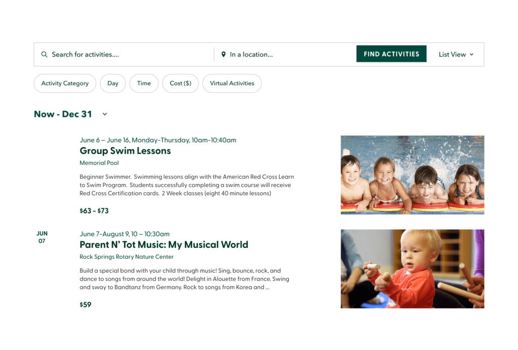
The O’Fallon Parks and Recreation team approached us with a request for a modernized website that could accommodate their expanding audience. Our objective was to improve the user experience both in terms of the website’s interface and its functionality. Their team is now able to make updates more easily and families are able to effortlessly explore events, activities, and various features within the parks.
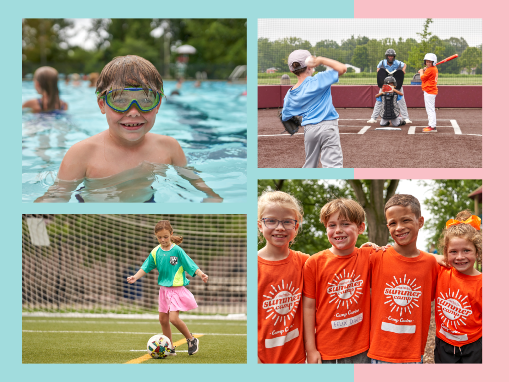
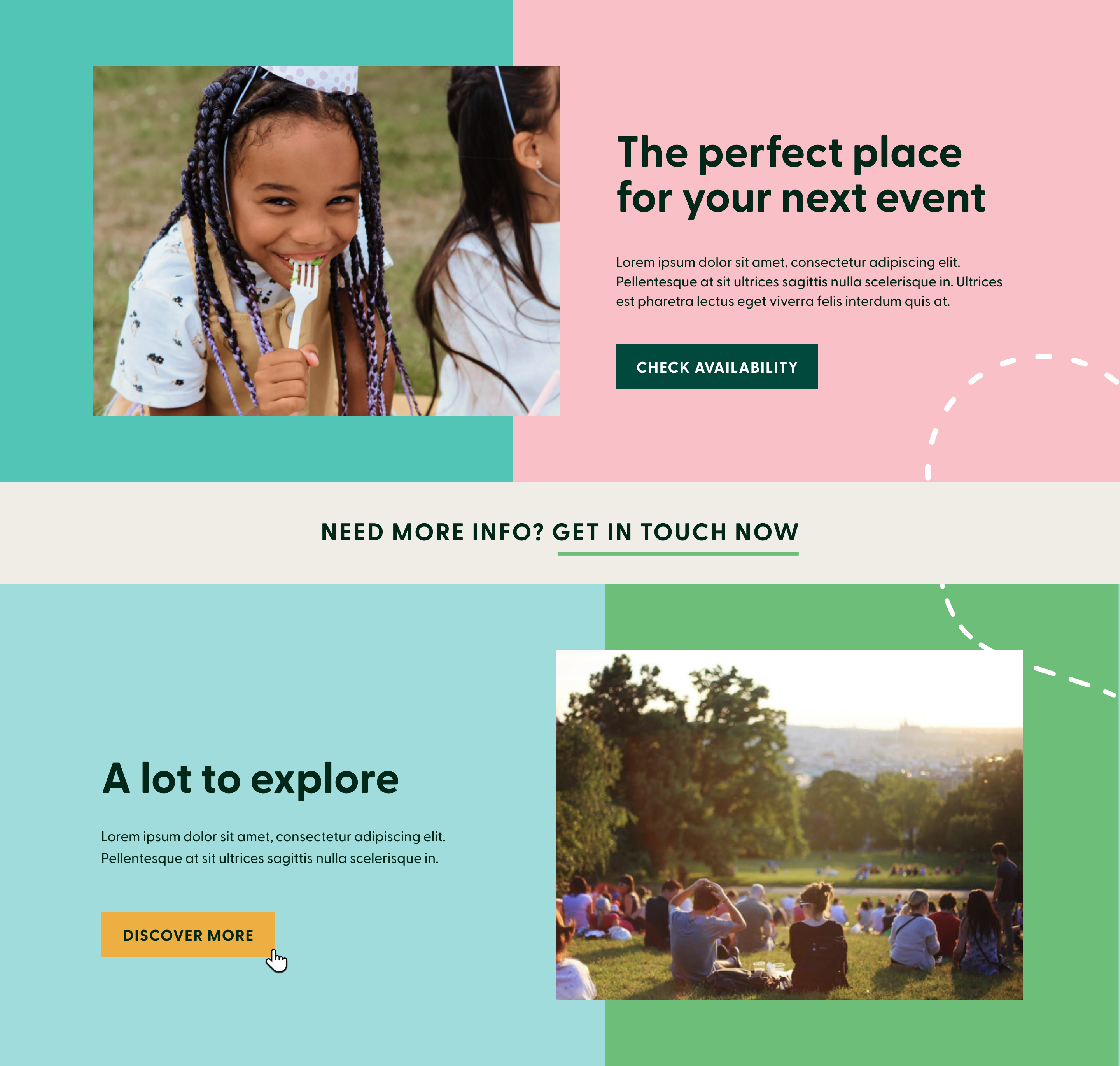
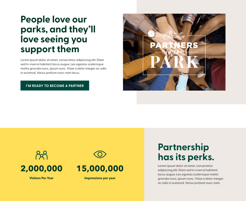
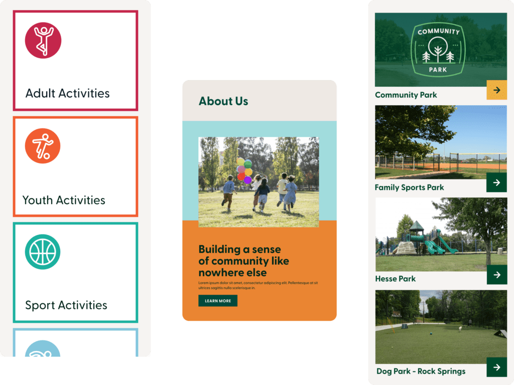
Additionally, they wanted a new design that would give their site a playful yet informative feel. To fulfill this vision, we incorporated bright colors and visuals to effectively showcase the diverse offerings of the park system.
What We Did
Site Mapping
WordPress Design & Development
Content Migration
Branding
Industry
Parks and Recreation

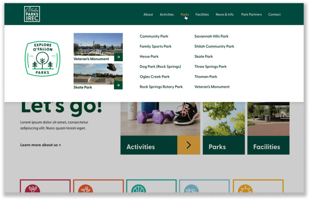
Our first task was to create an updated sitemap. We reorganized the navigation and activity categories to enhance user experience. Our goal was to create a solid framework that would seamlessly guide users through the content on the site.


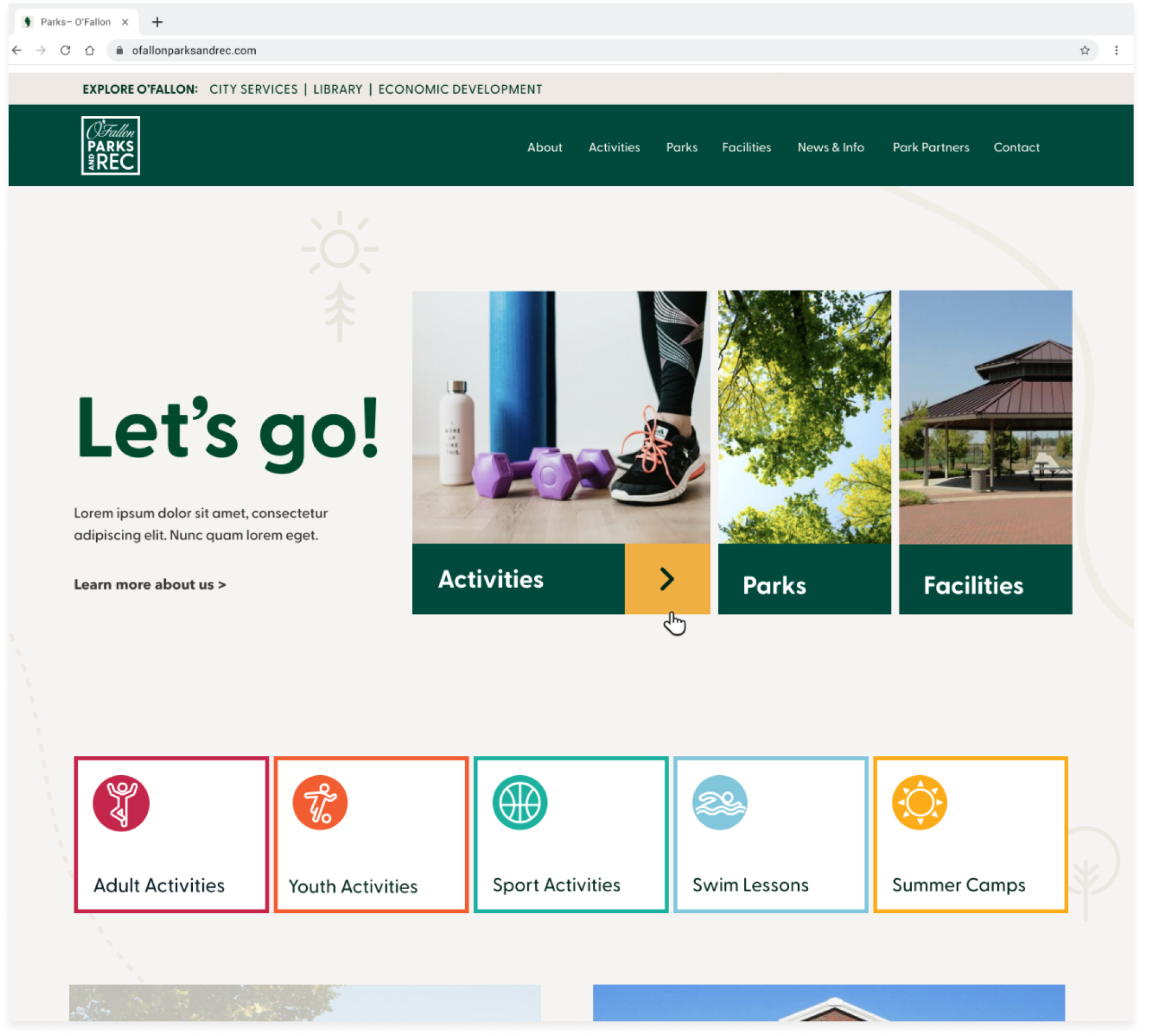
A Cheerful Enthusiasm
By adopting a user-centered design approach, we aimed to create a website that residents and visitors would turn to as a valuable resource for information and inspiration. To grab their attention, we employed an eye-catching color palette that added a new level of visual appeal to the platform.
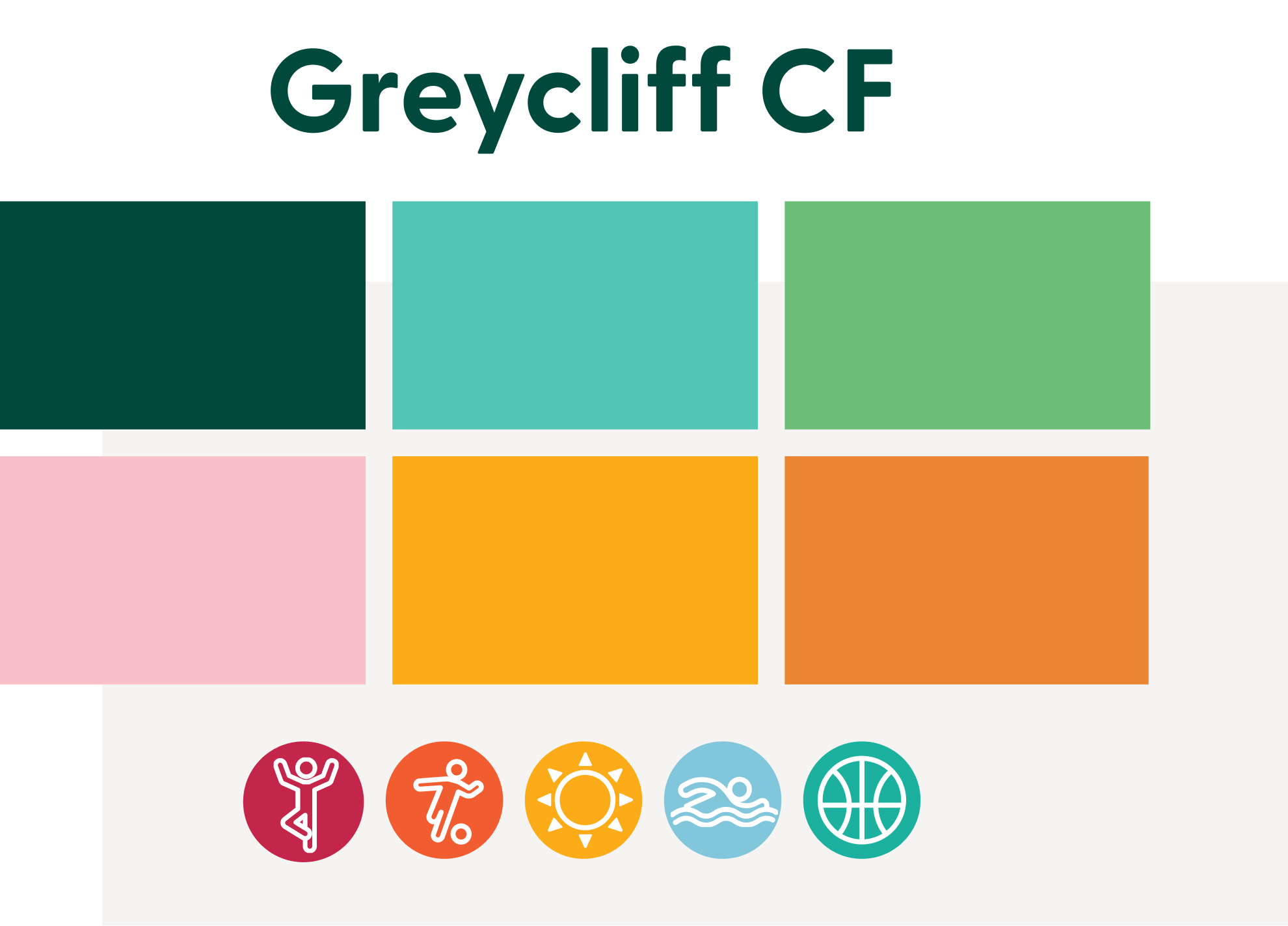
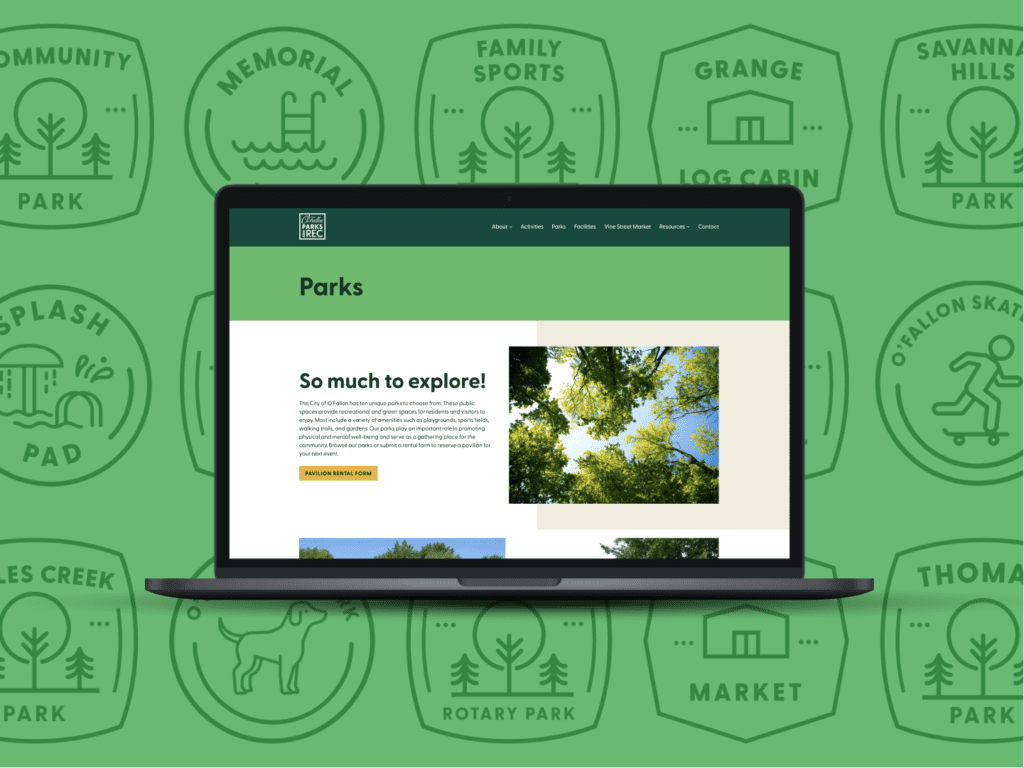
A New Visual Language
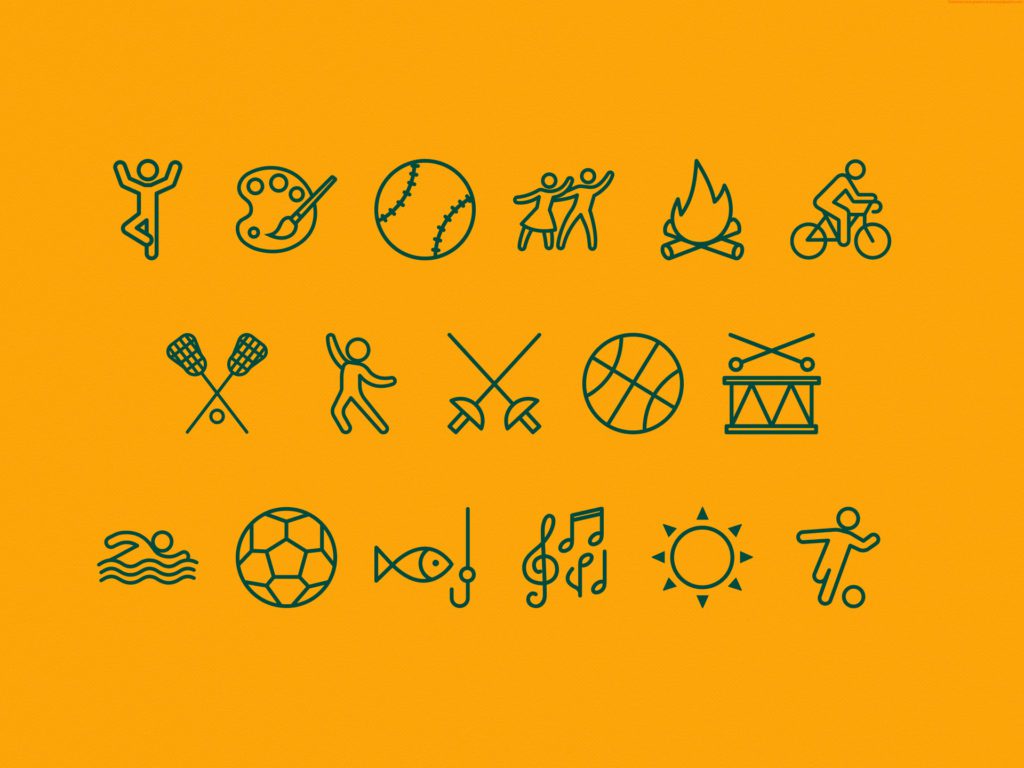
Icons played a crucial role in organizing information in a fun and visually engaging manner. By representing various categories of activities and locations, they allowed users to identify and navigate through relevant information with ease.

A User-Centered Design Approach
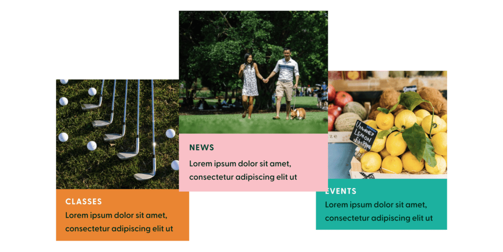
Implementing well-structured landing pages, intuitive search functions, and interactive cards created an engaging environment of exploration.
Contact Matchbox Design Group Today!
If your website could use a refresh, if you’re looking to drive more traffic to your site, or you would like to submit a guest post, fill out the form below and we’ll contact you to learn more about your digital needs.
