At Matchbox, we believe that a strong brand is the foundation of a successful business. Our team of experts is here to help you establish a compelling and cohesive brand identity that resonates with your target audience. Keep reading to learn more about our St. Louis branding services.
We understand that branding goes beyond just a logo. It’s about crafting a story, creating emotional connections, and standing out in a crowded market. Whether you’re starting from scratch or looking to revamp your existing brand, we offer a comprehensive range of services to meet your branding needs. In the world of design, every detail matters.
Our St. Louis Branding Services
When it comes to branding, we do more than just present you with a bunch of pretty logo options. We dig deep. We want to know who you are, why you exist, who you serve, and why we should care about you. Yes, the deep, touchy-feely questions that only true branding fanatics can love. But you’ll love us, too, especially when we transform your brand into a messaging, voice, and visual identity that increases your sales and appeal. Your brand speaks for you when you can’t.

Things We Do:
- Rebranding
- Brand identity
- Brand voice/tone
- Messaging
- Branded copy
- Logo redesign
- Choosing and incorporating new brand colors
- Branded photography
*If you have a special request let us know and we’ll see if we can help!

Our Branding Process
As stated, we start every project with a kickoff conversation that helps us define who you are and what your brand is all about. We do this so that we can better assess the health of your brand immediately.
We also want to figure out what your goals are. This means short-term goals, long-term goals, and anything in-between. After this initial conversation, we will spend a great deal of time studying your business, your competitors, and your industry as a whole.
We will then come together as a team to develop the best plan to set your brand apart from the crowded clutter that is on the web. This includes curating strong messaging, discovering new opportunities, figuring out why people should believe in your brand, and developing a strategy that builds on that foundation to create a strong, long-lasting brand to propel you forward for years to come.
Featured Branding Projects

Personal Assistance Services (PAS) Branding

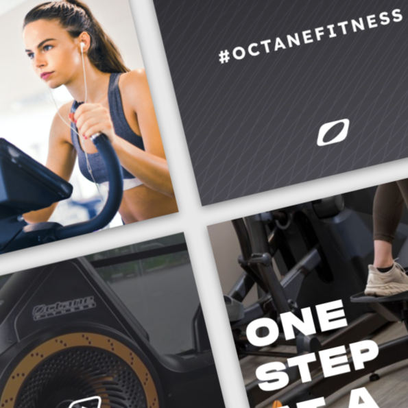
Octane Fitness Branding
Contact Matchbox Design Group Today!
If your website could use a refresh, if you’re looking to drive more traffic to your site, or you would like to submit a guest post, fill out the form below and we’ll contact you to learn more about your digital needs.