Landing pages are the newest, hottest trend, and with good reason, provided they’re created and used correctly.
Essentially a single, standalone page that has been created with the sole purpose of conversion -so, no information other than the ones needed to earn a lead or score a sale-, a landing page requires a landing page builder, some best practices and some imagination to nail the trends.
So, let’s see… What will those be in 2020 and how will they help you get crazy-high conversion and, ultimately, a very good ARR?
Don’t Babble
It’s not just that you don’t need too many words, as the text has begun to have less and less of an effect and everyone notices the visuals and the videos first.
You also don’t need to go overboard with the visuals themselves and you need, in the end, to trust in minimal design in general.
For starters, too many words will make your visitor notice things that you don’t need them to, and that won’t help your conversion in the end.
You need them to just see your brand’s name and tone and take some action. Which is what your CTA will tell them to do.
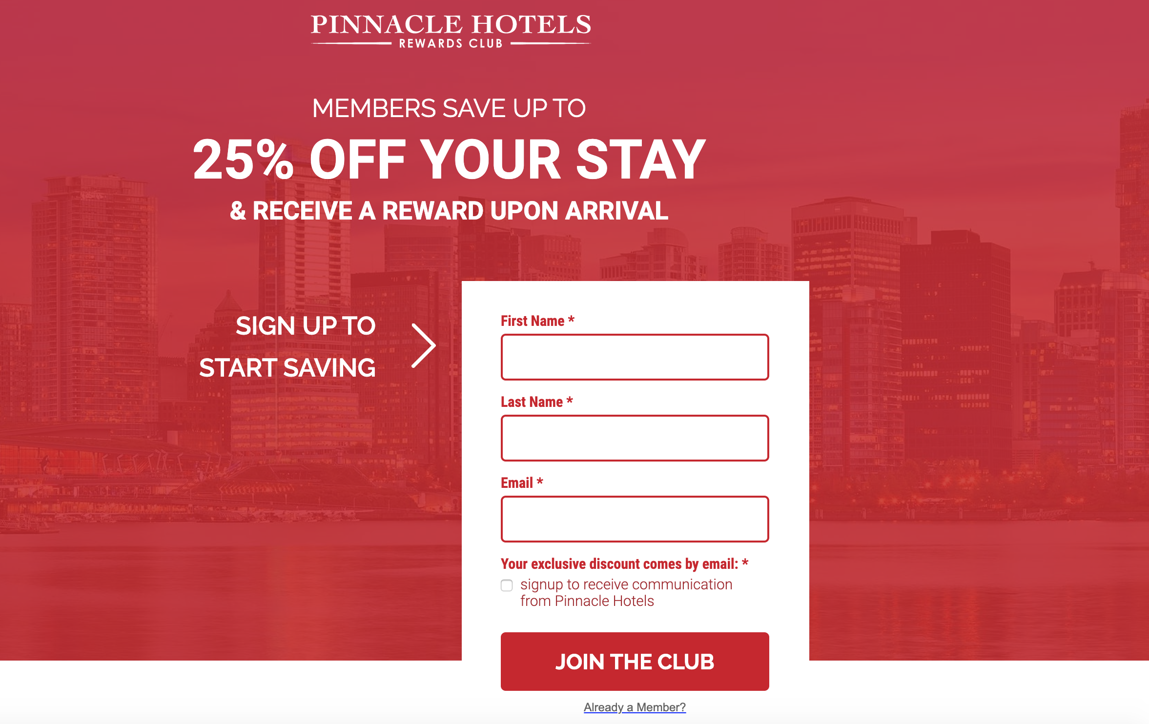
You see how simple this landing page is. Not too much copy, actionable verbs only, as many as zero links (I’ll get to that in a bit) and a signup form.
The verbs are telling me exactly what to do, and they’re pointing out the benefits of my actions. I can save if I sign up.
The design is not exactly my cup of tea, but it proves my point: It’s minimal, it doesn’t take the attention off the actual message and it’s easy on the eyes.
But being easy on the eyes is not the sole purpose here, as there is more to this than just having a clear message: A packed page needs more time to load. Now, if you like your page loading slow, then it’s fine by us, but you’ll lose a whole lot of conversion.
A page that’s not “babbly” will load faster and keep the user’s attention, which will then spark action, which will, in the end, convert.
Remember The links?
Include as little as possible, but always give the users a way out. What do I mean by that? Let me show you:
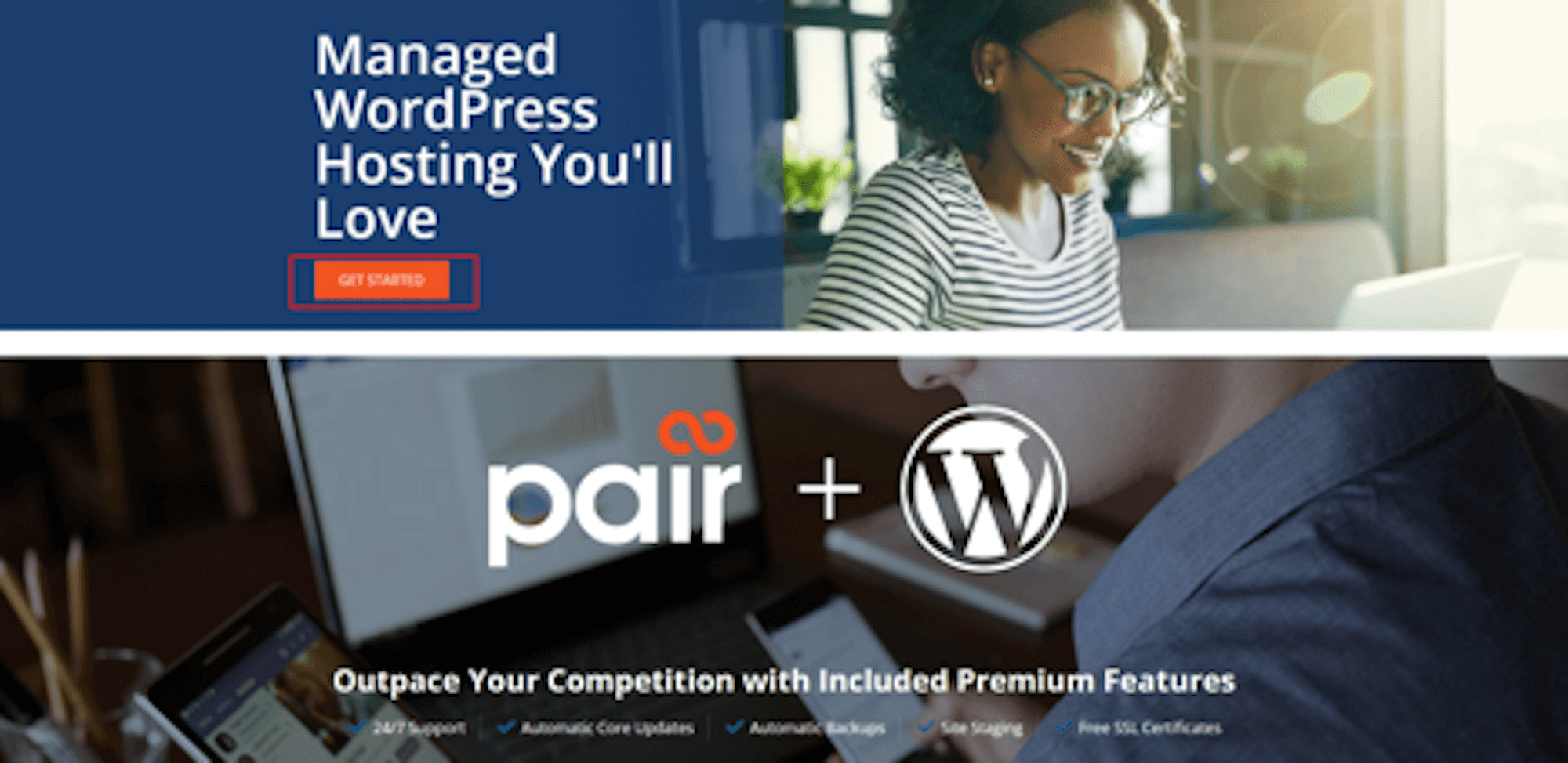
The reason behind that is the fact that too many links will capture the user’s curiosity, making the user click here and there to gather more information.
The result will be for them to steer clear off the page and somewhere else. And nobody wants that.
Don’t include a navigation bar. This is the main difference your landing page and your homepage have when it comes to their look and feel, and there’s a reason behind that: Your landing page is there to convert, whereas your webpage is there to inform.
In the example above, the only link on the landing page is the CTA, which means that you’re lead, through verbs and links, to “Get started”. Not to discover more about the company or see the pricing page.
Video And Interactivity Will Rise
It’s only normal after all. Video has seen a great rise in the past years and it will only continue to rise. Which is fair, considering that videos are way easier to digest and can’t be too long, as the page won’t load.
A short video means digestible content with a very compact presentation or explanation that will be straightforward and to-the-point.
Video offers some great SEO opportunities as well, as they’re straight up SEO optimized.
Now, as for interactivity: You need your landing page to convert, remember that.
This means that you need the user to engage with your landing page, in order to convert and not just have a generic, static landing page.
It’s not just about the fun a user is going to have by engaging with your landing page. It’s not even about the outcome. It’s about the time the user will spend there. Let me make this a bit more clear:
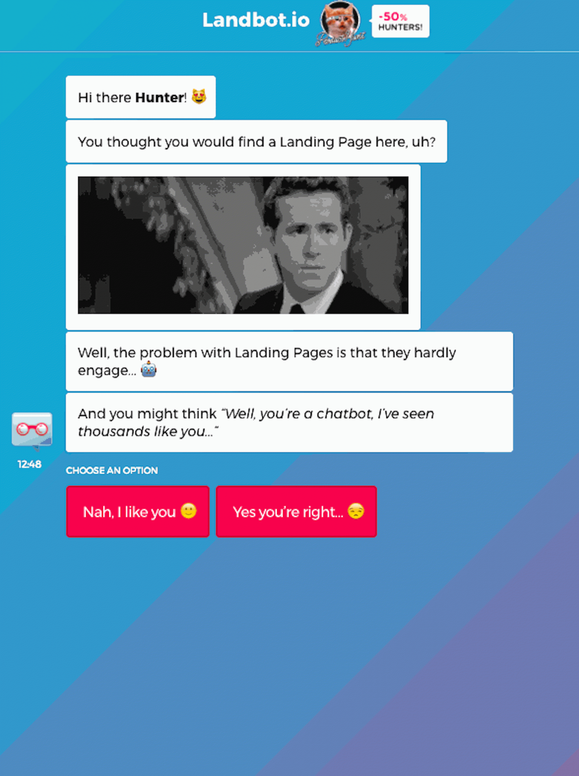
It seems like this landing page is asking for me to engage, which will make me spend more time on here, which, in turn, will make a search engine think that it’s worth the effort and more users should see it.
In other words, engaging, interactive landing pages are fun for the user and great for you.
Super pro tip: Engage users by sending an email with a QR code that will lead them to an interactive landing page and create a treasure hunt that will engage the user and will give you tonnes of exposure.
Optimization For Long-Tail Keywords
If we’re honest, this is not exactly a trend, it’s a best practice, but it’s one that lasts, so it needs at least an honorable mention.
Of course, you need to target the right keywords first, but the right keywords can be way too generic and very unhelpful.
This is why you need long-tail keywords. To make sure that the user will find you, both when it comes to a generic search, such as “SEO agencies” and to “SEO agencies in St. Louis”.
But you need it for another reason. When a user is looking for something really specific, they’ll enter that specific search term first, in the search bar and then they’ll broaden their search.
By managing to actually rank for a long-tail keyword right off the bat, you’re gaining more exposure, as your page will satisfy user intent before the user gives up.
Oh, and another thing to keep in mind: Long-tail keywords are the way people actually search for things on the internet. So, by ranking for them, you’re satisfying user intent right off the bat.
Takeaway
Landing pages are nowadays the next best thing when it comes to conversion. Therefore, all businesses need to try them out and learn how to use them correctly.
Landing pages can get more leads, more sales, boost engagement and definitely give your brand some much-needed energy.
So, what do you think? Are there more landing page trends you’d consider? Don’t forget to let us know and, as always, share the knowledge!
 Author Bio:
Téa Liarokapi is a content writer working for email marketing software company Moosend and an obsessive writer in general. In her free time, she tries to find new ways to stuff more books in her bookcase and content ideas-and cats-to play with.
Share at:ChatGPTPerplexityGrokGoogle AI


 Author Bio:

