With access to the high-speed Internet almost anywhere around the world, most businesses have taken it upon themselves to start their own companies and use the best of the best digital marketing techniques to showcase their businesses on the very first page of the search result of google. Take a look here at these 7 Sacramento tech startups, where their marketing techniques are as good ass the service they are providing people. This post will talk about 5 ways responsive web design benefits your SEO.
With the way mobile has dominated desktop over the last few years, you would think that responsive web design is all ready the standard for all websites, especially ones that are doing SEO.
The funny thing is, about 60% of all websites still don’t display well on devices. Despite the myriad of statistics that show the benefits of having responsive web design, the response by many webmasters to the apparent demand for responsiveness remains slow at best.
This rather lukewarm response to the mobile explosion is puzzling since responsive web design does amazing things for a site’s SEO, which all webmasters who know what they’re doing care about. Maybe knowing the ways that responsive web design benefits SEO would do the trick. Here are of 5 ways responsive web design benefits your SEO:
1. Google’s Mobile-First Index
The Mobile-First Index launched by Google early this year should be more than enough reason for webmasters to go responsive.
In a nutshell, the Mobile-First Index is all about Google predominantly using the mobile version of a website during the indexing and ranking process. It’s essentially Google favoring websites that are optimized for mobile users, and that should give your SEO efforts a major boost.
2. Faster Loading Time, Better Rankings
The chances of a site ranking well in search engine results become better when its pages load fast. Google itself has confirmed that page loading time is a ranking factor, and it has been consistent about favoring fast-loading sites.
Responsive web design will boost page loading speed, especially on mobile devices. Users appreciate it when they don’t have to wait for an eternity for a page to load, and that ultimately leads to better user experience and eventually, higher rankings.
3. Better User Experience
Since we’re on the subject of user experience, Google has long declared that user-friendliness is now a search engine ranking factor.
Since ‘time on page’ indicates how valuable your site is for any given query as far as Google is concerned, the search engine giant will eventually reward your efforts to make your site’s UX great with higher rankings.
Make your website design responsive, and your site will do and achieve all of the above.
4. Reduced Bounce Rate
Google keeps an eye on the length of time people spend on your site. When people bounce off to another site almost immediately after the page loads, Google takes note, and will likely interpret it as an indication that your page offered nothing relevant to the user. The result, more often than not, would be a downward adjustment in your ranking in the SERPs for that query.
Now imagine your bounce rate if people access your site on their mobile devices, and your site doesn’t display well because it isn’t responsive. They will drop your site like a hot potato, and your bounce rate will go through the roof.
Your site may have the most gorgeous web design, the most compelling content, and backed up by excellent optimization work, but if it’s not responsive, mobile users are not going to stay longer than a few seconds. Make your site responsive to make mobile users stick around longer, and impress Google enough to get those higher rankings.
5. Minimizes Duplicate Content
You know how Google feels about duplicate content, but you are risking its wrath when the route you take towards mobile-friendliness is making a separate website for mobile.
Such a setup requires the use of a separate URL, but the content of the mobile site and the one for desktop is virtually identical, which Google’s algorithms will undoubtedly pick up on and judge one of them as having duplicate content.
If your site has responsive web design, all of your web content will remain on a single domain while displaying well on mobile devices. That way, you won’t be called out for duplicate content while trying to be mobile-friendly.
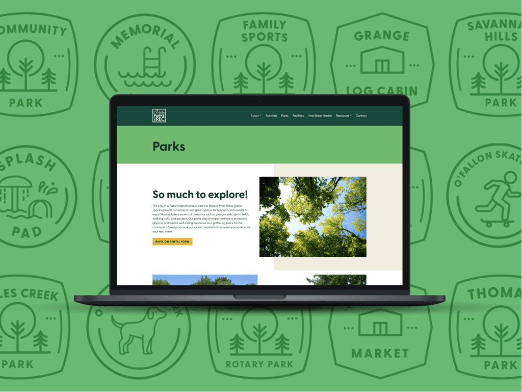
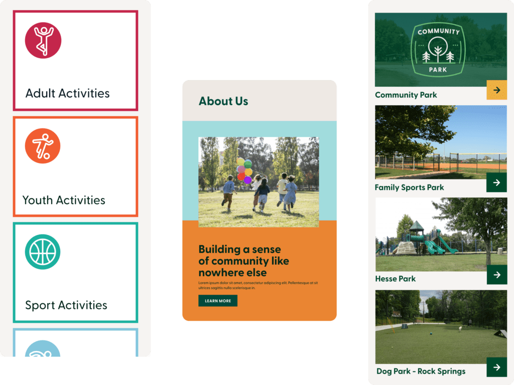
O’Fallon Parks & Rec: A Responsive Web Design Case Study
The O’Fallon Parks and Recreation website’s reconstruction was driven by a need for a modernized platform capable of accommodating a growing user base. Central to this transformation was the implementation of responsive web design, a crucial element that greatly enhanced the site’s overall effectiveness.
This responsive approach ensured that the website seamlessly adapts to various screen sizes and devices, offering an optimal viewing and interaction experience for all visitors. Now, with the site’s responsive design, users can effortlessly access information, events, and activities whether they’re on a desktop, tablet, or smartphone.
This adaptability has significantly improved user engagement and accessibility, allowing the O’Fallon Parks and Recreation team to effectively reach and serve a broader audience.
If you want your optimization efforts to bear fruit in this day and age of mobile domination, go for responsive web design now.
About The Author
Shawn Byrne is the founder and CEO of My Biz Niche, an Arizona-based digital marketing company that has achieved superior results for their clients. Before My Biz Niche, Shawn worked for Venture Capitalists where he built a private portfolio of e-commerce and informational websites that generate revenue through various digital marketing strategies.
James is a savvy digital marketing specialist with a Masters of Science in Internet Marketing. For the past fourteen years, he has been specializing in SEO, PPC & Marketing Strategy. He has a super sharp analytical mind and a finely tuned creative eye for marketing initiatives that optimize brands.
To provide the best experiences, we use technologies like cookies to store and/or access device information. Consenting to these technologies will allow us to process data such as browsing behavior or unique IDs on this site. Not consenting or withdrawing consent, may adversely affect certain features and functions.
Functional
Always active
The technical storage or access is strictly necessary for the legitimate purpose of enabling the use of a specific service explicitly requested by the subscriber or user, or for the sole purpose of carrying out the transmission of a communication over an electronic communications network.
Preferences
The technical storage or access is necessary for the legitimate purpose of storing preferences that are not requested by the subscriber or user.
Statistics
The technical storage or access that is used exclusively for statistical purposes.The technical storage or access that is used exclusively for anonymous statistical purposes. Without a subpoena, voluntary compliance on the part of your Internet Service Provider, or additional records from a third party, information stored or retrieved for this purpose alone cannot usually be used to identify you.
Marketing
The technical storage or access is required to create user profiles to send advertising, or to track the user on a website or across several websites for similar marketing purposes.

