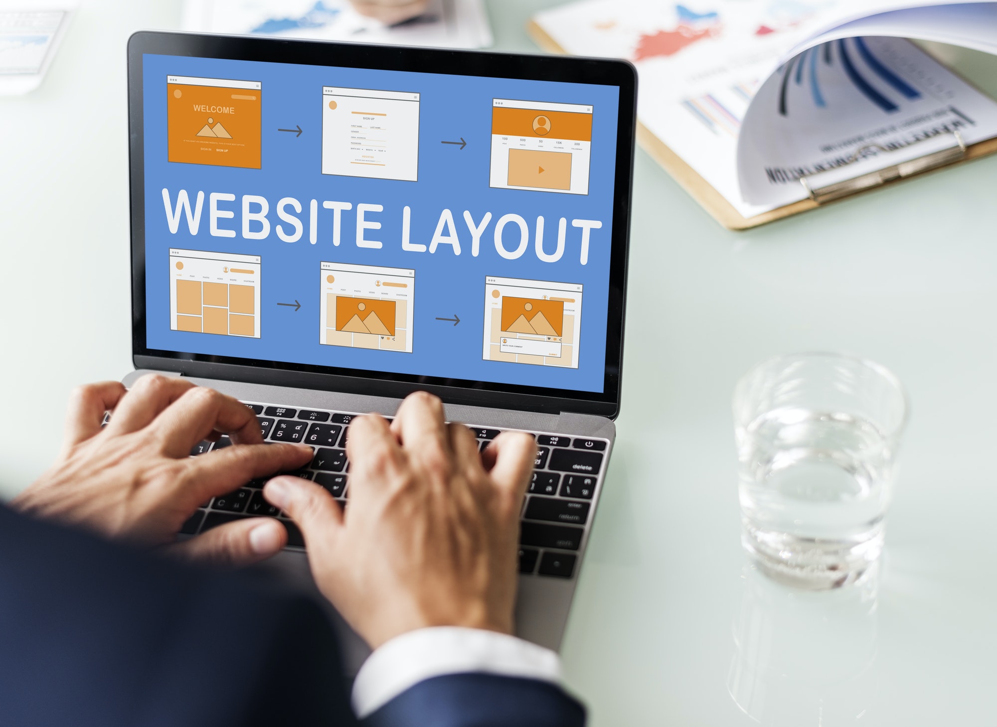
Your website design is the key to how quickly visitors can determine the motive of your website and what your company does. Optimizing your website design is a good start if you are trying to rank higher on SERPs (Search Engine Result Pages) or reduce bounce rates. No matter how good the content is or how good your products and services are, if they are not presented efficiently to the visitors, then the website will hardly get any traffic. Your website must have the right balance of both optimized and quality content and an engaging design. Today we will discuss some tips to improve your website design.
A website design that can easily communicate with the audience is likely to have more visitors and improved customer engagement. There are several ways in which you can improve your website design; however, it depends on the type of website you have. Here ten essential tips that will help you improve your website’s design disregarding the domain it belongs to:
1. Get Straight To The point

The vast amount of content on social platforms has shortened the attention span of audiences. Thus, your website must be upfront about its motive without beating around the bush to prevent visitors from quickly losing interest in it. Getting your point across within the first few seconds a customer comes to your website is essential. Long and grouped content must be avoided. Short and compact, to the point sentences does the trick.
2. Make Your Contact Information Readily Available
Ensure that your website has a ‘Contact Us’ option on every page, whether as a side menu or a footnote. Making your contact information readily available will prevent you from losing any potential leads.
3. Responsive Websites
Computers and laptops are not the only devices that customers browse the internet. Most of your site’s visitors are likely to use smartphones to access it. It is better to stay on the safe side and make your website responsive so that it automatically adjusts to the size of the device that the visitor is using.
4. Social Media Sharing Options
You may find a related article from a Sydney web designer that says that websites must have social media sharing options to maximize their organic traffic. The visitors must be able to share your website and your content on social media. Letting users share your site will bring in a lot of social media traffic which will, in turn, share your site again, which will bring on even more traffic- you get the drift.
5. Choose The Right Photos

Using stock photos just for the sake of it can affect your website badly. It would be best if you used pictures that look genuine and fit the context. Whenever possible, use your photographs. If that is not possible, you should do a thorough screening of the stock photos that you are tempted to use and see if it brings any realism to your brand or not.
6. Simple Design Goes A Long Way
Stay away from intricate designs and animations. Simple and minimalistic designs will let your content be seen by the visitor easily without any distractions. Flashy websites might be the thing in the early 2000s, but it is not in the 2020s. As long as your website’s design is effective in getting the point across, you are probably good to go.
7. Site Speed Is Important
Having a simple design on your website allows it to load much faster than having a flashy and elaborate design. Even with your website designed beautifully, you will get a hard time receiving enough traffic if your page load speed is slow.
8. Avoid Excessive Pop-Ups
Understandably, pop-ups, and adverts are an extra means to your website’s revenue. However, excessive pop-ups are generally associated with malware or viruses by users, even when they are not. While single pop-ups prompting for a call-to-action is common on websites, too many pop-ups can badly affect the user’s experience on your website. If visitors spend more time closing pop-ups on your website instead of reading the content, it might explain the lack of traffic or the higher bounce rate of your website.
9. Make Your Logo Clickable
This point is especially crucial for eCommerce sites that have a lot of pages on their websites. When your logo or banner is clickable, the user can easily navigate through your website and go to the homepage without any hassle.
10. Increase Readability
For the website to effectively get its point across to the visitor, it must have excellent readability. The readability of any website can be enhanced by flat designs and the incorporation of white space. White space, or negative space, allows users to focus on the elements that are of top priority.
An efficiently designed website is as essential as the quality of content you put in it. There must be a healthy counterbalance in both of these aspects for any website. Hopefully, these tips to improve your website design has helped you with your future design projects.
Share at:ChatGPTPerplexityGrokGoogle AI
Post Written By:
James McMinn
James is a savvy digital marketing specialist with a Masters of Science in Internet Marketing. For the past fourteen years, he has been specializing in SEO, PPC & Marketing Strategy. He has a super sharp analytical mind and a finely tuned creative eye for marketing initiatives that optimize brands.


