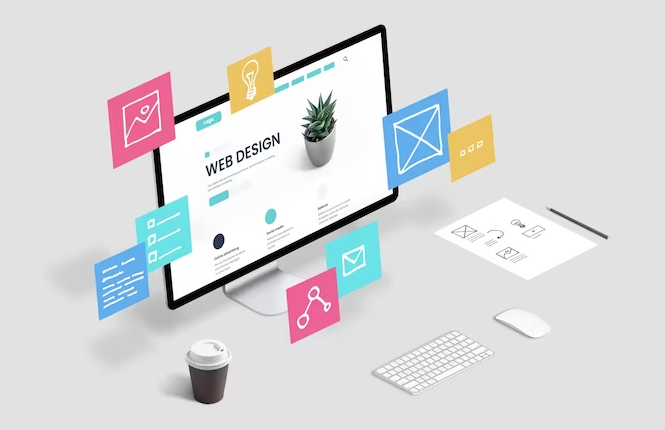
Creating an interactive web design is important for companies. It helps them to get the attention of visitors perfectly at the first glance. There are different techniques to create this type of design, in the most popular right now is by using the method of data visualization. It specifically follows a data-driven design approach, letting people know about the company’s products/services in a unique manner. The concept used in this type of design is pretty simple i.e. to promote products with the help of real market data.
It has been noted that customers always look towards real data while purchasing any product from the market. Keeping this fact in view, web designers are now using data visualization techniques to build better websites. They understand how crucial this visualization can become for their websites, provided all the important web design principles are clearly followed. It can make their front-end design interactive, allowing users to understand the services in a better way.
However, the art of using data visualization for web design optimization is also not simple. It requires good technical skills, as well as an understanding of various areas where data should be shown. In this blog, we will discuss these practices in detail, so that beginners can fully acknowledge the concept of this unique design technique.
Let us first start from the basics understanding the core definition of data visualization below.
Putting it simply, data visualization is a technique with which you showcase data in a meaningful manner. It helps you to present the information in an easy way so that everyone can understand it quickly. Based on this data, project administrators can make smart decisions in a timely manner. This visualization can be presented in any form such as charts, numbers, etc.
Data visualization is used for different types of purposes. Besides presenting the data clearly, data visualization also helps to break down complex data sets. In this case, it allows us to find the patterns clearly without getting into any confusion. That is how hidden details are explored, allowing people to evaluate the data correctly.
The utilization of data visualization in a web design makes pretty good sense. It can help to make the front end of any website fully interactive. The data illustrated in the design can hook users’ attention, allowing them to see the benefits of a product in a realistic manner.
Why Should You Use Data Visualization in a Web Design?
Every web designer understands the importance of user experience. They know that people will only stay on the website if they find its front-end interactive. Keeping this in view, designers try to utilize different methods that can give their visitors the best user experience. Among different techniques, data visualization often proves to be a good choice, as it presents real data to the people.
With data visualization, you create designs that are free from your own random perceptions. This means that the design is backed by the data, which is basically the real source of converting customers. This type of design always works to make the site interesting for visitors. It showcases everything based on the data so that users can understand everything easily.
There are a number of ways in which data visualization can be incorporated into the design. Being a project stakeholder, you need to pick any one option from these methods wisely. Ideally, you should pick a method that fits perfectly to your marketing strategy. This way, you can build a better website that will ensure to give conversions upon each interaction.
Unleashing Data Visualization for Superior User Experiences
In the realm of web and app design, leveraging the power of data visualization is a must for instance, if you are planning to create instant cash loan apps this is a transformative approach to take. By integrating data visualization, designers can create interfaces that not only captivate but also inform users effectively. This dynamic combination ensures a seamless fusion of financial insights and visually appealing design, promising an unparalleled user
How To Use Data Visualization To Optimize Web Design
If you are planning to design an interactive front-end for your website, go with the integration of data visualization. But, wait, you might be thinking how it would be done considering you’ve got no knowledge about this technique.
Luckily, you are at the right place, reading the right tips to implement data visualization perfectly in a web design. Let’s take a look at the points below to understand how data visualization can be efficiently used in a web design.
Find Out Areas Of Focus
First of all, you need to find those areas where you want most of the visitors’ attention. It could be at multiple places where you want people to look closely at the numbers. Generally, front sliders always become a top choice for many designers. They know that a good number right at the start can help them to build an early impact. It does not require a big psychology, but simple common sense when you are trying to attract the attention of website visitors instantly.
Besides top sections, mid-CTA banners can also be a good choice to showcase some catchy insights. You can define the number of global clients, projects completed, and other stuff in this area. This is how you can get the attention of new customers who are visiting your website for the first time.
Set An Objective
Once you have marked out the areas where data visualization will be given the most attention, move toward the next step of setting objectives. It is an important part that is often ignored by many designers. They do not chalk out the goals that should be met at the end of the design process. This approach simply keeps them in a loop, as they do not know when to conclude the data visualization in a web design.
Speaking about goals, you need to set benchmarks that can help you quantify the performance of a website. It includes targets like conversions, bounce rate, and others. These numbers provide an ideal view of whether the data illustration on the website is working fine or not. This is certainly the best way to know how data is influencing people to change their decisions on your website.
Gather Data And Present Results
Once you have done the above two steps, it is time to gather the data that would be illustrated in the respective areas. Generally, you need to showcase numbers that define your strength in particular engagement spaces like conversions, traffic, and others. People pay more attention to these types of data, so make sure to compile them as per your branding requirements.
Meanwhile, remember to test this data illustration on staging before taking it to the live website. This will help you to find out all the errors that are present in the design, giving you ample time to fix them correctly. Many times, wrong numbers are quoted mistakenly, hence try to double-check the facts to present everything properly.
FAQ: Visualizing Data In Excel
Q: How to visualize data in Excel?
To visualize data in Excel, start by organizing your data effectively with clear labels and categories. Then, select the data you want to visualize and go to the “Insert” tab to choose a chart type that suits your data, such as bar charts, line graphs, or pie charts. Customize your chart to enhance clarity and interpretation by adjusting colors, fonts, and labels. Finally, analyze the chart to identify trends and insights.
Q: What makes a good data visualization?
A good data visualization is accurate, clear, relevant, and aesthetically pleasing. Accuracy ensures that the visualization represents the data correctly, while clarity ensures it is easy to understand. Relevance focuses on presenting the most important insights, and aesthetics enhance the visual appeal without sacrificing clarity.
Q: How to present qualitative data visually?
Presenting qualitative data visually can be done through word clouds, heatmaps, bar graphs, pie charts, and infographics. Word clouds visualize word frequency, heatmaps display patterns or relationships, bar graphs compare categories, pie charts show proportions, and infographics combine text, images, and icons for compelling presentations.
Final Words
That brings us to the end of this blog in which we have discussed how data visualization can be used perfectly in a web design. It is indeed a great way to present facts that can grab the eyeballs of visitors on a webpage. With the help of data visualization, you can elevate the user experience of the website, allowing it to perform better in interaction. However, to do that, there are some steps you need to keep in mind. This blog has discussed some of them, and we hope that you would’ve understood all of them.
Contact Matchbox Design Group Today!
If your website could use a refresh, if you’re looking to drive more traffic to your site, or you would like to submit a guest post, fill out the form below and we’ll contact you to learn more about your digital needs.
To provide the best experiences, we use technologies like cookies to store and/or access device information. Consenting to these technologies will allow us to process data such as browsing behavior or unique IDs on this site. Not consenting or withdrawing consent, may adversely affect certain features and functions.
Functional
Always active
The technical storage or access is strictly necessary for the legitimate purpose of enabling the use of a specific service explicitly requested by the subscriber or user, or for the sole purpose of carrying out the transmission of a communication over an electronic communications network.
Preferences
The technical storage or access is necessary for the legitimate purpose of storing preferences that are not requested by the subscriber or user.
Statistics
The technical storage or access that is used exclusively for statistical purposes.The technical storage or access that is used exclusively for anonymous statistical purposes. Without a subpoena, voluntary compliance on the part of your Internet Service Provider, or additional records from a third party, information stored or retrieved for this purpose alone cannot usually be used to identify you.
Marketing
The technical storage or access is required to create user profiles to send advertising, or to track the user on a website or across several websites for similar marketing purposes.