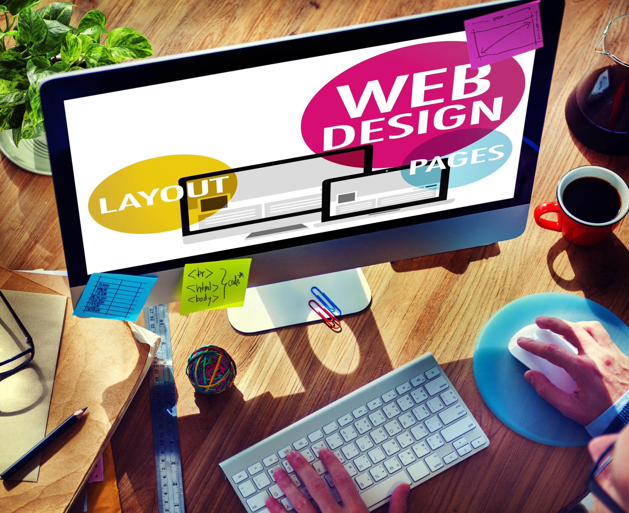
Many elements go into designing a high-converting website. From aesthetic to functional to marketing choices, seemingly small decisions can make a notable impact on consumer behavior. But when it comes to SaaS, there’s one thing that must always remain at the forefront of the design strategy: user experience. Today we are going to talk about some high-converting SaaS website design techniques.
As a concept that describes the end consumer’s interaction with a brand, UX encompasses visuals, convenience, efficiency, and everything in between that is part of the buyer journey. The most high-converting SaaS websites aren’t the ones with the best copy or marketing tactics. Instead, they’re the ones, which predict and meet consumer needs, often far before those same consumers are even aware of them.
So if your goal is to design a high-converting SaaS website, these are the top tips to keep in mind during the planning process.
Make It Intuitive
The first step towards creating a SaaS website that inspires conversions is to ensure that it’s 100% user-oriented. What does that mean? It’s quite simple. It means it presents the user with a clear value proposition the moment they land on your homepage.
Now, if you consider that the average time spent on a page in 2020 was 62 seconds, it becomes quite clear that there’s no time to delay – especially if you know that almost half of all page visits end in a bounce. That’s why Nielsen’s advice that you must present your unique value proposition in 10 seconds or less is still relevant.
So how do you achieve this?
Well, that’s simple as well. First, you make full use of your hero section. In this example by Vetter, you can see just how much you can say with a few words and a blank background.

Second, you make the navigation process as user-friendly as possible. Help your potential customers get the information they’re after with page jumps, as done on InFlow Inventory’s B2B Portal landing page.

Third, ensure that the conversion is a natural continuation of the page experience. Place CTA buttons in highly-visible relevant spots and make them a central part of the design. You can look for inspiration on the HeroBot homepage that’s got CTAs down to a T.

Use Content to Target Different Stages of the Buyer Journey
If it’s conversions you’re after, it’s crucial to understand that you can’t allow yourself to be a one-trick pony. After all, a “Sign up” CTA won’t go far with a consumer who doesn’t even know they need your product, will it?
So, don’t just focus all your attention on the last step of the sales process. Do your best to design a website that works for all stages of the buyer journey.
High-quality content can go a long way in reaching new audiences, convincing them to sign up, download, or purchase, and keeping existing customers coming back for more. As there’s a wide variety of formats and topics any SaaS brand can address, it’s an investment worth making. And, it can even replace a large portion of paid marketing tactics, ultimately saving you money.
For example, take a look at this guide published by TimeTackle. You’ll see that it’s a great way to offer valuable information to consumers in need of a time-management solution. Without being even a bit self-promotional, it still positions the company as an authority on the topic, encouraging readers to sign up for its product.
St. Louis Website Development Company
Show Off Your Product
It’s well-known that design is one of the most impactful factors influencing consumer behavior. This is why you need to find a way to visually represent your product, even if it’s not a physical object.
For eCommerce brands, this is easy. They can invest in product photography and video, display the multimedia assets in a convenient spot, then let web visitors slowly fall in love with products based on aesthetics. However, when you’re selling a SaaS product, this can be a bit more challenging.
One solution would be to display the product as it appears in real-life. With screenshots, in-app videos, and screen grabs, potential buyers will get a good idea of what they can expect. This is what’s done on the Bear website.

Thanks to the app’s minimalistic design, it’s a solid choice that offers suitable visibility and clarity. However, it would likely be too much for a more complicated solution. In such cases, illustrations may be the better choice.
Look at the Atlassian Marketplace website, and you’ll find that their main product categories rely on illustrated art. It’s far better at describing concepts than product photography, especially as there are hundreds of solutions available. Ultimately, this approach avoids losing potential customers due to showing the one thing they’re not interested in.

Build Trust
Social proof is becoming increasingly important in securing conversions, especially as the competition in the SaaS industry gets tougher. With this in mind, adding different trust signals to a website always makes for an excellent idea.
If you’ve applied tip #2, you’ve already invested in your brand’s authority and trustworthiness. However, you can take things a step further.
For one, you can position your company as a key player in the industry by showing off some numbers. ShowMojo, for example, takes pride in having a database of half a million properties and having helped capture more than 21.2 million leads for its users.

Zoho Desk proudly displays the recognition they received from Gartner in 2020.

Chargebee shows off their most prominent users.

And finally, Hiver makes it their point to show off the high rating they’ve received from over 500 users on G2.

Offer Incentives
Last but not least, when aiming to design a high-converting SaaS website, make sure that it inspires consumers to take the desired action. Even if it takes a little bit of a push.
Incentives such as the timer pop-up used by Nord VPN encourage consumers to make a purchase as soon as possible. The reason to take such action? The brand’s marketers are well-aware that once the web visitor leaves the site, they’re either likely to put off their purchase, or even worse, go to a competitor brand.

Final Thoughts
SaaS is a fast-growing industry. According to BMC, it’s expected to generate close to 141 billion in 2022. This is an exciting promise to anyone interested in the field. However, such impressive numbers always mean high competition, which necessitates effective solutions.
In the end, if a SaaS brand’s website isn’t up to par in securing conversions, the company risks becoming one of the many startups that fail every year. Fortunately, this risk can be mitigated by making the right design choices. The five tips we’ve discussed in this post are easy to implement and will go a long way. And best of all, they don’t have to burn a hole in your budget. On the contrary, they can be quite affordable compared to popular paid marketing strategies most brands turn to nowadays.
Share at:ChatGPTPerplexityGrokGoogle AI