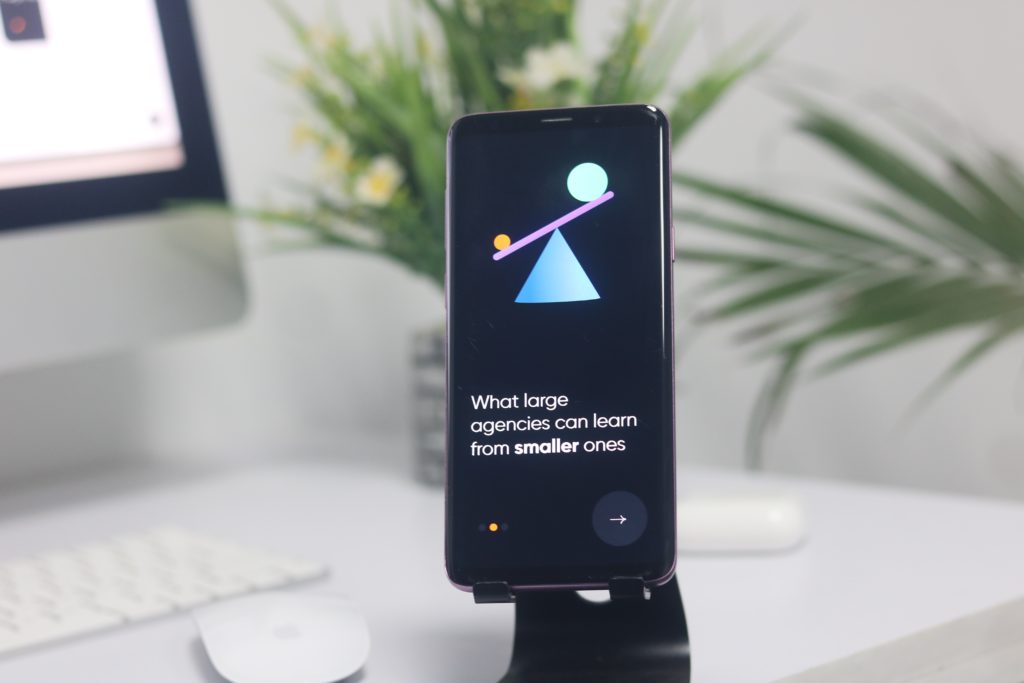
Today we are going to discuss 13 web design trends to check out, the 2023 edition.
In the realm of web design, 2023 has been nothing short of a whirlwind. With tech’s relentless innovations, you’ve got to keep your web design game robust, sassy, and up-to-date. From the rise of immersive metaverses to the resurgence of retro typography, web design trends are more dynamic than they’ve ever been.
But let’s not kid ourselves: keeping up with the trends is not just about looking cool; it’s about staying relevant and ensuring the ever-demanding users are not clicking the dreaded ”X” on their tabs. After all, it’s 2023, and we’re not just designing websites – we’re crafting experiences.
So, if you’re ready to invest in your business website, we’ve got the 411 on the trends shaping up this audacious, tech-forward era. We’ve put together five exciting web design trends that are taking this year by storm. By the end, you’ll learn not only how to make an impression but also how to leave a digital footprint that’s uniquely yours.
AR And VR Integration: Leveling Up User Experience
Are you ready to swap reality for something a bit more…virtual? If you’re squinting with skepticism, just read on. AR and VR have been increasingly popular terms as of late, but they’re much more than just buzzwords – they’re the next frontier in web design.
AR (augmented reality) and VR (virtual reality) integration in web design doesn’t aim to replace reality but rather to enhance it. In 2023, it’s all about creating sensory, interactive experiences that keep users glued.
Modern technology revolving around AR and VR has truly catapulted UX to stratospheric heights. With these tools, web designers are no longer constrained by the two-dimensional plane. We’re now creating virtual showrooms, interactive tutorials, and immersive product showcases, engaging users in ways we’ve only dreamed of.
How do you make AR and VR work for your web design? First, understand your audience. AR/VR is cool, but it’s not a one-size-fits-all solution. Identify where it adds value. Are you selling products that benefit from a 360° view or a try-on feature? Or maybe your tutorials can be more engaging in a simulated environment?
Next, ensure your AR and VR elements work seamlessly with other parts of your website. These elements should elevate the user experience, not complicate it. Ensure they’re intuitive to navigate, quick to load, and compatible across devices.
Lastly, remember that AR/VR isn’t about creating an isolated experience. It should tie back to your brand story and aesthetic. Consistency is key!
So, don’t be a bystander in this tech revolution. Get in the game, get creating, and take your users on a journey that transcends the screen.
Eco-Conscious Design Trends: Doing The Right Thing
Remember when ”green” was just a color in the designer’s palette? Well, not anymore. Green is now a calling, a movement, an ethos. As the world leans into sustainability, web design can’t lag. Yep, even virtual landscapes can be eco-conscious, and here’s how.
Eco-conscious design is not a mere trend – it’s a shift in web design philosophy. It’s rapidly becoming an expectation, and eco-friendly websites are leading the way with their minimalist designs.
When designing a website, it’s essential to communicate your green efforts to your visitors. Share your commitment to digital sustainability on your web pages. If you follow the eco-friendly route in your web design, make a note of your minimalist, optimized design and your reduced energy consumption. That will resonate with your user base, reinforcing their commitment to doing business with you.
Take Baselang, a platform offering unlimited Spanish tutoring online. One look at their homepage, and you can tell they’ve nailed the minimalist design. It’s clean, clutter-free, and offers only the key features of its services. This isn’t just aesthetically pleasing, but it’s also a green design strategy.
Minimalistic websites like Baselang’s are usually leaner, which means less data to transfer and store, less energy to power servers, and, consequently, reduced carbon emissions. It’s an excellent example of how design choices can contribute to reducing the digital carbon footprint.
But that’s not all. The green design also means opting for eco-conscious hosting services, which use renewable energy or carbon offsetting. Baselang, or any other company striving for sustainability, could take this step to further decrease its digital carbon footprint.
The Aesthetics Of Brutalism: Eccentric Is The New Black
If you’ve been around the digital block, you’ve seen them: those raw, in-your-face websites that dismiss the rules and embrace chaos. It means we’ve entered an era of brutalist web design, a trend that’s kicking elegance to the curb and making us question our design conventions.
Derived from brutalist architecture, web brutalism is all about raw honesty. Forget gradients, animations, or color harmony – brutalism thrives on bold colors, stark typography, and layouts that break grids. But don’t mistake it’s unrefined look for a lack of thought. Brutalist design is intentional and powerful, and it challenges the status quo.
So, how do you dip your toes into brutalism without alienating your users? Start with typography. Opt for bold, oversized fonts that pack a punch. Next, break the grid. Asymmetrical layouts and unconventional placements can create a visually intriguing site.
Then, play with colors. Brutalist design isn’t shy, so don’t hesitate to use high-contrast colors that stand out. And finally, keep it raw and honest. Brutalism is here to celebrate the unrefined.
A word of caution: Brutalism isn’t for everyone. It’s bold, it’s loud, and it can be off-putting for some. But if done right, it can help your brand stand out in the sea of ”played-safe” designs.
Here’s how designing with brutalism worked great for The Outline, a news and media website. With a unique blend of brutalism and modern design, The Outline uses intense color contrasts, bold typography, and an unorthodox layout to capture their readers’ attention.
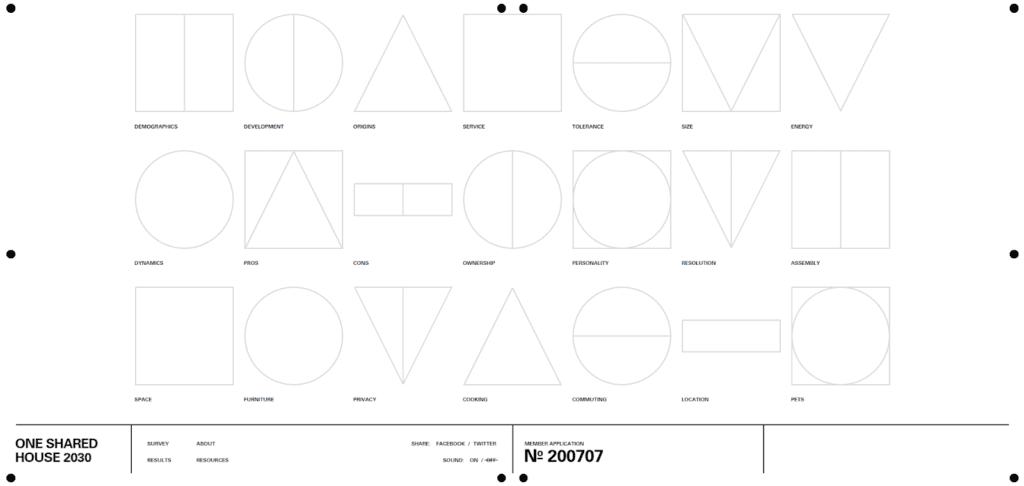
Another example of great use of brutalism is ONE SHARED HOUSE 2030, a collaborative project that explores the future of co-living. This website utilizes a brutalist design with sharp typography, high contrast, and a non-standard layout.
Educational Interactivity: Empowering Users With Knowledge
For webpages selling products that require a certain level of understanding, integrating ”educational interactivity” becomes a game-changer.
Educational interactivity doesn’t just resolve doubts – it builds trust and confidence in your product, especially for sectors that are shrouded in misconceptions. By offering information in an engaging, interactive manner, you’re not just selling a product. You’re fostering an informed community.
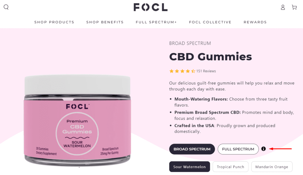
Let’s examine FOCL, an e-commerce business selling premium CBD products and plant-based wellness solutions. To some, CBD is a known entity with recognized benefits, but to others, it’s a new frontier accompanied by a barrage of questions. What’s CBD? How does it work? Is it legal? This is where educational interactivity swoops in.
First, take a look at their interactive informational icons. They use clickable icons and hover effects to explain what their product contains. They make this learning journey engaging rather than just a boring science lecture. Think interactive animations that spring to life as users hover or click.
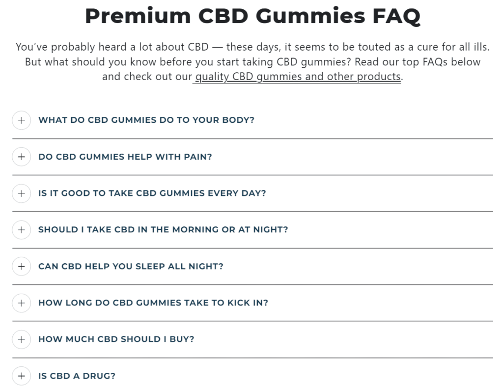
Next, FOCL integrates an interactive FAQ section. Instead of a traditional Q&A list, they create an interactive module where users can select their concerns and receive personalized answers. This covers topics like legality, usage, potential side effects, and more.
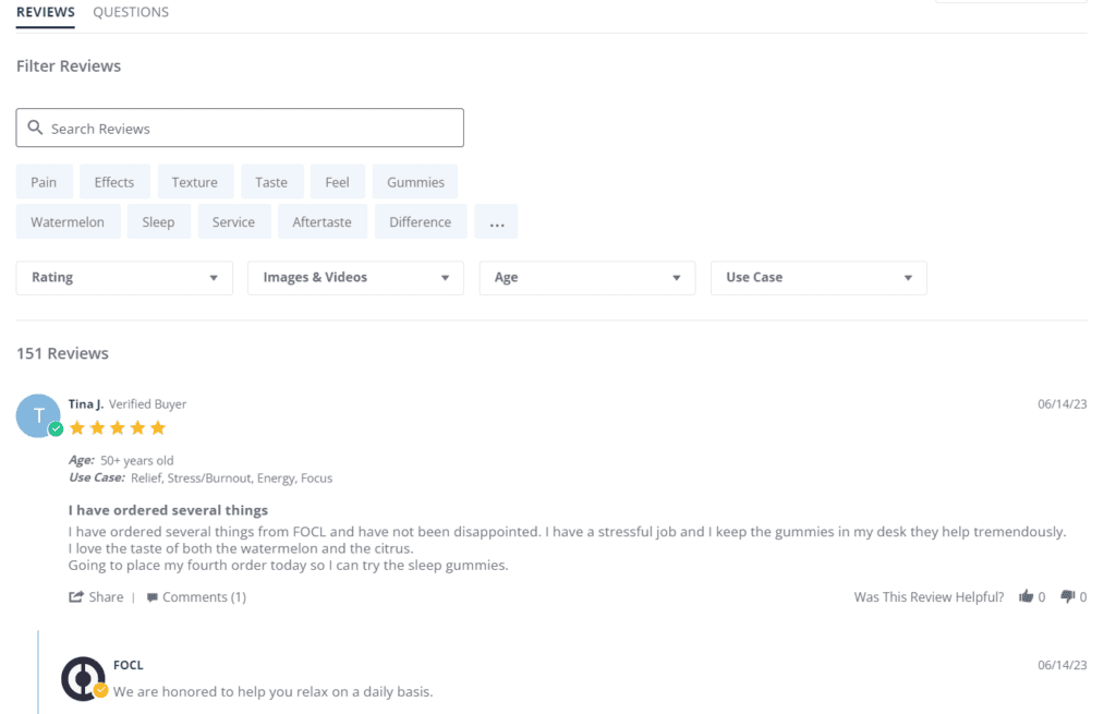
Lastly, they interactively incorporate customer testimonials. The section showcasing different user stories is filterable in so many ways, thanks to a search feature that helps visitors look up the aspects they’re most interested in.
If you thought serif fonts were just for print and grandma’s love letters, think again. Serifs are making a bold comeback in the digital sphere, adding a dash of old-world charm to our modern, sleek interfaces.
For years, web design was a sans-serif playground – clean, legible, and minimal. But with the rebirth of serifs, web typography is getting a personality upgrade. Serifs bring an air of elegance, tradition, and warmth, standing out amidst the sea of sans-serifs.
Making web design not just about pixels and code but also about stories and emotions is one more way to build a stronger connection with your user base.
But how do you balance this retro charm with your modern design? The key is to blend, not overshadow. Use serif fonts for headings or specific highlights. Pair them with sans-serif fonts to maintain readability and modernity.
Also, remember not all serifs are created equal. There are traditional, slab, and modern serifs, each with its unique flair. So pick one that aligns with your brand personality. A tech website might opt for a modern serif, while a literary blog might lean into the traditional.
One cautionary note: serifs can get tricky on smaller screens or lower resolutions. So, always test your design across different devices and screen sizes.
An impressive example of perfectly blending serif and sans-serif fonts on their website is Mailchimp, the popular marketing, automation, and email platform. They use the custom, quirky serif font ”Cooper Light” for headers, giving their brand a friendly and approachable vibe.
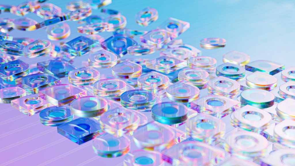
Let’s start with 3D elements and graphics in our list of emerging technologies and trends in web design!
The 3D elements and graphics refer to the use of 3-dimensional visual elements for creating depth and a sense of realism in the visitor’s experience. If you want to capture visitors’ attention and increase their stay time on the website, using 3D elements and graphics can be a brilliant idea while upgrading your business website. Gaming, e-commerce, architecture, or entertainment-related websites are ideal use cases that incorporate 3D elements and graphics into their website designs.
The use of 3D elements and graphics is a smart way for incorporating an element of storytelling via your business website. You can divert visitors’ attention to a specific section where you want them to focus while they’re on a certain page.
With this approach, businesses can easily upgrade users’ overall experience and instill the element of captivation once they land on the website.
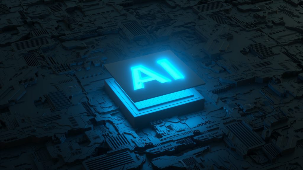
Artificial Intelligence (AI)
Circuit board and AI micro processor, Artificial intelligence of digital human. 3d render
Next, on our list of emerging technologies and trends in web design, is AI!
AI (or Artificial Intelligence) is penetrating every industry and it has a considerable role in improving today’s web design standards, too.
How AI is enhancing web design standards?
Well, the use of AI in web design refers to the automation of repetitive tasks by the use of machine learning that helps webmasters in studying visitors’ behavior and various other aspects. By implementing AI in web design, web designers and developers can enhance a website’s performance to manifolds knowing what exactly the visitors seek in a particular website.
In short, artificial intelligence-integrated websites offer every visitor a tailored experience that ultimately results in longer stay time and objective fulfillment.
Dark Mode Design
Dark mode is another popular trend in the web design world when it comes to listing down emerging technologies and trends.
Contrary to the light website page backgrounds, the dark mode uses darker color interfaces offering a unique feel to the website visitor. One of the reasons for choosing dark mode in website layouts is to offer the visitor protection against eye strain or save the device’s battery life.
Over the years, our reliance on digital devices has increased to manifolds and this has unlocked the danger of developing various eye-related issues. Using dark mode designs in websites is a smart move not just to protect human eyes against strain but also to upgrade the website design standards, too.
When you visit a news portal, you’ll witness the majority of them offer the dark mode option to their visitors for enhancing their focus while reading the news. Turning “Dark Mode” on not only offers them focus while reading but also saves them battery life if they’re accessing the website on their mobile.
Micro-Interactions
Gone are the days when we used to have static websites today, a website does more than offer information. And micro-interactions are another popular trend when we discuss emerging technologies and trends in the web design world.
The micro-interactions are the subtle, interactive elements strategically included in a website’s layout for enhancing visitor’s overall experience. These include the small, animated buttons such as you see on social media to express the feeling of a visitor upon reading a post or discovering certain information.
Imagine you add an item to the cart while shopping online and a small, but engaging, animation appears while you do it instantly cheering your mood. That’s one of the many examples of how micro-interactions can set the mood of your website’s visitors.
The prime purpose of including micro-interactions in the website’s design is to improve a user’s engagement ratio and increase retention time. With the addition of micro-interactions, you can obtain visitors’ feedback while keeping their overall experience delightful and amusing.
Mobile-First Design
In our list of emerging technologies and trends in web design, the next trend is creating mobile-first designs!
We all access the internet via our mobile more than laptops or PCs, today!
And prioritizing a mobile-ready website interface becomes a wise approach instantly when the majority of visitors are accessing your business website via a mobile screen.
The key purpose of choosing mobile-first designs is to offer the visitors an optimal experience on smaller screens just as they’d access the website on a bigger screen. The designers and developers would work together on every element of the website for maintaining the website’s quality on both screen sizes – smaller and larger.
One wise example of how organizations utilize mobile-first design is to look at any news-related website that offers you an amazing experience on your mobile just as you’d have on a larger screen. You’ll not find any mistake in the page’s layout, varying fonts, oddly arranged graphical elements, or header/footer of the page even when accessed through a mobile device.
Motion UI
Speaking of emerging technologies and trends in the web design world, motion UI is another popular trend that designers utilize when working on a new project. The motion UI concept involves using animations, transitions, and dynamic elements in a website’s layout for creating an interactive user experience. Using these elements not only brings new life into your website’s overall look and feel but also engages the visitor resulting in extended user retention time.
Have you ever visited a website that has an interactive menu instead of a plain navigational bar? Meaning when you hover over a specific menu section, it opens an extended list of sub-menu instead of covering the whole page with a static menu bar? That’s one example of how motion UI works while designing a futuristic and interactive website.
Not only restricted to the aesthetic part of the website, but motion UI also allows you to add strategic sections in every area of the website than just wooing your visitors with the surprising menu bar.
Progressive Web Apps (PWAs)
As we conclude our emerging technologies and trends list in web design, there’s one essential mention without which this list is incomplete.
Yes, we’re talking about the progressive web apps otherwise known as PWAs!
PWAs are a new web development approach that combines the best features of native mobile applications and traditional websites into one. The key purpose of PWAs is to offer users a seamless, fast, and engaging navigational experience across various devices and platforms. PWAs are designed to be responsive, installable, and reliable for end users due to their unique structure in comparison to traditional business websites. Plus, these applications can be accessed when offline, have push notification functionality, and provide a smooth performance to the users.
One key example of PWAs is the Twitter Lite app which offers all features just like the regular Twitter app does but consumes lesser battery life.
And with this, we conclude our list of emerging technologies and trends in web design that you should know. We hope this list will help you in making the right decision when you want to upgrade your existing website with new and emerging trends and technologies.
Final Thoughts
Those are the five dominating web design trends of 2023 that, according to us, have redefined the virtual landscape.
From the multi-dimensional approach of AR and VR and the raw aesthetic of brutalism to the meaningful commitment of eco-conscious design, the versatility of serif fonts, and the empowering approach of educational interactivity – web design is revolutionizing.
Although, you need to remember one important thing! These trends aren’t one-size-fits-all. Consider them as colors in a designer’s palette, each with its vibe and charm. Whether you splash them generously or apply them sparingly, the key is to align them with your brand’s personality, your audience’s preferences, and your website’s goals.
About One Of The Guest Authors
Bruce Murphy is a highly skilled graphic designer with a specialization in Mobile Application Interfaces and Digital Illustration. With over 10 years of experience in the industry, he has established himself as a top professional at Ingenious Guru, a leading design agency.
Contact Matchbox Design Group Today!
If your website could use a refresh, if you’re looking to drive more traffic to your site, or you would like to submit a guest post, fill out the form below and we’ll contact you to learn more about your digital needs.
To provide the best experiences, we use technologies like cookies to store and/or access device information. Consenting to these technologies will allow us to process data such as browsing behavior or unique IDs on this site. Not consenting or withdrawing consent, may adversely affect certain features and functions.
Functional
Always active
The technical storage or access is strictly necessary for the legitimate purpose of enabling the use of a specific service explicitly requested by the subscriber or user, or for the sole purpose of carrying out the transmission of a communication over an electronic communications network.
Preferences
The technical storage or access is necessary for the legitimate purpose of storing preferences that are not requested by the subscriber or user.
Statistics
The technical storage or access that is used exclusively for statistical purposes.The technical storage or access that is used exclusively for anonymous statistical purposes. Without a subpoena, voluntary compliance on the part of your Internet Service Provider, or additional records from a third party, information stored or retrieved for this purpose alone cannot usually be used to identify you.
Marketing
The technical storage or access is required to create user profiles to send advertising, or to track the user on a website or across several websites for similar marketing purposes.

