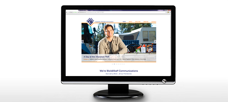
It’s been over three years since we began working with Blick&Staff Communications and today we’re excited to show off their new website design. As you can imagine, a lot of things can change in a three year period and one of the things for Blick was their image. So naturally, one of the first places to show off your new look and feel is your digital presence.
When we started looking at the project with Blick it quickly evolved from a landing page to an informative single page site. We were excited with the challenges this brought on and are even more pleased with the outcome. Here’s how we did it…
Blick&Staff Website Gets A Facelift – How We Did It
Amanda worked with the Blick team to craft a new look based around “Imaginative, Meaningful Communications.” We started development with a static HTML site and implemented some jQuery features to dress it up a bit. One of the main features of the site is the fixed navigation. When you click on a menu item the page will either scroll down or up to the desired content. We also used a content slider to feature some of their recent work. The image below is a preview of the full site but you can see it in action by heading over to www.blickandstaff.com.

