Estimated reading time: 21 minutes
In today’s fast-paced digital world, mobile optimization for banks isn’t just a nice-to-have—it’s essential. As smartphones continue to transform how people manage their finances, customers now expect seamless, secure, and intuitive mobile experiences from their financial institutions.
Mobile optimization for banks goes beyond making a website “mobile-friendly.” It’s about designing a digital experience that loads quickly, looks professional, and functions effortlessly across every device. With Google’s mobile-first indexing, your site’s mobile performance has a direct impact on visibility in search results—and ultimately, how easily potential customers find and engage with your bank online.
Related Links
Whether someone is checking their account balance on the go, comparing mortgage rates, or looking for the nearest branch, they expect fast, frustration-free experiences that make banking simple. In this guide, we’ll break down what mobile optimization means for banks and how your institution can use it to strengthen customer relationships, improve SEO, and stay competitive in the digital age.
Table of Contents
- Understanding Mobile Optimization for Banks
- The Impact of Mobile Optimization on SEO
- 4 Key Elements of Mobile Optimization for Financial Websites
- Best Tools for Mobile Optimization
- Real-World Example: Midwest BankCentre
- Content Optimization for Mobile
- Tracking & Measuring Mobile Optimization Success
- Embracing Mobile Optimization for Success
- Elevate Your Mobile Banking Experience with Matchbox Design Group
Understanding Mobile Optimization for Banks
Before diving into best practices and technical details, it’s important to start with the basics. In this section, we’ll break down what mobile optimization for banks really means, why it matters in today’s digital-first financial world, and how it shapes the way customers experience your website.
What is Mobile Optimization?
Mobile optimization is the process of adjusting your website and its content to ensure it offers an outstanding experience on mobile devices. It’s not just about shrinking your site to fit smaller screens; it’s about rethinking the user experience from a mobile user’s perspective. This includes everything from the layout and design to the speed and functionality of your website. Mobile optimization ensures that your site is not only accessible but also intuitive and efficient for users who are browsing on their smartphones or tablets.
The Contrast with Traditional Desktop SEO
The world of SEO has evolved drastically with the rise of mobile internet usage. Traditional desktop SEO focuses on optimizing a website for larger screens, where users often have a stable internet connection and are likely to spend more time browsing in-depth. Desktop SEO strategies prioritize aspects like comprehensive content, multimedia elements, and intricate designs.
Mobile optimization, however, accounts for the different ways users interact with their mobile devices. These users expect quick, easy-to-digest information accessible on the go. They’re more likely to engage with simple, streamlined content that loads quickly and is easy to navigate on a smaller screen. Here, the emphasis is on speed, simplicity, and directness. Elements like touch-friendly buttons, readable fonts, and compressed images become paramount.
| Aspect | Traditional Desktop SEO | Mobile Optimization |
|---|---|---|
| Primary Device | Desktop or laptop computers | Smartphones and tablets |
| User Behavior | Users spend more time browsing and reading in-depth content | Users seek quick, accessible information on the go |
| Content Focus | Long-form, detailed content with multimedia elements | Concise, scannable content that’s easy to digest |
| Design Priorities | Complex layouts, multiple columns, and large visuals | Simplified, single-column layouts with clear hierarchy |
| Navigation | Mouse and keyboard interactions | Touch-friendly buttons and gestures |
| Performance Needs | Assumes stable, high-speed connections | Optimized for fast loading even on slower mobile networks |
| Visual Elements | Larger images and videos with high resolution | Compressed visuals to improve speed and responsiveness |
| SEO Considerations | Desktop-first indexing and keyword optimization | Mobile-first indexing, responsive design, and page speed emphasis |
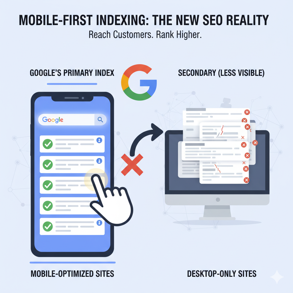
The Significance of Mobile-First Indexing by Google
Google’s mobile-first indexing is a game-changer in the SEO landscape. This approach means that Google predominantly uses the mobile version of the content for indexing and ranking. Since the majority of users now access Google via mobile devices, the search engine prioritizes mobile-optimized sites. This policy reflects a fundamental shift in how websites are assessed and ranked.
For banks and credit unions, this means that a mobile-optimized website is a requirement. Without it, your institution risks losing visibility in search results, making it harder for potential and existing customers to find and engage with your services online.
In the following sections, we will explore how financial institutions can effectively implement mobile optimization strategies to align with these evolving SEO practices, ensuring they remain competitive and visible in the ever-changing digital landscape.
The Impact of Mobile Optimization on SEO
A mobile-friendly website isn’t just about looking good on a phone—it’s about being found. Search engines now prioritize mobile performance when ranking websites, meaning your mobile experience can make or break your visibility. Let’s take a look at how mobile optimization influences SEO and why it’s worth your attention.
How Mobile Optimization Affects Search Engine Rankings
Mobile optimization plays a crucial role in determining a website’s ranking in search engine results. Search engines like Google prioritize user experience, and with the increasing prevalence of mobile browsing, a mobile-optimized site is seen as offering a superior user experience.
Here’s how it impacts SEO:
- Improved User Experience: A mobile-optimized banking website provides customers with a smoother, more intuitive experience—whether they’re checking balances, paying bills, or applying for a loan. This leads to longer visit durations and lower bounce rates, which signal to search engines that your site delivers value and should rank higher.
- Faster Page Speed: Mobile-optimized bank sites are designed for speed, which is a key ranking factor and trust signal. Faster load times not only improve SEO but also create a better experience for customers who expect quick, secure access to their financial information.
- Better Local Visibility: For banks with multiple branches, mobile optimization strengthens local SEO by helping your locations appear in nearby searches—like “bank near me” or “ATM open now.” A mobile-friendly site ensures that potential customers can easily find your nearest branch or access your services on the go.
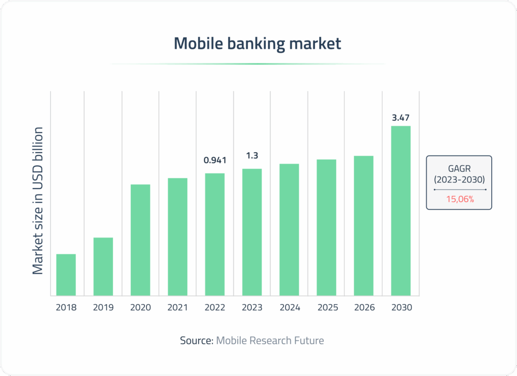
The Surge in Mobile Banking: A Statistical Perspective
The statistics on mobile banking are compelling:
- According to The American Bankers Association, about two-thirds of Generation Z (64 %) and Millennials (68 %) use mobile banking apps most often, while more than half of Generation X (55 %) do too.
- According to research, 68 % of all consumers use a mobile app to view or manage their bank account, and 72 % say they prefer to manage their finances via online or mobile channels.
- A survey found that 75 % of Americans use one or more banking apps.
- Mobile banking adoption in the U.S. is rising—one source reports 72 % of U.S. adults are using mobile banking apps in 2025, up from 65 % in 2022.
This data underscores the importance of mobile optimization not only as a component of SEO strategy but as a necessity for banks and credit unions to stay relevant in a highly competitive online space.
In the next sections, we’ll delve into the key elements of mobile optimization and how financial institutions can implement these strategies to enhance their online presence and connect more effectively with their audience.
4 Key Elements of Mobile Optimization for Financial Websites
Mobile optimization has a lot of moving parts, but they all work together to create a great experience for users on the go. Here are a few key elements to focus on:
1) Responsive Website Design
Responsive web design is the foundation of mobile optimization for banks. It ensures that your website automatically adjusts to fit any screen size—from desktop computers to smartphones—without compromising functionality or design. For banks, this adaptability is crucial to delivering a consistent, secure, and user-friendly experience across every platform where customers manage their finances.
A responsive banking website helps customers access key services—like account login, branch locators, and loan applications—quickly and easily, no matter what device they’re using. It also reinforces trust by presenting a professional, reliable interface that reflects your institution’s credibility.
Key elements of responsive web design for banks include:
- Fluid Grids: Use flexible grid layouts that allow page elements—such as rate tables, navigation menus, and CTAs—to resize and reorganize based on screen width.
- Flexible Images: Implement scalable images and icons (like branch maps or service visuals) that maintain clarity and proportion on every device, ensuring your brand always looks professional.
- Media Queries: Utilize CSS media queries to apply tailored styling for different screen sizes. This enhances readability, accessibility, and usability across all devices, ensuring a smooth experience for mobile banking users.
2) Fast Loading Speeds
When it comes to mobile banking, speed is everything. Customers expect instant access to their accounts, loan information, or branch locations—without delays. A slow-loading banking site can quickly erode trust and drive users away, especially when they’re trying to complete time-sensitive tasks like making payments or transferring funds. Optimizing your website for speed not only enhances the customer experience but also boosts your SEO performance and conversion rates.
Key ways to improve mobile site speed for banks include:
- Optimize Images: Compress and resize images—such as promotional banners, product photos, or staff portraits—without sacrificing quality. Smaller image files load faster and keep users engaged.
- Minimize Code: Streamline your site’s CSS, JavaScript, and HTML to reduce file sizes and eliminate unnecessary scripts that slow down performance. This is particularly important for feature-rich banking sites with calculators or application forms.
- Leverage Browser Caching: Enable caching so returning users can quickly reload frequently accessed resources like your homepage, login page, or contact information. This creates a smoother, more reliable experience for repeat visitors.
- Choose a Reliable Host: Partner with a secure, high-performance hosting provider that ensures consistent uptime and fast load times. Reliable hosting is especially critical for financial institutions handling sensitive data and high traffic volumes.
3) User-Friendly Navigation
Visitors often come to your site with a specific goal—logging in, checking account balances, finding loan information, or locating a nearby branch. A user-friendly navigation system makes those actions fast, intuitive, and stress-free. The easier it is for users to find what they need, the more likely they are to stay engaged and trust your digital experience.
Best practices for navigation include:
- Simplified Menu: Keep your mobile menu clear and organized. Prioritize essential actions like Log In, Open an Account, Find a Branch, and Contact Us. Avoid cluttered drop-downs and group related items logically to guide users quickly to the right place.
- Touch-Friendly Buttons and Links: Design large, well-spaced buttons that are easy to tap—especially for critical actions like Apply Now or Make a Payment. Proper spacing reduces frustration and helps prevent accidental clicks.
- Readable Fonts: Choose clean, legible fonts that maintain readability on smaller screens. Use adequate contrast and font sizes that don’t require users to zoom in to read account details or form text.
- Accessible Contact Information: Make it simple for users to reach you directly. Include clickable phone numbers, branch locators, and contact forms that work seamlessly on mobile devices. Quick access to support reinforces trust and improves overall customer satisfaction.
4) Local SEO for Banks
For banks, strong local SEO is key to connecting with nearby customers who are searching for financial services on the go. Whether someone is looking for “banks near me,” “mortgage rates in [city],” or the closest ATM, optimizing your mobile site for local search helps ensure your institution appears at the right moment—when users are ready to take action.
Local SEO strategies for mobile banking include:
- Local Keywords: Incorporate city and neighborhood names into your content, metadata, and headings. Phrases like “personal banking in [City]” or “business loans near [Neighborhood]” help search engines understand your regional relevance.
- Google Business Profile Optimization: Keep your Google Business Profile (formerly Google My Business) updated with accurate branch addresses, phone numbers, business hours, and photos. This ensures customers get the right information instantly when they search on mobile.
- Local Backlinks: Build relationships with reputable local organizations, chambers of commerce, and community partners to earn backlinks. These connections improve your credibility and strengthen your visibility in local searches.
- Location Pages: Create dedicated pages for each branch or service area, complete with localized content, testimonials, and embedded maps. This helps mobile users quickly find nearby branches and directions, improving both usability and local ranking potential.
Incorporating these key elements into your mobile optimization strategy can elevate your online presence, particularly in a vibrant market like St. Louis. By focusing on responsive design, speed, user-friendly navigation, and local SEO, you can ensure that your website not only attracts but also retains mobile users, ultimately driving growth and success for your business.
Best Tools for Mobile Optimization
To ensure your website meets the demands of mobile users, it’s essential to utilize the right tools for testing and optimization. Here are some of the key tools:
Lighthouse (via Chrome DevTools)
What it is: Lighthouse is an open-source auditing tool built into Google Chrome that evaluates performance, accessibility, SEO, and mobile friendliness.
Why use it: It provides an in-depth look at how your website performs on mobile devices and offers clear, data-backed recommendations for improvement.
How to use it:
- Open your website in Google Chrome
- Right-click anywhere on the page and select Inspect (or press
Cmd + Option + Ion Mac /Ctrl + Shift + Ion Windows) - Go to the Lighthouse tab in DevTools
- Select Mobile as the device type
- Click Analyze page load to generate your report
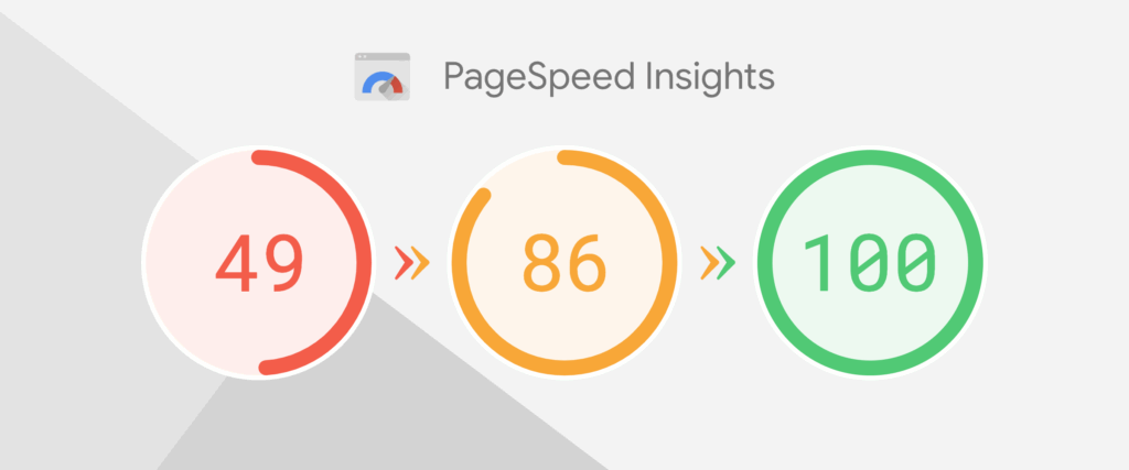
Google PageSpeed Insights
What it is: PageSpeed Insights measures how fast your site loads and performs on both mobile and desktop using data from real users and lab testing.
Why use it: It gives you detailed scores, highlights performance issues, and provides specific recommendations to improve mobile speed and user experience.
How to use it:
- Go to https://pagespeed.web.dev/
- Enter your website URL
- Click Analyze
- Review the Mobile tab for performance scores and improvement tips
GTmetrix
What it is: GTmetrix tests your site’s performance using Lighthouse metrics and advanced speed analysis.
Why use it: It’s great for identifying what’s slowing your site down—like large images, long scripts, or server delays—and provides optimization tips.
How to use it:
- Visit https://gtmetrix.com/
- Enter your website URL
- Click Test your site
- Review the report for load time, structure, and performance scores

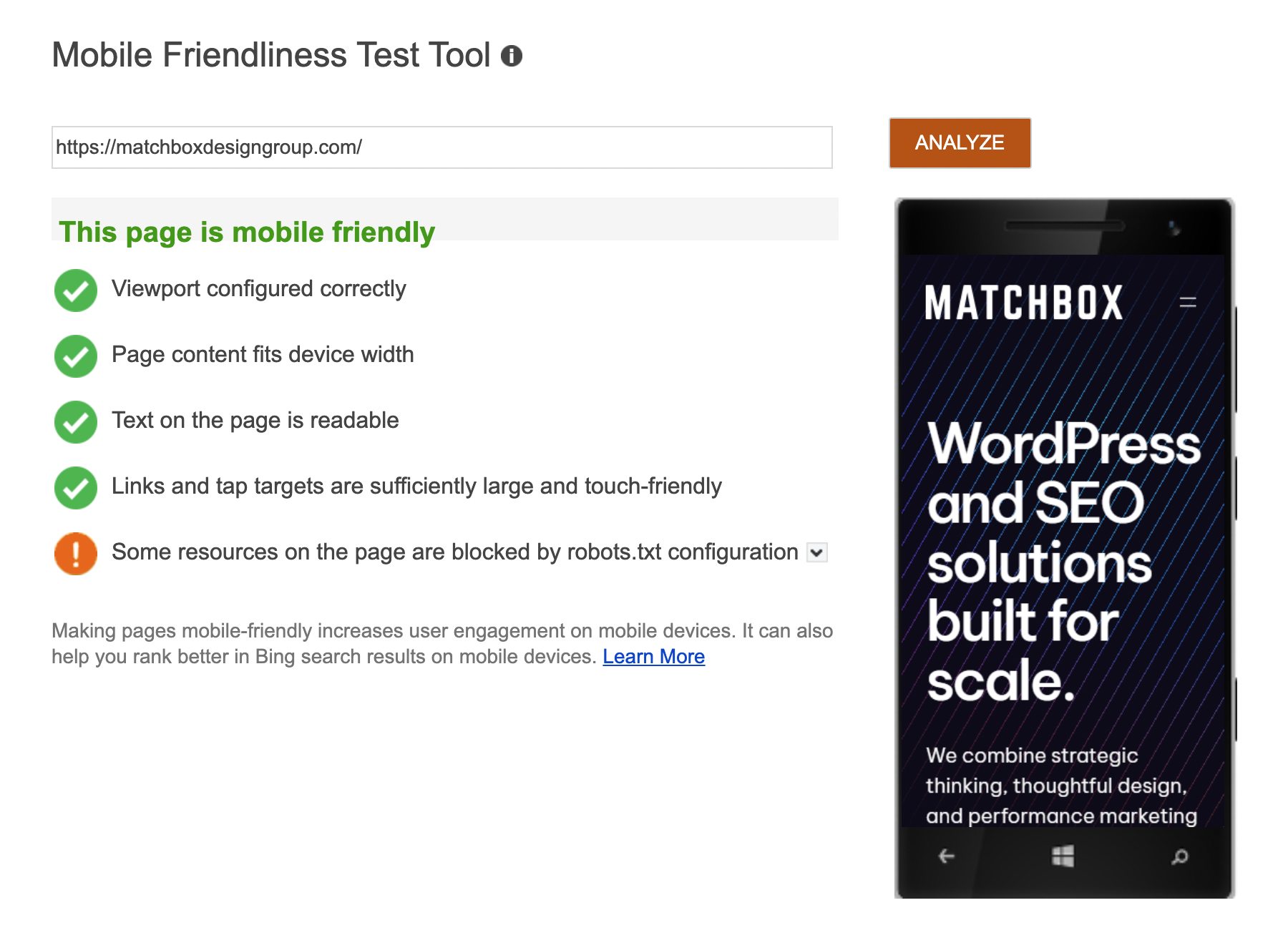
Bing Mobile Friendliness Test
What it is: Bing’s free tool checks how well your site performs on mobile devices according to Bing’s standards.
Why use it: It ensures your website delivers a strong mobile experience across all major search engines—not just Google.
How to use it:
- Go to https://www.bing.com/webmaster/tools/mobile-friendliness
- Enter your website URL
- Click Analyze
- Review the results for readability, tap target spacing, and responsiveness
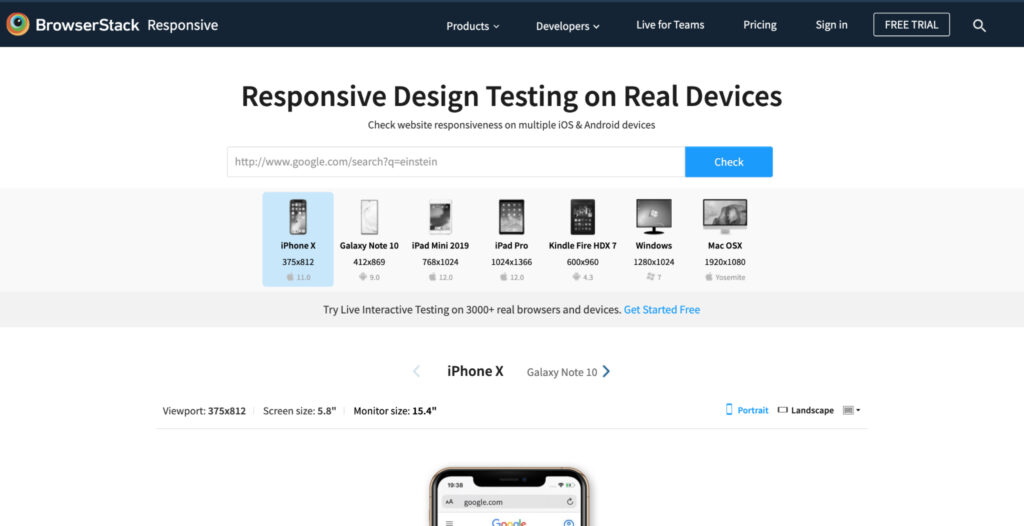
BrowserStack Responsive Checker
What it is: A free visual testing tool that shows how your site appears on real mobile devices and screen sizes.
Why use it: It’s a quick and easy way to check how your design, navigation, and content scale across devices—no coding or setup required.
How to use it:
- Visit https://www.browserstack.com/responsive
- Enter your website URL
- View your site’s live previews on popular devices like iPhone, Samsung Galaxy, and iPad
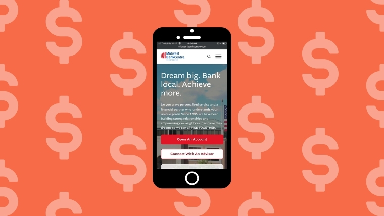
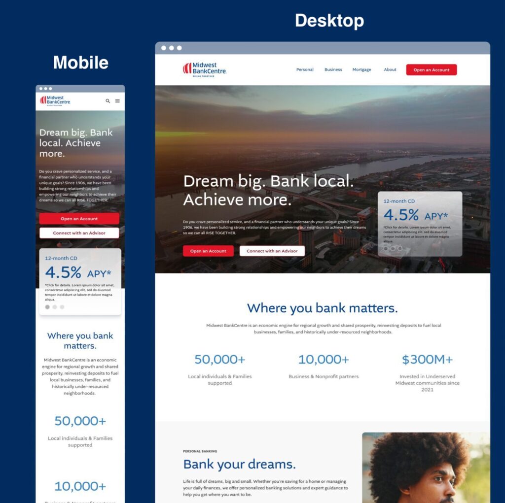
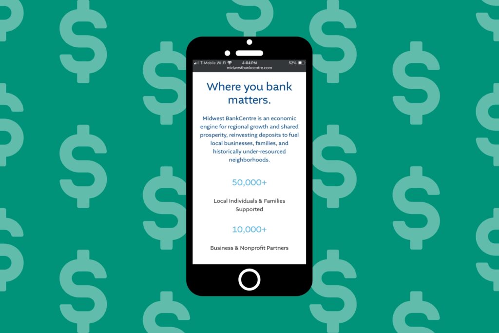
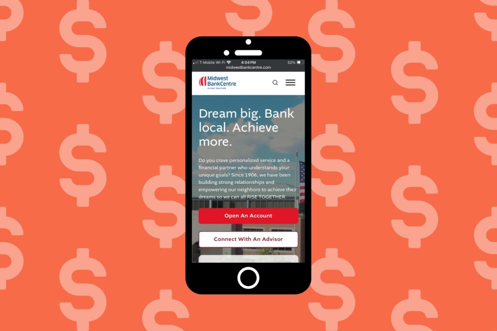
Real-World Example: Midwest BankCentre
When it comes to mobile optimization for banks, Midwest BankCentre is a perfect example of how thoughtful design and strategy can transform digital banking. As a long-standing community bank with deep local roots, their goal was to modernize their online experience without losing the warmth and trust that define their brand.
The Challenge
Midwest BankCentre’s previous website wasn’t fully meeting the needs of mobile users. Navigation felt clunky, page load times were inconsistent, and key customer actions—like finding branch locations or accessing online banking—weren’t as intuitive on smaller screens. For a growing financial institution, these friction points limited engagement and impacted their ability to connect with customers on the go.
Our Approach
Our team rebuilt Midwest BankCentre’s website with a mobile-first strategy, ensuring that every interaction was clear, fast, and accessible. We streamlined navigation so users could easily log in, find products, or contact support within just a few taps. Key actions like “Find a Branch” and “Open an Account” were prominently placed to drive engagement and conversions.
We also optimized the site’s performance through responsive design, compressed media, and improved load speeds—critical factors for both user experience and SEO. Visually, the design strikes a balance between professionalism and approachability, with clean layouts, legible typography, and strong calls to action that guide users seamlessly through their journey.
The Results
The new mobile experience allows Midwest BankCentre customers to bank anytime, anywhere, with confidence. The improved usability and performance not only enhance customer satisfaction but also strengthen the bank’s digital visibility through improved search rankings and engagement metrics.
By prioritizing mobile optimization, Midwest BankCentre set a new standard for what community-focused banking can look like online—proving that even the most established financial institutions can evolve to meet the expectations of today’s mobile-first customers.
Content Optimization for Mobile
When customers visit a bank’s website on their phone, they’re usually on a mission—checking rates, finding a branch, or managing their accounts. That’s why optimizing your content for mobile isn’t just about formatting; it’s about clarity, efficiency, and trust. Mobile visitors should be able to scan, understand, and act in seconds. Well-optimized content keeps users engaged and helps your site perform better in search results.
Here are key areas to focus on when optimizing bank website content for mobile:
Prioritize Clarity and Readability
Mobile banking users tend to skim rather than read word-for-word, so make every line count.
Make sure to:
- Use short paragraphs (2–3 sentences) and clear, descriptive headings to guide users through the page.
- Avoid jargon—translate financial terms into plain language that’s easy for anyone to understand.
- Place the most important information, such as loan rates, account features, or contact options, at the top of the page where users see it first.
Pro Tip: Use collapsible sections or accordions for detailed information like disclosures or FAQs. This keeps the mobile layout clean without sacrificing content depth.
Use Compelling, Action-Driven CTAs
On mobile, calls-to-action (CTAs) should be short, visible, and specific. Place primary CTAs near the top and repeat them strategically throughout longer pages, so users don’t have to scroll far to take action. Also make sure to replace generic buttons like “Learn More” with goal-oriented CTAs such as “Open an Account,” “Get a Quote,” or “Find a Branch.” Last but not least, ensure CTAs are large enough to tap easily, with plenty of white space around them.
Highlight Trust and Security Messaging
Trust is at the heart of mobile banking content.
Make sure to:
- Clearly display security badges, encryption notices, or links to privacy policies.
- Reinforce your commitment to safety with concise messaging such as “Your data is encrypted and secure” or “Bank with confidence anywhere.”
- Include customer testimonials, ratings, or case studies that build credibility without overwhelming the layout.

By focusing on these areas, you can create content that not only performs well in mobile search results but also engages and resonates with mobile banking users, fostering a stronger connection between your institution and the local community.
Tracking & Measuring Mobile Optimization Success
Once your bank’s mobile website is optimized, the next step is tracking how those improvements perform. Measuring success helps you understand what’s working, what needs refinement, and how users are engaging with your site. By monitoring key metrics like page speed, conversion rates, and user behavior, your team can make data-driven decisions that continually enhance the mobile banking experience. Banks also benefit from working with a virtual administrative assistant to help manage these analytics tools, monitor performance trends, and streamline reporting processes.
Key Metrics to Monitor
The right metrics reveal how customers interact with your mobile site—and how effectively it supports their financial goals. Here are the key performance indicators
- Mobile Traffic: Track how many visitors access your site from mobile devices and which pages they visit most—such as Online Banking Login, Open an Account, or Find a Branch. Steady growth in mobile traffic signals that your site is visible, discoverable, and easy to use.
- Bounce Rate: Monitor how often users leave after viewing just one page. A high bounce rate could mean your mobile content isn’t meeting user intent—perhaps your login button isn’t prominent enough or key services aren’t easy to access. A lower bounce rate indicates your site is engaging and intuitive.
- Page Load Speed: Every second counts in mobile banking. Track your mobile page speed using tools like Google PageSpeed Insights or Lighthouse. Faster load times not only improve user satisfaction but also build trust—crucial for customers managing sensitive financial data.
- Mobile Conversion Rate: Measure how often users complete desired actions, such as submitting a loan application, scheduling an appointment, or signing up for email updates. Increases here reflect stronger engagement and a smoother user experience.
- Search Engine Rankings: Keep an eye on how your bank ranks in mobile search results for branded and local terms (e.g., “community bank near me” or “mortgage rates in [City]”). Mobile-friendly sites typically see higher visibility and more qualified traffic.
Using Google Analytics to Track Mobile Banking Performance
Google Analytics is one of the most powerful tools for understanding how customers interact with your bank’s website on mobile devices. By analyzing mobile-specific data, you can identify what’s working, uncover usability issues, and make data-driven improvements that enhance the digital banking experience.
Here’s how to use Google Analytics effectively for mobile banking:
- Set Up a Mobile Segment: Create a dedicated segment that tracks only mobile users. This allows you to isolate data such as page views, bounce rates, and session duration for mobile visitors. You’ll get a clearer picture of how mobile users engage with high-priority pages like Online Banking Login, Open an Account, or Loan Applications.
- Analyze User Behavior: Review behavior flow reports to see how mobile visitors navigate through your site. Pay attention to where they enter, how long they stay, and where they drop off. For example, if users consistently exit during the application process, that may signal friction in your mobile form design.
- Monitor Mobile Conversions: Track key actions—such as form submissions, appointment scheduling, or clicks to call your branch—to measure conversion success. Comparing mobile conversion rates over time helps you evaluate whether design and performance updates are improving user engagement.
- Compare Mobile vs. Desktop Performance: Regularly compare metrics like load times, bounce rates, and conversion rates between mobile and desktop users. This helps identify opportunities to further optimize mobile usability or content accessibility for on-the-go banking customers.

Embracing Mobile Optimization for Success
As we’ve explored throughout this guide, mobile optimization for banks and credit unions isn’t just a trend, it’s a core function of modern websites. But don’t worry, if your website isn’t fully optimized for mobile yet, it’s not too late.
Mobile optimization is an ongoing process, and even small improvements can make a big impact on performance and customer experience. By following the steps outlined in this guide—or by partnering with a digital strategy team like ours—you can build a mobile experience that’s fast, secure, and built for the way people bank today.
Key Takeaways
- Mobile optimization builds trust and convenience. Customers expect seamless, secure, and intuitive mobile experiences when managing their finances online. A mobile-optimized site shows professionalism and reliability.
- Responsive web design is foundational. Your website should automatically adapt to any screen size—ensuring users can easily access key features like account login, branch locators, and loan applications from any device.
- Speed and simplicity matter most. Fast-loading pages, clear navigation, and concise content keep users engaged and reduce friction during critical actions like making payments or submitting forms.
- Local SEO connects you with nearby customers. Optimizing for local search helps potential customers find nearby branches, ATMs, and region-specific services right from their phones.
- Content should be clear, scannable, and action-driven. Use simple language, strong calls to action, and trust-focused messaging that reinforces your institution’s security and credibility.
- Track your progress with analytics. Monitor mobile traffic, conversion rates, and page speed using tools like Google Analytics and PageSpeed Insights to measure performance and identify improvement opportunities.
- It’s never too late to optimize. Even if your site isn’t mobile-ready yet, small changes—or a partnership with a digital strategy team—can dramatically improve your mobile banking experience.
Elevate Your Mobile Banking Experience with Matchbox Design Group
You’ve learned how mobile optimization can transform how customers interact with your financial institution—now it’s time to put that knowledge into action.
At Matchbox Design Group, we help banks and credit unions create mobile experiences that build trust, drive engagement, and perform seamlessly across every device. Our team combines deep technical expertise with a strategic approach tailored to the financial industry—ensuring your website not only looks great but also delivers measurable results.
Whether you’re ready to rebuild your site from the ground up or simply enhance your current mobile experience, we’ll guide you every step of the way. Fill out the form below, and let’s build a digital banking experience that’s as strong and reliable as the institution behind it.