Responsive website design came to the fore around 2010 to take care of the growing usage of smartphones on the internet. Tablets such as the iPad began to get used frequently during those days only. Responsive design is related to the development of technology that displays the right website content appropriately across these devices.
Before this, mobile sites had separate versions of mobile and desktop websites created for loading as the device got recognized as a tablet or a cell phone. It immensely increased the time for website development. There was a struggle to display the same content on desktop and mobile sites without experiencing a considerable design disconnect.
Mobile sites were loaded if the device sent a specific signal to a server. It dramatically increased the amount of time taken to access a site successfully. Undoubtedly, there was a need to have a better option for easy loading. A responsive website design is an answer to the same problem.
Unlike mobile sites, a responsive design is not a distinct version of a website that just loads on tablets or smartphones. Instead, a responsive website needs just one design. It involves consideration of certain CSS and HTML code rules that determine how a site appears. The designer adjusts how a website loads, taking care of the device’s restrictions and screen size.
It requires building just one site. This also ensures that users can find the same design and content and the same experience irrespective of whether they access your website through a mobile device or a desktop.
Website owners began to opt for a responsive design right from 2011. This trend continues to grow to this day. A responsive website design is a top growth factor for businesses with an online presence. That’s why getting web design services for a small business can prove beneficial for your startup or small-to-medium-sized company in several distinct ways.
Importance Of Responsive Design
You may already have understood why responsive design is so important. This is because it helps the website owners cut down on the development cost and time and provide a better user experience. If you are managing both a desktop site and a mobile site separately, you are managing two different websites.
If you make changes in one of them, you will also need to carry out the same in the other. On the flipside, responsive sites need only a single update that easily shows up in their content.
Responsive design is crucial due to the increasing number of people who choose to surf the internet with research and purchase. If people can easily and quickly access your website from their phones, they are more likely to stay on your site. If your site requires a lot of pinch-to-zoom and displays content, it will take a lot of time. In such a case, visitors may leave a site right away.
Google also recommends going for a responsive design for several reasons:
A responsive design means just a single URL for every piece of content rather than having multiple URLs.
Responsive design decreases or eliminates any duplicate content you have used on the available versions of the website.
A responsive site also lowers the loading time compared to mobile websites as the browser needs not to detect your device or change its “version.”
Google needs to crawl your website just once to index it and not multiple times for every version. It keeps your search engine presence “fresh.”
A responsive website is considered highly important for websites that get users frequently on their mobile devices. It is essential for anyone selling the products in an e-commerce store. A responsive website lets you gather leads from a site.
Benefits Of A Responsive Website
As the number of people accessing the internet from mobile devices grows steadily, it gives another great advantage to responsive websites. Such websites hugely lower your bounce rate. Also, users may need to wait a long time to load your site. Sites that do not perform simple tasks easily may leave without getting conversions.
A responsive design helps you know about the number of people who visit your site and leave at the same pace from all platforms. This is known as bounce rate. Responsive sites have lower bounce rates. It means that there will be a rise in conversion rates.
Responsive e-commerce stores also make it easier to browse and buy, letting your mobile site get higher purchase rates. This directly connotes that an eCommerce store needs to invest in responsive design to get a higher return on investment, especially if mobile purchase rates are higher!
Mobile traffic will increase if more users choose to perform their tasks on their tablets and phones. Several retailers or businesses in the industry lack a responsive site. As you create a responsive website, you will be ahead in the game. It gives you the chance to grow your sales and outrank your competition!
A responsive design will lower the hassle from a business perspective.
It reduces the time taken to launch new content.
This lowers the amount of duplicate content.
This also lowers the need for multiple URLs.
It lowers the strain and loading time on your server. You get several benefits from your users and customers who like to access your website. Apart from this, it also becomes easier for your staff.
How Much Does A Responsive Website Cost?
Several factors determine the cost of a responsive website. There are no easy ways to go for a specific cost for responsive designing services. If you analyze the cost of your newly designed responsive site, there are certain things you need to consider.
New businesses or start-ups designing unique websites for their online store or other business need a responsive design. A responsive design agency can help you build a brand new website with responsive technology integrated from the beginning. It means that you won’t need to redevelop anything. Therefore, the costs will be relatively low in the course of time.
Considering a website redesign for a responsive design is a good situation if you don’t have it already. If your website gets redesigned, it includes a code to render it responsive. Redesigns can generally be costly, but you need to have a sensible plan for a responsive website if you want a new look and feel.
Based on your website’s initial design, it can become hard for you to change a responsive design without altering your code or how your website appears. You can adapt to changing the responsive web design if you again redesign your website or go for a new CMS (content management system).
This responsive design is worth your investment as even your non-mobile users will be able to appreciate your new streamlined and easy-to-use website. You get various benefits to go for this. The cost will be based on the stage of the development of your website. In most cases, the cost of developing a website design will be less than you expect. In any case, having a responsive website design is worth the investment.
Finding The Best Responsive Website Design Company
Always look for a company with a responsive design portfolio on its website. The most reputable agencies like to show their work in images or website links they have designed. Just visit some sites from your computer, tablet, or phone. Check:
How do they look?
Do they have a quick loading?
Do they display the same content on various mobile devices?
Are both the websites functional and attractive?
Browse the company’s website to understand their work and how they present themselves. When you find satisfactory answers to all such questions, you can go for the particular responsive web design services.
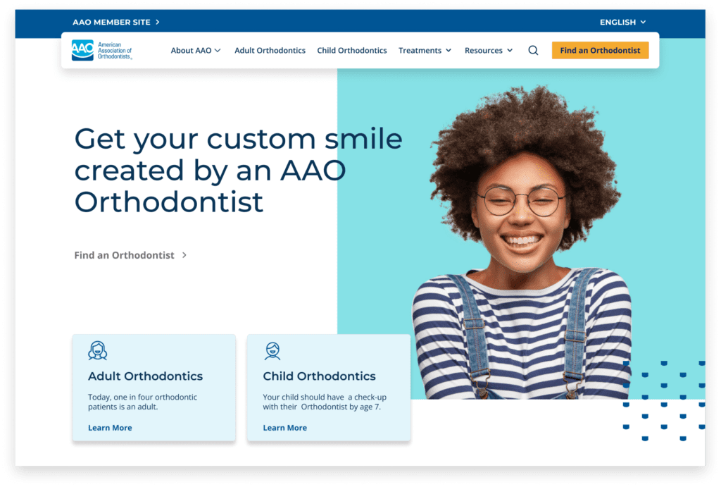
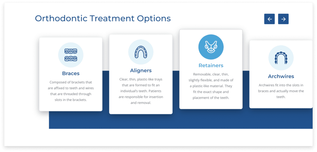
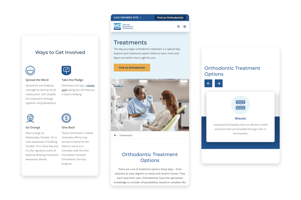
American Association Of Orthodontists: A Responsive Web Design Case Study
When tasked with designing the website for the American Association of Orthodontists, our goal was clear: to project an image of professionalism and warmth that would resonate with both members and visitors.
To achieve this, we meticulously selected a color palette characterized by clean and bright hues, which not only exuded a sense of professionalism but also invited users into a comforting digital space. The website is adorned with captivating images of individuals beaming with radiant smiles, each picture set against bold backgrounds that infuse a modern and purposeful touch.
What truly sets this website apart is its responsive web design. Every element, from the images to the content, seamlessly adapts to various devices and screen sizes. This responsive approach ensures that whether visitors access the site on a desktop computer, tablet, or smartphone, they are met with the same inviting and visually pleasing experience.
By prioritizing responsive design, we’ve made sure that the website remains accessible and user-friendly for all, further reinforcing the commitment to excellence in orthodontics in an increasingly mobile-centric digital landscape.
To learn more about how our developers designed this site, check out the full AAO Case Study.
Conclusion
Responsive website design is a fundamental step to increasing your online business’s growth. Make sure that your website has all the essential qualities which make it easily accessible to your prospects and buyers. To learn more about responsive website designing and get one for your company’s website, feel free to reach out to responsive website designing experts at Passionate Marketing.
Contact Matchbox Design Group Today!
If your website could use a refresh, if you’re looking to drive more traffic to your site, or you would like to submit a guest post, fill out the form below and we’ll contact you to learn more about your digital needs.
Responsive Design FAQ
Q: What are the three main elements of responsive design?
Responsive design hinges on three essential elements. First, a flexible grid layout allows content to adapt proportionally to diverse screen sizes, ensuring a uniform appearance. Second, media queries, CSS techniques, enable the website to discern the device’s characteristics, facilitating adjustments in styling and layout. Lastly, flexible images and media guarantee scalability, preventing distortion and ensuring a cohesive user experience across various devices.
Q: Why is responsive design so hard?
Responsive design poses challenges due to the intricacies of catering to diverse devices. Achieving a seamless user experience across various screen sizes, resolutions, and orientations demands meticulous planning, code optimization, and thorough testing. The complexity further intensifies as designers strive to strike a balance between aesthetics and functionality on both desktop and mobile platforms.
Q: Does Google prefer responsive design?
Indeed, Google recommends responsive design for several reasons. Firstly, it streamlines the indexing process with a single URL for content. Secondly, it minimizes or eliminates the need for multiple versions of the same content, reducing issues related to duplicate content. Lastly, responsive websites typically load faster, contributing to a positive user experience, a factor Google considers in its ranking algorithm.
Q: Which language is best for responsive web design?
HTML5 and CSS3 form the bedrock of responsive web design. HTML5 provides the structural foundation, while CSS3 manages styling and layout adjustments. Often, JavaScript is incorporated to enhance interactivity and responsiveness. Together, these languages constitute a robust toolkit for effective responsive design.
Q: Does responsive design help SEO?
Certainly, responsive design positively impacts SEO by aligning with Google’s preferences. Its contribution to better search engine rankings is attributed to factors such as a unified URL structure, reduced duplicate content, and an improved user experience, all of which resonate with Google’s ranking criteria.
Q: Is Responsive Web Design front end or backend?
Responsive Web Design primarily concerns front-end development, focusing on the user interface and experience. While back-end considerations may arise for specific functionalities, the core principles of responsive design are implemented on the front end to ensure seamless adaptation to various devices.
Q: Is Wix responsive design?
Yes, Wix supports responsive design. Wix provides templates and tools that automatically adjust website layouts and styling to suit various screen sizes. This ensures a consistent and visually appealing experience for users across different devices.
Q: How do you tell if a website is responsive or adaptive?
To discern if a website is responsive, manual resizing of the browser window or using different devices will reveal how the layout adapts. Inspecting the CSS code for media queries through browser developer tools indicates responsiveness. Additionally, online tools analyzing how a website responds to various screen sizes provide insights. Responsive designs should deliver a fluid and consistent user experience across diverse devices.
James is a savvy digital marketing specialist with a Masters of Science in Internet Marketing. For the past fourteen years, he has been specializing in SEO, PPC & Marketing Strategy. He has a super sharp analytical mind and a finely tuned creative eye for marketing initiatives that optimize brands.
To provide the best experiences, we use technologies like cookies to store and/or access device information. Consenting to these technologies will allow us to process data such as browsing behavior or unique IDs on this site. Not consenting or withdrawing consent, may adversely affect certain features and functions.
Functional
Always active
The technical storage or access is strictly necessary for the legitimate purpose of enabling the use of a specific service explicitly requested by the subscriber or user, or for the sole purpose of carrying out the transmission of a communication over an electronic communications network.
Preferences
The technical storage or access is necessary for the legitimate purpose of storing preferences that are not requested by the subscriber or user.
Statistics
The technical storage or access that is used exclusively for statistical purposes.The technical storage or access that is used exclusively for anonymous statistical purposes. Without a subpoena, voluntary compliance on the part of your Internet Service Provider, or additional records from a third party, information stored or retrieved for this purpose alone cannot usually be used to identify you.
Marketing
The technical storage or access is required to create user profiles to send advertising, or to track the user on a website or across several websites for similar marketing purposes.


