Running an eCommerce business can often feel like you’re spinning multiple plates. There are stock inventories to manage, plus the business of actually shipping out products and dealing with returns — and all of that can only happen after successfully marketing your online store using social media or ads. Today we will discuss how a well-designed online store can help your success. Contact us for our services in St. Louis.
With so much to focus on, it’s no wonder that many business owners simply add a premade template to their online store and call it a day, never stopping to consider the impact that design can have on their revenue and future success.
Why Good Design Matters

Good Design Makes A Great First Impression
Studies have shown that most website visitors make a judgment call about a site’s quality in around 50 milliseconds. That’s a shockingly small window of opportunity to make a strong first impression, especially when over two-thirds of users judge a company poorly based on a badly designed website.
Don’t believe that bad design has the potential to impact your sales? Consider how you’d feel if you passed a store with a poorly arranged window display or a dirty, broken sign nailed above the door. You’d probably be tempted to give the place a wide berth, right? The same principle applies to a clunky, badly designed store in the online world.
Using online graphic design software is a great way to reduce the hassle, get great results, and help in enhancing your marketing efficiency.
Good Design Positively Impacts Your Revenue
If a simple alteration to your online store resulted in a 2% improvement in sales, would you go ahead and make the change? If you’re already earning $5,000 a month, that’s an extra $1,200 per year for only five minutes of work.
Minor design changes, such as the color of a button or the placement of an image, can often have benefits that go beyond positive first impressions, directly impacting someone’s decision to buy a product from your store.
Good Design Improves Usability
It’s important to remember that some of your store’s visitors may have impaired vision or visual disturbances when exposed to certain color combinations or design elements. In the USA alone, up to seven million adults are thought to suffer from these types of problems, so this isn’t a trivial issue by any means — besides, color and font choices affect every store visitor, and could mean the difference between a potential buyer adding items to the cart, or moving on out of frustration.
Good Design Improves Brand Awareness And Image
Last but not least, a well-designed online store helps visitors and repeat customers connect with your product offerings and overall brand, helping shoppers become more invested in your business on a personal level.
It’s tempting to think of logos and color schemes as a separate discipline from web design, marketing, or packaging. However, maintaining a well-designed, unified “look” across every aspect of your business can significantly boost your image and, ultimately, your profits.
The Individual Design Elements Of An eCommerce Store
The best eCommerce store designs successfully balance aesthetics with usability. The color scheme, fonts, images, and overall look of your site fall under aesthetics, whereas usability is all about ensuring that your store loads quickly, has all the menus and buttons in the right places, plus all of the other small details that can impact UX (User Experience).

The subject of great design is way beyond the scope of this article, but very briefly, the individual elements you need to consider include:
Typography
Make no mistake, choosing a suitable typeface, and arranging text to be both aesthetic and readable, is a real skill. Typography isn’t just about picking a nice font — it’s also concerned with line lengths and heights, spacing, and more.
Color Scheme
Did you know that researchers at the University of British Columbia have shown that blue shades improve a person’s creativity, whereas red increases memory function and attention to detail? In addition, another study has revealed that men and women prefer different colors.
Studies like this might not directly apply to eCommerce store design, but they highlight that color choice can significantly impact perception, especially with niche products and genres.
Composition & Direction
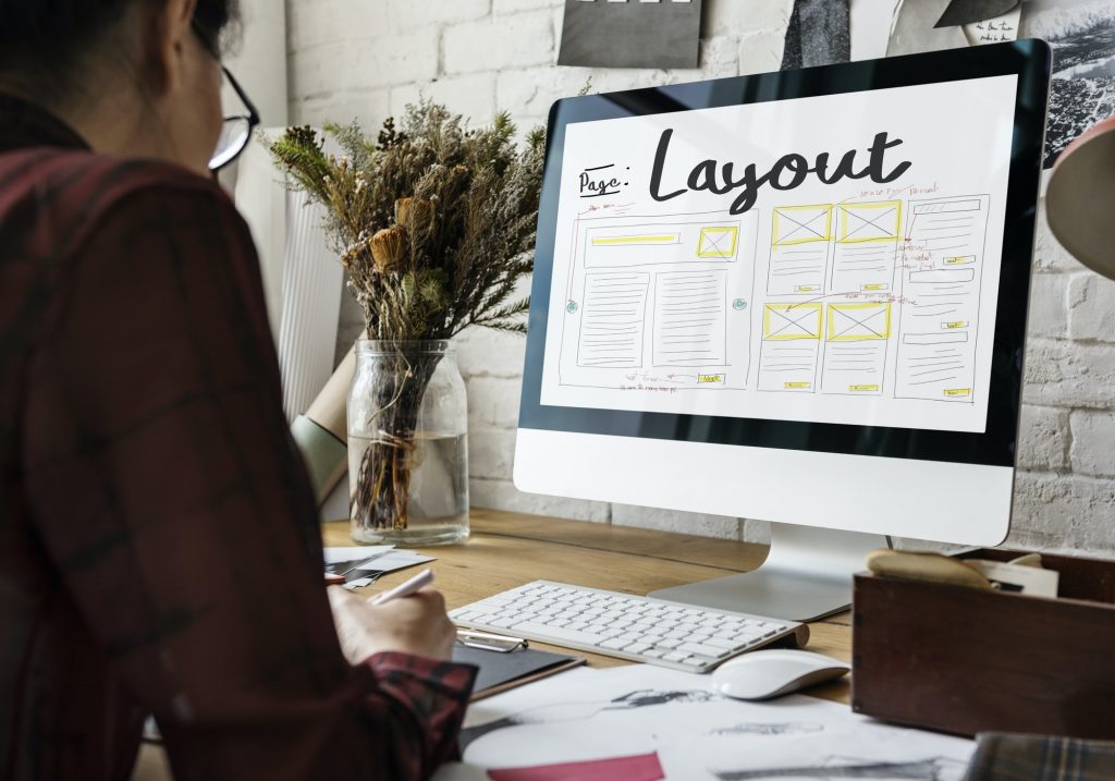
Composition concerns the framework of your eCommerce store, as well as where and how you choose to layout photos, logos, or text. Direction is a similar concept and relates to placing items on a page in the correct location, based on how a visitor is likely to scan their screen, scroll or click a button, for example.
Other considerations
There are dozens, if not hundreds, of other concepts in the discipline of design that are important to get right. The contrast between different elements of a page, scale, balance, symmetry, depth, minimalism, and white space, to name just a few. Like it or not, every change you make to a website or eCommerce store can positively or negatively impact perception and useability, so it’s essential to have at least a basic understanding of these concepts.
Feeling Overwhelmed? Concentrate On The Basics
Design concepts can sometimes feel a little abstract. It’s also tricky to gauge the impact of a design change without getting into the realms of complex split-testing. So how do you get started improving the design of your eCommerce store? If you’re planning on doing the work yourself, here are some vital concepts to keep in mind:
- Shoppers need to understand what you’re offering immediately.
- They need to be able to buy your products without friction or complication.
- Your branding (logo and colors) needs to be uniform across your entire site.
Design Tips For The Individual Elements Of Your Store

Typography
Stick to one main sans-serif font for the majority of your site. You can mix and match fonts, but it’s best to keep things organized. The general rule is to use one sans-serif font for the main text and a second serif font for larger headings. Make sure your font choices are readable and available across all browsers.
Color scheme
Make a quick online search for color palettes. Choose 2-3 complimentary colors that work well with your products or niche. Keep things simple and try not to go too crazy with loud, clashing colors — minimalism is an excellent aesthetic to aspire to!
Logo And Images
Your logo should be relevant and a good stylistic fit for your brand, rather than just a cool design that you happen to like personally. When it comes to product photos, consider the colors and background they were taken against, paying attention to the space they occupy on the page.
Composition
Composition is tricky to quantify, but it’s important. Think simple, clean, and effective. Avoid clutter but also excessive white space. Visit your favorite company’s eCommerce store and see how they handle the placement of individual elements within a page, and think about how you feel as you navigate the site.
A Word On Responsive Design And Speed
These days, most frameworks such as WordPress, Shopify, and Wix will all scale perfectly no matter the size of a shopper’s tablet, laptop, or smartphone. However, there’s a lot of room to mess things up if you’re modifying an existing template with your own design tweaks, so you must test your site across various screen sizes and the different input methods (touchscreen or mouse, for example).

Finally, the speed of your eCommerce store can have a massive impact on abandoned shopping carts. If visitors become frustrated by slow load times, they may leave your store before ever viewing your items in more detail. Website speed is governed by non-design considerations such as hosting, but if you’re filling a store with large, poorly optimized photos, it could impact loading times considerably.
Take Things Slowly
Once you’ve decided to take the design of your eCommerce store into your own hands, don’t try to rush out your masterpiece in a single sitting. Most web designers would agree that websites are never technically “finished”. Your store will continue to evolve over time, adopting the latest trends and best practices along the way. As you become more confident, you may decide to split-test your decisions, and you’ll probably be surprised at what your visitors prefer!
The Bottom Line For A Well-Designed Online Store
You might be tempted to dismiss design as a vague and abstract idea, but there are plenty of well-tested principles out there with the data to prove their importance, so whether you’re planning on Etsy drop shipping or building a store to sell handmade cosmetics, the aesthetics and overall design of your eCommerce website will make a significant impact on your revenue and overall success.
Contact Matchbox Design Group Today!
If your website could use a refresh, if you’re looking to drive more traffic to your site, or you would like to submit a guest post, fill out the form below and we’ll contact you to learn more about your digital needs.


