If you want your website to have decent conversion rates, one thing is certain — your landing pages will be integral to that process. Not investing enough time and energy into creating the best possible page is one of the common landing page mistakes that online businesses often make, to their detriment. The last thing you want is to lower your conversion rates by accident, which is why we’ll look at some of the most widespread mistakes to avoid.
Bad Headlines
Apart from your call to action text, your headlines are the most integral element in driving website visitors to perform specific actions. The headlines are there to captivate a visitor, grab their attention, and send them towards your offer.
Make sure your headlines are clear and visible.
Seeing as headlines are the flashiest and most prominent part of your copy, they are also the first encounter a visitor has with your landing page and website in general. Thus, inadequate or uninteresting copy text will result in low conversion rates.
So, what should your headline look like? First of all, it should capture the essence of your offer in a couple of words, but don’t go overboard with jargon. These headlines have to be attractive and straightforward, definitely not the place for big words and complicated vocabulary.
Subpar Mobile Optimization
These days, people don’t access the World Wide Web solely from desktop computers. Studies show that more people are going online via mobile devices daily. That’s why your website’s mobile optimization is essential for your overall user experience quality. If more than 60% of Internet users access websites on mobile phones, you’ll be making one of the common landing page mistakes if you don’t ensure that your mobile experience is up to snuff.
Also, make sure that all images found on your website are optimized for small-screen devices. The same goes for any conversion-related forms that users are supposed to fill out on the website; these need to be adaptable to any screen size.
Unoptimized Forms
Speaking of forms, we have to talk about them in more detail as well. Proper form design is crucial to your conversion rates, and we’re not just talking about the checkout stage at the end of the conversion from lead to customer.
After all, plenty of people who will take a look at your website don’t want to buy anything, at least not right away. Many of them are just now Googling in search of a solution to their specific issue. Thus, they don’t know what kind of products or services your business offers and whether it’s suitable for them. What these people need is more information.
Therefore, you should try to hook them in with a free resource that will be immediately valuable to them, such as a niche video or a free eBook. In return, they will land on your list of leads by providing some personal details first.
This is precisely where many businesses make the mistake of creating overly complicated signup forms. The last thing users want is to deal with a form with dozens of different fields; the chances are high that the website visitors will look elsewhere for what they need and go to competing websites.
Plus, people don’t like giving too many personal details. At the start, it will be enough for them to provide their email address and name. And once they see that you’re giving them valuable information that they wouldn’t easily obtain elsewhere, they’ll have more confidence in your business. A strong relationship between customers and companies is based on trust.
Subpar Website Design
For a moment, put yourself in the shoes of your website visitors. When you’re looking for something online and arrive at a clunky website that looks like it was built in the ’90s, what is your first reaction? You roll your eyes, try to find your way around it for a brief while, but ultimately, you’re likely to go back to the Google search results page and try to find something better.
Always go with the simplest possible design.
All of this tells us one thing — the user experience is the ultimate measure of quality when it comes to creating a website, particularly when we’re talking about landing pages. If users can’t easily find what they’re looking for and grasp the website’s layout right away, that will be a problem.
The landing page has to be devoid of meaningless clutter — keep it neat and straightforward. There should be a starkly visible navigation bar that leads to other pages. Put your headlines and CTA copy in places that are easy to see.
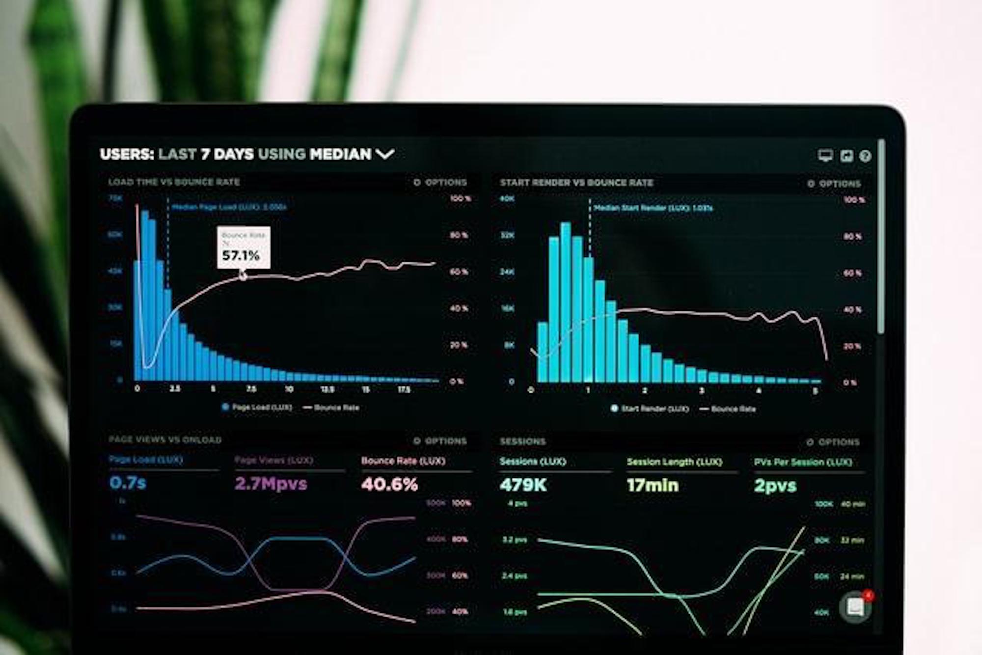
Slow Loading Times
For our final pick among the most common landing page mistakes, we’re going with the big one — bad loading times. These days, you have to understand that people have certain expectations of their Internet browsing experience. A majority of Internet users expect each page to load in less than five seconds. Any more than that and people become instantly frustrated.
No-one likes waiting for their content to load.
If visitors perceive your website as clunky and slow, that’s the single worst thing for your conversion rates. Right away, they’ll build an impression of your business as slow and subpar, and probably decide to look elsewhere, so it is one of those landing page mistakes you definitely want to avoid.
And no, the fact that you have beautiful graphics or excellently written copy doesn’t help here. Your website loading slowly means that people simply leave in frustration before experiencing any of that. If you want to have a site that all users can enjoy, you need to optimize your website as best as you can. Don’t post uncompressed high-res images, find the best possible hosting, and check your speed regularly.
Guest Post Author Bio:
Carl Myers has been working as a freelance blogger for 4 years, mostly writing on the topics of SEO and tech-related news. During his time as an author, he has gained a great understanding of the world of search engine optimization.
Contact Matchbox Design Group Today!
If your website could use a refresh, if you’re looking to drive more traffic to your site, or you would like to submit a guest post, fill out the form below and we’ll contact you to learn more about your digital needs.
James is a savvy digital marketing specialist with a Masters of Science in Internet Marketing. For the past fourteen years, he has been specializing in SEO, PPC & Marketing Strategy. He has a super sharp analytical mind and a finely tuned creative eye for marketing initiatives that optimize brands.
To provide the best experiences, we use technologies like cookies to store and/or access device information. Consenting to these technologies will allow us to process data such as browsing behavior or unique IDs on this site. Not consenting or withdrawing consent, may adversely affect certain features and functions.
Functional
Always active
The technical storage or access is strictly necessary for the legitimate purpose of enabling the use of a specific service explicitly requested by the subscriber or user, or for the sole purpose of carrying out the transmission of a communication over an electronic communications network.
Preferences
The technical storage or access is necessary for the legitimate purpose of storing preferences that are not requested by the subscriber or user.
Statistics
The technical storage or access that is used exclusively for statistical purposes.The technical storage or access that is used exclusively for anonymous statistical purposes. Without a subpoena, voluntary compliance on the part of your Internet Service Provider, or additional records from a third party, information stored or retrieved for this purpose alone cannot usually be used to identify you.
Marketing
The technical storage or access is required to create user profiles to send advertising, or to track the user on a website or across several websites for similar marketing purposes.