In the post-pandemic world, people are accustomed to buying items online instead of in-store as a preventative measure. As a result, eCommerce sites are becoming increasingly popular, as they don’t require a physical location. Today we are going to discuss how to create a responsive web design for eCommerce.
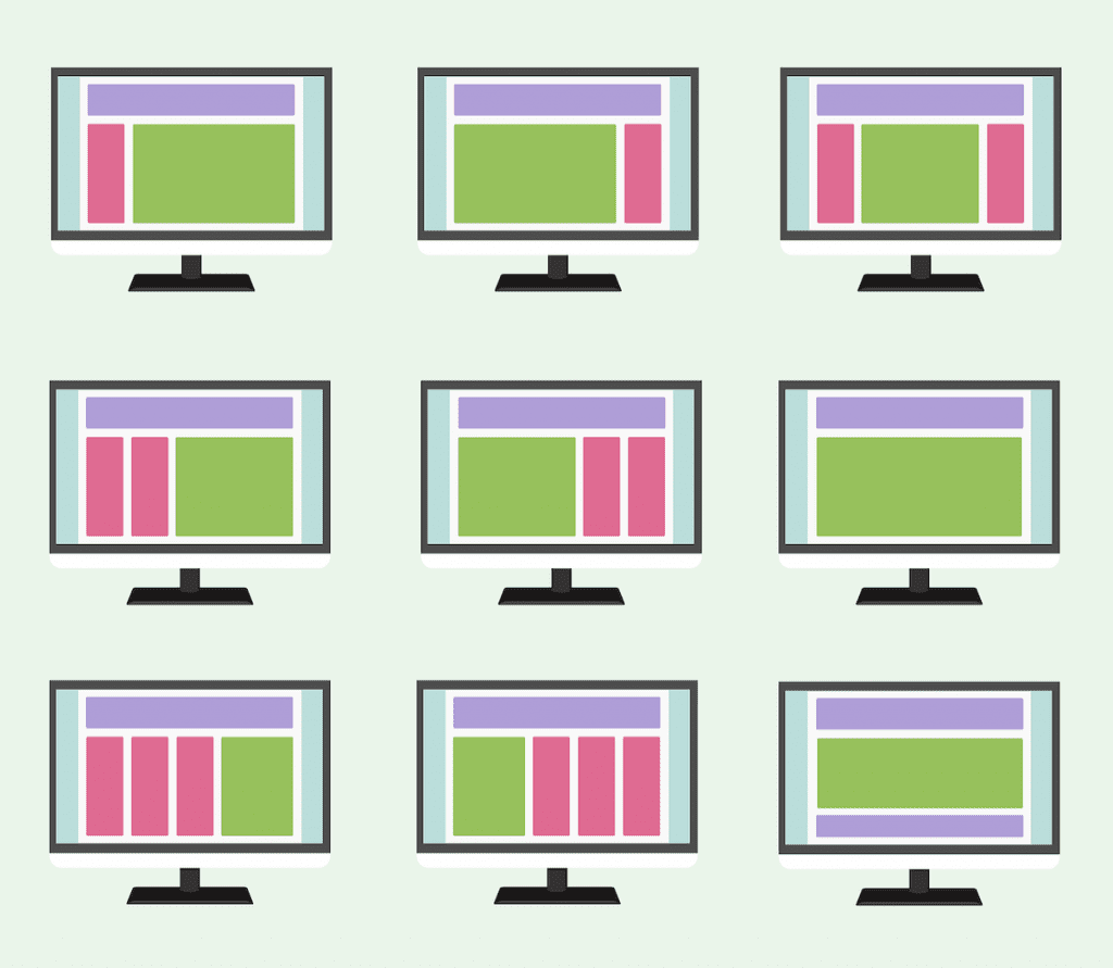
Since many people prefer to shop online using their mobile phones, it’s important to ensure your website is responsive. This means that your eCommerce website needs to look and feel the same regardless of the device users explore it on.
Whether you have a small eCommerce store or a large enterprise with your own website, your site needs to be adjustable.
With an eCommerce store, you can design your website to allow anyone with access to the Internet, even those who are not as digitally savvy, to browse and buy from your site. However, this isn’t an easy task and it takes a lot of effort and creativity to make a good website that will be both visually appealing and functional.
Responsive websites ensure a good user experience because viewers don’t need to pinch and zoom in order to look closely at products they want to purchase. It also allows for easier shopping when using mobile devices like smartphones or tablets.
In this post, we will cover all you need to know to create a responsive eCommerce website.
Benefits Of A Responsive Design
Before we jump into all the steps that will help you nail the responsive design, let’s see some of the reasons why you should do it.

With a responsive design, you don’t have to worry if the content will look the same on all devices and screen sizes or if it will be easy for them to navigate the website. Most people have their phones in their hands for the majority of the day, and you simply cannot have a website that is only accessible from the desktop.
That being said, the first benefit of a responsive design has to be the Optimal User Experience.
By optimizing your website to accommodate all smartphones and tablets, your users will be able to explore your eCommerce site on any device and enjoy the content and a pleasant experience.
The easier a site is to navigate, the more chance that the customers will come back.
Satisfied customers will help you Improve Brand Reputation, another benefit of responsive design. By enabling your customers to navigate your website with ease, it is more likely that they will not only come back but recommend your website to others.
Moreover, a responsive design will help you with Site Management. Maintaining only one website will significantly cut your costs and take less time.
Another important thing you should remember is that Search Engines Favor Responsive Online Stores.
Search engines put responsive online stores at the top of their search lists because such websites guarantee a good user experience.
Improved readability and ease of use are what count most in terms of search engine optimization.
The final benefit of responsive web design is Higher Conversion Rates – most people will more likely buy products from their smartphone than from a desktop. So, if your website looks the same on all devices, you are more likely to sell more products or services.
Straight North
How To Know If Your Design Is Responsive
There are a number of tools you can use to test the responsiveness of your website.
One of the most popular is the Google Chrome browser because of its built-in responsive testing tool. You can also use Google’s Mobile-Friendly Test to see how well your site performs on mobile devices.
Other tools you can use are Adobe Photoshop, Adobe Illustrator, and Microsoft Expression Web.
How To Create An Outstanding Website Design

Source: simplexsoftware.com.au
Now that we’ve covered why responsive websites are better let’s explore some of the best ways to optimize your website.
Think Like A User
When thinking of how to design your website, we recommend you put yourself in the user’s shoes. Think of what kind of features you find helpful and try to implement them into your site.
Moreover, don’t hesitate to research the eCommerce websites of your competitors. That can help you understand which elements could work on your site and which wouldn’t.
Ultimately, users want a site that is easy to navigate, informative and is easy, simple, and straightforward.
For your online shop to be successful, you need to listen to your audience.
For example, a website design company in NYC will prioritize making your website user-friendly and provide comprehensive design to make sure the customer comes first.
And if you put the customer first, the chances are that your small business will turn into a large corporation sooner than you think.
Keep It Simple
Overcomplicated websites can only confuse users.
You don’t want to bombard your audience with ads or overwhelm them with too many colors, big, bold letters on the first page, and too much information.
Cluttered websites can only distract your customers from buying anything from your online store.
While the first page on your website should reflect your brand and display some of the content, you should keep it simple. Have up to five items on the first page, e.g., products on sale, the most popular items, or the best-rated items.
By displaying rated products, the customer is greeted by positive reinforcement, only fortifying the wish to buy something from your website.
Categorize Your Content
When you create a sleek and simple first page with only a few products displayed on it, where are you going to place the rest of your items?
We suggest you organize them into categories.
Make it simple to explore your product categories and pages. Make it convenient for your consumers to find items and filter them based on color, size, or product category. The better organized your categories are, the simpler it will be for your consumers to find what they’re searching for – and to buy the product.
Put Branding First
A good branding strategy will help you connect with your buyers – they will know all about your eCommerce business, what type of products you offer, and what values you care about.
To be able to infuse branding into your eCommerce, you need to work on making your brand an established one.
Branding simply means standing out from the crowd – how different are you from your competitors, what values you stand for, and how do you make the world better with your store?
When you have the answers to all the questions above, you will be ready to promote those views on your website and likely drive sales through the roof.
Use An Adequate Color Palette
Color plays an important part in consumer psychology. In fact, there is a whole psychology branch exploring how color palette influences consumers.
For example, bright colors (such as red) are bound to stand out on any website. So, to encourage your customers to want to click the “BUY NOW button, you can make it red. Studies show that a red “BUY button increases your sales by 34%.
If you want to make your website appear more credible, use blue color. It is universally loved and makes buyers feel calm and trusting.
By understanding what colors you need to use for your respective business, you can increase your sales significantly.
Utilize Icons When It’s Appropriate

When used correctly, icons help to enhance responsive web design in varied ways. Appropriate and well-designed icons help to eliminate the need to use large blocks of text. It’s particularly essential when dealing with small screens where space is an issue, and at a premium.
Apart from learning the importance of cloud computing, you also need to note that:
- The designer can deliver the icons they need to the site using the Scalable Vector Graphics format.
- You can use CSS to animate the SVG files, thereby making it possible to incorporate exciting effects.
Use High-Quality Images
There’s nothing worse than having blurry images on your website.
If you want to sell your product, you need to advertise it in the best possible way. By using high-quality photos, you will build confidence and instill trust among our customers.
If your buyers see professional, high-quality product images, they will be more likely to buy the item since they will know exactly what they are buying and what to expect from the product.
We suggest you present your product from every angle and highlight its exact measurements.
Looks Matter
An eCommerce site’s premise is that you’re asking your website users to buy stuff from you. As a result, you’re requesting sensitive information from them, such as their credit card information. They won’t feel comfortable doing so if your website doesn’t look professional.
And what does having a professional website mean? For starters, there should be no mistakes or misspellings on your website. From one page to the next, the typography, color palette, and footer design should be consistent. You should make sure there are no broken links on your site and that all buttons work well.
If you want your customers to trust you – and that trust is necessary for your eCommerce business to succeed – you’ll need to invest in a good website. You can do that with an experienced website design company.
Include Social Proof
One of the best ways to establish trust with your new customers is by showcasing how satisfied the existing customers are with your products.
Make sure you have a part of your website dedicated to testimonials where you can.
You can even feature customer photos along with a couple of sentences explaining the benefits of using your products.
Additionally, you can implement a rating system on your site and encourage new customers to leave comments and share product photos if they like.
The more new customers see how satisfied others are with your products, the more likely they become your customers, too.

Simplify The Checkout Process
Make your checkout page design straightforward, simple, and easy to navigate. Allow your buyers to register on your site or check out as a guest.
Make everything about the checkout process crystal clear. You should let your customers know what kind of information they’ll need to provide to complete the purchase and where they can submit it.
Moreover, they should know what shipping methods you offer, how much they cost. Additionally, be clear in what the customers need to do if there’s a problem with their order or they need to return an item.
Once your customers complete a transaction, send them to an order confirmation page to let them know they’ve successfully purchased a product on your eCommerce site.
Let’s Recap!
A responsive website design is something that all businesses should consider as a way to increase conversion rates and create an excellent customer experience. We hope this article helps you with responsive web design for eCommerce sites.
Author Bio:
Travis Dillard is a business consultant and an organizational psychologist based in Arlington, Texas. Passionate about marketing, social networks, and business in general. In his spare time, he writes a lot about new business strategies and digital marketing for DigitalStrategyOne.
Contact Matchbox Design Group Today!
If your website could use a refresh, if you’re looking to drive more traffic to your site, or you would like to submit a guest post, fill out the form below and we’ll contact you to learn more about your digital needs.


