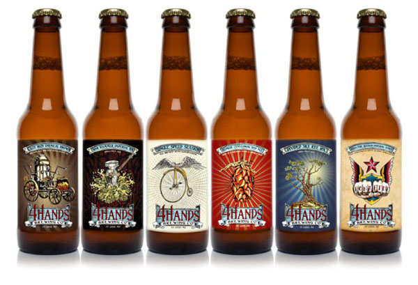
Happy International Beer Day everyone! This is an important day for us at Matchbox. We take beer drinking pretty seriously. Our owners, Cullen and Brent are even developing an app and website dedicated to finding the best craft beers in the world (coming soon). So we want to celebrate by showcasing our favorite beer label designs.
Although we debate on which brews are the best (IPAs are overrated. There I said it.), we all agree that we are in the midst of a beer renaissance. And along with more creative-tasting brews comes more inventive packaging.
We thought what better way to celebrate our passion for design and beer.
Our Favorite Beer Label Designs
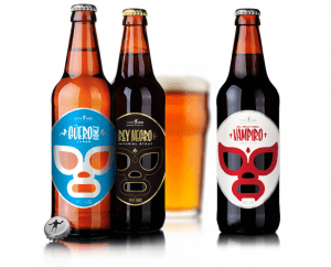
This Mexican craft beer identity is inspired by the golden era of lucha in the 1950’s. The label and the character that is behind the drink are one in the same.
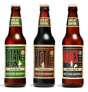
We have to admit, Great Divide makes this list not only because of its clean yet bold design, but 4>because the beer itself is a company favorite. These are strong beers and their labels coordinate with the taste perfectly. The designs are modern and masculine without trying too hard.
4 Hands beer labels are a work of art. Literally. The company works with local artists to create a distinct and whimsical illustrations on all of their labels.
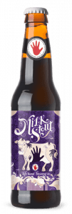
We love when a label not only looks great but embodies the beer itself. Described as “Udderly Delicious,” this milk stout tastes like none other and looks like none other. In a sea of red and blue, the dark purple color stands out on a shelf in a class of its own.
Gumballhead by 3 Floyds Brewing Co.

3 Floyds Brewing Company prides itself on being “not normal.” It does not get more not normal than a cartoon cat with a black eye smoking a cigarette. The label follows no trends and is unapologetic–which is why it’s one of our favorite hard-to-get beers in St. Louis. Indiana road trip, anyone?

