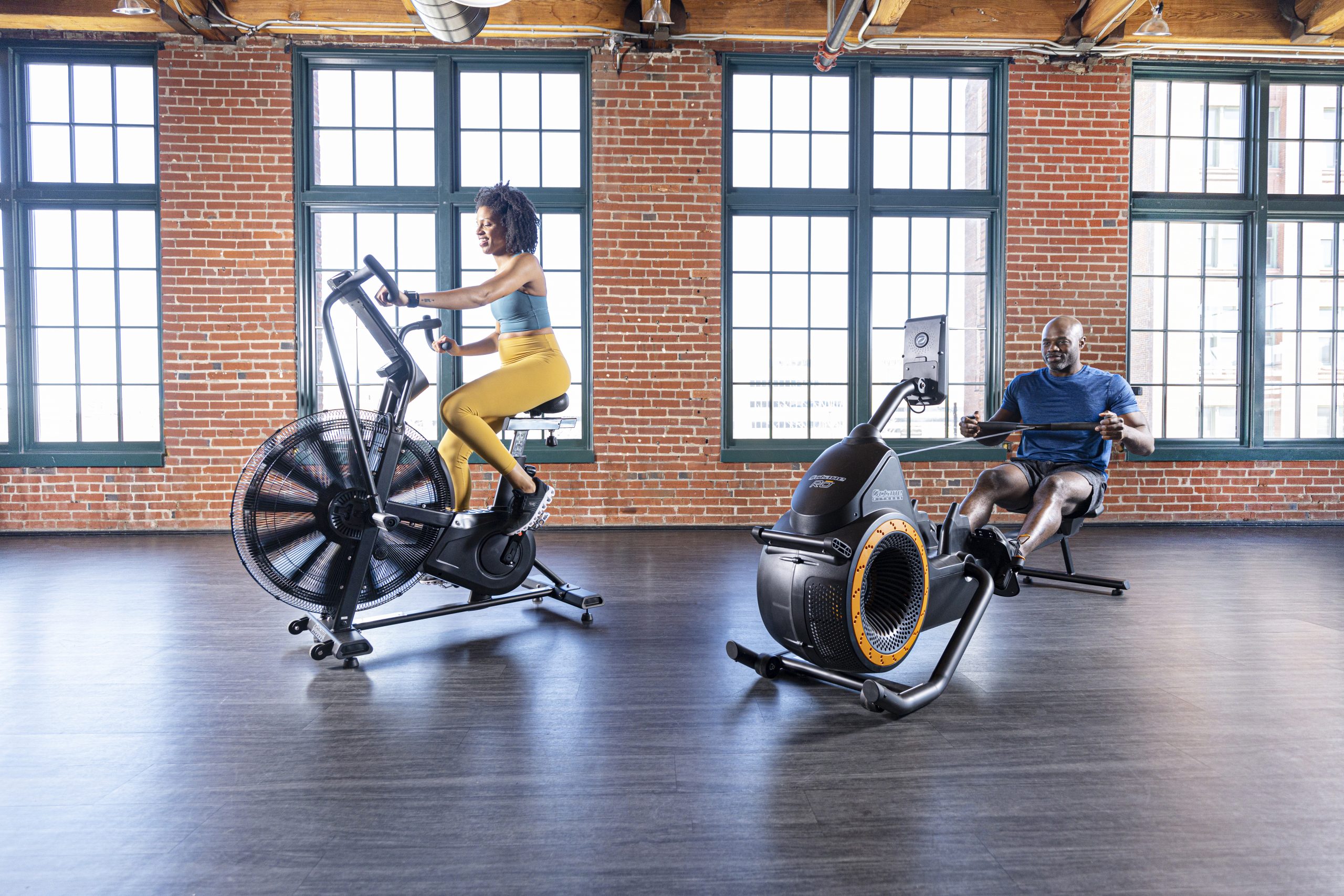
High Performance Cardio Equipment
Octane Fitness is a fitness equipment manufacturer who specializes in cardio and endurance machines for both commercial facilities and individual consumers. They came to us in need of a brand update and challenged us with creating a fresher look and feel without completely reinventing the wheel.
Their current website was dated and needed restructuring. We provided them with an updated site map and design to better showcase their products, added more content, and utilized WooCommerce to help improve the user experience. We also made some major updates to product pages which helped present information more clearly, specifically in relation to product features and specs.
What We Did
Site Mapping
WordPress Design & Development
Content Migration
Content Strategy
SEO
Industry
eCommerce
Health & Fitness
B2B Services
Branding Elements
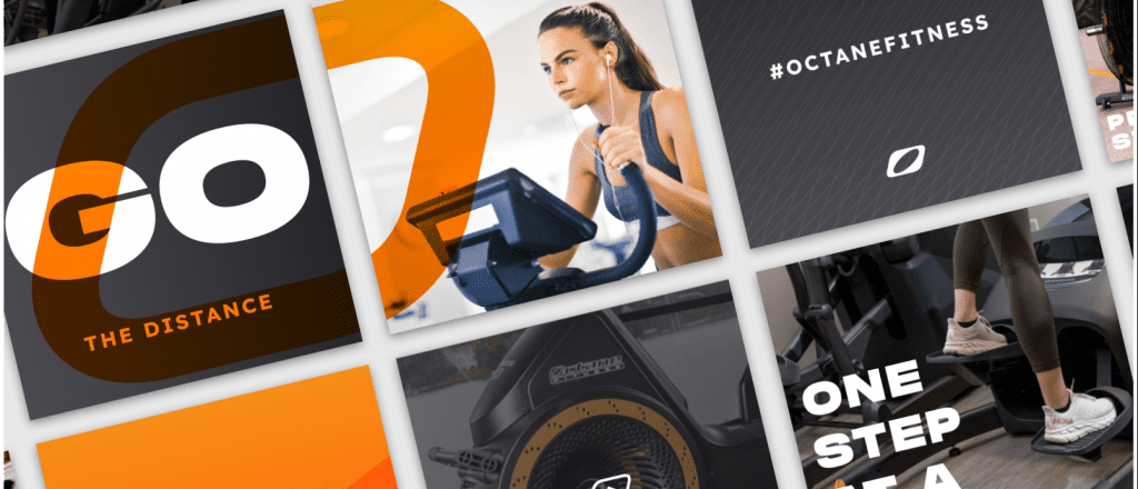
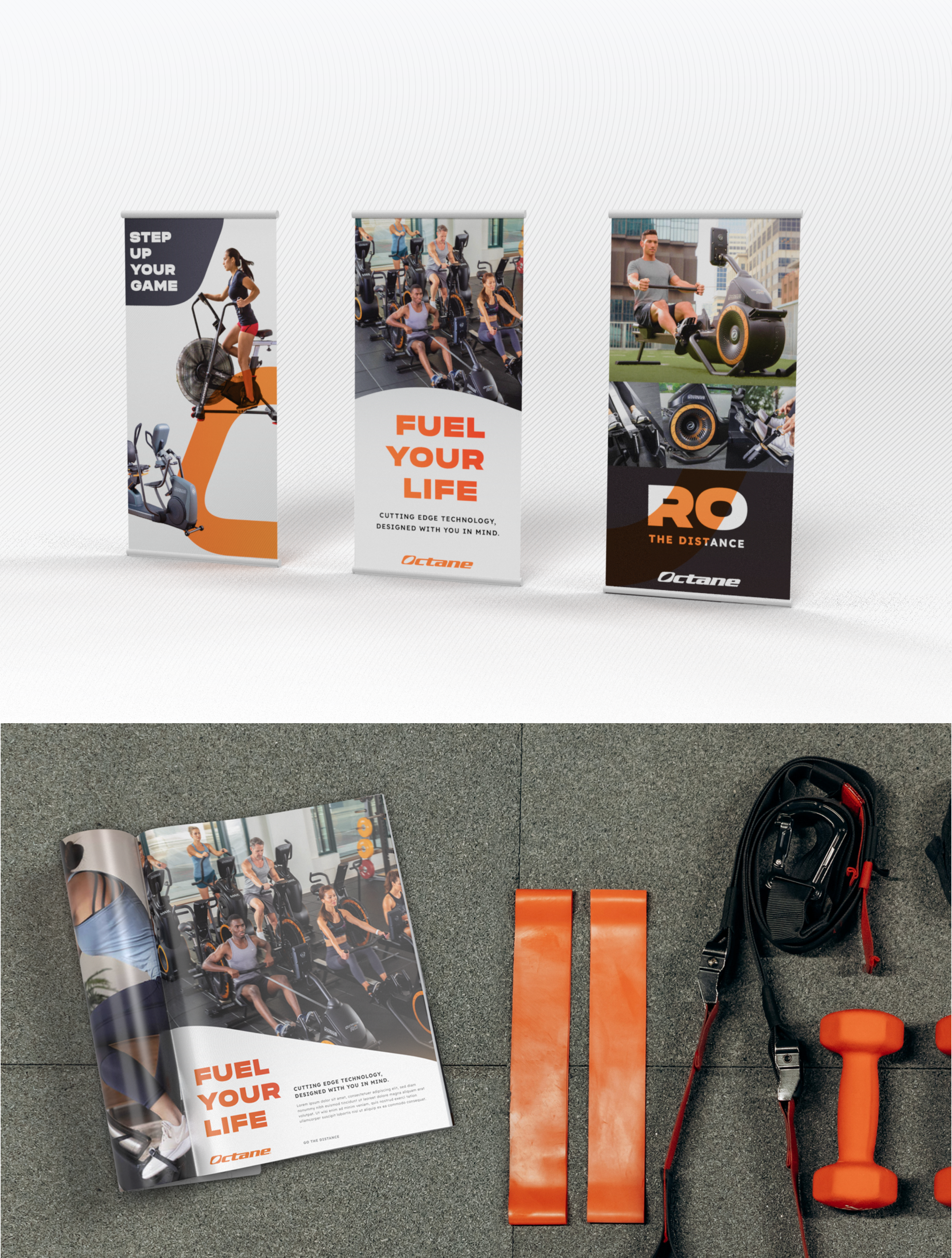
During the design process, there were a few important factors we needed to keep in mind. One of those being versatile brand elements that could be utilized outside of the website. The client wanted to be able to showcase new design elements and lifestyle messaging through social media, trade show banners, and print advertisements.
Eye-catching product images are a must have for eCommerce websites. The new images for the site better showcased product features and helped to create a more personal feel by featuring real people using the machines.
Logo Design
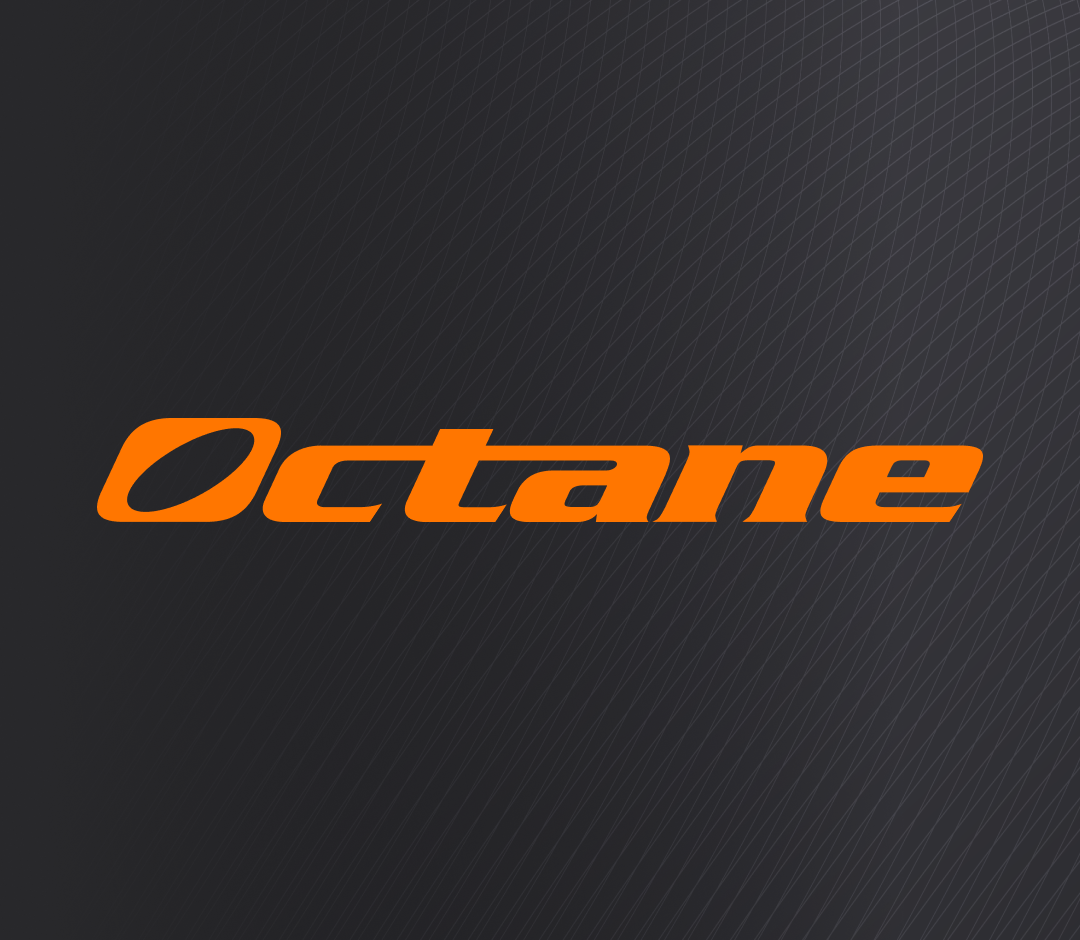
Our first area of focus was the logo. Octane’s original logo featured a timeless design of bold text and eye-catching color, it just needed a few minor updates to push it to the next level.
Our team made a simple but very impactful change to remove “Fitness” from the logo. This helped clean up the visual presence by removing any unnecessary elements or clutter. Our decision to shorten the logo to just “Octane” will help push the brand forward by presenting itself in a more memorable way that is easily recognizable.
Bold Messaging
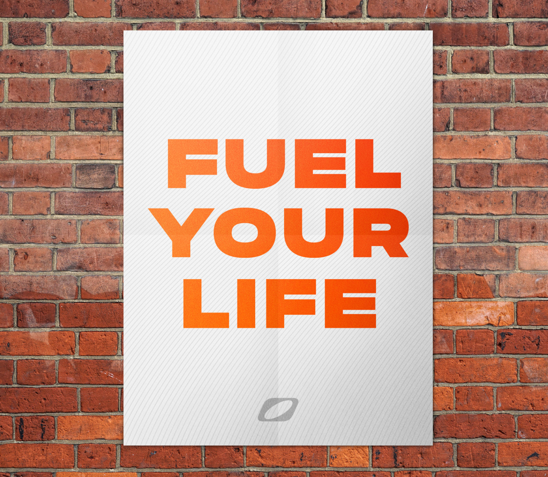
Our next area of focus was messaging. Octane’s original copy was a bit repetitive and lacked a consistent tone/voice. We saw an opportunity to add more powerful and moving statements that would catch the user’s attention and help redefine who they are as a brand. We accomplished this by using the expressive font “Phonk” and playing around with text colors and patterns.
Typography & Texture
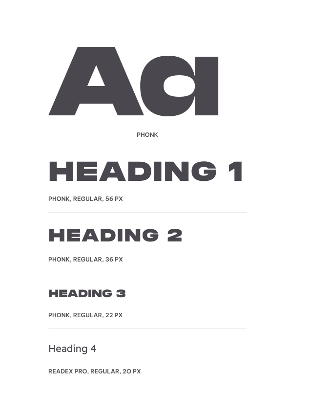
One of the most important contributions to the new look and feel is the introduction of Phonk, a powerful sans serif font that commands attention. We used this font for short but impactful messaging to better define areas certain of the site.
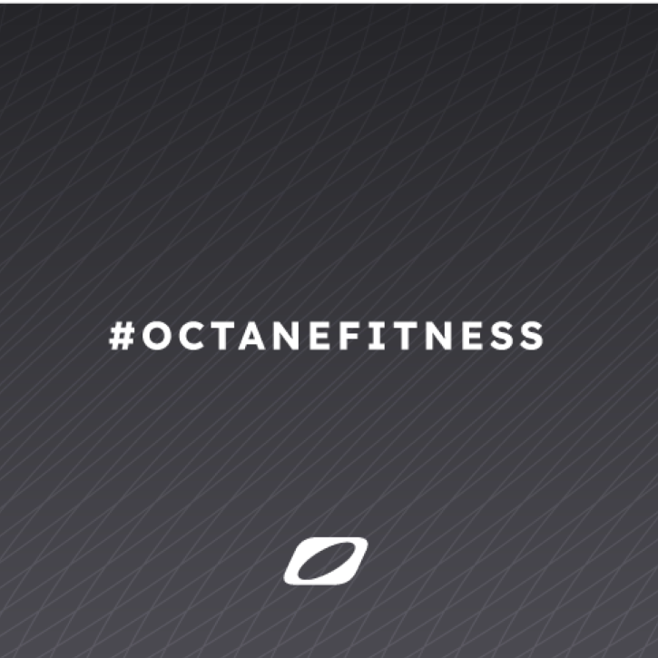
Texture was a new brand element that we introduced. The organic patterns we created helped add space and dimension without overwhelming the user with huge bursts of color. We also incorporated the O from the Octane logo into a few of the textures to reinforce the brand in a subtle but interesting way.

Dynamic Homepage
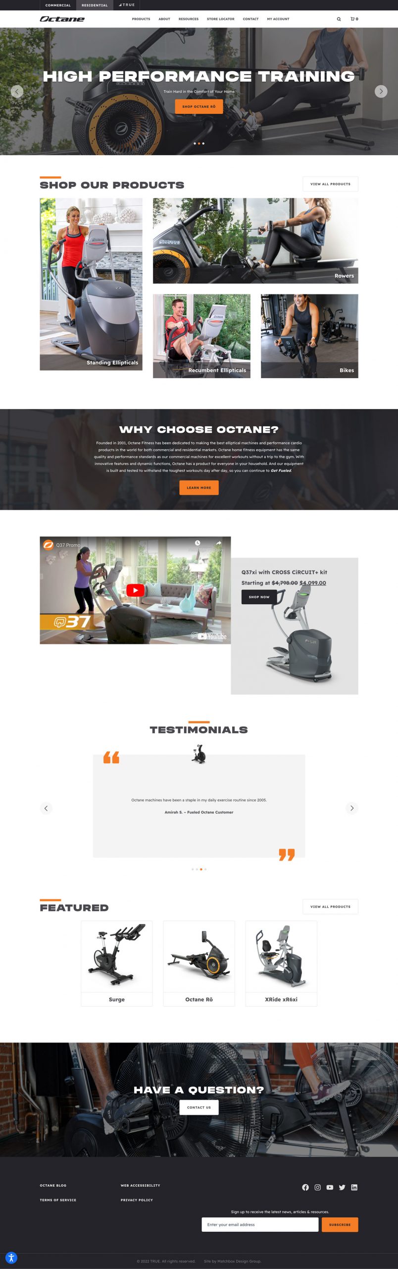
We introduce big, bold fonts and images at the top of the page to grab the user’s attention and showcase a few of their more popular products. We also include an in-page navigation feature for product categories that encourages the user to travel deeper into the site and explore all of Octane’s product offerings. We also added a few supporting content pieces such as a short company description, featured video and customer testimonials.
Intuitive Product Rolls
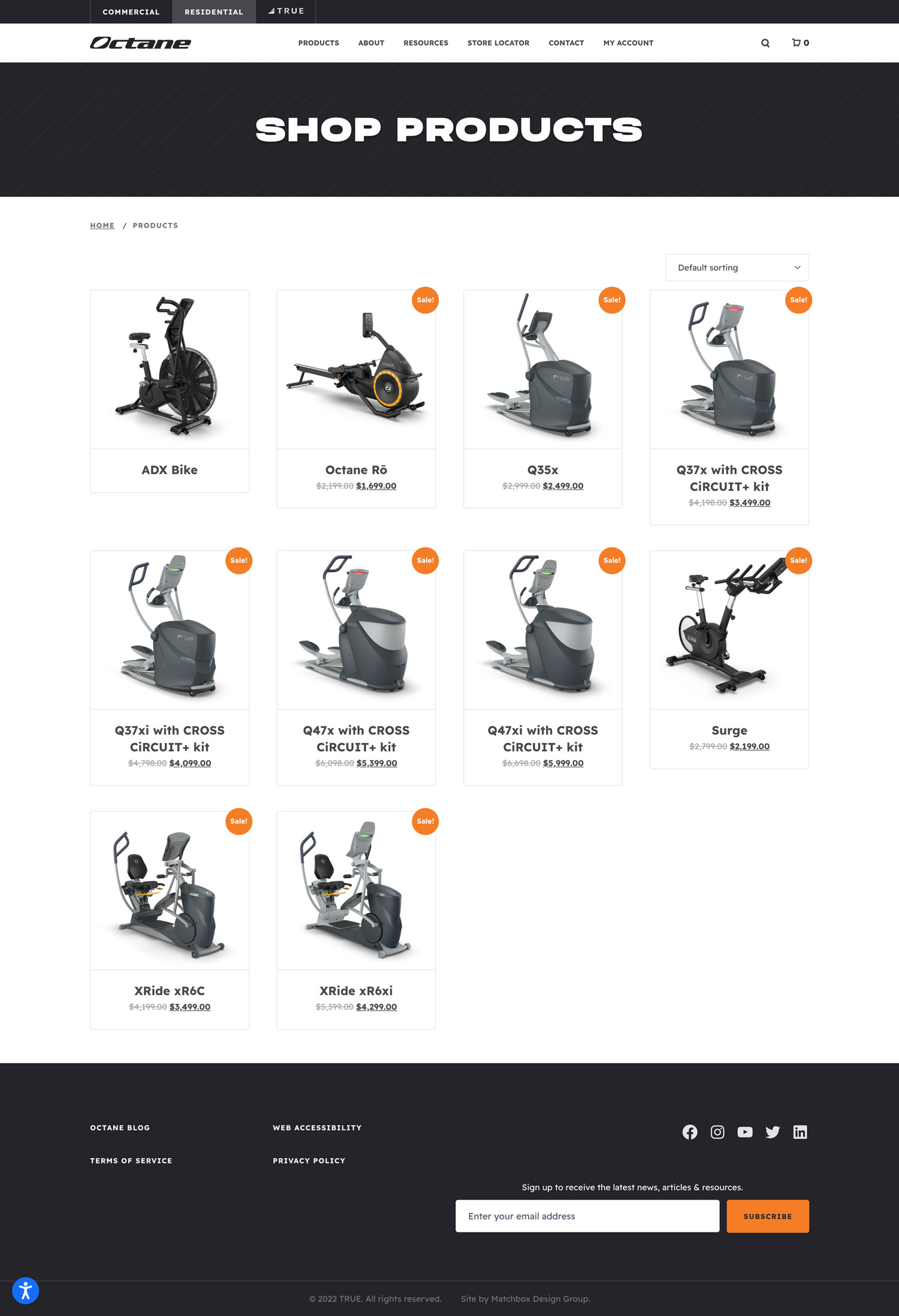
An effective product roll should be easy to navigate. We decided to keep it simple with a product image, name and price. The goal was to only display key product information without making it feel over-the-top or obnoxiously flashy.
Product Page Elements
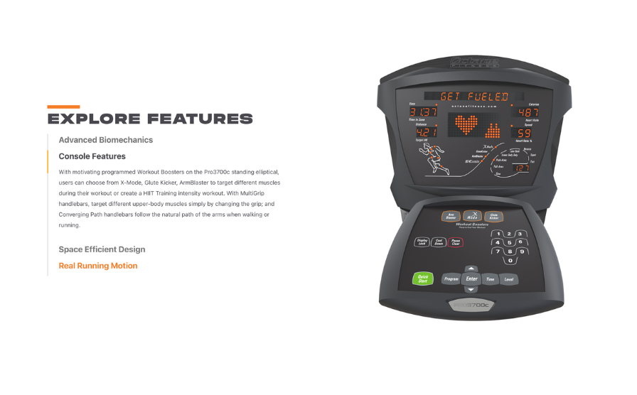
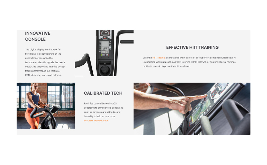
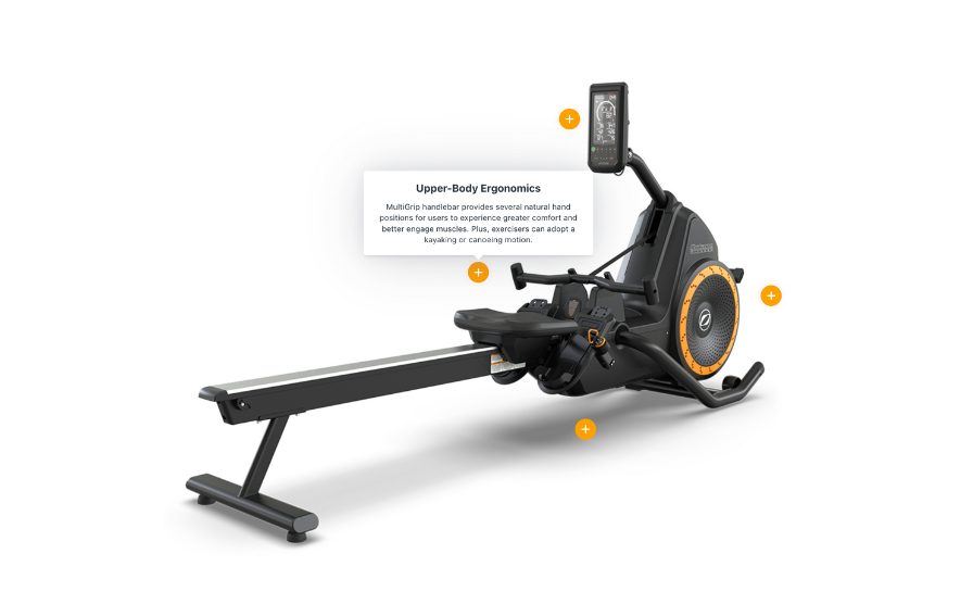
Using a familiar page structure at the top of a product page is key for conversions. Past this, customers are looking to be wowed by product functions and features. To do this, we leveraged interactive content pieces, eye-catching visuals and compelling lifestyle messaging.
Strong Branding Online & Offline
We built Octane’s brand system to hold up beyond the screen. The bold typography, high-contrast orange-and-black palette, and dynamic action photography translates well into other forms of marketing materials.
During the design process we took extra care to ensure that all elements could be re-sized and re-purposed for trade show pieces, brochures, and other non-digital mediums. Versatility is key to a lasting brand.
Let’s start the conversation.
Want to get more out of your marketing or just talk through some ideas? We’d love to hear from you. Fill out the form and we’ll be in touch soon.