Estimated reading time: 11 minutes
Are you undecided about the direction to take with your branding? Why not consider simplicity? Let’s talk about why simplicity works.
Related Links
In a world of excess, minimalism has a highly unique appeal. In fact, minimalist seekers — a consumer segment that focuses on living a minimalist lifestyle, quality, and sustainability — make up 18% of the population. But they’re not the only type of buyers drawn toward simplicity.
According to research from Google, most people prefer designs that are simple and familiar.
So, if you’re looking for ways to elevate your online (or offline) presence and maximize your chances of appealing to your target audience, less could be more.
TL;DR: Why Simplicity Works
Minimalist branding isn’t just trendy—it makes your brand clearer, more memorable, timeless, and easier for customers to engage with. Simplicity cuts clutter, prevents overwhelm, and boosts accessibility, ultimately improving recall, conversions, and customer trust.
What Counts as Minimalist Design & Branding?
When discussing minimalism, your initial impulse may be to think about extremely pared-down branding strategies such as those used by Aesop, COS, or MUJI.
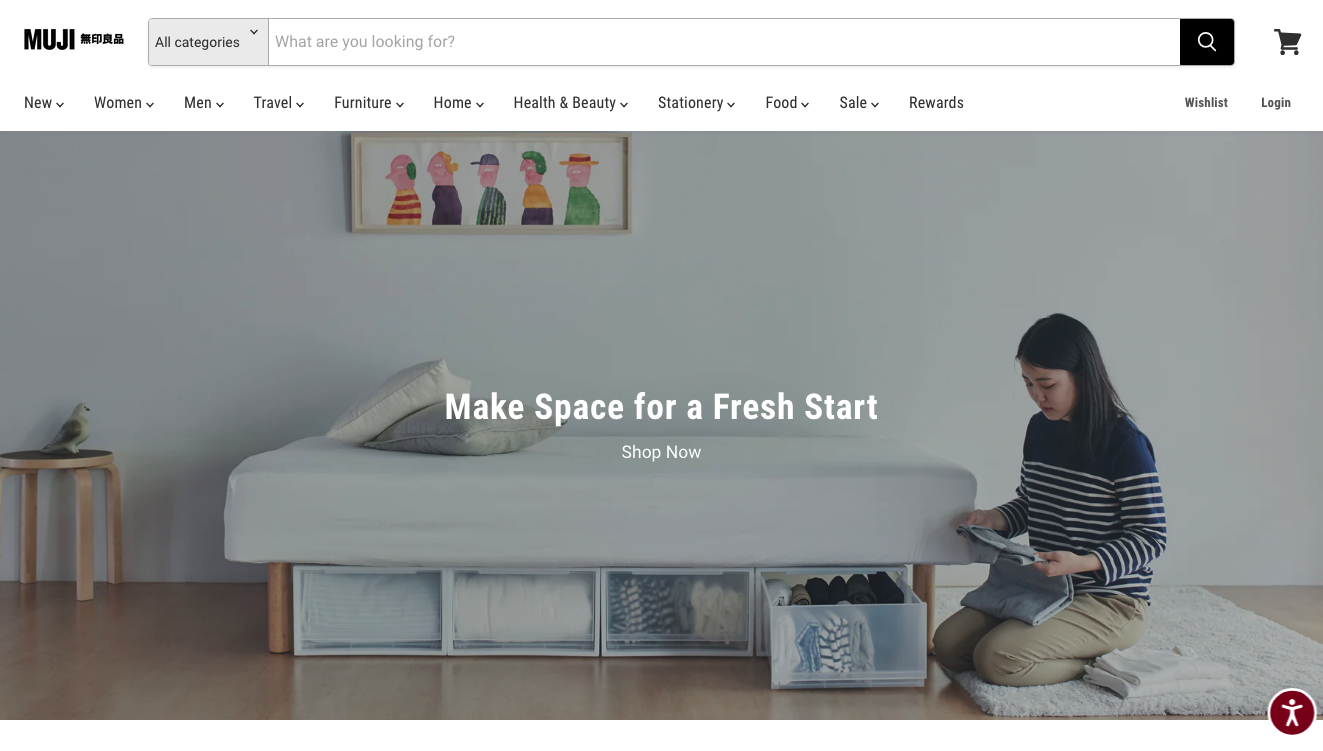 Source: muji.us
However, there are numerous ways to embrace the benefits of minimalist design without taking it to the extreme.
For instance, brands like Bang & Olufsen do a tremendous job of maintaining a fine balance between simplistic branding and colorful content. This allows them to ensure that their solutions appeal to young audiences while still maintaining an air of superior quality, craftsmanship, and luxury.
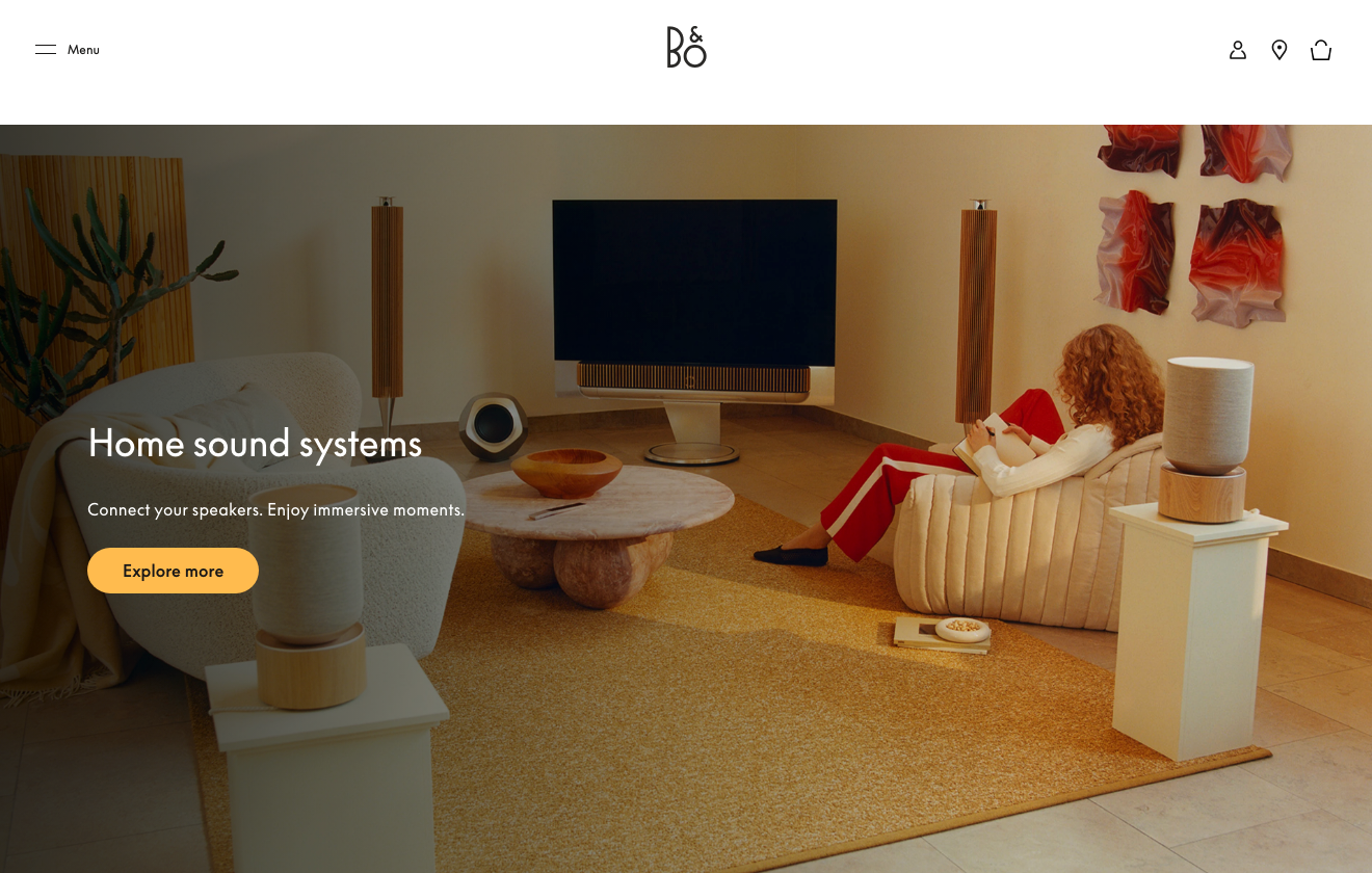
Source: bang-olufsen.com
Why Simplicity Works: The Benefits of Minimalist Design and Branding
Right now, simplistic design may be in vogue. However, the truth about incorporating minimalism into your branding and digital marketing strategies is that it’s not just about being trendy.
In fact, there are several tangible benefits of embracing simplicity, especially when done from a customer-centric point of view.
A Laser-Sharp Focus on What Your Business Does Creates Clarity
One of the biggest conversion obstacles for brands operating in niche markets is a lack of clarity regarding the value they offer. And the great news is that even a bit of minimalism can help remove that confusion.
Because it prioritizes straightforward information, minimalist branding makes it super easy to show your target audience precisely what they can expect from your brand.
Check out how Sewing Parts Online does it. In addition to a name that perfectly sums up the type of products this business sells, its value proposition creates further clarity for consumers who are still unsure if the brand has what they need. It promises “Expert service. Largest selection. Everything […] delivered quickly to your door.” This choice of wording ensures a perfect understanding of the company’s value proposition, making web visitors that much more likely to browse the brand’s selection and consider buying from it.
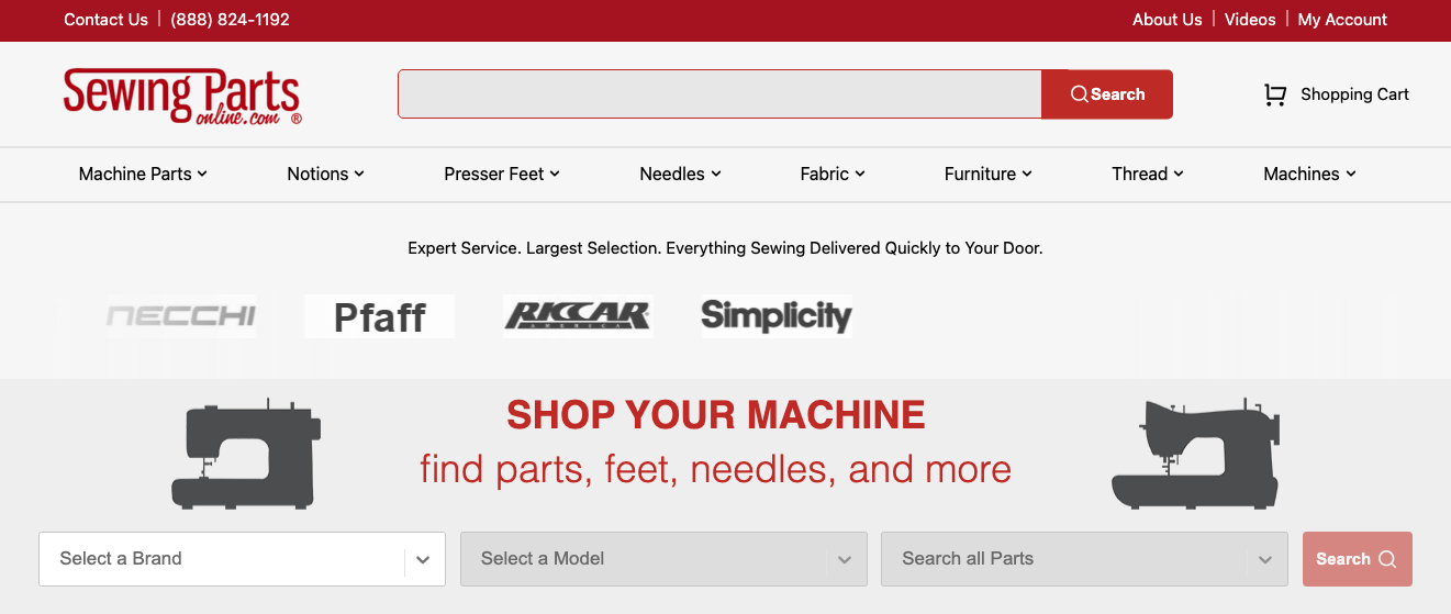
Source: sewingpartsonline.com
Minimalist Branding Improves Recall in Competitive Markets
Brand recognition is crucial for business success. After all, most consumers opt to buy from brands they’re familiar with.
Additionally, data shows that 87% are willing to pay more for products from companies they trust. Plus, 67% of people are more likely to shop with companies they associate with their childhoods.
So, how can you make your brand and products more memorable? Well, simplicity could help you do it.
By taking the unnecessary frills out of your branding elements, you can make it easier for your audience to remember (and later recognize) your business and products.
Think about brands like Nike or McDonald’s. Their logos are extremely simple. Yet, they’re so universally known that these businesses have the freedom to use them even out of context, still ensuring that their customers know exactly what they’re looking at.

Source: x.com
The key to accomplishing memorability isn’t to copy existing branding elements and hope they work for your brand. Instead, it’s to find that unique take that can help your audience instantly associate a branding element with your business’s value proposition.
The Brain Ritual logotype is a great example of what this can look like in practice. It’s simple, clear, and memorable. Seeing that it has a close connection to the type of product the brand sells, it has an excellent chance of getting consumers to instantly associate the visual with the benefits the product offers.
There’s Something About Simplicity That Breeds Timelessness
If you think about some of the world’s longest-lived brands or products, you’ll find that they often rely on simplistic branding. And there’s a good reason why this approach works.
By avoiding trends, decorations, and complex branding elements, businesses can maximize the longevity and appeal of their solutions. Moreover, they can avoid coming off as passé — especially if they operate in industries where trends come and go.
For example, the Chanel No. 5 packaging has stayed more or less unchanged for a century. Yet, it remains one of the most well-known perfumes in the world — a true classic that built its name and appeal on simplicity and evolved into a timeless choice for (almost) any occasion.
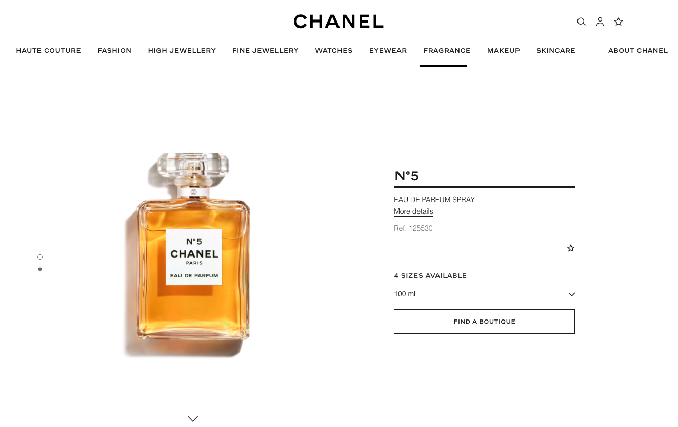
Source: chanel.com
The Absence of Clutter Translates Into Fewer Distractions From Your Value Proposition
Did you know that people’s attention spans are getting consistently shorter? According to the latest research, the median adult only has a 40-second attention span.
So, if you’re trying to engage your target audience and convince them to consider your solutions, you’ve got a very limited amount of time to do so.
By embracing minimalism — both in your branding and web design strategy — you can effectively encourage prospects to pay closer attention to what you have to say.
Essentially, by removing clutter (and distractions) from your online presence, you can encourage potential customers to pay closer attention to your marketing messages, instantly elevating their product understanding and their purchase intention.
In practice, this tactic can take many forms.
For instance, you might opt to do something similar to Ever After Weddings, a service brand that makes its online presence exceptionally straightforward in terms of the buying/browsing journey. Sure, the business does use plenty of webpage elements, a highly stylized logo, and lots of copy. Nevertheless, it streamlines the browsing journey, intentionally guiding web visitors toward a conversion by preventing them from getting distracted by unnecessary navigation options or CTAs.
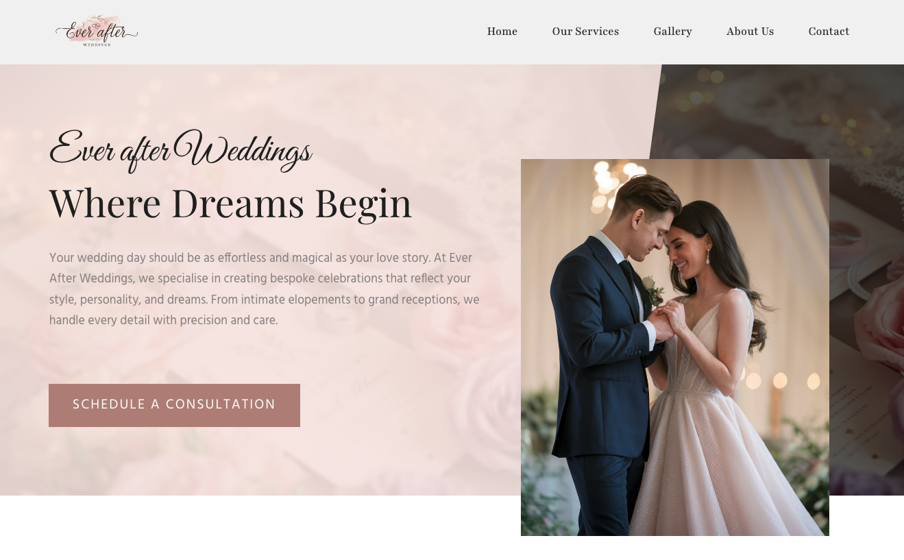 Source: everafterweddings.com.au
Alternatively, you may choose to employ minimalism in a way that’s more suited to appeal to prospects in the mid and bottom stages of your sales funnel.
Brickface, for instance, knows that its target audience’s primary goal is to find an expert home improvement service provider. So, instead of forcing web visitors to scroll through pages of content, the brand positions its contact form at the top of its webpage, where it invites people to request a free quote and begin the process of eliminating their pain points right away.

Source: brickface.com
Too Much Information Can Lead to Overwhelm — Minimalism Helps You Avoid It
What do people do when they have too much information on their hands? Typically, they go into analysis paralysis, which causes them to delay (or give up on) conversion decisions. Naturally, this is the precise opposite of what you want your digital presence to achieve.
So, if you’re trying to streamline the buyer’s journey and make your marketing more effective, it’s a good idea to avoid bombarding your prospects with too much information at once. Instead, opt for minimalism to engage prospects and only begin the sales pitch after you know you’ve got their attention.
From a branding standpoint, this can look similar to what ITsynch does with its logo and tagline. The business specializes in cruise ship management software. However, it doesn’t go into (inevitably complex) detail on what this can mean for potential customers. Instead, it just states that it offers “applied innovation, breakthrough results.” This minimalist branding decision helps ITsynch position itself as an authority and engage its target audience, which is much more effective than trying to cram all of the benefits it offers into the first branding element its audience comes across.
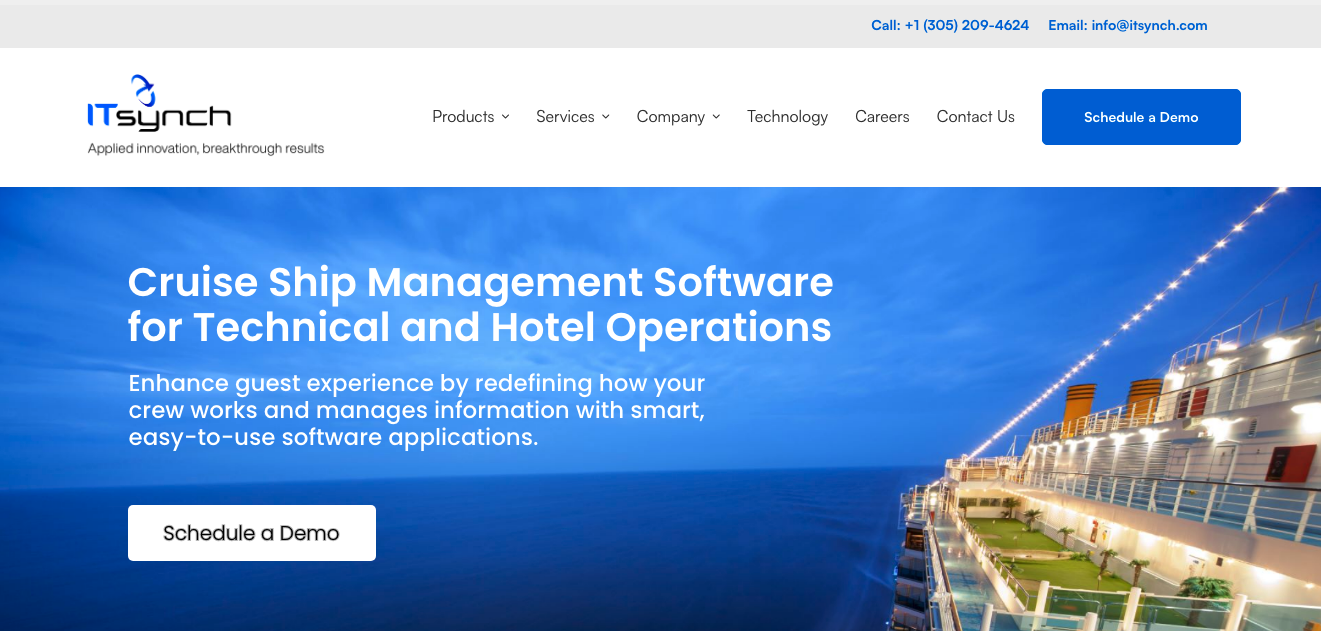
Source: itsynch.com
Simplicity Can Make Your Branding More Accessible
Finally, as you explore the potential benefits of using minimalist design in your branding strategy, consider the following.
Most businesses have a poor track record of presenting prospects with accessible brand experiences. Nearly 95% of websites fail to meet basic accessibility standards. And that can be a real detriment, especially when attempting to establish your business as the go-to in your industry.
So, if you’re considering reasons for embracing minimalism in your online presence, know that it might help you deliver a better brand (and browsing) experience to your audience.
What’s great about this tactic is that it doesn’t have to be a complicated fix. Small tweaks — like simplifying your color palette or reducing the number of page elements — can significantly improve your site’s UX and the customer journey, which is a surefire way to bring your conversions up as well.
FAQ: Why Simplicity Works
Q: Does minimalist design mean boring design?
A: No. Minimalism focuses on clarity and impact. You can still use color, typography, and layout creatively while avoiding unnecessary clutter.
Q: Which industries benefit most from minimalist branding?
A: Tech, fashion, lifestyle, and luxury brands thrive with it—but any industry that wants clarity and trust can benefit.
Q: How do I know if my brand needs simplification?
A: If your customers struggle to quickly understand what you offer, or if your site has low engagement/conversion rates, minimalism may help.
Q: Can minimalism hurt my brand?
A: Yes—if overdone. Stripping too much personality or detail can make a brand feel cold or generic. Balance is key.
Q: Is minimalism only about visuals?
A: No. It also applies to messaging, navigation, copy, and the entire customer journey.
Final Thoughts: How to Implement Minimalism in Your Branding Strategy
Now that you understand why and how minimalist design works, the next logical step is to implement it in your branding strategy.
The best advice we can give here is not to do a complete overhaul of your organization’s identity. Instead, explore ways to simplify key branding or design elements, with the aim of making them more effective at reaching your business goals.
In other words, begin your branding strategy simplification by checking whether a pared-down direction is the right fit for your business. Ask yourself whether simplicity aligns with the value you offer. More importantly, check whether your ideal customers want it from your brand.
Once you’ve done that, you can start exploring opportunities for implementing minimalist design. Your value propositions and key branding elements are a good start. You can also focus your attention on streamlining the customer journey through simplistic and to-the-point communication.
Why Simplicity Works Video
Lastly, as you embark on the journey of embracing minimalism, don’t forget that it has to be something you do consistently. Don’t try to apply it to just one element of your brand’s identity and then completely ignore it with everything else. Instead, do your best to create a cohesive and dependable digital presence for your brand, as that will be key to getting your audience to notice, engage with, and remember your brand, making it much easier to nurture leads into customers.
Key Takeaways: Why Simplicity Works
- Clarity sells: Minimalism sharpens your value proposition and removes confusion.
- Recognition matters: Simple logos and branding are easier to recall in crowded markets.
- Timeless > trendy: Stripped-down design avoids being dated and sustains brand longevity.
- Less distraction = more conversions: Clean layouts guide users toward action.
- Avoid analysis paralysis: Minimalist communication prevents information overload.
- Accessibility boost: Simpler color palettes and layouts improve UX for all users.
- Consistency is critical: Apply simplicity across the whole brand, not just one element.