Starting a business usually includes starting a brand as well. With great brands come great logos that are instantly recognizable and leave a lasting imprint in our minds. Achieving a result like that is difficult and the road towards it is treacherous and packed with potential pitfalls. Whether it is via gut feeling or thorough research – your logo design has to be effective.
Reaching the desired logo takes a certain level of understanding of the psychology behind creating visual identities and brands. The two main composites of this are the design choices you make for your brand and how those choices reflect your brand in the minds of your consumers.
Below you will read about said composites in an entwining way to hopefully spark a fresh idea for your emerging business.
Designing The Logo
Your brand needs a logo that reflects its message. Finding inspiration is hard if you are new to the business. Understanding the types of logos circulating is a start.
Some brands opt to go for a single letter logo. Letterform logos are quite effective when combined with a well-thought-out design (examples are McDonalds and Facebook). These logos send a sharp message and should be used mostly when your logo is already in some market presence.
Logos that are composed exclusively of freestanding words or abbreviations for corporations (like Sony or Google) are called Wordmarks. They are great if your message wants to evoke clarity and precision. You can spice these up by using fonts, backgrounds, colors and small design additions to the text. Remember that your word is the most important thing here, though – don’t overdo it.
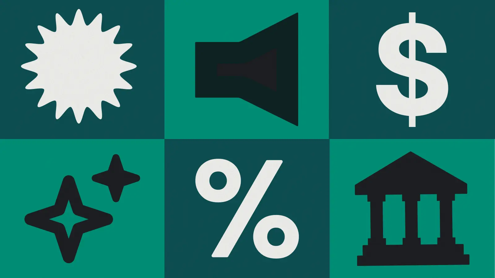
Your business is fast – get a feline, your business is wise – get a wizard. Pictorial logos are symbols that are recognizable representations of familiar sights in our daily life. This can be anything – as long as people notice it. Notable companies using this solution are Apple and Twitter.
Abstract logos are completely detached from the brand. They can perhaps project-specific feelings via their shape and curves, but you should essentially go for the aesthetics here. These are hard to pull off and really take a gifted individual to produce properly. The most successful logo of this kind belongs to Nike, clearly conveying the precision and success with that appealing checkmark.
Developing Shapes And Forms
Your design should take this into strong consideration. This effect may seem minor but it can be quite meaningful when it comes to reinforcing the reaction you were building for your consumers. This is done by using shapes and lines in a way that they convey different reactions.
Rounded and circular shapes send the message of warmth and inclusion. Incorporating such a shape creates feelings of connectivity, compassion, and unity. Some consider the round shape to symbolize femininity – due to it looking kind of like an egg.
Shapes with sharp edges symbolize edginess and aggressiveness. If you are looking to get attention from a younger demographic – combining these with vibrant colors can make you stand out. But beware, overdoing the aggressiveness and color mix may disconnect and negatively impact your brand.
Understanding The Color Psychology
Colors have a psychological effect on the human mind, everyone is aware of that. Using colors in a way that your brand powerfully resonates within the audience is key. Using different colors produces different results:
Black is not necessarily a color – but it was probably the first one used when logos are considered. The color is timeless and sophisticated. It will never go out of fashion – however, it will never be innovating. Stability and vigilance are its messages.
Red evokes passion and aggression. It’s great for sales or promoting identities that are modern, attention-seeking and appealing to the youth. If you’re all about action – red is the way to go.
Blue is the color of the sky and the sea. Wherever we are we can see blue, so naturally, people quite prefer it when it comes to logos. For a calm and trustworthy message – going blue is best. There is a reason political parties, social media, and tech companies go for this color.
Green is very recognizable and it reminds people of interestingly quite specific things. Those things are expectantly nature and money. If you are within these niches than going green shouldn’t be a bad choice.
Branding Your Website – Giving It A Visual Identity
Your brand identity is mainly conveyed through your site. If you are running a business involving digital products or services – your visitors will undoubtedly go to your site before going to check out. This is exactly why your site should be the place where your brand identity is most intensively promoted.
Color can be an extraordinarily powerful design tool and when combined with good functional design, it can provide the best user experience. Use the color pallet from your logo and combine shades of that color. Where able combine with contrasting colors or neutrals to create a dynamic that is appealing to the eyes and provokes engagement.
Going for a responsive web design to accommodate for the snowballing mobile market while combining previously mentioned design decisions can be too much, but there are web developers that can cater to such needs. If time is getting constrained and main business is waiting for work to be done – getting a helping hand can relieve the stress, it’s important that you maintain your idea for others to execute.
Familiarizing yourself with your brand and visualizing it clearly can be challenging. Measure for a solution by viewing yourself from a variety of angles and assess the best option. Match your philosophy with just the right touches to tell your story in the best way possible and success will ensure – no doubt.
If you have found your visual identity and are looking for online tasks or jobs, you can always go here.
Our Guest Blogger
Media Gurus, an Australian business, and marketing resource. He is an aspiring street artist and does Audio/Video editing as a hobby.”
James is a savvy digital marketing specialist with a Masters of Science in Internet Marketing. For the past fourteen years, he has been specializing in SEO, PPC & Marketing Strategy. He has a super sharp analytical mind and a finely tuned creative eye for marketing initiatives that optimize brands.
To provide the best experiences, we use technologies like cookies to store and/or access device information. Consenting to these technologies will allow us to process data such as browsing behavior or unique IDs on this site. Not consenting or withdrawing consent, may adversely affect certain features and functions.
Functional
Always active
The technical storage or access is strictly necessary for the legitimate purpose of enabling the use of a specific service explicitly requested by the subscriber or user, or for the sole purpose of carrying out the transmission of a communication over an electronic communications network.
Preferences
The technical storage or access is necessary for the legitimate purpose of storing preferences that are not requested by the subscriber or user.
Statistics
The technical storage or access that is used exclusively for statistical purposes.The technical storage or access that is used exclusively for anonymous statistical purposes. Without a subpoena, voluntary compliance on the part of your Internet Service Provider, or additional records from a third party, information stored or retrieved for this purpose alone cannot usually be used to identify you.
Marketing
The technical storage or access is required to create user profiles to send advertising, or to track the user on a website or across several websites for similar marketing purposes.


 Media Gurus, an Australian business, and marketing resource. He is an aspiring street artist and does Audio/Video editing as a hobby.”