Dream Big. Bank Local. Achieve More.
Midwest BankCentre distinguishes itself as a community-focused financial institution that prioritizes reinvestment in its local region. Unlike larger, national banks, Midwest BankCentre directs its resources toward empowering underserved neighborhoods and small businesses in the St. Louis area. This case study is about the Midwest BankCentre Website Rebuild.
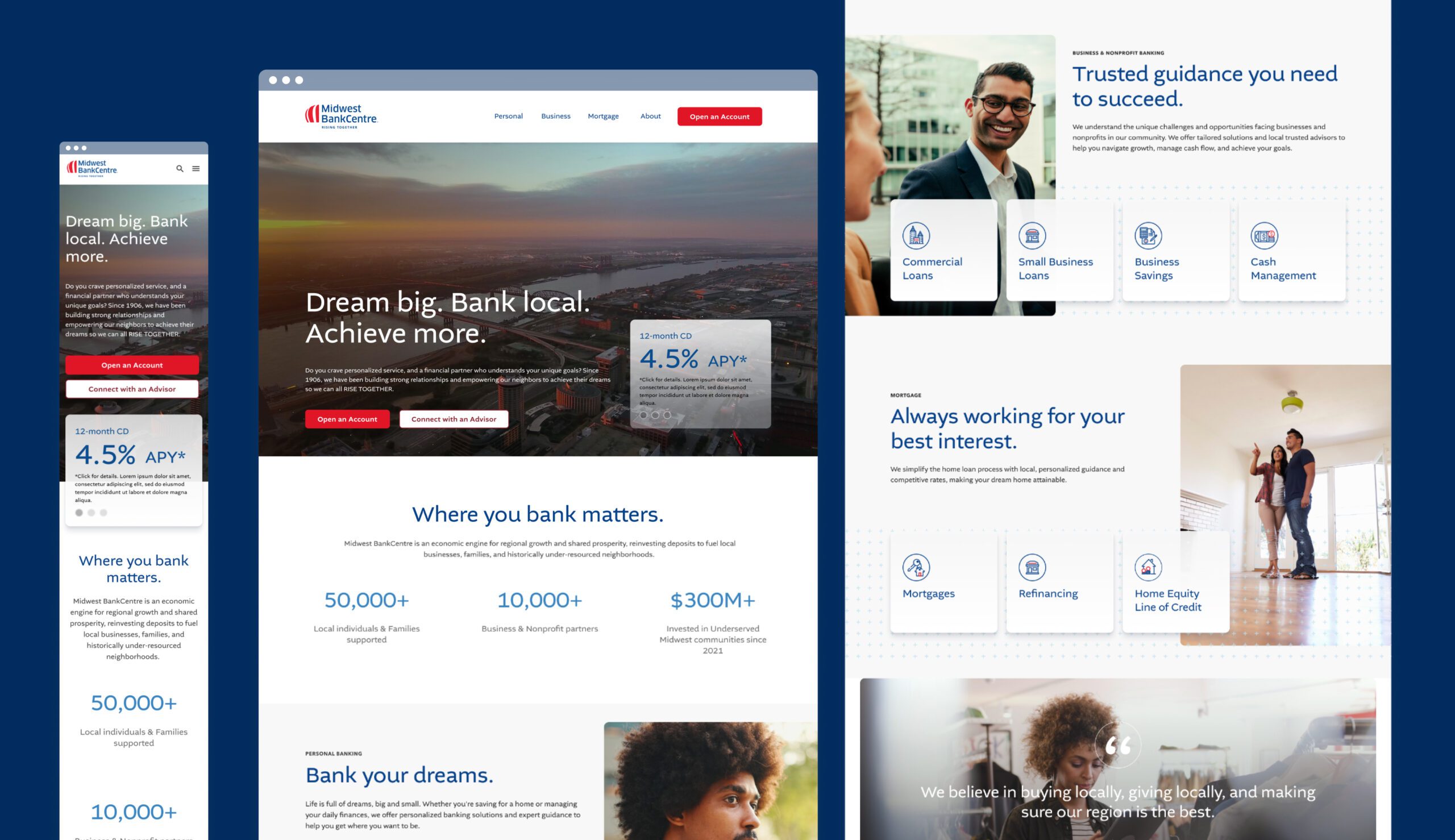
When they came to us, Midwest BankCentre was struggling with outdated interfaces, an inconsistent user experiences across devices and pages, and a lack of clear guidance for complex financial services. In addition to that, they had been consistently growing and lacked the ability to easily add new sections and pages with their current CMS and wanted a consistent design structure that could grow with them into the future.
Where We Started
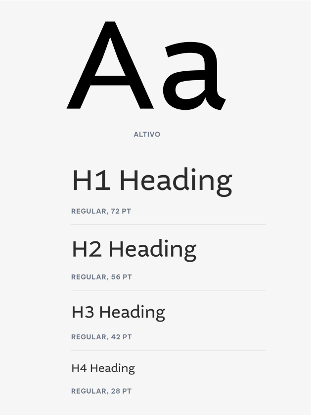
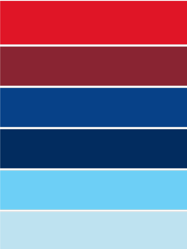
Midwest BankCentre partnered with Darling Brand Makery, the agency behind their branding, to develop their home page design. Once the home page was approved, our team took that foundation and expanded on it, designing the rest of the site to ensure a cohesive and seamless user experience. By building on the established visual direction, we created pages that not only aligned with the brand but also provided a functional, user-friendly experience.

Making Navigation Simple
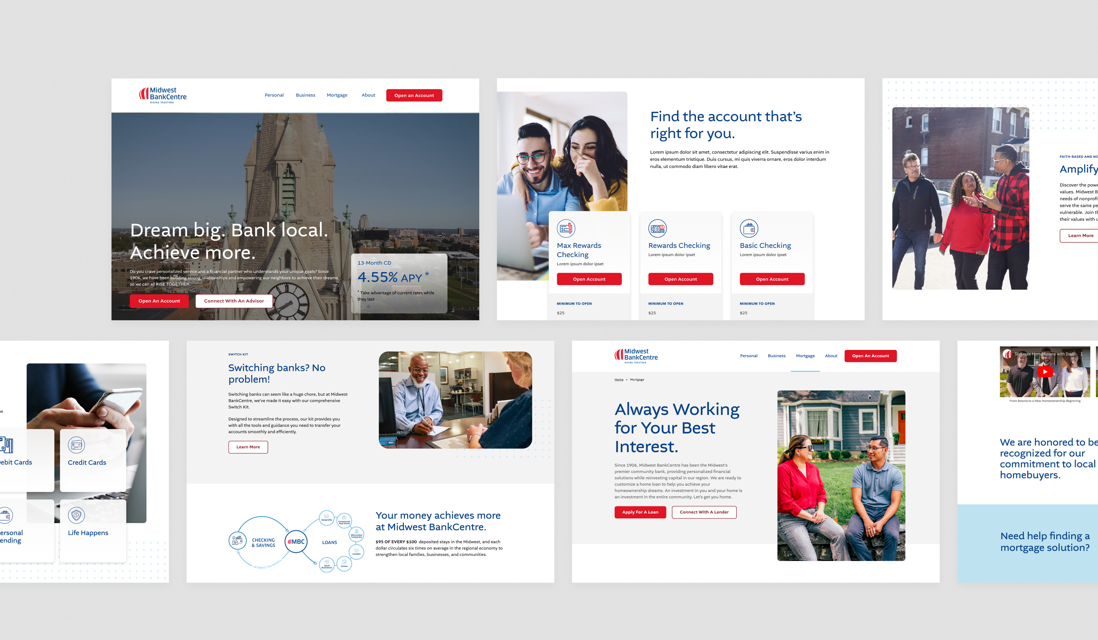
Bank customers increasingly expect intuitive navigation, quick access to account information, and tools for financial literacy. Midwest BankCentre’s goals included improving their navigation, simplifying the way information was presented, and eliminating unnecessary pages. We started with an extensive audit of the site, and began to put together a sitemap structure that was more organized and intuitive.

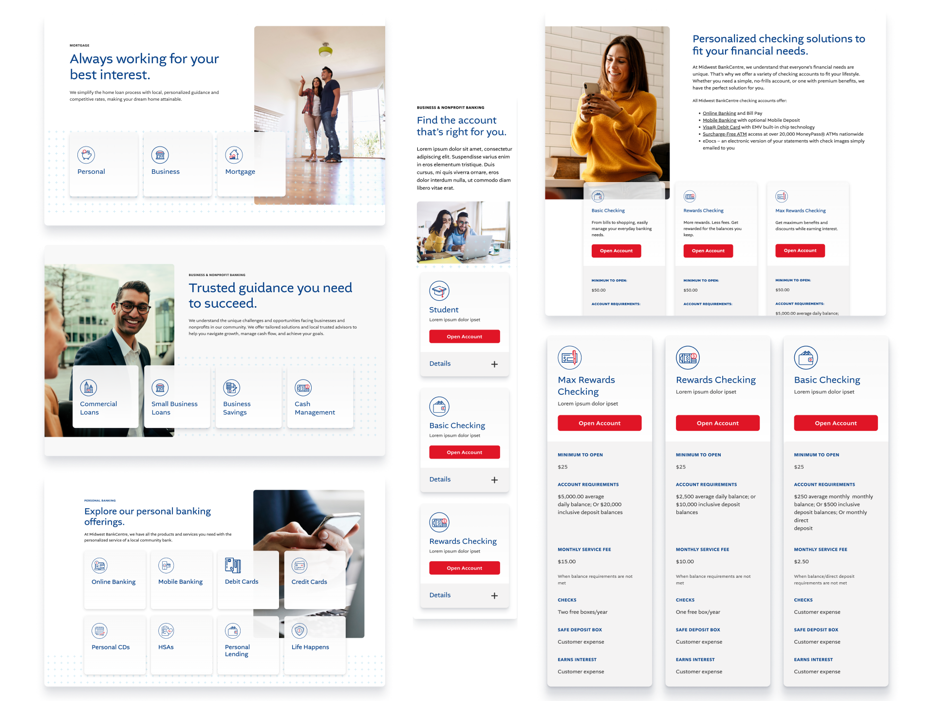
To enhance usability, we restructured the menu for faster navigation and easier access to frequently used actions. Additionally, we created visually appealing cards and buttons across several pages, enabling users to quickly compare services and locate what they needed. Bold buttons, paired with custom iconography, ensured a clear and intuitive interface that streamlined the user experience.
An Emphasis on Community
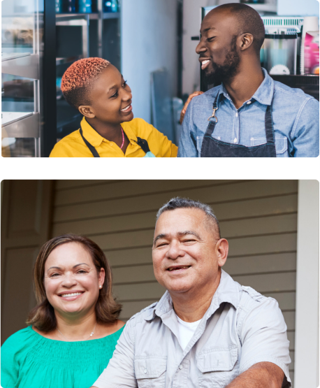
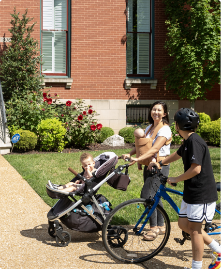
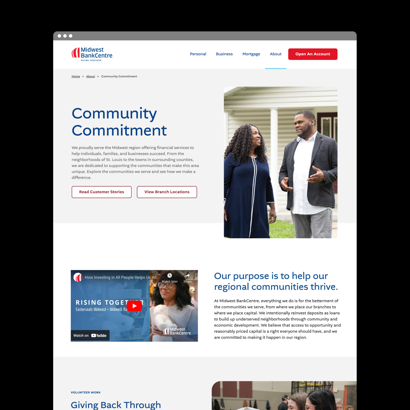
Midwest BankCentre’s brand is deeply rooted in the belief that banking local can create a lasting, positive impact on communities. By emphasizing their focus on reinvesting in neighborhoods, fostering economic growth, and building strong relationships, we created a site that reflects their mission to uplift individuals, families, and businesses.
From thoughtful visuals to intentional messaging, every element of the website reinforces Midwest BankCentre’s dedication to the communities they serve.
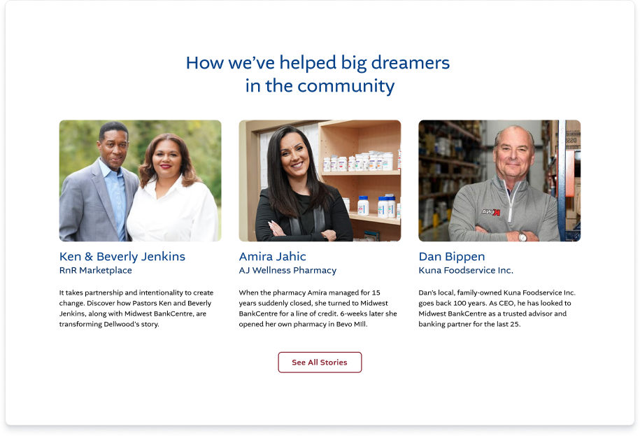
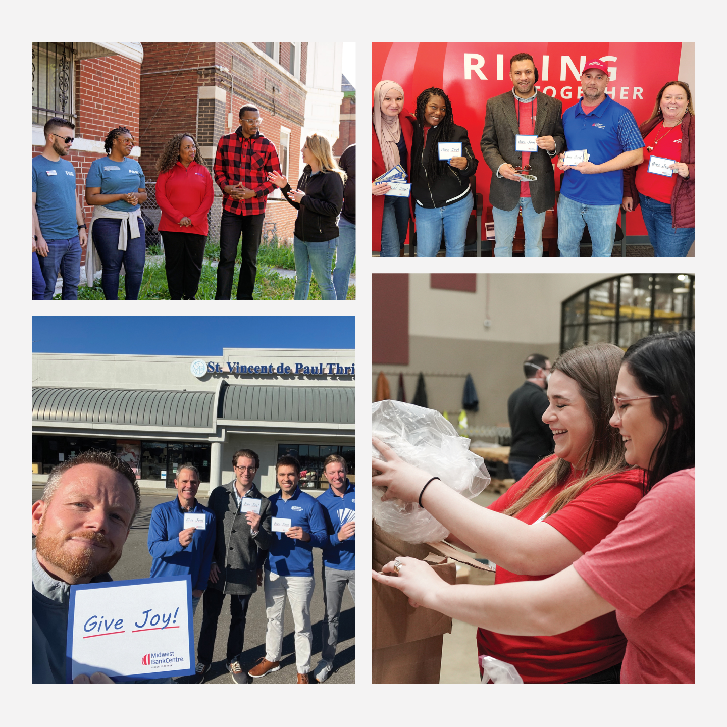
Midwest BankCentre’s efforts go beyond traditional banking by fostering community connections. Their “Give Joy” program involves employees volunteering and participating local outreach.
The Midwest BankCentre Website Rebuild Result
By emphasizing responsive design, accessibility, and personalized user journeys, the website met objectives while allowing Midwest bankCentre to foster deeper relationships with clients and the community at large.
I want to thank Matchbox for a great 2024! Heidi, our VP of Marketing, has been incredibly complimentary of the work you and your team have done. As I shared with our CEO and Board of Directors, the website was delivered on time, on budget, and exceeded expectations. Heidi continues to express how much she appreciates your team’s intelligence, clear communication, and excellent execution. Thank you for being such a strong partner!
Danielle Bateman Girondo
Chief Marketing Officer
Let’s Start the Conversation
Want to get more out of your marketing or just talk through some ideas? We’d love to hear from you. Fill out the form and we’ll be in touch soon.

Similar projects to explore
Let’s start something
