Estimated reading time: 8 minutes
Setting up a website for your business is not an option anymore; it is a necessity. Your business website establishes your credibility and credibility in your customers’ eyes. A person arriving on your website is like someone pulling up to your office. There will be a first impression. You want it to be a positive one. And according to studies, this impression is formed within 50 milliseconds (0.05 seconds).
Just as you would put great thought into designing your office, the design of your website also requires great consideration. The state of your website, like your office, will have a huge impact on the future of your business. Design drives a staggering 94 percent of the perception of your website.

Even if you are getting your website designed by professionals, it is helpful to know web design principles. Learning HTML and CSS is beneficial as well. You can be more involved in the design process and provide valuable input. The result would be a customized website that perfectly suits your business’s needs.
Read on to understand the ten essential web design principles for creating effective websites.
Simplicity
You have heard of ‘less is more.’ It holds true in the case of website designs. Follow these tips for a simple and elegant design:
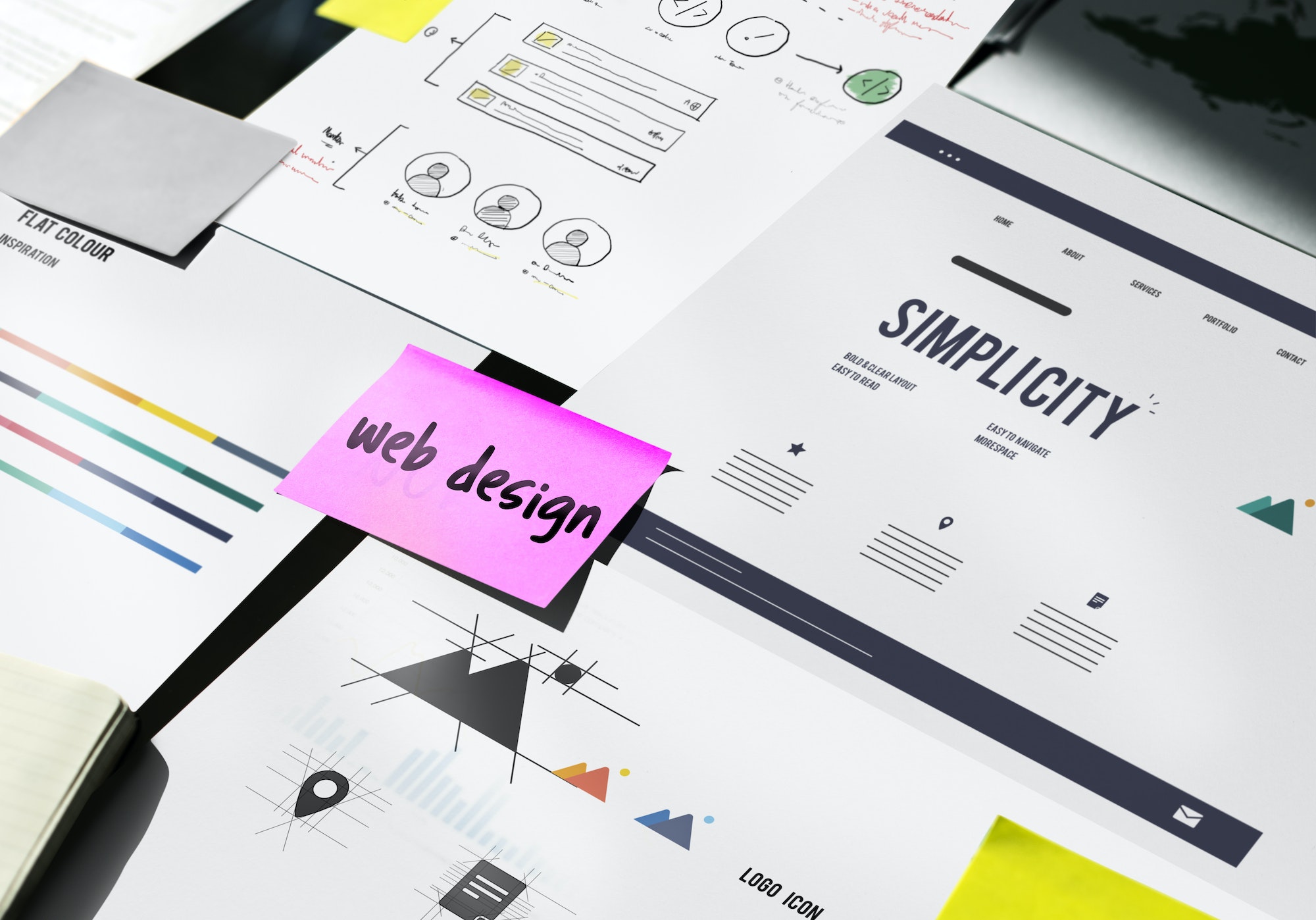
- Cluttered layouts are confusing, jarring, and look outdated. When in doubt, always go for the simpler design. This is in line with the concept of minimalism. The main purpose of the website should be immediately clear. A simple design is straightforward and to the point, while maintaining aesthetic appeal. A grid-based layout helps in organizing and aligning elements for a clean design.
- Avoid excessive graphics, text, and website elements. However, this does not mean skimping on the necessary content and features, affecting the functionality and leaving the users puzzled. The imagery used should reflect the personality of the brand.
- Regarding typography, ensure that the fonts are easy to read and web-friendly. Try to limit the number of typefaces used throughout the website to three.
- Choose a color palette that suits the brand image and makes the brand memorable. Colors can evoke certain emotional responses and affect the users’ behavior subtly. Too many and too loud colors will cause eye fatigue and overwhelm the users. It is best to use three to five colors throughout a website. Using more than five colors can be tricky, but might work with a grid layout. In the case of a three-color palette, some might recommend making use of the 60-30-10 rule. The selected color palette should be pleasing to the eye for the best response.
- Turn the negative into a positive. The white space, which is the empty space between the visual elements also known as the negative space. Use it to your advantage. Let it draw attention to the important content.

Ease of Use
The design of a website must be user-centric, and the end result should be user-friendly. It should help users find what they are looking for quickly and without any hassle. You can utilize a visual hierarchy to direct the users toward the content.
Adopt an intuitive structure like the F pattern or the Z pattern. These patterns are based on the common ways in which most people scan content. Facebook and Apple use the Z pattern on some of their pages.
Get creative with your call-to-action (CTA) buttons to make sure they stand out. Make sure that the CTA is clear. Typically users will just quickly scan the content and click on the button that they think will serve their purpose. Utilise Fitt’s law to your advantage with regard to the CTA. Make the CTA bold and position it close to where you expect the pointer of the user to appear.
Balance
To achieve balance in the design of a website, you must make sure that the visual weight is distributed proportionally. Achieving balance requires skill and can be time-consuming, but the resulting design will be comfortable and pleasing to the user’s eyes.
It is simpler to achieve balance through the use of symmetry. You can use any of the three major types of symmetry: bilateral, radial, or translational symmetry. Bilateral symmetry can be vertical, horizontal, or diagonal. Since it is difficult to achieve complete symmetry, a near-symmetrical design will also work. Translational symmetry can also be very eye-catching and satisfying.
Achieving balance through an asymmetrical design can be complicated, but it is not impossible. You can come up with some very interesting compositions with asymmetry that make your site aesthetically pleasing.
Ease of Navigation
Website navigation, another essential web design principle, plays an important role in the way your website will be perceived and remembered. If the user gets lost on your website, all the carefully curated content will be of little use. The navigation menu can be compared to the GPS of a car, guiding and leading the user to the place they want to reach.

The navigation design should be simple and logical, regardless of whichever form it takes (sticky, drop-down, or sidebar). Navigation options are usually at the top or left of a page. The navigation text should be prominently displayed and must be easy to locate.
Navigation options should be easy to click across different devices. The navigation text must be precise but clear. Limit navigation items (eight seems to be a good number), and sort them in order of importance.
Ease of Decisions
For this essential web design principle, keep in mind the Hick-Hyman Law, also known as Hick’s Law. According to this law, a person will take longer to make a decision based on the number and complexity of the choices available. This also increases the possibility of making no decision at all. In the case of websites, it might lead to the user exiting the website, or bouncing. If you wish to make the user stay on the website longer, reduce the number of choices, or provide filters (as in the case of e-commerce websites).
Accessibility
Design your website in consideration of people with disabilities, impairments, and limitations. Making your website accessible to all is not only humane, but it will also be beneficial for your business. It will increase the number of users of your website and enable your business to venture into market segments that were previously difficult to enter.
Some of the elements related to accessibility include making sure that all the images have alt text, so a user with a screen reader can understand what the images are; adding labels to form fields for those using screen readers; avoiding the use of tiny font sizes; making sure background and foreground color contrasts are sufficient; and more.
Going with the earlier analogy of an office building, you would make sure that your office is accessible to all; similarly, you should ensure that all types of users can operate your website. Improved accessibility of your website will depict your values and thereby raise regard for your business.
Responsive
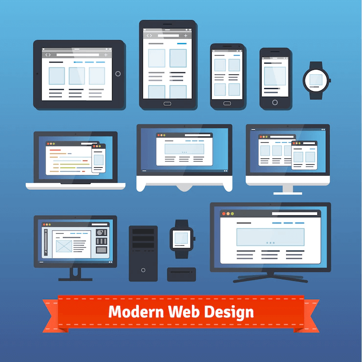
These days users don’t just access websites from their desktop PCs. Quite a substantial amount of website traffic comes from mobile devices. Tablets have become common. The design of your website needs to be such that it not only looks good on all devices but is also easy to use across devices.

A website with a responsive design will automatically shrink, enlarge or hide the images, text, and other elements according to the size of the device from which it is being accessed. This helps ensure that your site is mobile-friendly.
Shorter Load Time
Your website must be designed to load as quickly as possible; this is also known as page speed optimization. The longer it takes to load, the more the chances of a user leaving it even before giving your content or business a chance. Optimize the file sizes for faster loading. A significant percentage of users expect a website to load within two seconds and will leave the website if it takes longer than that.
Suitability to Purpose
The design of your website must suit its purpose. Each page must have a clear intention. From the point of view of businesses, there are some basic objectives common to all websites: establishing an online presence, engaging the audience, cultivating relationships, and increasing revenue. The design should be suitable for the specific purpose of the website.
Consistency
The design elements (like the color schemes, layout, and fonts) must be consistent throughout the website. Consistency is the most important principle for effective website design. Aim for consistency in visual elements as well as functionality. Consistency will make your website and brand memorable.
Conclusion
Taking these essential web design principles into consideration will help your site stand out from the sea of websites online.
Studies have shown that:
- 88% of users won’t return to a website after the initial bad experience
- 75% of users judge the credibility of a business based on its website
- 94% of negative feedback on a website is related to its design
With a well-planned website, you can enhance the user experience and thereby leave a lasting positive impression. This will facilitate lead conversion and make users return to your website more often.
Contact Matchbox Design Group Today!
If your website could use a refresh, if you’re looking to drive more traffic to your site, or you would like to submit a guest post, fill out the form below and we’ll contact you to learn more about your digital needs.


