Many web design trends are entering the scene in 2023, and one of the phrases being mentioned is “ïnclusive design.” No, it’s not just another term for “accessibility.” It’s far more than that.
Kat Holmes, Director of UX Design at Google, explains: “Accessibility is an attribute, while the inclusive design is a method.”
So What Is Inclusive Design Anyway?

Another expert, Matt May from the Adobe family, provides an insightful definition:
“We have defined Inclusive Design as design that considers the full range of human diversity with respect to ability, language, culture, gender, age and other forms of human difference.”
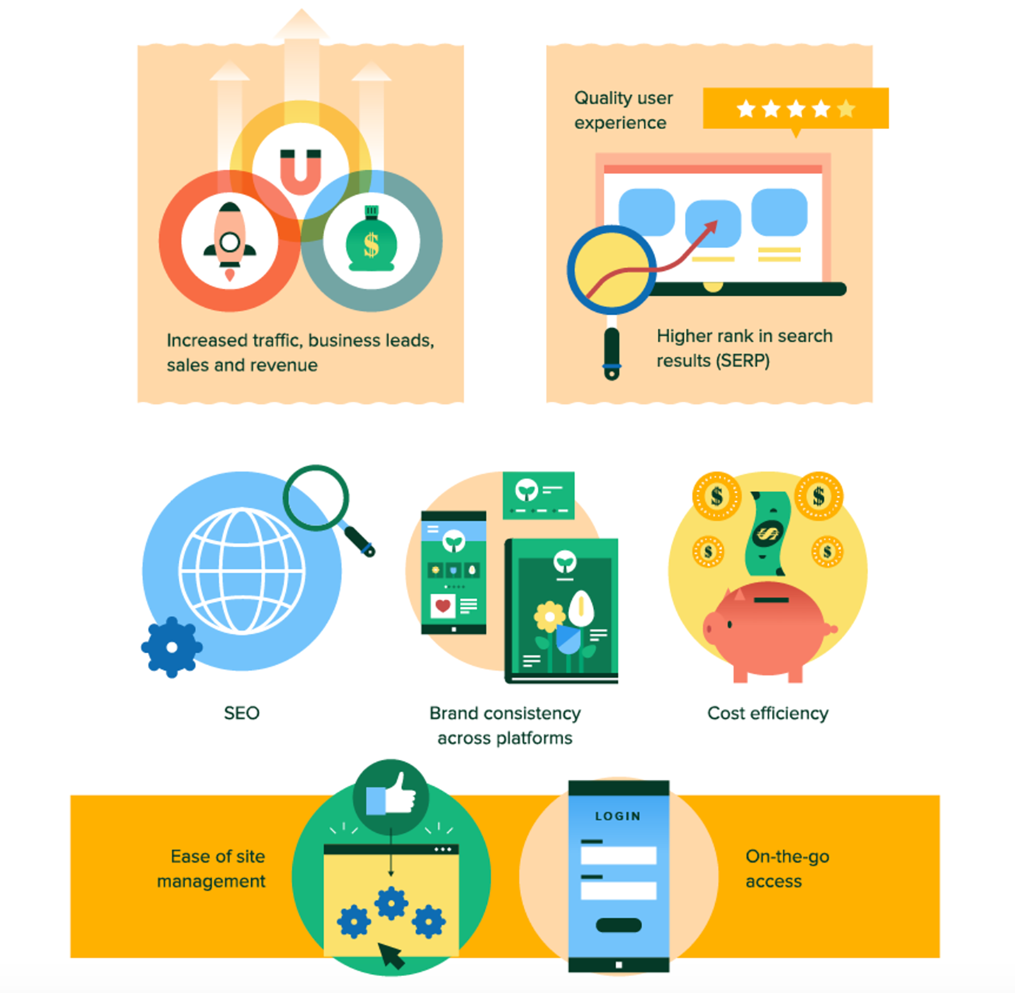
Designing with inclusivity in mind is just better practice overall. It’s something that web designers should design for simply because we can. But if that in itself isn’t reason enough, consider the fact that 95% of users see user experience as the most important factor when visiting a website. Therefore, inclusion is also, plain and simple, good for business. Now, to give you a better idea as to where to start, we’ve compiled a list of tips to help you solidify your inclusive design methods.
Useful Inclusive Design Tips
Know Your Audience
This is a given in web design, digital marketing, and business in general. But knowing your audience doesn’t just come from looking at existing data. Taking that approach is fine if you’re aiming at keeping your existing users, but the whole point of great design is to provide greater access and better user experience for everyone. And this includes potential users.
Expanding your testing to include a broader range of individuals will help broaden your understanding of the audience you’re seeking to include. Alternatively, an insightful HubSpot article suggests that other improvements to user experience may be discovered by interviewing users who visit and use the site most frequently through push notifications or customer surveys.
Start With Uncommon Uses
As we mentioned, most of the time, we approach design from a conventional perspective. Or rather, we are constrained to our own way of looking at things. For starters, we typically explore websites with a mouse with scrolling functions or using devices with touch screens, so this is what we wind up primarily designing for. It’s only after functions around these interactions are established that we think of what we might have missed. And with inclusive features being mere afterthoughts, it’s more likely for a crucial function to be omitted. So instead of taking a traditional approach to planning, Vasilis Van Gemert, from the University of Applied Science in the Netherlands, suggests flipping the process entirely and focusing on designing first for people with disabilities exclusively.
Be Aware Of Personal Assumptions
In the previous point, we covered how web designers can tunnel when planning by prioritizing functions based on common uses. It’s possible, too, to lose sight of designing for inclusion when decisions are made by individuals who take similar perspectives and assumptions.
As it turns out, this can be further exacerbated by a psychological phenomenon called “groupthink.” It’s the tendency of individuals working together to unconsciously favor consensus to the degree where they self-censor in favor of maintaining harmony within the group. This, in turn, can lead to dangerously warped perceptions, and skewed decisions. Awareness is a great start, but diversifying hires and building inclusive teams all help to take inclusion to the next level.
Design For Alternatives
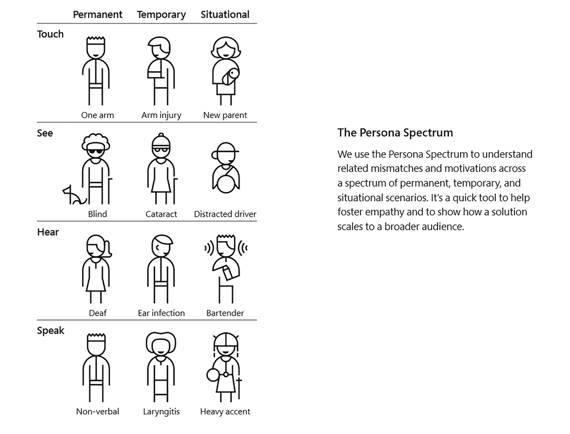
There are a couple of ways to do this. From the availability of audio descriptions to allowing customization of color in closed captions, providing alternatives don’t just include people. They provide better, more personalized interactions with content and the website in general. These are accessibility features we’ve mentioned, yes, but they are not beneficial only to users with disabilities. Designers take user experience up a notch when they design for both different personas and different situations. Here’s an illustration from Microsoft’s Inclusive 101 Toolkit that demonstrates the examples of personas you should be designing for:

Offer Different Ways To Complete An Action
This is especially handy to keep in mind now that users are accessing websites from a variety of devices. For starters though, we can design websites with higher contrast between objects in the foreground and the background space. Making buttons and fields less reliant on color identification is another improvement that’s bound to bolster user inclusion.
Make Actions Easier To Complete
From integrating a “show password” feature to using live regions that work with assistive technologies, there are numerous ways to facilitate user actions. Something as simple as cutting down the number of times users have to fill out forms can already improve user experience tremendously. You may also integrate features that allow users to interact with the site using voice, or integrate APIs that use vibrations for individuals who are deaf or hard of hearing.
Make Content Your Top Priority

According to research from DesignAdvisor, a staggering 50% loss of sales occurs when users are unable to find information. On a more fundamental level, planning your site’s architecture well also bolsters content discoverability. Other features such as reader-friendly typefaces, the option to zoom or reveal and hide content, will also help users get to the content they need more efficiently.
Your Turn To Implement Sound Inclusive Design
You now have the basic principles to rely on as you employ the method of inclusive design to your work. Before you jump into it, we’d like to hear from you.
Which tip did you find the most useful? If you’re already familiar with this approach, are there any additional best practices that come to mind? Share your thoughts on social media along with this post. Don’t forget to tag us in so we can join the conversation!
Share at:ChatGPTPerplexityGrokGoogle AI
Post Written By:
James McMinn
James is a savvy digital marketing specialist with a Masters of Science in Internet Marketing. For the past fourteen years, he has been specializing in SEO, PPC & Marketing Strategy. He has a super sharp analytical mind and a finely tuned creative eye for marketing initiatives that optimize brands.
