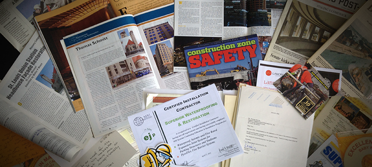
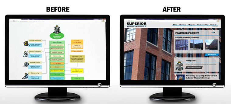
Following the first meeting with the Superior team, a package arrived at our office via courier. It was an overstuffed envelope filled with everything from testimonials, newspaper articles, photographs, CD’s, awards, certificates, and magazine articles. We asked for resources and they delivered! Our challenge was to translate all of those elements into web-ready content; we had our work cut out for us. This is how we took on the superior team website design challenge

The Superior Team Website Design Task
Although this stack looked daunting, it helped me see exactly what made up Superior’s core: impressive safety policies and top quality workmanship. After flipping through a few more articles, I knew exactly what kind of website they required… you guessed it, a superior one.
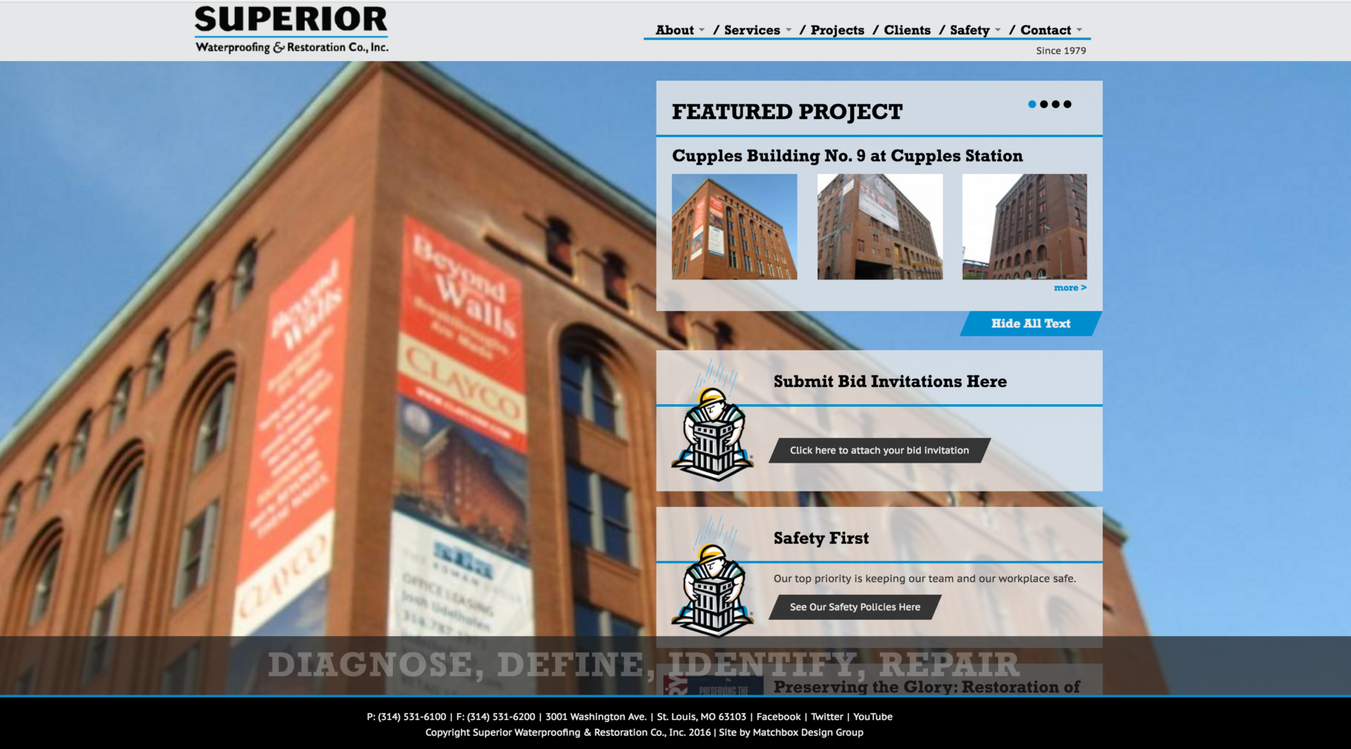
In design, I wanted to showcase this company’s vast range of projects that are impressive in quality, size, and grandeur. The best way to display beautiful buildings on the web is with large photography, so I did just that! I kept things strong, grounded and masculine with the use of the hefty slab-serif for titles and directions and by incorporating they’re branded blue. Their logo, who goes by the name Gus, also appears throughout the site adding a friendly face to the pages.
The Superior team was prepared, organized, and quick to send assets and answer questions. Their timeliness helped us launch the website one month early. Part of their Mission Statement reads, “Always do the right thing,” and that is how we approached every element of this website. We are pleased to announce that it is live and can be viewed here: superiorwaterproofing.com

Share at:ChatGPTPerplexityGrokGoogle AI 