Started from the Bottom, Now We’re Here!
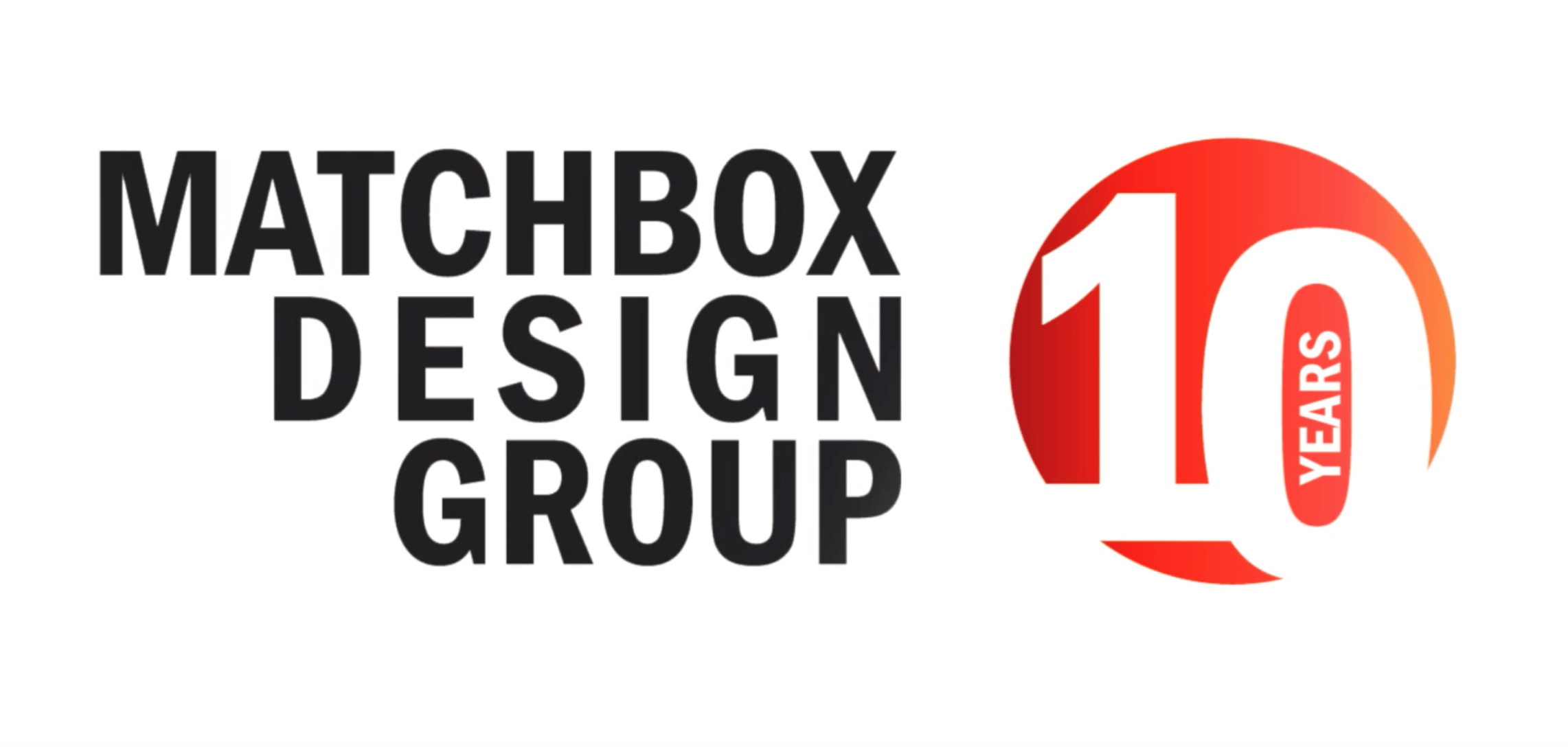
Did you hear that it’s our 10th year in business? As one way to commemorate the occasion, our design-savvy teammates put their creative brains together to come up with a logo for our 10-year anniversary, we call it our Matchbox 10 logo. A milestone we like to refer to as “Matchbox 10.”
Brent, Jeremy and Sarah went to work to capture the celebration of 10 years without veering too far away from our original logo. (But if you know Jeremy at all, he’s always got amazing ideas that deviate from the norm, but get us to a really fun place with any project.)
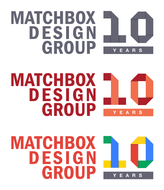
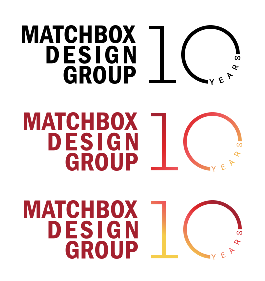
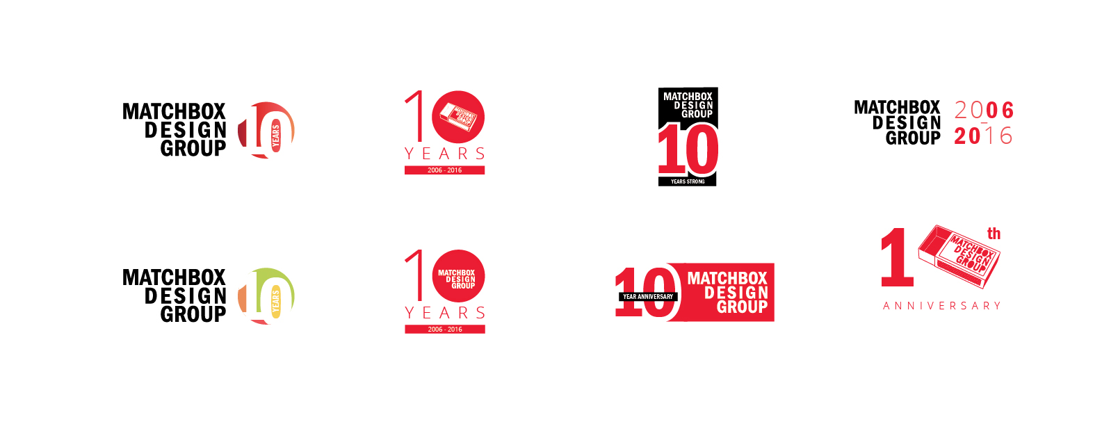
Matchbox 10 Logo Design Ideas
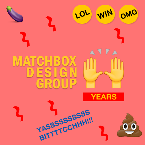
The first idea that came to Jeremy was to make a Buzzfeed-worthy logo, because OMG! YAS! LOL! WIN! Who doesn’t chuckle when they see the poop emoji?
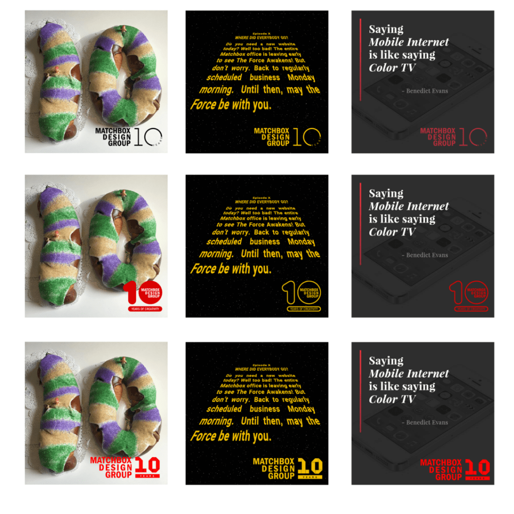
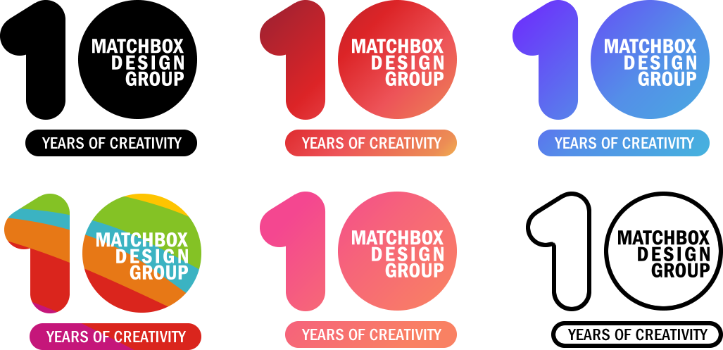
Sarah and Brent took clever, but more clear-cut routes. They focused more on how to make the “10” the prominent element in the logo while remaining true to the Matchbox Design Group company name.
Take a look at our logo journey below. The logo design that won out is the one at the bottom of this blog post. It’s simple, clean and gets the point across with being too cluttered. Congrats to Sarah, our designer, for creating the logo we all loved the best.
Shout-out to the St. Louis-based startup, Lumogram, who took our favorite logo and made it an animated GIF! (See below.)
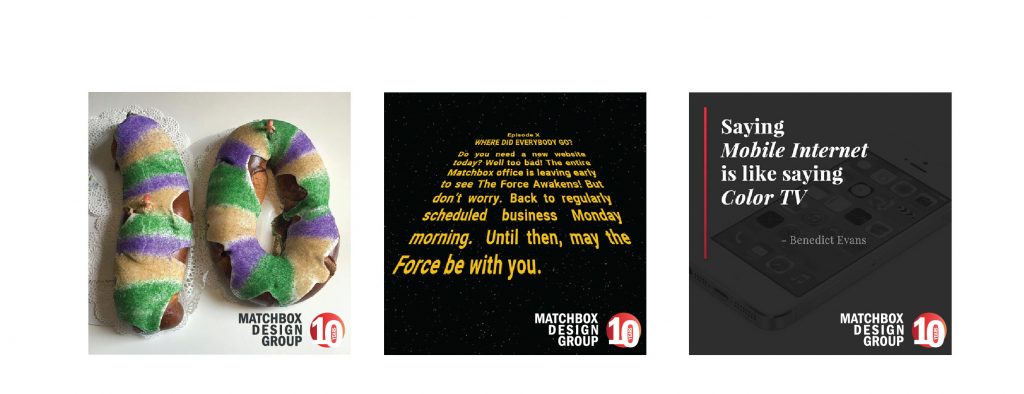

This is one of the Lumograms provided to us, that we did not choose to use:
