QUINCY UNIVERSITY WEBSITE DESIGN & DEVELOPMENT: THE BACKGROUND
Quincy University is a small Franciscan university in Quincy, Illinois, that offers a wide array of degree programs and student activities on their scenic campus. We have been working with Quincy for the past five years on a variety of projects. Back in 2013, Quincy University approached us to help design their website. We developed new features on the site and translated their new brand image into a fresh presence on the web.
Fast forward to 2015. Once again we had the opportunity to work with Quincy University on very big project.
OUR TASK
This time around, Quincy University’s Marketing Director asked us to redesign, rewrite and redevelop the entire university website. This project consisted of a top-to-bottom rebuild of their structure, as well as a new look and feel that resulted in a fresh appearance for their brand and a new sound for their brand voice.
OUR STRATEGY
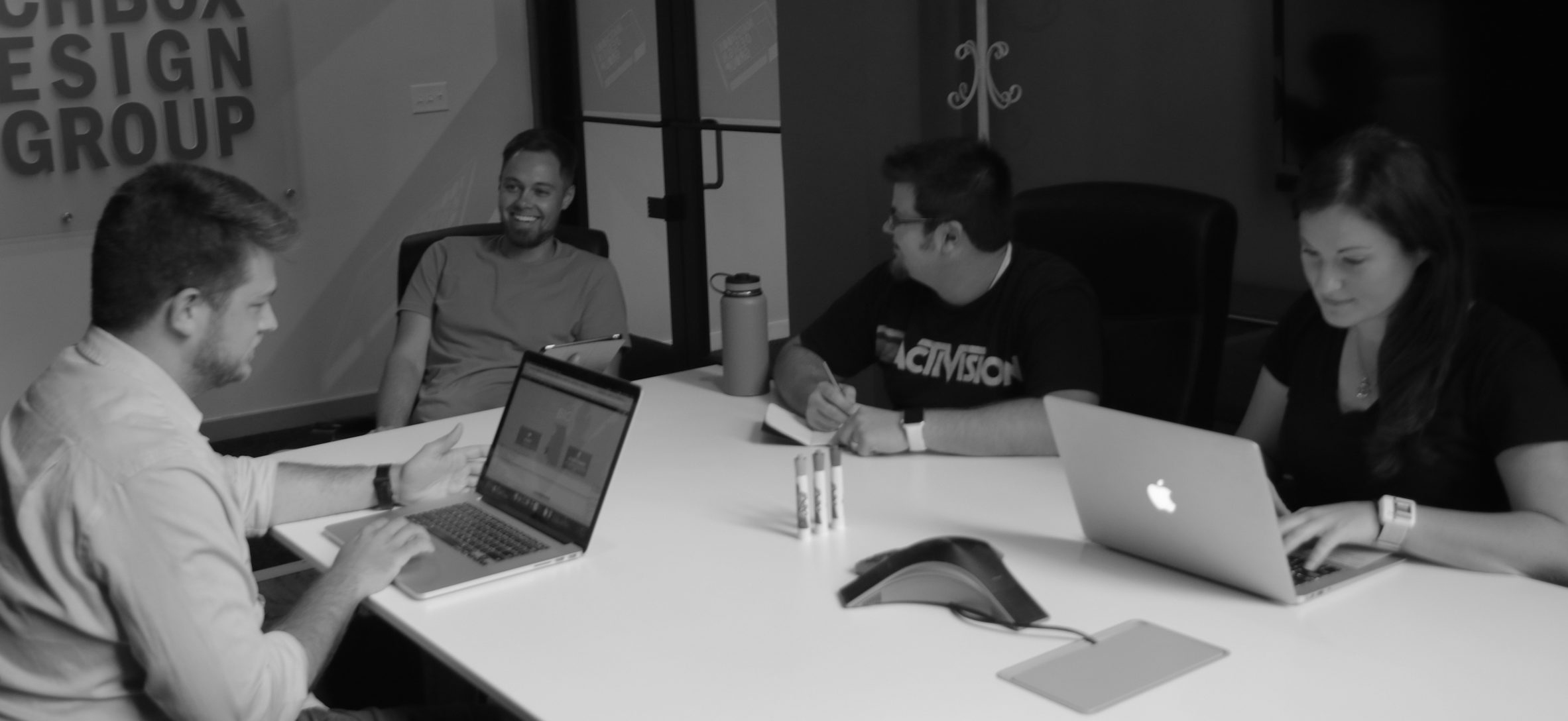
Before design and development began, we started with a strategic foundation of research that involved on-campus meetings, interviews, focus groups with students and secondary research on university website initiatives. We wanted to hear about the website directly from the people who used it on daily basis—and from the younger students who used it as a college selection tool. These findings guided every design, content and user experience decision that we made for this website.
“We dedicated a good portion of our discovery time to figuring out exactly what the website meant to each user segment. Our team wanted to know exactly what these web users needed the Quincy website to do for them. At the end of this phase, we were extremely well informed on what we need to create and how simple to keep the user experience.” -Katie Eigel, Director of Content Strategy
Most of our initial creative meetings involved not just our design team, but our development and content teams, as well. Every member had something valuable to contribute at every stage of this process.
“Crafting a new look and feel for Quincy gave us a chance to be the student again. We learned so much from interviewing the freshman class at Quincy about what mattered to them when they picked a school.” -Brent Feldman, Partner and Director of Design
OUR IDEAS
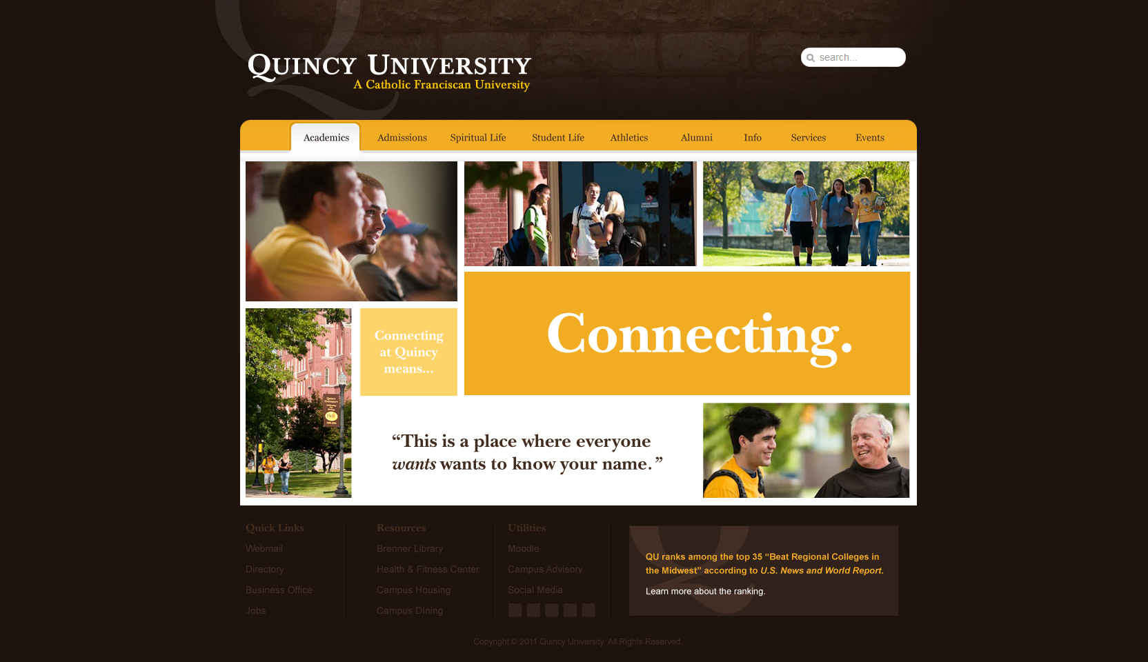
As much as we can respect the tried-and-true collegiate Quincy school colors of gold and brown, we knew we needed to make some updates. The website and the brand looked dark, dated and the content failed to resonate with the younger millennials and Generation Z members who frequented the website more than anyone else.
The key stakeholders at Quincy told us that they wanted the website to reflect the actual college experience of Quincy, which is all about community, connections and opportunities — all rooted in Franciscan values.
THE CONTENT STRATEGY DETAILS
When we starting diving into the website, Quincy had 1500+ individual web pages. (Yes, we see a lot of websites, and, yes, that’s a lot!) The content plan was to take an inventory of all the existing pages and perform a content audit on the website. We created a detailed site map. Next, we needed to be informed about the users before we made any decisions about content. Our team gathered to create user personas and user flows to help us better understand what content needed to be condensed, deleted or expanded based on our perspective users.
“Heading up this project to create a new image for Quincy University couldn’t have been done without the help of our Director of Content Strategy getting a handle on 1,500+ pages of content. We’ve worked on sites this size before, but universities need very specific silos and funnels to be effective.” -Brent Feldman, Partner and Director of Design
Our initial research and Discovery Phase gave us the information we needed to craft a distinctly different brand voice for Quincy that their team could carry out on the website and across all collateral.
THE DESIGN DETAILS
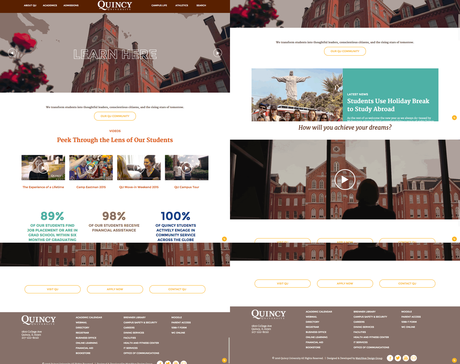
We wanted to brighten and freshen up the look. We added more white space into the designs and introduced big, striking photographs. We worked alongside the university’s hired photographer to create an authentic feel. We developed new graphical assets, messaging and colors. The new look added vibrant and inviting imagery complemented by student achievements and faculty commentary. The user experience of the website has been enhanced dramatically by streamlining content, condensing menus, elevating prominent pages and funneling specific users to desired actions.

Taking the brand in a new direction will help set the standard for effective creative, collateral and digital work moving forward. One of our biggest goals was to craft the look and feel for the website that would attract prospective students while still retaining current students. In addition to the website overhaul, we look forward to working with Quincy to measure website analytics, track user behaviors and translate these results into impactful marketing tactics beyond the website.
“The new Quincy University site was a huge project, and one that was often challenging, but the end result was incredibly rewarding. We were able to take a site that was not user friendly and whose appearance seemed dated, and turn it into a vibrant, user-driven site that had all the tools needed for the expansive Quincy community. We did this with large, fresh imagery of the university and its occupants, a bright color palette and expressive fonts and widget groups (like testimonials, buttons and icons) to give users a visual break on heavier content pages.” -Sarah Kidwell, Designer
THE DEVELOPMENT DETAILS
Our Development Team was very proud of the work they did on this site. It was important for us to build a website that could easily be customized by the many content stakeholders who would be ultimately managing the Quincy University website. The majority of the pages can be customized with a page builder. This means that Quincy can build pages for their site in almost any configuration imaginable. The client loved this flexibility.
“I was lucky enough that the Quincy project was my first time creating a Backend Page Builder for a client. The entire site design was made up of repeating modules, so we figured it would be easy for the user to just select which module they wanted, select the color scheme, then drag and drop it into place.” -Jeremy Schwartz, Front-End Developer
Our Development Team investigated a few pre-built Page Builders and the amount of time it would take to build one from scratch. But, they ultimately decided to go with Advanced Custom Fields Pro Page Builder. The team was already using Advanced Custom Fields Pro for a few other features and it seemed to work exactly how we wanted it.
We built out each module type with every color scheme possible. Page Headers, Section Titles, Button Groups, Instagram Feed widgets and more were all left with the appropriate blanks for the user to fill out and drop into place.
After building out all the site chunks, we created a how-to page and example pages for the client. This allowed the client to see how each module worked and how it would look when it was completed. This worked very well, and the client was able to build out most of the site themselves. This saved us a lot of time and saved the client a lot of money. In the end, everyone came out very happy.
THE DELIVERABLES
The Old Quincy Site
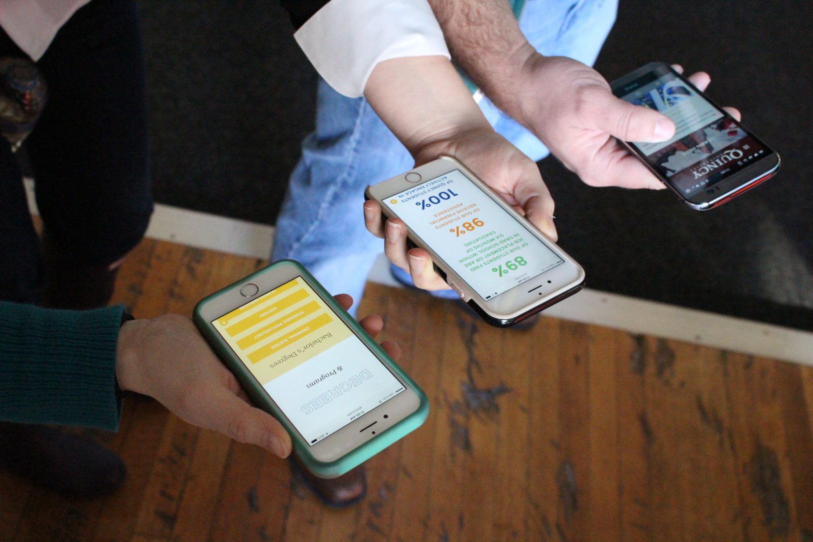
The New Quincy Site
To see our other work, visit here.
