Great web design isn’t just about aesthetics—it’s about creating a website that tells a compelling brand story by integrating brand storytelling while driving conversions. Research shows that stories are remembered 22 times more than facts alone, making storytelling a crucial element of effective web design. By leading with a clear value proposition, eliminating conversion obstacles, structuring the layout for easy navigation, and using customer stories to build trust, you can turn casual visitors into loyal customers.
If you’ve ever spent time creating a website, you know that great design is less about making things look good and more about making things work. But here’s where many brands stumble: they forget that people respond to stories, not just pretty layouts.
Research shows stories are remembered 22 times more than just plain facts. So, if you’re not weaving storytelling into your web design, you’re missing out on a huge opportunity.
That’s why we will show you how to blend brand storytelling seamlessly with conversion-focused web design. Whether you’re looking to boost leads, increase sales, or make a stronger connection with your audience, we’ve got practical tips and real-world examples to help you do that.
Stick around because, by the end, you’ll have a better handle on how to design a website that tells your brand’s story and drives results at the same time.
Lead With Your Value Proposition
Your value proposition is the core of what makes your brand stand out. It’s the first thing visitors should see and understand when they land on your site. That’s because 81% of consumers say they need to trust a brand before buying from it.
Your value proposition sets the stage for that trust by clearly showing what your brand offers and how it meets their needs.
Here’s how to seamlessly incorporate your main message into your web design:
Make sure your value proposition is clear, concise, and front and center on your homepage.
Use language that speaks directly to your audience, focusing on how you solve their problems or deliver something unique. Answer why anyone should care about your solution.
Avoid jargon or fluff. Just be straightforward.
Pair your message with a strong visual, like a hero image or a background video that reinforces what you’re offering.
Don’t make visitors scroll to find your value proposition. It should be impossible to miss as soon as they arrive.
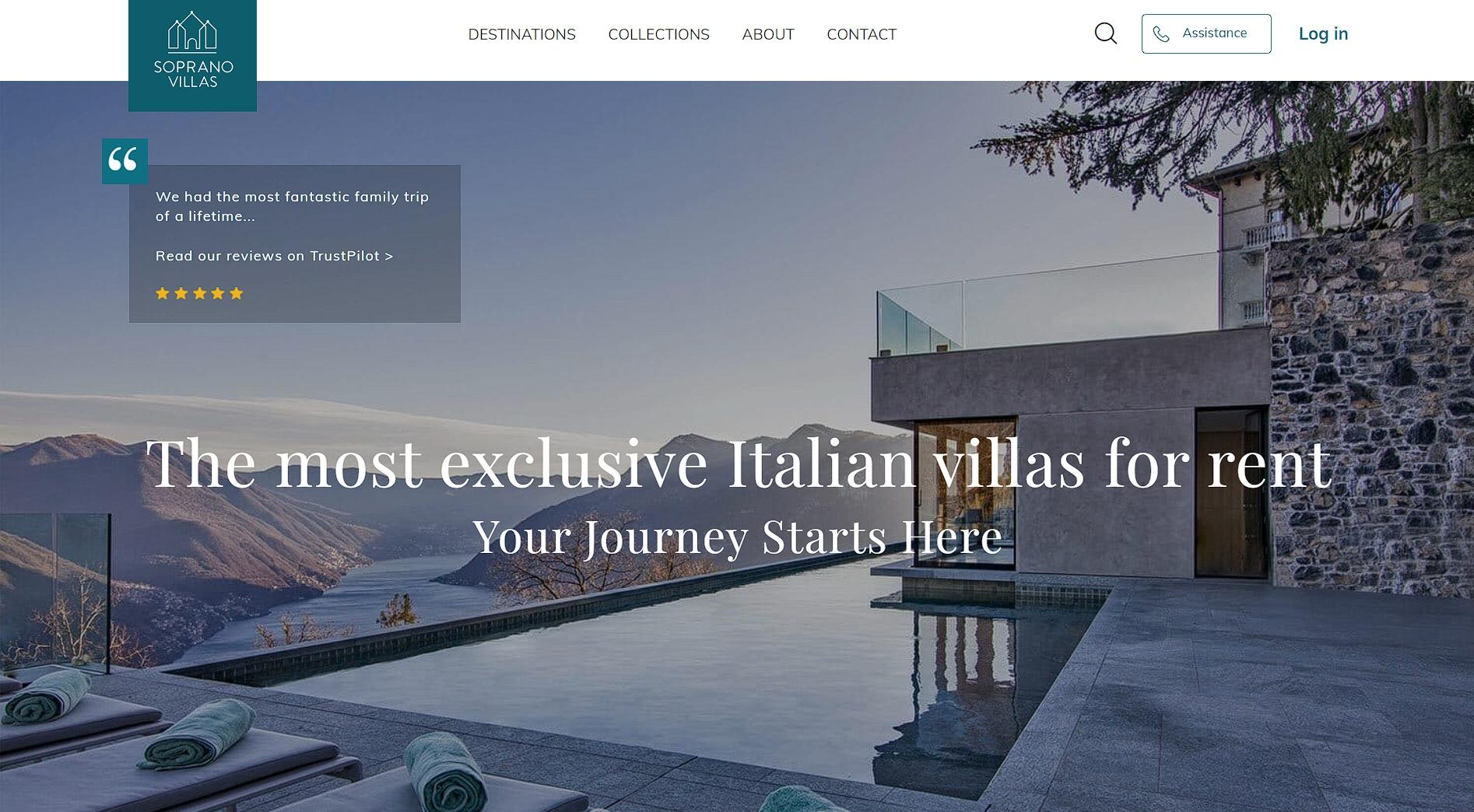
A great example of this strategy comes from SopranoVillas, a luxury real estate agency specializing in Italian villa rentals.
Key Takeaways: Integrate Brand Storytelling
Lead With Your Value Proposition: Clearly state what makes your brand unique and why it matters to your audience. Keep it concise, avoid jargon, and reinforce it with strong visuals.
Remove Conversion Obstacles: Address common concerns like product quality, shipping, and trust by using testimonials, guarantees, and trust badges.
Guide Users With Smart Layouts: Utilize intuitive design patterns (F-pattern and Z-pattern) to lead visitors through your site naturally, ensuring they find what they need effortlessly.
Use Customer Stories to Build Trust: Testimonials, case studies, and video reviews add credibility and reassure potential customers that your product or service delivers real results.
Prioritize User Experience for Higher Conversions: Every element of your site should serve a purpose, from clear navigation to compelling calls to action (CTAs), reducing friction in the buying process.
As soon as you land on their website, you’re greeted with a stunning image of one of their villas and a bold, simple value proposition that immediately tells you what they’re about.
“The most exclusive Italian villas for rent” leaves no room for doubt. If you’re looking for an upscale Italian vacation rental, you know you’re in the right place.
This statement instantly hooks visitors, lets them know they’re in the right place, and sets the stage for the rest of the brand story. It’s clear, it’s compelling, and it makes you want to start packing your bags.
Eliminate Common Conversion Obstacles
Even the best-designed website can lose conversions if visitors encounter too many doubts or unanswered questions.
Addressing common conversion obstacles is key to keeping potential customers from bouncing. People need reassurance when they’re making decisions online. If you can remove any concerns they have about quality, security, or product reliability, you’ll make it easier for them to move forward.
That’s why trust-building elements are so important. They break down the barriers that keep users from converting.
Here’s how to do this effectively:
First, identify the common concerns of your target audience. These could be worries about product quality, shipping times, warranties, or even the legitimacy of your business.
Then, strategically place trust signals like customer reviews, certifications, guarantees, or trust badges throughout your site.
Make sure you have these elements on high-traffic pages like the homepage and product pages.
See that they’re easy to spot without being intrusive.
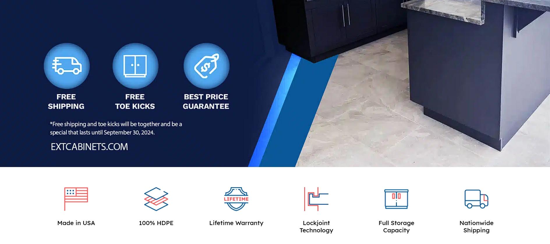
You’ll find a great example in EXT Cabinets, a brand that specializes in outdoor kitchens and cabinets. They address potential obstacles head-on by placing multiple trust badges right on their homepage.
These small, circular icons reassure visitors about key aspects of their products and services. For instance, badges like “Made in USA,” “Lifetime Warranty,” and “Nationwide Shipping” tackle common concerns about product origin, durability, and delivery.
But they don’t stop there. “Lockjoint Technology” showcases their innovation. “Full Storage Capacity” addresses functionality concerns. And “100% HDPE” reassures about quality.
By making these trust factors immediately visible, EXT Cabinets removes doubts and builds confidence in their products. This helps visitors feel secure enough to take the next step, whether that’s making a purchase or requesting more information.
Use Your Site’s Layout To Guide Your Customers
A well-structured layout is more than just an aesthetic choice. It’s a powerful tool for guiding users through your site.
People don’t want to think too hard when browsing. They expect an intuitive flow that naturally leads them toward their goals.
A smart layout ensures they find what they need quickly, increasing the chances they’ll take action, whether that’s making a purchase or signing up for a newsletter. The smoother the user experience, the higher the conversion rate.
Here’s how to get this right:
Design your site so that visitors can easily follow a logical path. Proven methods are the F-pattern and the Z-pattern – these are how most people scan web pages. Place your most crucial elements along these lines for maximum impact.
Use elements like clear navigation bars, strategically placed buttons, and well-organized product categories.
Break up content with visuals and headers so users aren’t overwhelmed by large blocks of text.
Make sure your call-to-action (CTA) buttons are easy to find but not overbearing.
Keep the layout clean and avoid unnecessary distractions. Everything on the page should have a purpose.
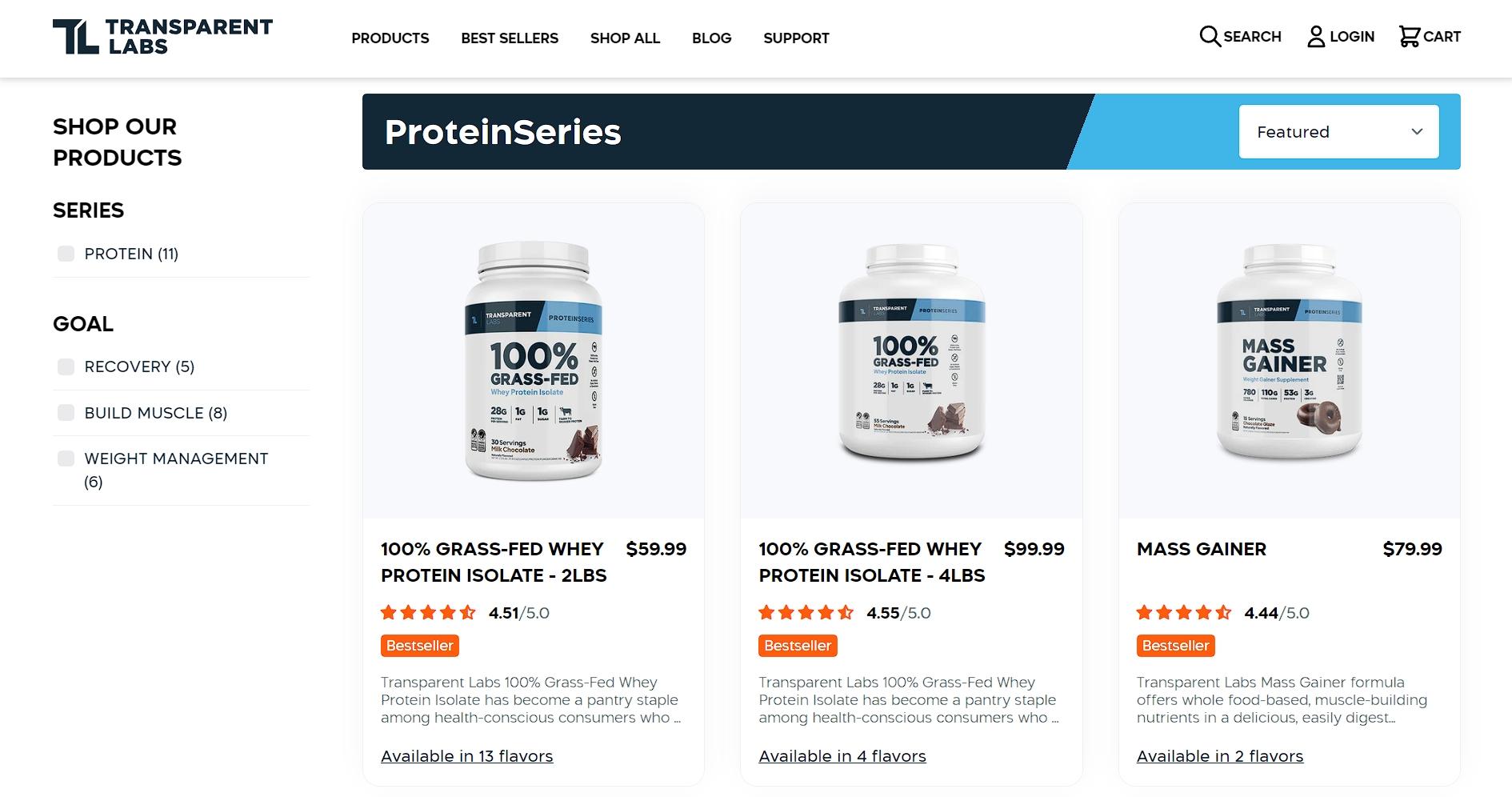
One brand that excels at this is Transparent Labs, a natural sports nutrition supplement company. Take their ProteinSeries page, for example.
They use a grid layout to neatly present all their protein supplements, showcasing each product with uniform, high-quality images. The grid is accompanied by clear product titles, prices, brief descriptions, and star ratings. This gives visitors all the information they need to make a decision without having to dig.
This blend of clean design and concise copy makes it easy for users to compare options and find what they’re looking for. It makes the shopping experience straightforward and stress-free.
Design With Readability In Mind
If your visitors can’t read your content, they can’t buy your stuff. It’s that simple.
Readability plays a vital role in keeping users on your site and boosting your SEO. If your text is hard to read, users are more likely to leave, increasing bounce rates.
Clear, well-organized content, on the other hand, not only retains readers but also signals to search engines that your site offers valuable, user-friendly information.
Here’s how to make your content more readable:
Focus on creating a readable structure.
Use plenty of white space to give your content room to breathe, and break up text with subheadings and bullet points for easy scanning.
Stick to simple fonts and ensure the text size is large enough for all users to read comfortably.
Keep your sentences concise and avoid jargon that might confuse or overwhelm visitors.
Make sure your color contrast is strong – light gray text on a white background might look sleek, but it’s hard on the eyes.
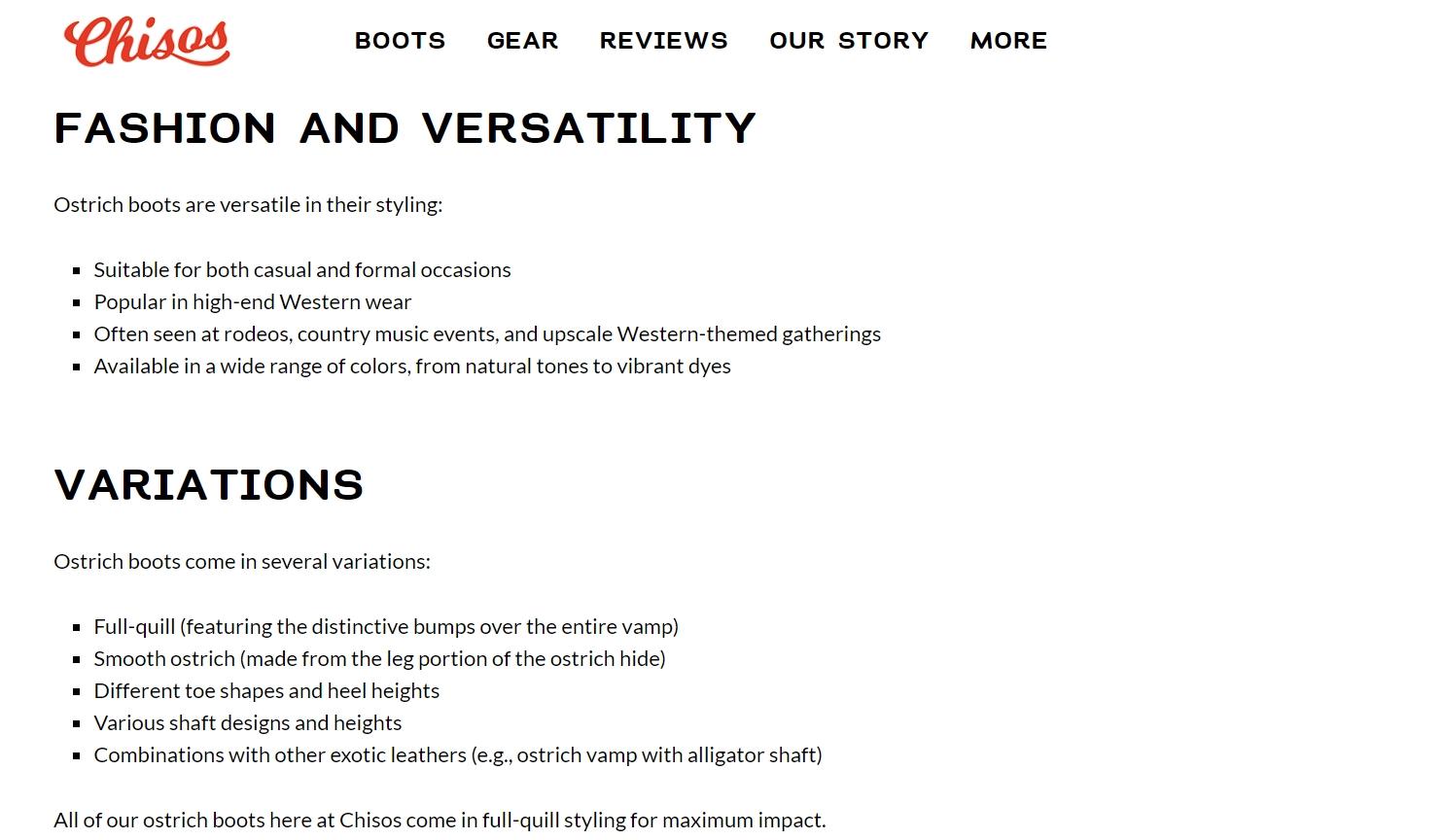
Chisos, a brand known for its handcrafted cowboy boots, is a great example of this approach.
On their Ostrich Boots collections page, they include a rich description of their products after showcasing them. Instead of cramming all the information into dense paragraphs, they break it up with multiple headings, short paragraphs, and bullet points.
This formatting ensures the content is digestible and easy to skim. The language is simple yet informative, with perfect grammar, making the content accessible to any visitor.
By prioritizing legibility, Chisos keeps their customers engaged and well-informed, which ultimately leads to better conversions.
Tell Your Customers’ Stories
There’s no better way to build trust with potential customers than by sharing the stories of those who’ve already had great experiences with your brand. 92% of consumers read at least one online testimonial before pulling out their wallets.
Hearing real people rave about your product or service creates instant credibility, making new visitors feel more confident in choosing your brand. Customer testimonials turn abstract promises into tangible proof.
Here’s how to harness this storytelling goldmine:
Feature genuine, detailed testimonials from happy customers across your site.
Make them easy to find by placing them on key pages like your homepage, product pages, or pricing pages.
Use a variety of formats – quotes, video testimonials, or case studies.
To boost authenticity, include details like the customer’s name, their company, and even a photo if possible.
This personal touch helps site visitors relate to the experiences shared and envision themselves benefiting in the same way.
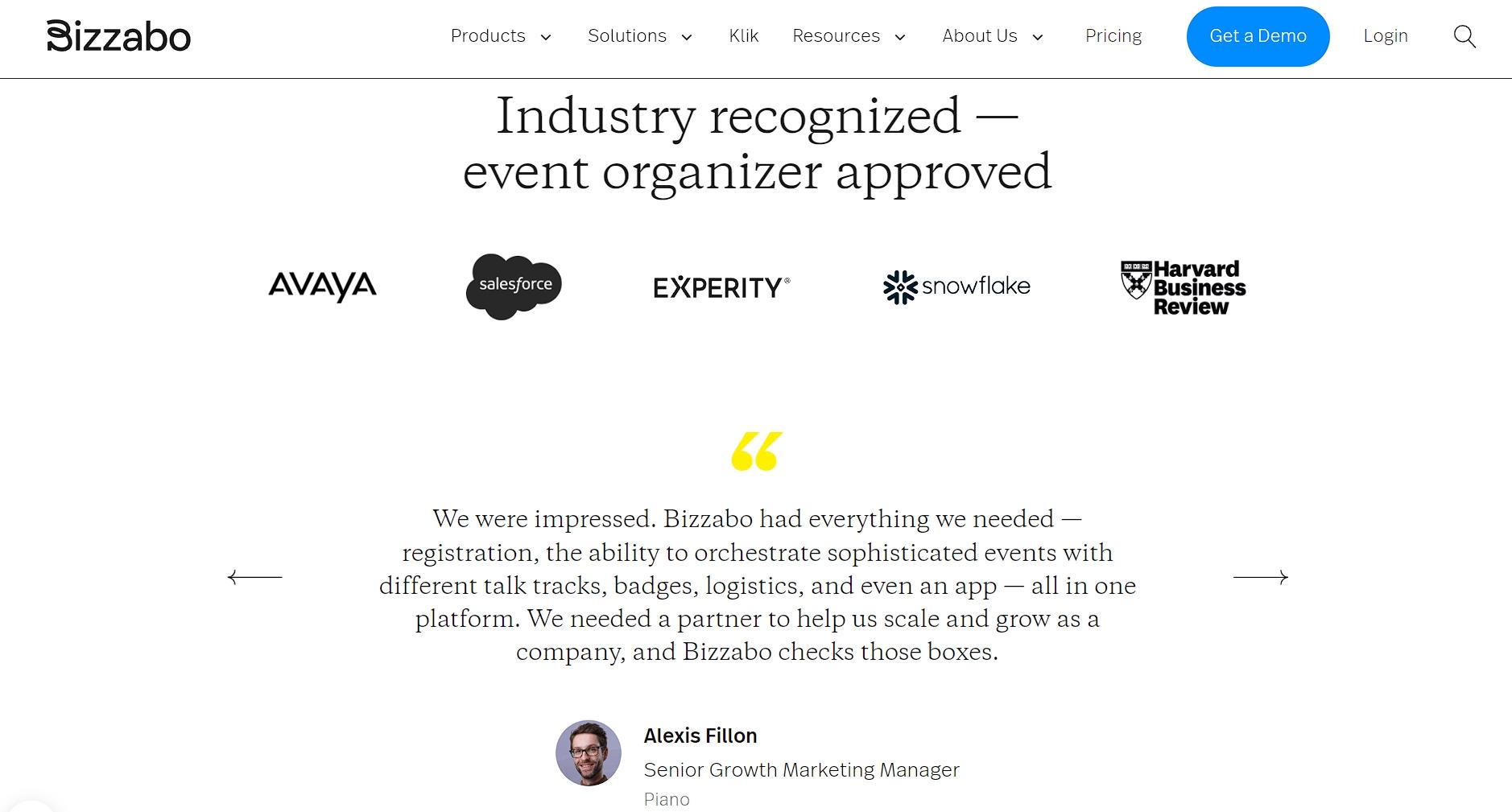
Bizzabo, an event management software company, does this brilliantly. On their event management system page, they showcase several glowing customer testimonials right after presenting the key features and benefits of their product.
The testimonials are placed front and center on a clean white background, immediately drawing attention. Each testimonial includes a direct quote from a happy customer, along with their photo, company name, and position, making it feel personal and authentic.
This method helps Bizzabo prove their product’s value and build trust with potential customers. Their approach is how you turn skeptics into believers and casual browsers into buyers.
Final Thoughts
Above, we learned that it’s not enough to simply have a functional website. You need one that connects, engages, and converts.
By integrating brand storytelling with smart web design, you’ll be able to shape an experience that resonates with your audience.
Whether it’s through a strong value proposition, customer testimonials, or a clean, intuitive layout, every detail matters.
So, start implementing these strategies, and see how your site can evolve from just another webpage to a powerful brand asset that drives real results.
FAQ: How To Effectively Integrate Brand Storytelling With Conversion-Focused Web Design
Q: Why Is Brand Storytelling Important In Web Design?
A: Storytelling creates an emotional connection with your audience, making your brand more memorable and relatable. It helps build trust and encourages users to take action.
Q: How Can I Make My Website’s Value Proposition Stand Out?
A: Keep it short, direct, and easy to understand. Place it prominently on your homepage, pair it with a strong visual, and make sure it addresses your audience’s pain points and needs.
Q: What Are Common Website Conversion Killers?
A: Slow load times, cluttered design, unclear messaging, lack of trust signals (like reviews or guarantees), and complex navigation all reduce conversions. Keep your site clean, fast, and intuitive.
Q: How Do I Structure My Website To Increase Engagement?
A: Use a clear hierarchy with easy-to-follow layouts like the F-pattern or Z-pattern. Break up content with visuals, use intuitive navigation, and ensure CTAs stand out.
Q: How Can I Use Customer Testimonials Effectively?
A: Place testimonials strategically on key pages (homepage, product pages, checkout). Include names, photos, or videos for authenticity, and highlight specific benefits customers have experienced.
Contact Matchbox Design Group Today!
If your website could use a refresh, if you’re looking to drive more traffic to your site, or you would like to submit a guest post, fill out the form below and we’ll contact you to learn more about your digital needs.
James is a savvy digital marketing specialist with a Masters of Science in Internet Marketing. For the past fourteen years, he has been specializing in SEO, PPC & Marketing Strategy. He has a super sharp analytical mind and a finely tuned creative eye for marketing initiatives that optimize brands.
James is a savvy digital marketing specialist with a Masters of Science in Internet Marketing. For the past fourteen years, he has been specializing in SEO, PPC & Marketing Strategy. He has a super sharp analytical mind and a finely tuned creative eye for marketing initiatives that optimize brands.
To provide the best experiences, we use technologies like cookies to store and/or access device information. Consenting to these technologies will allow us to process data such as browsing behavior or unique IDs on this site. Not consenting or withdrawing consent, may adversely affect certain features and functions.
Functional
Always active
The technical storage or access is strictly necessary for the legitimate purpose of enabling the use of a specific service explicitly requested by the subscriber or user, or for the sole purpose of carrying out the transmission of a communication over an electronic communications network.
Preferences
The technical storage or access is necessary for the legitimate purpose of storing preferences that are not requested by the subscriber or user.
Statistics
The technical storage or access that is used exclusively for statistical purposes.The technical storage or access that is used exclusively for anonymous statistical purposes. Without a subpoena, voluntary compliance on the part of your Internet Service Provider, or additional records from a third party, information stored or retrieved for this purpose alone cannot usually be used to identify you.
Marketing
The technical storage or access is required to create user profiles to send advertising, or to track the user on a website or across several websites for similar marketing purposes.