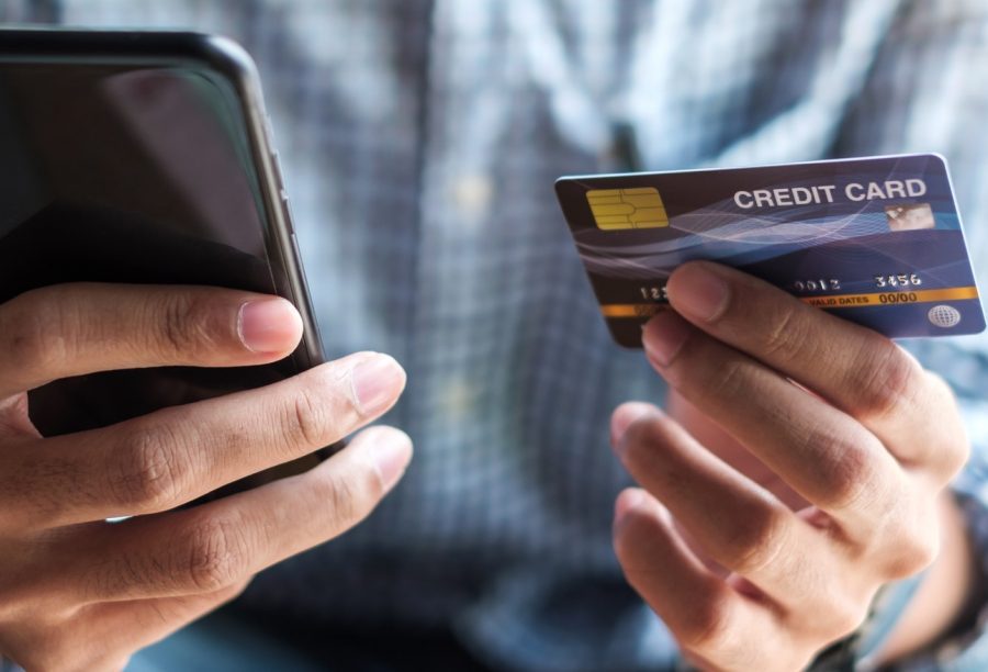
As of 2020, almost 50 percent of web traffic in the United States originated from mobile devices. In view of the last world changes, reaching new clients via mobile will go on. Customers will search, choose, and checkout. And, of course, we all know mobile users expect the checkout flow to be fast, easy, and secure. How about if we simplify their checkout experience with good mobile checkout practices.
As of 2020, almost 50 percent of web traffic in the United States originated from mobile devices. In view of the last world changes, reaching new clients via mobile will go on.
Customers will search, choose, and checkout. And, of course, we all know mobile users expect the checkout flow to be fast, easy, and secure. How about if we simplify their checkout experience?
We have to, as the mobile audience is dictating sales in 2021.
Mobile Checkout Practices You Should Spot
Well, we consider a checkout on mobile devices with the example of FireCheckout. This is a time-tested checkout solution for Magento 2 stores. Yet, the practices for improving the checkout page can be used on all eCommerce websites.
First, we have to help customers avoid much typing. It is possible to reduce the number of checkout fields users have to fill out. There are also techniques that prevent making annoying typos. So, first things first.
How To Minimize The Data, Users Have To Enter During Checkout
Offer A Guest Checkout
The option allows a visitor to buy without creating a store account. No need to enter the information. Thus it takes less time and makes the user closer to complete the purchase.
Yet, we have to remember the benefits of creating accounts. Registered customers with stored shipping addresses, email addresses, and phone numbers, will go through the next checkout faster, as their data will be rendered automatically.
And if that’s the case, the FireCheckout module provides 5 registration modes during checkout. You can choose between:
- Guest checkout
- Default mode (No changes to Magento logic)
- Optional registration at checkout page
- Required registration at checkout page
- Automatic registration in the background. By the way, this option registers users automatically if enabled. There will be no checkout registration field visible.
Reduce The Number Of Fields
When minimizing the total number of fields, the Address Field manager will be helpful. This is a part of the FireCheckout, which allows for changing address form fields status. Thereby you can hide the checkout field or make it optional according to your store requirements.

Use Autofill Possibilities
To make the user experience more seamless on mobile and prevent them drop out of the buying process, suggest autofill on your checkout page. Two options are considered:
Detecting users’ location based on their IP addresses. The FireCheckout allows using the user’s current GeoIP location as an address. Thus the fields such as Country, Postal Code, Region, and the City will be automatically filled.
Entering the correct address via Address Autocomplete feature. It fills the address form, using Google Maps API features. Once the user begins typing, the Google autocomplete suggests results. It helps customers choose their address faster, and go on with the checkout process.
How To Make The Checkout Easier Via The Page Design
Here we’ll talk about the checkout page layout without distractions. Mobile visitors have such a small screen to navigate, press and complete, that the unnecessary elements could mislead users during checkout.
Eliminate Distractions On The Checkout Page
The neat layout with a clear structure is the proven way to optimize checkout on mobile devices. You have to think over:
- The forms’ appearance on the page.
- The order of fields and logical connections between them.
- The display of elements that guide users to the purchase complete.
With the FireCheckout, you can choose up to 5 responsive checkout page layouts: 1 column, 1 column multistep, 2-column, 2-column alternative, 3-column. And then it is possible to customize the page layout to make it match the different screen sizes.
Here you can view a 3-column layout shown on a tablet.

For instance, you can transform some elements into collapsible blocks, hide the shipping methods section, as shown above, edit the size of the checkout field.
When it comes to logical connection, you can set up the dependencies between fields. Then there will be shown or hidden a checkout field in case another field’s value matches some conditions. This checkout option is implemented via the FireCheckout Dependent Fields utility.
Remove The Header On The Checkout Page
We also recommend removing a header. The empty layout without a header and footer will help the visitor focus on the important checkout steps, and complete them faster.

In the image, you can also see a progress bar at the top of the screen. This is an essential element for usability when checkout on mobile. This is a kind of visual cue to talk about in the next paragraph.
How To Streamline The Checkout With Visual Clues
The mobile checkout is also different by how users deal with input fields. And we should help them. There are various visual techniques that simplify the checkout experience on mobile devices:
Progress Bar
You can see that in the image above. The indicator guides users from step to step by letting them understand what checkout activity will be the next.
Color Contrast
Sure you better use the same color scheme that associates the rest of your store design. Yet pay attention to the CTA button font and color. It is better to highlight them to attract users’ attention to particular actions. The FireCheckout module includes 4 checkout page themes as well as a broad range of customization options that on the whole help to guide users to the required interaction.
Labels, Hints, Notification
These visual cues help the customers understand what information is required or what wrong data they entered. The module allows you to:
Show field errors and notices in the Tooltips or Magento traditional notices below the checkout field.
Use field placeholders instead of labels.
The hints like those ones create clear instructions for your clients on mobile.
As we mentioned in the previous posts, enhancing security measures is one of the important checkout optimization practices.
How To Make The Checkout Secure
Payments Via Trusted Providers
If your store works with multiple payment providers, you can show their famous badges in the payment section at checkout. Once your visitors see the famous icons, it increases the security credibility of the checkout in your store.
With the FireCheckout extension, it is possible to integrate the most popular and secure payment methods. That will help your customers make payments easily and safely.
Google ReCaptcha On The Checkout Page
We all need to make sure we deal with real customers. To avoid fake orders because of failed credit card fees, and delivery issues then, we recommend installing Google ReCaptcha on checkout.
The feature for Magento 2 sites is available with the M2 ReCAPTCHA module. It allows for using an integrated reCAPTCHA form on the checkout page.

Summary
We want to tell the truth – so many stores lose sales because of ignoring important nuances for building checkout on mobiles.
Don’t be the one with a lot of missed opportunities. Today we’ve shared with you the best practices to streamline the checkout and get maximum conversion.
Optimizing the mobile checkout experience will put money back into your wallet. Time to use the right solutions and tools for your website.
Contact Matchbox Design Group Today!
If your website could use a refresh or you’re looking to drive more traffic to your site, fill out the form below and we’ll contact you to learn more about your digital needs.