Are you prepared for natural or man made disasters? Do you have all the safety equipment and knowledge that will help you protect your family in case of fire, tornado, or other emergency? Don’t take chances with your safety!! And at least visit this website to see what awesome work came out of our partnership with The Safety Junction.
When I was first introduced to this project, I thought that our clients might have gotten some worst case scenario ideas from the“Doomsday Preppers” TV series on the National Geographic Channel. However, after meeting Tim and Jen McMahon, I quickly realized that they are completely rational business-minded people who were just trying to buy an emergency kit for their family. After being unimpressed by the current products on the market, they started to do more research and soon, The Safety Junction was born.
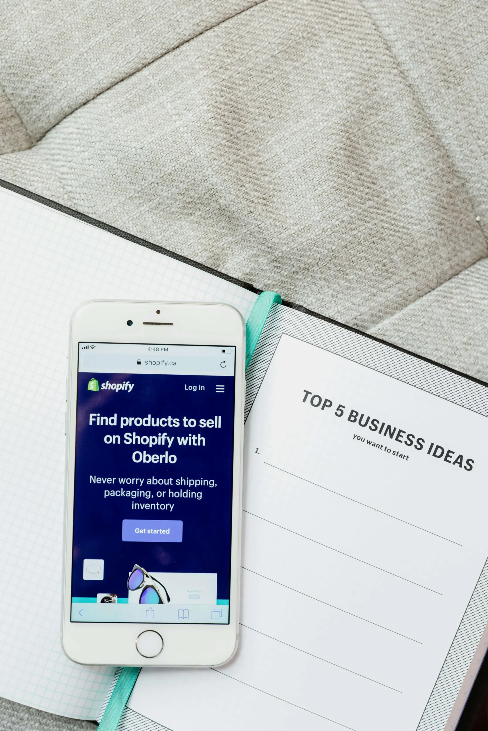
Safety Junction Website Development
The McMahon’s connected with Matchbox early in the development of their company for assistance with collateral and web design. The business plan and logo were developed prior to our engagement with The Safety Junction. Our team was then brought in to design the outer packaging, the bundle icon system, the family plan and other elements included within the kit. High quality website designers in Seattle believe that website designs are unique for each client, so no templates can be used. Utilizing the icon system and building off of the packaging design, we then designed the user guides which provide a step-by-step look at what is inside of each kit, the replenishment reminder cards which alert customers when items in their kit are close to expiration, and even family game night cards. (I dare you to download and play “Name That Tool – Family Survivor”, you’ll be shocked at how ill-prepared you truly are!) From these elements, we then dove into a customized, fully-loaded consumer-friendly website, which is light years ahead of other “emergency kit” providers’ sites in its ability to put a friendly face on emergency preparedness products.
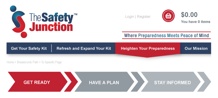
The Safety Junction’s identity is cloaked in a red, white and blue color scheme to imply the importance of the content it covers. Red to portray the urgency in emergency situations, blue to portray the calming effect that preparedness can have in an emergency situation and the color combination of red, white and blue to connect and unite The Safety Junction brand to our National colors. The colors and graphics are strong and bold to grab and retain the attention of the customers. The content could be vital to their survival, so we made everything extremely user friendly. We implemented an icon system for ease of use throughout the entire brand – whether a user is browsing the website, using a kit mid-disaster, or playing family game night, the icons will eliminate unnecessary confusion and provide a memorable image to rely on.
Safety Junction Website Launch
With Phase 1 of the project nearing completion, we can say that we, and our clients, are so pleased with this first step. The website is now up and is full of cool features and great information. It even has a unique customization process so you can create the perfect kit for your family.
Try it out by going to www.thesafetyjunction.com