As most digital users are aware, Google currently controls two-thirds of website search traffic in the United States, making it a key stakeholder in the information being sent and received by content consumers and producers alike. Basically, they control a large portion of the Internet, and when they make a change to how their algorithms rank searches, it’s something that can’t be taken lightly. And on April 21, 2015, the search giant announced a new mobile-friendly algorithm, many have dubbed “Mobilegeddon.”
To quote Google’s Webmaster blog: “Starting April 21, we expanded our use of mobile-friendliness as a ranking signal. This change will affect mobile searches in all languages worldwide, and will have a significant impact in our search results. Consequently, users will find it easier to get relevant and high quality search results that are optimized for their devices.”
Why Mobile-Friendly Search Matters
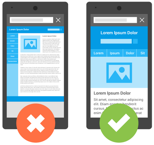
The focus of this algorithm is to promote mobile-friendly content, and many would argue — Matchbox included, that this is actually long overdue. As users increase switching from larger screens and desktops to mobile devices and tablets, the way digital content is displayed on these devices must adapt as well. We have all been to websites on our phone where we are squinting to read and getting frustrated by not having the ability to click on something. Or our huge fingers click the wrong thing instead. This is why Google is making this change.
Google wants websites to be more readable, consumable, and digestible for people sharing and connecting on these smaller screens. While it is definitely more work for companies and businesses to adapt to these changes, it’s ultimately a good thing. If your users are trying to access your goods, services, and information via these devices, shouldn’t we make this experience as pain-free and as enjoyable as possible?
What else is changing?
In addition to the ranking adjustments associated with being responsive or mobile friendly, Google is also updating the presentation of URLs in search results. As opposed to showing the full URL, they will now look like a breadcrumb. This is why a logical and SEO friendly URL structure is key.

As part of this launch, Google is introducing support for schema.org structured data for websites to signal to the search algorithms:
- The website name to be used instead of the domain name
- The URL structure of the URL as breadcrumbs
How Google’s Mobile-Friendly Search Affects You
About two weeks after the launch of the update, here is what we know about Google’s more mobile-friendly search engine approach and how it impacts us as consumers and producers of web-based content:
- It will only search rankings on mobile devices. This offers some website owners a small sigh of relief. However, we recommend to not take this too lightly. If you receive a lot of mobile traffic, these ranking adjustments could bump your site significantly.
- It affects search results in all languages globally. This change is happening world wide and shows Google’s commitment to making the mobile web a better place
- It applies to individual pages, not entire websites. This means if you only have a mobile landing page, your other pages could drop in ranking. By treating each page separately Google can show what they consider the “best result” for the user.
- The algorithm changes are expected to affect websites slowly. Google is not expected to push out the entire changes in a day or week but rather over the course of a few weeks, to allow website owners to make necessary changes.
- If you’re worried that you may be too late to the mobile game, it appears there is some good news. Google is reprocessing new mobile-friendly pages quickly. So you still have time to make the change, have Google recognize it quickly, and not be penalized for it.
However big this update ultimately ends up being, Google’s push toward mobile-first design and their clear public stance on this issue strongly signal that mobile-friendly sites are going to have an advantage over time. This is not Google just trying to be a pain in the butt, this is simply Google trying make the web better for the future, no matter what size screen we are holding.
Are you worried about your mobile search results?
Check to see if your site passes as Mobile-Friendly: https://www.google.com/webmasters/tools/mobile-friendly/